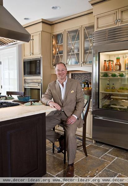
Remodeled Baltimore Showhouse Kitchen

Remodeled Baltimore Showhouse Kitchen
Design:
Blue Arnold, CKD, Kitchens By Request, 1115 Baldwin Mill Rd., P.O. Box 452, Jarrettsville, MD 21084; 410/557-6957, kitchensbyrequest.com.
Photographs by Gordon Beall
Text by Amy Elbert
Produced by Eileen A. Deymier
With all due respect, guys, college fraternity houses aren't known for gracious interior design, elegant dining, or, for that matter, anything close to clean kitchens. Interior designer Blue Arnold wasn't daunted, however, and boldly signed on to renovate the kitchen of a former fraternity house at the University of Maryland, Baltimore County, for the 2009 Baltimore Symphony Showhouse.
The Tudor Revival-style house was built in the late 1920s and was remodeled over the years to suit the needs of residents, including the fraternity. The new owner, who wanted to return the house to a single-family dwelling, gave the designer free rein to create a stylish kitchen that would suit a 21st-century family. Blue did just that, while staying true to the house's heritage. "My approach was to bring a modern sensibility without losing the look or feel of what was basically a traditional English cottage," says Blue, who's a certified kitchen and bath designer in Jarrettsville, Maryland.
The footprint of the space remains basically unchanged, but a wall dividing the kitchen and pantry was eliminated to create one 15x21-foot space, with an enlarged doorway leading to the dining room. Blue unified and grounded the room with Italian travertine floor tiles reminiscent of old European cobblestones.
An island with counter-height seating--ideal for modern family living--sits front and center and houses the cooktop. "I like the idea of cooking as theater, and having the cooktop in the island provides for that," says the designer. "Family and friends can interact with the cook." The vent hood is prominent, so Blue chose a stainless-steel model with sleek, sophisticated baffle filters rather than typical mesh grills.
He upped the island's function by adding a pop-up TV. A simple mechanism lifts and lowers the 19-inch flat-panel screen, allowing people to watch TV while preparing or eating meals. The island is wired so the screen can function as a computer monitor as well, making it easy to view family schedules online and search for recipes on Web sites. "The screen serves so many purposes. That, to me, is the essence of modern life in an antique setting," Blue says.
Ceiling-high cabinets maximize storage and reflect the house's period styling. Simple raised panels on the doors are outlined with molding. "It gives more depth, and it's a very simple technique that doesn't cost a lot of money," the designer says. Maple perimeter cabinets are painted linen white and rubbed with a truffle-colored glaze.
The island, in dark-stained cherry finished with a charcoal glaze, has a flip-down door on one end to hide outlets and is topped with Jerusalem Gold limestone in a traditional matte finish. "We wanted the island to look like an antique or a piece of furniture," notes Blue. "The limestone is a beautiful, rich neutral that lightens the kitchen and goes with the floor." The seating side of the island top is bowed slightly, softening the geometry of the room.
The arch repeats in upholstered window valances and wood apron valances trimming the bottom edges of some upper wall cabinets. Seeded-glass cabinet doors with X mullions add character while obscuring views of the cupboard's contents. "Everyone worries about glass doors, but this way things don't have to be perfectly arranged inside," Blue explains. The mullions echo a diamond grid in one of the house's original windows, helping the kitchen blend with the period architecture.
Rather than polishing the perimeter granite countertops to a high sheen, he showcased an Italian finishing technique called Antico, in which wire-brush rollers burnish the granite, creating a leatherlike texture that has a sense of age.
Large-format 6x12-inch slate tiles cover the backsplash, picking up the brown and pewter tones of the floor. For an unexpected modern touch, the designer added decorative insets--oval glass tiles with a brushed-silk finish framed by rustic stone. One inset is recessed into the backsplash in the baking zone, providing a handy niche for storing bottles of oil and seasonings off the counter.
Blue incorporated many similar design features, ensuring that the kitchen is as functional as it is beautiful. He tucked the warming drawer directly under the cooktop, where it is easy to reach, rather than in the typical spot below the wall ovens at floor level. "Who wants to bend down to use a convenience appliance?" the designer asks.
In the pantry area near the dining room door, he included a bar with a sink and wine and beverage refrigerators, providing a convivial place for guests to gather in the kitchen without intruding on the cook's work space. Refrigerator drawers for beverages are also located near an exterior door, keeping soft drinks handy for kids to grab when playing outdoors.
With its blend of contemporary details, modern technology, and Old World design, it's hard to believe this elegant and functional kitchen was once a fraternity hangout. But doing the unexpected is Blue's forte. "I like some nuance. I didn't want to do just the same old thing," he says. "This is fresh."


