My Houzz: Functional Flair for a 1926 Home in San Antonio
http://decor-ideas.org 10/31/2015 23:13 Decor Ideas
Galeana Younger knew her 1920s home in downtown San Antonio, Texas, would have to be taken down to the studs, but she saw the potential underneath years of neglect. She gave the dated home a yearlong renovation with what she calls “unconditional love,” and the home is now full of color and whimsical touches that help many of the original features shine.
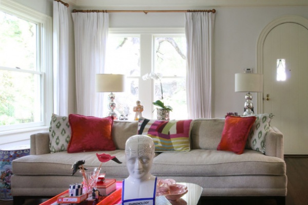
Houzz at a Glance
Who lives here: Galeana Younger and her son, Gray Woodson, 12; their black Labrador mix, Buck, and their Boston terrier, Bolt
Location: Monte Vista neighborhood of San Antonio, Texas
Size: 2,910 square feet (270 square meters); three bedrooms, three bathrooms
Year built: 1926
One of the things Younger likes about her home is how well it functions for her and her son. “I really think about the space and how I want it to function, and then I set out to find things,” she says. “I typically pool together lots of options before paring things down. Then I make sure my final selects tell a complete story.”
Wall paint: White Dove, Benjamin Moore; ceiling paint: Frozen Dew, Pratt & Lambert; sofa: Jonathan Adler; coffee table: family hand-me-down
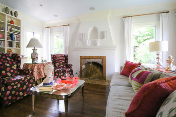
After repainting the interior and refinishing the floors, Younger decorated the interior with a vibrant, candy-colored palette and offbeat accents. “A friend once said my house was like a delicious confection. I’ve always liked that thought,” Younger says. “‘Delicious confection’ reminds me of a big pink pastry I might find in Paris — and who doesn’t like the thought of eating a big pink pastry in Paris?”
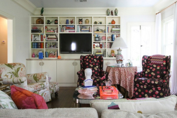
The bookshelves are filled with books and knickknacks Younger has collected over time, including design books, snow globes, a brass unicorn, porcupine needles and her son’s bronzed baby shoes. “I look for inspiration from lots of different places,” she says. “I like the hunt. I’ve found some of my best pieces at the most unexpected places at the most random times.”
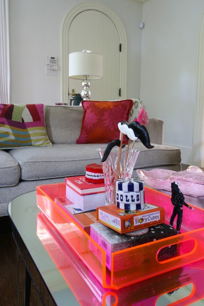
“Incorporating a functional flair is definitely one of my design philosophies,” Younger says. “I want to be surrounded by lighthearted reminders and pick-me-ups.” Playful accessories and accents are everywhere, as seen in this coffee table vignette with chattering teeth and mustache sticks. “I’d choose to live in Candy Land over blasé any day,” she adds.
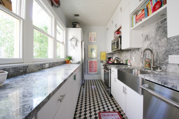
Younger transformed the feel and function of the kitchen without changing its footprint, since the layout on that floor didn’t allow her to expand it. She added a wall of windows that provide all-day natural light and make the room feel more spacious than it is.
Concrete floor tile (similar pattern): Materials Marketing; sink: Kohler
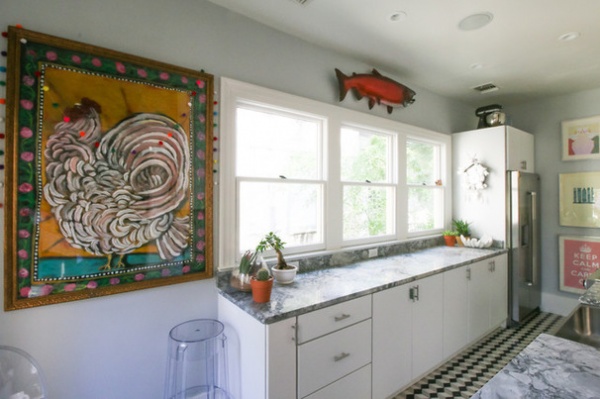
The light and bright colors used in the kitchen also help give the illusion of its feeling bigger than it is and allow a few selected art pieces to stand out. One notable piece is a red salmon caught by Younger’s paternal grandfather. “It’s a different kind of art,” Younger says. The salmon and a piece by artist Raymundo Gonzalez bring in the vibrant colors from the adjoining rooms.
For the countertops, Younger considered Carrara marble but nixed it. “I knew it wouldn’t withstand our careless habits in the kitchen,” she says. Instead she found a gray and white granite that looks a lot like marble. With this option, she says, “I knew I wouldn’t have to worry about things such as stains and regular maintenance.” It gives her the best of both worlds.
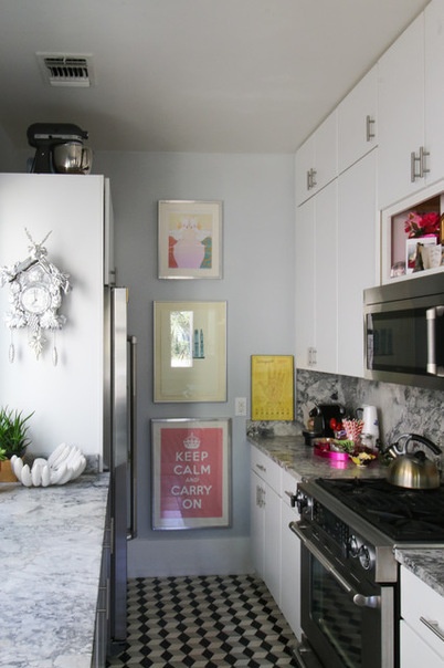
This was one of two kitchens that were in the house when Younger bought it. The primary kitchen was located downstairs, and Younger has since turned it into a third bathroom.
“Maximizing storage while keeping things feeling open was my challenge,” Younger says. The wall opposite the windows is configured to provide as much storage as possible, with upper cabinets extending to the ceiling.
Art: Samantha Hahn (top); Julia Rothman (middle); sfgirlbybay (bottom), Etsy; range: Jenn-Air
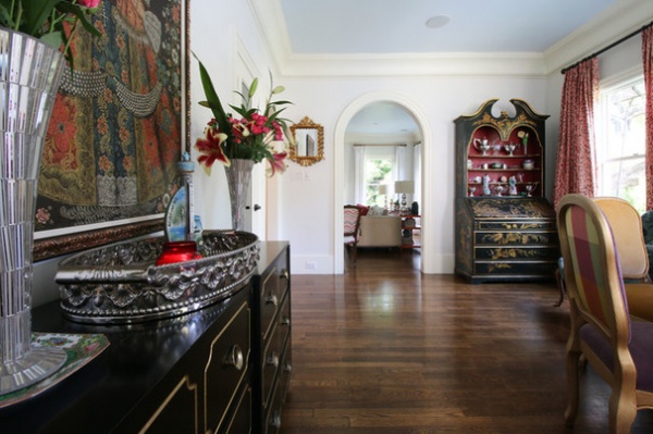
Younger’s mother has an eye for style and taught Galeana how to see the potential in a space, calling it “po.”
“I grew up in homes with impeccable style,” Younger says. “My mom in particular is especially good at thinking about how to make things fabulous but still practical.”
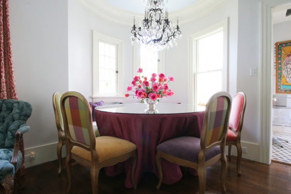
Younger credits her mother and grandmother for modeling an easy blend of style and function. The dining area is in a cove created by the turrets that are part of the home’s architecture. The space features a custom table with a mirror tabletop and vintage chairs. “My maternal grandmother had an incredible eye,” Younger says. “She wasn’t afraid of color. Her turquoise dining room was paired with dark pink leather chairs, and she had great flair. Plus, she understood the art of entertaining.”
Chandelier: Schonbek
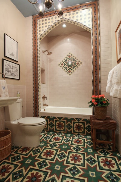
Because of the condition of the house when Younger bought it, all three bathrooms had to be gutted, giving her the freedom to reimagine what they could be. “I wanted the bathrooms to feel original to the house — like they’d been here forever,” Younger says.
This bath in the upstairs hall serves as both a guest bath and her son’s bathroom, and it contains the only tub in the house. Going with a more sophisticated palette and carefully chosen finishes has helped the bathroom perform its two functions well. Turkish tile patterns inspired Younger’s design as well. The floor is concrete tile in a custom pattern.
Tile (similar floor and shower surround): Materials Marketing; shower tile: Design Materials
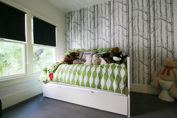
Twelve-year-old son Gray’s bedroom has neutral finishes with lots of storage for his things.
Wallpaper: Woods, Cole and Son; duvet: Ikea
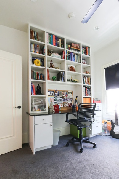
The white background has allowed the space to grow with Gray and adapt to his changing storage needs without needing to be redesigned. The custom built-in shelf helps keep his things organized.
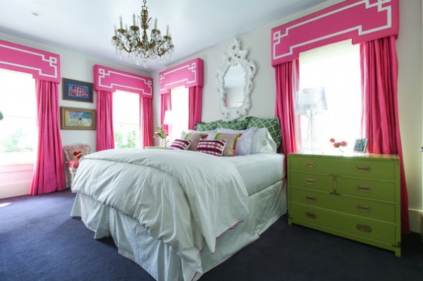
The master bedroom is chock-full of playful colors, with bright pink window treatments, lime green campaign nightstands and a chandelier set off by mostly white bed linens and white walls.
Younger views decorating her home as an ongoing process. But that doesn’t mean she’s constantly changing things. “I sort of think of things on a 10-year cycle,” she says. “It’s probably time to change some things up after a decade of living with them.”
She says these changes can be small and still make a big impact, like re-covering a chair, painting the walls and getting new pillows or lamps.
Pillow shams: Designers Guild; sheets: Yves Delorme; throw pillows: Trina Turk; curtain fabric: Silk Baron; chandelier: family hand-me-down; mirror: One Kings Lane
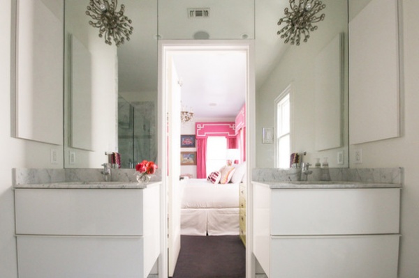
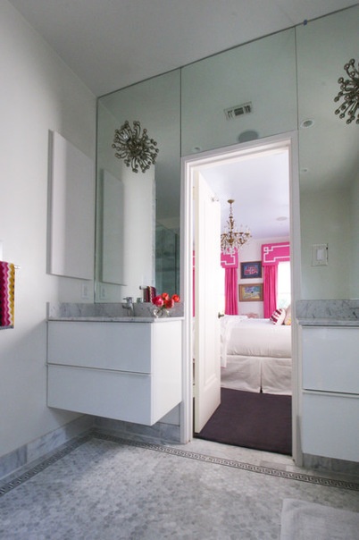
The master bathroom is elegant and serene. The colors are kept to a minimum in this room, but other things, like the lighting over the vanities, make a big impact. For this room, Younger went with a classic Carrara marble. “Black, gray and white is a color combination that always works in a bathroom — especially in a historic home from the 1920s or ’30s,” she says. “It’s timeless and elegant.”
Vanities: Godmorgon, Ikea; light fixtures: Robert Abbey
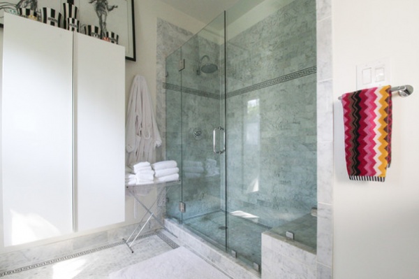
Floating cabinets and a chrome and Lucite tray for towels add to the serene feeling of the master bath by keeping things light and airy.
Tile: Walker Zanger
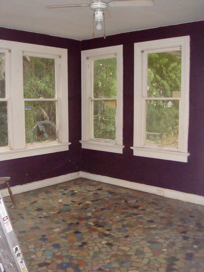
BEFORE: The mosaic tile floor in the walkout basement is original to the house. Younger knew she wanted to incorporate it when she remodeled the adjacent bathroom.
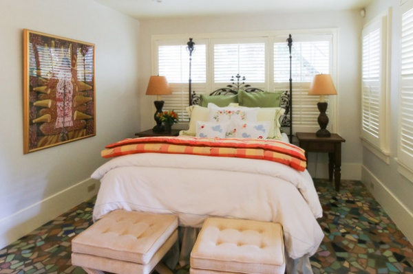
AFTER: Younger converted the walkout basement into a large guest suite. It feels like its own window-wrapped retreat.
Stools: eBay; wall paint, Lemon Chiffon, Benjamin Moore
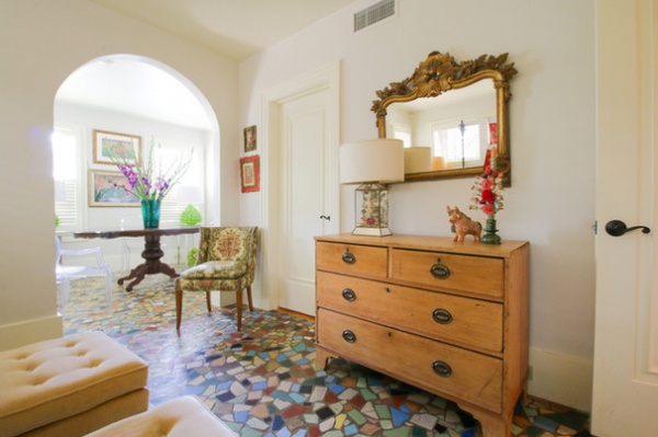
A chair, a dresser and two ottomans provide additional comfort for guests.
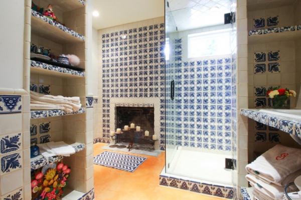
This downstairs bath was originally a kitchen, and when Younger redesigned the space, she left the fireplace where it was. She then gave the room a modern Mexican feel, thanks to her tile and color choices. “By taking the tile up the walls, it sort of makes a big statement, yet it’s still relatively simple and clean,” Younger says.
“Blue and white birds are frequent images found in Mexican folk art, so that tile design was a natural choice,” she says.
Tile: Reeso Tile
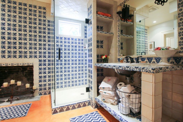
The concrete floor, stained an orange hue, is both hard-wearing and stylish. It also allows for an easy visual transition from the mosaic tile in the adjoining room.
“It’s not only a fun punch of color, but the color orange is complementary to blue so it makes a lot of sense,” Younger says.
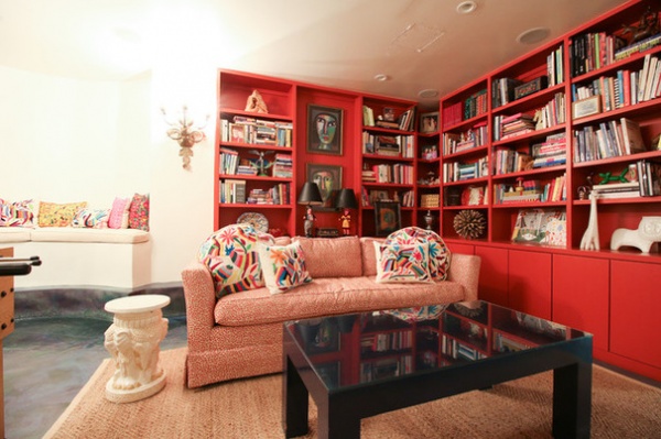
The downstairs has an inviting family room with colorful built-ins, a cozy couch, a large TV and a foosball table, making it a desirable destination for Younger’s son to hang out with his friends.
Paint on built-ins: Shy Cherry, Benjamin Moore; pillows, E & C Designs; artwork (faces): Victor Uhtoff
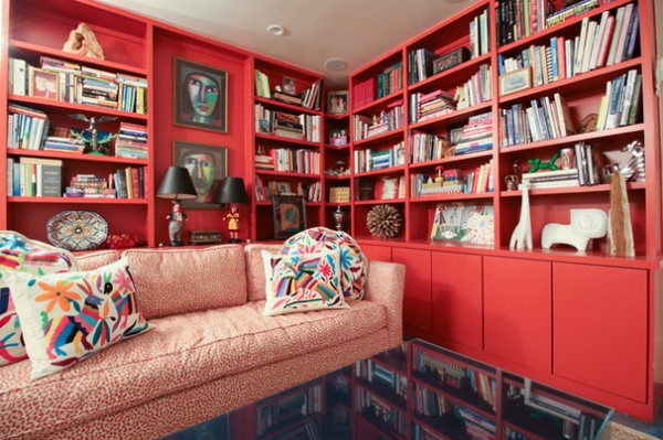
The room also contains several colorful pieces of art, including one by Raymundo Gonzalez. “His works are always colorful, passionate and whimsical,” Younger says.
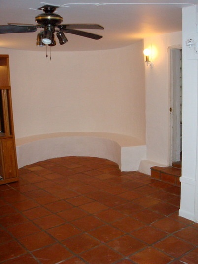
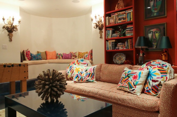
AFTER: Younger added a custom cushion and otomi-patterned cushions throughout the space. Along with artists like Gonzalez, whose works Younger collects, she also mixes in things from Etsy and 20x200. “Art doesn’t have to be expensive, and it only has to appeal to me,” she says. “If I like it, and I have a place to put it — and I can always find a place for something — then that’s enough of a reason to go with it.”
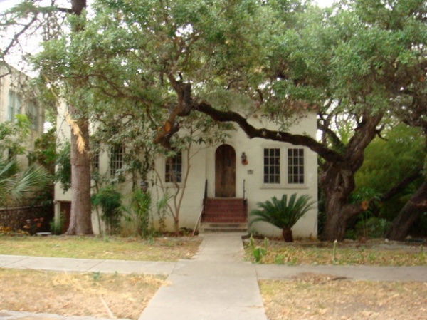
BEFORE: The exterior was partially hidden by overgrown trees and shrubs and in need of new windows and paint when Younger purchased the home.
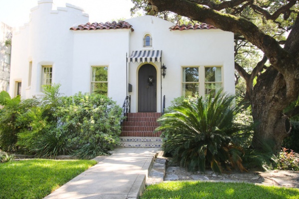
AFTER: Cutting back the overgrown trees and shrubs revealed two turrets to the left of the front door. Other upgrades included painting the exterior, replacing the windows and adding tile to the bottom two stairs to enhance the home’s curb appeal.
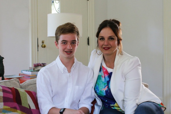
Younger, pictured here with her son, Gray Woodson, has a background in public relations and has also owned a women’s clothing boutique. During the economic downturn in 2008, she closed her retail store and put her extra time into renovating. She enjoyed the process, so she started her own interior design business, Galeana, helping clients with their own renovations and remodels.
See more photos of this home
My Houzz is a series in which we visit and photograph creative, personality-filled homes and the people who inhabit them. Share your home with us and see more projects.
Browse more homes by style:
Small Homes | Apartments | Barn Homes | Colorful Homes | Contemporary Homes |Eclectic Homes | Farmhouses | Floating Homes | Guesthouses | Homes Around the World | Lofts | Midcentury Homes | Modern Homes | Ranch Homes | Townhouses | Traditional Homes | Transitional Homes | Vacation Homes
Related Articles Recommended


