Sleek Kitchen Design Highlights the Views
http://decor-ideas.org 10/27/2015 23:13 Decor Ideas
“I can’t design anything I wouldn’t like to live in myself,” designer and builder Carley Montgomery says. For this kitchen, the open-plan design, great views of downtown Los Angeles and Montgomery’s penchant for sleek yet eclectic style helped inform the uncluttered look. Perhaps she liked what she did in this contemporary spec house too much. “We haven’t left the place since we finished it,” she says. While she and her team are planning to sell the home soon, they have made it their headquarters and Montgomery has been staying here. There are even plans to create a pop-up art gallery in the space in the near future.
Kitchen of the Week
Who lives here: Designer and builder Carley Montgomery
Location: Silver Lake area of Los Angeles
Size: 234 square feet (22 square meters)
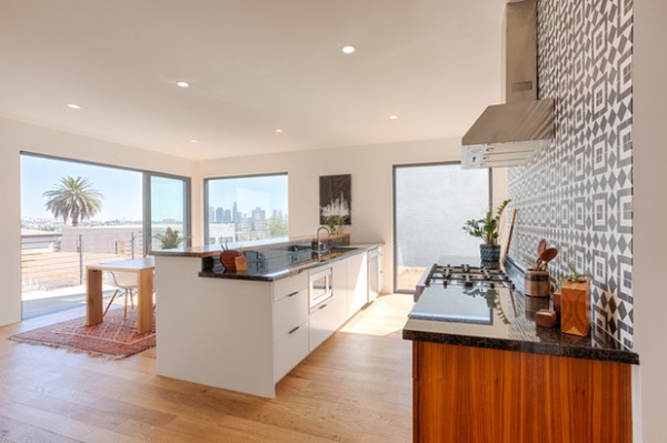
“Everything was about this amazing view of the downtown L.A. skyline,” Montgomery says. “I wanted everything to face it and keep the open feeling.” In fact, she would have skipped the higher bar top on the peninsula, but she needed a good spot to install electrical outlets in an inconspicuous way. Installing them on the wall between the two countertops worked out well.
Because the kitchen is so visible from the living room and family room, it needed to fit in with the other spaces. The large windows and doors are 8 feet high. “Rather than taking away from the views, we wanted to accentuate them,” Montgomery says. She found alternatives to upper cabinets to keep the open feeling.
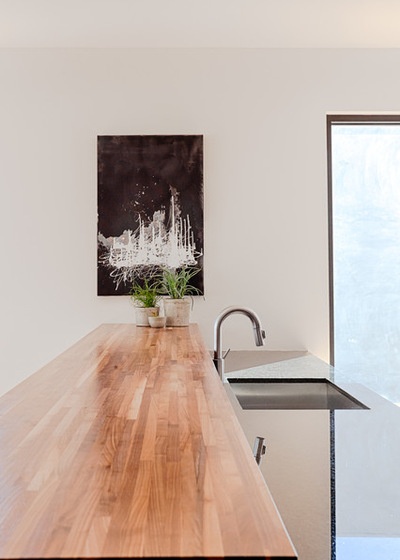
On one side, the peninsula contains the sink, the dishwasher, pullout trash and recycling bins, and drawers. “We used drawers instead of cabinet doors as much as possible. They are much more convenient and are a one-step operation,” Montgomery says. The other side (see previous photo) has additional cabinet storage for pieces that are not used daily, like platters, vases and a fondue pot.
Montgomery used beautiful walnut wood to warm things up throughout the house. This countertop is unstained walnut with a clear sealant.
Painting: Joel Gasparotto
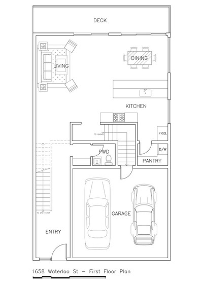
On the plan, you can see how the main living spaces relate to one another and that the refrigerator is tucked just around the corner in front of the pantry. This helped keep the kitchen from looking like a typical kitchen, making the entire living room, dining room and kitchen space more pleasing. At the same time, the refrigerator is within work-triangle range.
This house is part of a small development Montgomery completed that includes three main houses and two back houses on three lots.
She sourced the geometric encaustic tile on the range backsplash from Nicaragua. It makes one big statement and fits in with the contemporary art that Montgomery likes to display and plans to exhibit when she uses the house for a pop-up gallery.
In fact, the backsplash came out so beautifully that it inspired her to become a vendor for the tiles herself, a side project she is working on.
Learn more about cement tiles
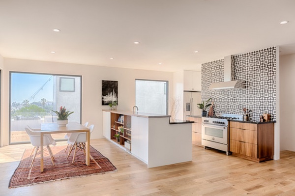
This is a view from the sofa in the living room area. “We placed the living room, dining room and kitchen all within one large, open space. It’s a tight plan, but there is ample room for everything,” Montgomery says. You can see how the custom walnut cabinets flanking the range resemble chests, giving them the look of free-standing furniture.
Range: Bertazzoni
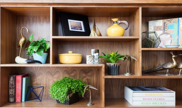
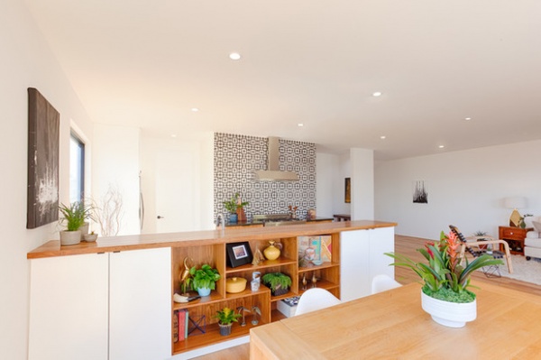
The dining room side of the peninsula has custom walnut built-in shelves that nod to midcentury modern style. Again, they help the kitchen elements fit into the large, open plan. The walnut shelves break up the long expanse and provide a place to display favorite items and plants.
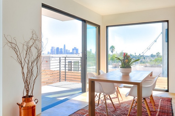
The dining room is wide open and adjacent to the kitchen. Montgomery and her team use it for working and meeting while enjoying the views of the city skyline.
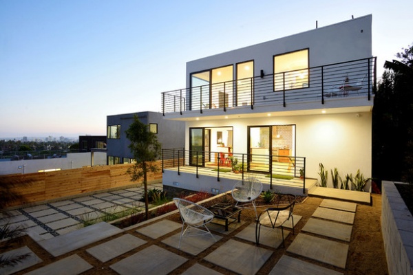
The large sliding doors provide big openings to the terrace. A big part of the home’s program is indoor-outdoor living. The lower patio (back-left side of this photo) doubles as a required parking area for the other dwelling on the lot, a back house. The grid of concrete squares is an attractive solution to this zoning requirement.
While Montgomery knows they’ll eventually sell the house, she’s in no particular hurry to vacate. After all, she designed it in the style she loves.
Read a guide to remodeling your kitchen
Related Articles Recommended


