Room of the Day: A Great Room Pays Homage to Ordinary Architecture
http://decor-ideas.org 10/27/2015 20:13 Decor Ideas
Preservation is a key consideration when renovating a home that has architectural significance — a midcentury modern ranch or an early 20th century Craftsman, for example — but what about the less-noted homes or periods in architectural history? These dwellings may be less revered, but they nevertheless contribute to a community’s identity and reflect how people lived. Without them, something’s missing.
When architect Murray Legge was hired to renovate a 1940s stick frame home in Austin, Texas, he took a somewhat uncommon approach: He didn’t add on to the home and he didn’t tear it down. “We really like stick framing construction,” Legge says. “There’s no obvious historic value, but it’s part of the fabric of what Austin is.”
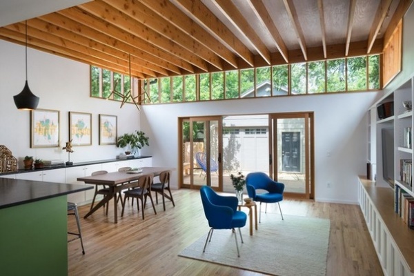
Great Room at a Glance
Who lives here: Emily Ramshaw, editor of the Texas Tribune, and David Hartstein, a filmmaker
Location: Austin, Texas
Designer: Murray Legge Architecture
Year built: 1940s; remodeled in 2015
Homeowners Emily Ramshaw and David Hartstein hired architect Murray Legge to remodel the main bathroom, kitchen, living and dining rooms. For many renovation projects in Austin, Legge says, this would have been enough to tear the house down and start from scratch, but he wanted to improve the house, not erase it.
“We were going to take the best of the 1940s stick frame modernism and try to strategically make these interventions that would make it a bright, open, airy space without fundamentally changing its appearance from the street,” he says.
Without increasing the home’s square footage or changing the layout, he tore down the walls of the compartmentalized kitchen, dining and living rooms and created one spacious living, cooking and eating area. Natural light floods the room from a new wall of windows, which also highlight the home’s structure.
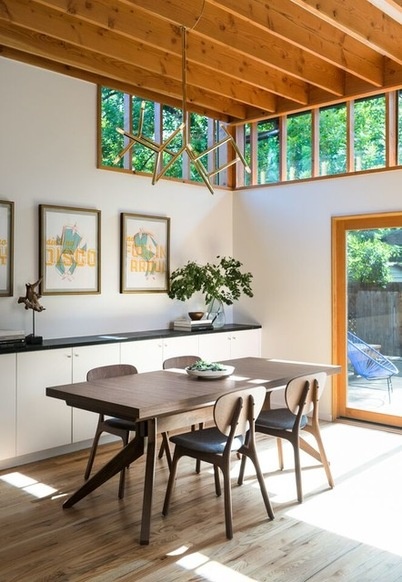
New 12-foot ceilings reveal the roof’s construction and add detail. Stock Douglas fir was used for the ceiling joists, which were sanded and given a polyurethane finish. The ceiling is a standard plywood with a pickling stain. “It makes it look a little dressier than construction-grade plywood,” Legge says. The roof’s insulation is above the exposed structure.
The walls were painted a clean white for contrast and to avoid having the house visually dominated by wood.
Dining table: Cross Extension Table, Matthew Hilton for Case
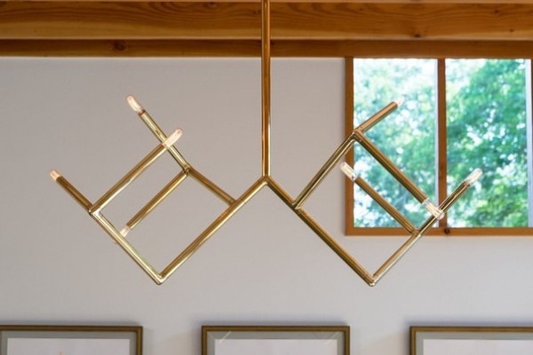
Legge commissioned Travis Cook, an architect who formerly worked for him, to design and build the brass light fixture over the dining table.
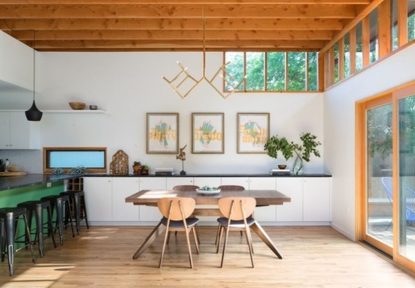
Along the rear wall, Legge cut out a new clerestory window. To avoid installing the necessary structural beam to support an expanse of glass the width of the room, which often ends up blocking the view you’re trying to frame, Legge let the studs run through the window opening. A higher-grade Douglas fir was used for the exposed portions, and the glass was installed on the exterior.
Built-in cabinetry along the far wall stores plates and serveware close to the dining table.
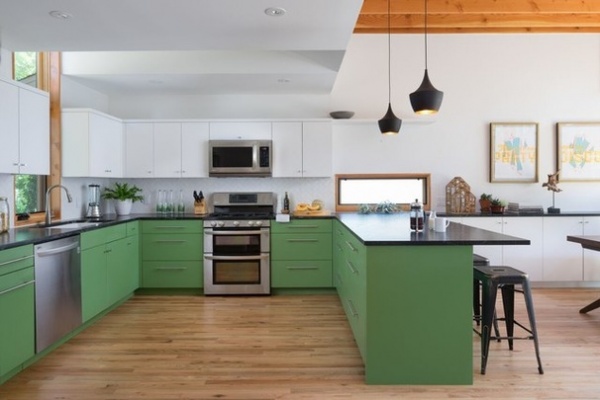
The cabinetry from the dining area continues into the kitchen at the same height, in the same style and with the same soapstone cap. “The casework starts to divide space, but we wanted them to feel like they’re from the same family,” Legge says. The green lower cabinets add color, and the white uppers balance out the kitchen so it doesn’t overwhelm the space.
The ceiling joists become concealed at the kitchen peninsula. Since the kitchen had more color and more detail, the architects felt it more appropriate to maintain a white backdrop and keep everything clean.
The new horizontal window over the peninsula divides the two spaces and also brings in more natural light. The window overlooks the driveway, so the architects used obscure glass to screen the view but still allow the light to wash across the dark counters.
Cabinet paint: Snowbound and Dill, both Sherwin Williams; pendant light: Tom Dixon
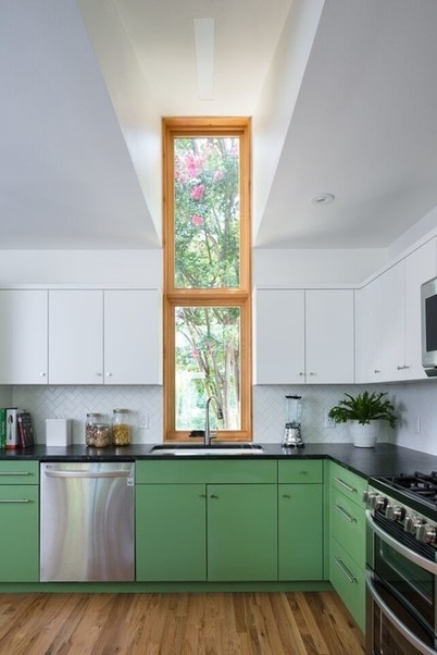
Most of the new windows are in the back of the house to preserve privacy, but a new vertical window over the sink faces the street and frames a mature crape myrtle in the front yard. From the street, the house and roofline look the same, with the exception of the vertical bay window that slices up through the kitchen.
Golden light filters through the tree and into the room, Legge says, and the 10-foot-tall window captures the view of the setting sun in the west, something the clients requested. The hole for the window was cut between existing roof trusses, avoiding extensive structural work.
Doors and windows: Sierra Pacific
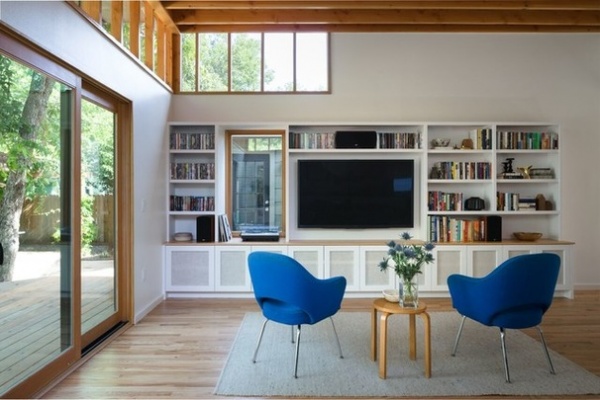
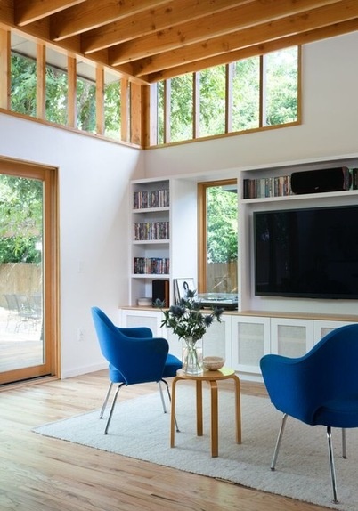
Custom built-in casework in the adjoining living area stores the couple’s vinyl records, DVDs and a subwoofer and ties in with the room’s simple wood cabinetry.
The vertical window overlooks a mini courtyard that the couple hope to turn into a garden one day. The window projects out slightly to accommodate the subwoofer in the cabinet below.
Side table: Alvar Aalto; armchairs: Executive Armchair, Eero Saarinen (the couple are looking for a couch)
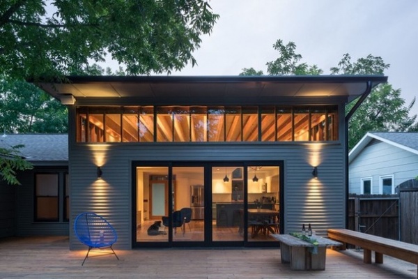
“What we love about this project is that we were able to work with this existing, very modest building typology rather than just throwing it out,” Legge says. “It preserves an existing structure without transforming a neighborhood too radically.”
Architecture: Travis Avery and Murray Legge, Murray Legge Architecture
Contractor: Gray Renovation
See more Rooms of the Day
Related Articles Recommended


