New This Week: 4 Kitchens That Embrace Openness and Raw Materials
http://decor-ideas.org 10/24/2015 02:13 Decor Ideas
Looking for a kitchen that feels airy and simple? Embrace openness and raw materials. Here, open shelving, open floor plans and an open ceiling assert these kitchens as accessible hubs of the home, while raw materials like brick, steel, concrete and wood grounds them in simplicity.
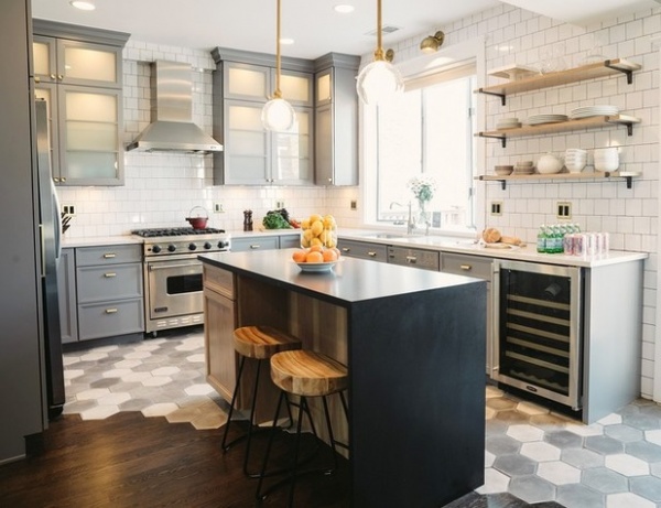
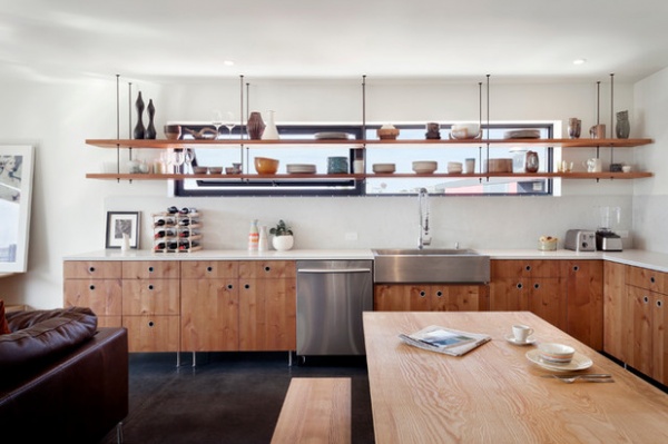
1. Industrial Ingenuity
Designer: SuzAnn Kletzien of SuzAnn Kletzien Design
Location: Lincoln Square, Chicago
Size: About 156 square feet (14.5 square meters); about 12 by 13 feet
Raw and open elements: For juxtaposition against the warm gray cabinets, designer SuzAnn Kletzien used a light natural wood finish for the island and open shelving. The room gets an industrial feel from the steel brackets that hold the open shelving, subway tile in a 4-by-4-inch format with black grout and brushed brass lighting and switch plates.
Tearing out a previous peninsula meant adding new flooring. The homeowners didn’t want to see a hard transition of wood flooring from the dining room to the kitchen, so Kletzien came up with the idea of using three-tone raw concrete tiles in an oversized hexagon shape to run diagonally across the floor.
Homeowners’ request: “The wife of the home loves cooking and is a very hip and chic person,” Kletzien says. “Her style inspired my color scheme. She mentioned loving brass and opaque glass elements. I basically ran with that.”
Plan of attack: Previously, the sink faced a blank wall, where the refrigerator now sits, and the bay window wasn’t being used at all. Meanwhile, a peninsula “shot out from nowhere,” Kletzien says. Placing the sink at the bay window gave the homeowner a view while washing dishes, while a thin, long island made use of the narrowness of the room and created more storage opportunities. Open shelving kept a bright and open feeling and created a focal point that’s seen when entering the front door of the house.
Mid-tone gray paint for the cabinets made the space feel lighter and more updated than the previous cherry cabinets.
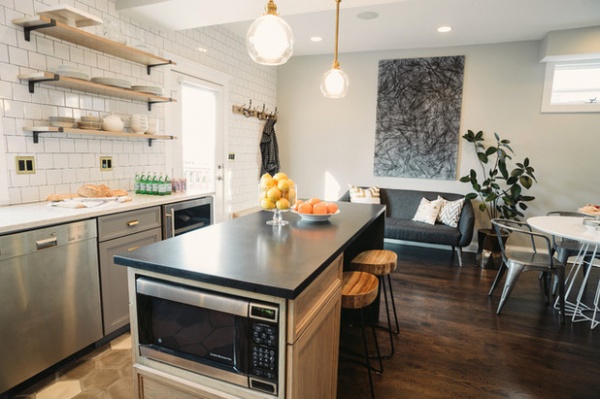
Who uses it: A young couple with two small children.
What goes on here: A lot of cooking and baking, plus playing with Legos, drawing, doing homework and watching TV.
Splurges and savings: The homeowners saved by reusing their original appliances purchased a couple years earlier and splurged on a wine refrigerator and the flooring design.
The nitty-gritty: Walls: 4-by-4 inch white tile; floor: Tres Grises, Mosaicos; countertops: Quartz Silestone Pulsar (perimeter), Black Absolute granite, leathered finish (island), B&B Formica; stools: Sleek stool, Wisteria; island pendants: Willamette, Schoolhouse Electric; wink wall lights: Isaac sconce, Schoolhouse Electric; hardware: Schoolhouse Electric; shelving brackets: Rejuvenation; cabinet paint color: Cinder, Benjamin Moore
Team: Mark Seef of Trademark Development (general contractor); Kenrose Kitchen Kabinets; Jake Moreland of Two Birds Photography
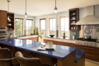
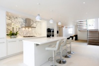
2. All About the View
Designers: John Kennedy of Sundberg Kennedy Ly-Au Young Architects and Jim Graham of Graham Baba Architects
Location: Seattle, Washington
Size: 500 square feet (46.5 square meters), including the dining and living space
Year built: 2015
Raw and open elements: Warm wood offsets the cool concrete floor of this penthouse apartment, which is part of a building that contains tech offices and a restaurant. “The space was designed for an urban dweller who only needs to go downstairs to the street to eat great food with friends and family or just grab a coffee and juice,” says architect John Kennedy. “This is not a kitchen for someone who cooks a lot or does much elaborate meal preparation.”
Homeowners’ request: Open the kitchen to views of Seattle seen through the living room and deck, where there’s a gas fire pit that allows year-round entertaining. “Grabbing a bit of cheese and crackers and a bottle of wine to take out on the deck is easy,” Kennedy says.
Plan of attack: The main priority was orienting the kitchen space and ensuring that natural light was coming in from multiple directions. “Since the kitchen is really secondary to the living room area, we located it toward the back of the room out of the way of the large sliding doors leading to the deck,” Kennedy says.
The homeowner decided early on that she didn’t want an additional floor covering, such as hardwood or carpet, over the concrete. “That fits with the industrial feel of the whole building,” Kennedy says. Wood cabinets and light-colored walls offset the concrete and add warmth. Floating the lower cabinets helped make the space feel larger.
Why the design works: “This is a very minimal-feeling space that is all about living in the city,” Kennedy says. “Even though the client spends a lot of time away from her apartment, you never want someone to feel that their home is cramped and cluttered. Keeping a minimal color and material palette helps make the space feel more open and larger than it really is. Open shelves instead of cabinets also gives the impression that the space is larger since there is no large mass at eye level. It also helps that the window ended up behind the shelves and you are looking through the storage shelf to the outside.”
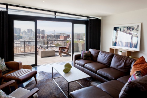
“Uh-oh” moment: Originally, Kennedy designed the kitchen window to sit below opaque upper cabinets and above the counter to offer a view to the homeowner while they sit at the table. “But while the framing was going on we realized that what you really saw was the building next door — not much of a view,” he says.
He realized that if they raised the window height, then the homeowner would be able to see the famous Space Needle observation tower. But while the homeowner was able to do without the upper cabinets because she doesn’t cook often, she still needed some additional storage. Open shelves that hang from the ceiling provide the right amount of storage while keeping the space feeling open.
Splurges and savings: The homeowner splurged on the sliding doors that lead outside, integral color in the concrete and radiant heat in the floor.
The nitty-gritty: Knotty alder cabinets: custom, Kaiser Woodworks; shelf: custom, MRJ Contractors; counters: London Grey, Caesarstone; faucet: Danze Parma pre-rinse; sink: 33-inch brushed stainless steel, Ariel; dishwasher: 24-inch Trifecta, Jenn-Air; paint: Cloud White, Benjamin Moore
Team: Sundberg Kennedy Ly‐Au Young Architects and Graham Baba Architects; Lesley Bain (urban design; Wing‐Yee Leung (project manager); Jeremy Imhoff (project architect); Tim Myhr, Carlos Lopes, Myra Lara and Caroline Brown (project team); MA Wright, Mike Wright, Megan Isbell (structural engineering); Brian Gibson, Steve Booth and Tony Vongdara of MRJ Constructors, (contractor); FIX, Shannon Loew (project management);
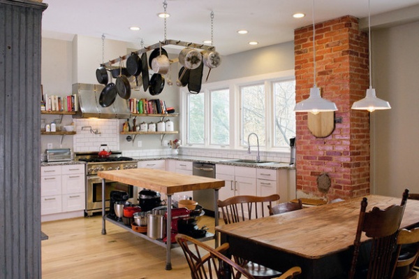
3. Half Baked
Designer: Jonathan Kuhn of Jonathan Kuhn Architect
Location: Takoma Park, Maryland
Size: 294 square feet (27.3 square meters); 14 by 21 feet
Year built: 1888
Raw and open elements: “It had to be bright, inviting and engaging while allowing for an abundance of cooking, baking and entertaining,” says architect Jonathan Kuhn. “The exposed brick, the reclaimed wide plank wood floors, the heaviness and texture of the island — steel pipe legs with thick butcher-block top — the pot hanger, high ceilings, industrial light fixtures and live-edge wood shelving all fit uniformly within the space. The result is a rustic and cozy kitchen that invites you to take part in all of its glory.”
Homeowners’ request: Last updated in the 1980s, the kitchen lacked flow, efficiency and connection with the rest of the home. The homeowners wanted the kitchen to be a place for cooking, baking, family gatherings, eating and a lot of entertaining. “It had to be usable,” Kuhn says. “Beautiful and energetic but not delicate.”
Plan of attack: The existing kitchen was poorly planned, with an awkwardly shaped peninsula and no connection to the adjacent informal dining area. Additionally, the space lacked storage, flow and function. Kuhn began by developing an efficient and organized layout that took into account access to the backyard, and then focused on appliances, cabinets and window placement. “We had to understand the ‘energy’ of the space before we could get into the details,” he says.
What goes on here: Meals, as well as crafts, school projects and homework. “It serves as a lab for cooking and baking while allowing for the children to have an opportunity to experiment,” Kuhn says. “This in combination with having a rich environment to share meals, whether it be with just the family or extended to friends.”
Who uses it: An attorney and a psychology professor, and their daughter and son.
Designer secret: Found and repurposed items. “The hood over the range, as an example, was from the existing kitchen,” Kuhn says. “It was incorporated into the new design to complement the other materials in the space — exposed brick, butcher block island and table, the hanging pots, wide plank reclaimed wood floors — as well as the historic and rustic feel of the home.”
Splurges and savings: The homeowners saved by reusing items such as the range hood to splurge on wide-plank wood flooring, adding windows and buying higher-end lighting, plumbing fixtures and a range.
The nitty-gritty: Cabinets: Ikea; windows, sink and faucet: Southern Sales Services; tile: Daltile
Team: Willis Builders (general contractor); Justin Ramsdell Photography
See more of this home
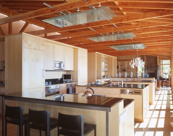
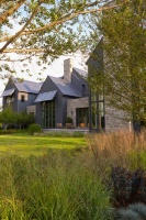
4. Raise the Roof
Builder: Tad Fairbank of Fairbank Construction Company
Why it’s raw: “The entire home was built with the emphasis on expressing the building elements rather than covering them up with drywall,” says contractor Tad Fairbank. “Douglas fir studs, rafters and beams were sanded to remove all stamps and labels so as to only reveal the raw wood.” Cabinets are natural maple wood. Tempered glass panels on the ceiling shield commercial grade, low-voltage lighting.
Homeowners’ request: A home that expressed itself. “An avid art collector, he wanted the house to be a piece of art as well,” Fairbank says.
Why the design works: Floor-to-ceiling windows on the right side offer views to the kitchen, dining room and sitting area so family gatherings could flow easily back and forth and everyone could participate in the different activities.
Who uses it: A former CEO of a large graphic design firm. “His attention to detail was evident throughout the house,” Fairbank says.
“Uh-oh” moment: “Days prior to commencing work, the area experienced an earthquake that caused the land to shift 8 inches,” Fairbank says. “There was additional structural changes as a result of the quake as well as having to relocate the house since the site had slipped. Over 750 yards of concrete were used to stabilize the site, including 50 18-inch pilings 30 feet into the earth.”
Team: Bruce Anderson of Cutler Anderson Architects
Related Articles Recommended
Related Images Recommend