My Houzz: Couple Feather Their Forever Nest in Industrial-Chic Style
http://decor-ideas.org 10/22/2015 02:13 Decor Ideas
Stacy Weiss and Will Carpenter created their forever home in an unconventional space: a 1920s commercial building that’s been a mechanic’s garage, a tile store and an artist’s studio. Weiss, owner of Weisshouse, a Pittsburgh resource for high-end vintage home goods, and Carpenter, a general contractor and owner of Carpenter Construction, became their own clients when they finally found this space. “We originally lived in a three-story house, then sold it and rented a loft [while looking for a building to repurpose]. We knew we wanted an industrial feeling with one-floor living,” Weiss says. Now, what was once a commercial building is reincarnated as a loft-inspired home.
Houzz at Glance
Who lives here: Will Carpenter and Stacy Weiss
Location: Shadyside neighborhood of Pittsburgh
Size: 2,800 square feet (260 square meters); two bedrooms, two baths
Year built: 1923; renovated in 2013
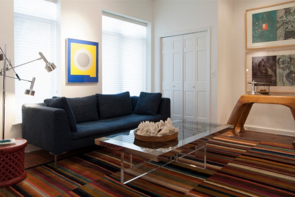
At the front of the home is the den, a quiet retreat from the rest of the space and a room that homeowner Stacy Weiss calls the “man cave” of husband Will Carpenter. “He watches sports in there every night,” she says with a laugh.
The couple have kept many of their furnishings as they moved from place to place. “We did a few new things, as configurations had changed, but I usually hang on to my furnishings,” Weiss says. One example is their 18-year-old Italian sofa. “The fabric was shot, so I bought blue denim and had a local seamstress recover it,” she says.
Sofa: Charles, B&B Italia
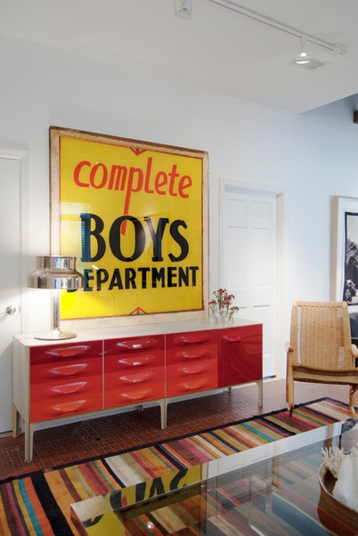
A vintage Raymond Loewy credenza makes a statement while providing storage in the den. A bright period sign helps give the space its industrial edge.
The flooring is one of the few features remaining from the building’s previous life as a tile showroom. “Some of the tile displays were applied right onto the old shop floor,” Carpenter says. The couple decided to keep this detail as an homage to the building’s history.
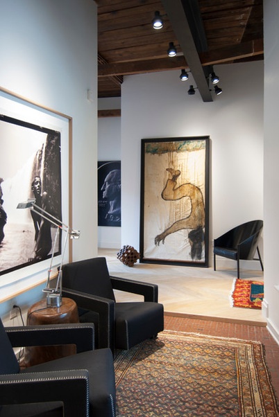
The couple’s priorities in searching for a new home included finding a space where they could display their extensive art collection. They buy a lot of their pieces from local galleries such as Mendelson Gallery and Weisshouse. “I feel the artwork makes it a home,” Weiss says. She placed large-scale works in the entry hall to bring intimacy to the grand space. “It adds a personal touch that you cannot achieve otherwise,” she says. The chairs provide a dramatic accent and the repeat of the color black draws the eye through the space.
Armchairs: Gerrit Rietveld for Cassina; artwork on right: Karl Mullen
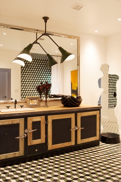
The guest bathroom reflects the couple’s design philosophy of mixing new and old. The vanity is fashioned from an antique butcher’s freezer and still has its original features, including the wooden top and worn paint. “Keeping elements from the past not only interests us aesthetically, it also works with our strong-held dedication to environmentally sensitive construction,” Carpenter says. “Our view is that by repurposing antiques and found objects, we can lessen our carbon footprint and minimize our individual effect on the environment.”
Hanging above the vanity is an antique French pendant light finished in dark green enamel. Graphic encaustic cement tile pulls it all together.
Floor tile: Harlequin, Original Mission Tile; faucet: Brooklyn 31, Watermark Designs
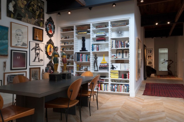
The couple went with an open layout to create a loft-like environment throughout the living room, dining room and kitchen. The flooring in this space was custom-made by a craftsman in North Carolina. It’s pre-oiled oak with a vintage stain in a herringbone pattern, which the couple chose as a nod to the historical significance of the building.
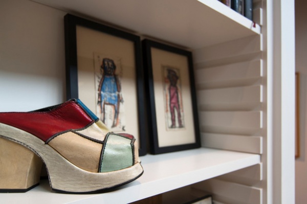
Collectibles are found throughout the home, such as on these built-in bookshelves in the dining area. The framed watercolor paintings, done on the backs of paper receipts, are by Karl Mullen.
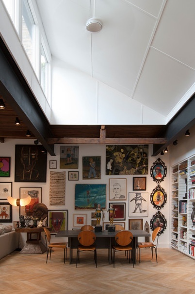
One fantastic feature of the space that the couple decided to keep is the bank of clerestory windows, which flood the interior with sunlight. The windows were added when the building served as an artist’s studio. “The only original part of the house is the ceiling and the existing skylights and clerestory,” Weiss says. “We basically changed everything else.”
“We loved the original wood and steel ceiling, including steel beams forged at the Carnegie steelworks,” Carpenter says. “In coming up with our design approach, we wanted to reflect some of the previous uses of the structure. It was important to us to reuse structures and objects in ways that are close to their originally intended use.”
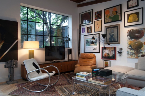
An eclectic array of artwork and layered Bokhara rugs help create a comfortable seating area. Weiss put together the gallery wall starting with one piece and working outward. “It’s like putting together a puzzle,” she says.
One of the most significant changes the couple made to the building was the addition of windows and doors along the back wall. The modern windows are constructed from steel and double-paned glass.
Windows: A&S Window Associates Inc.
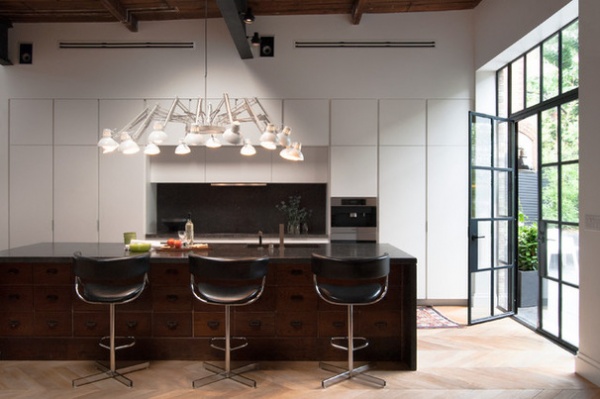
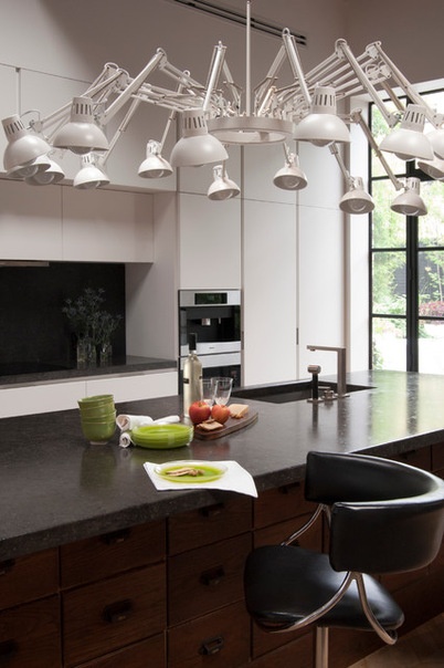
Weiss and Carpenter combined streamlined fixtures and furniture-like cabinetry to integrate the kitchen into the open layout.
The back side of the island cabinetry matches the rest of the kitchen and the front is made from an antique apothecary cabinet the couple discovered through Weisshouse. The top and sides of the island are clad in Belgian bluestone to contrast with the wood front.
Kitchen: Poliform; pendant: Dear Ingo by Ron Gilad, Moooi
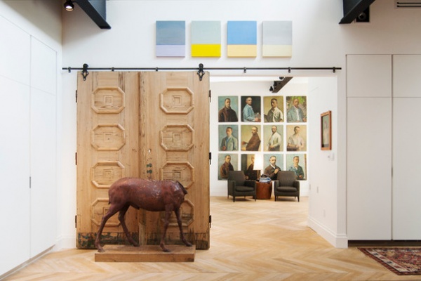
After finding this set of antique doors at auction, Carpenter and Weiss removed several layers of paint, revealing the wood’s natural characteristics. They then joined the doors to form a single panel that, when opened, offers a view of the master suite’s sitting area.
The rough-hewn quality of the wood offsets the contemporary feel of the surrounding walls, cabinetry and black hardware, as well as the hanging artwork that’s visible when the door is open.
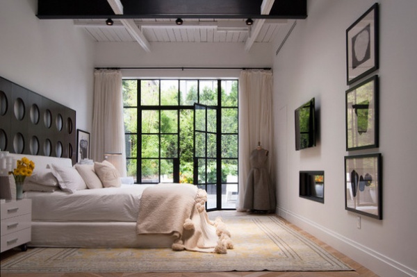
“It is my island in the storm,” Weiss says of the master bedroom. Washed in varying shades of white and cream, the space is reflective and bright. She painted the ceiling to match the walls as a way to soften the space.
The grand headboard was once part of the set for the film Intolerable Cruelty and, Carpenter says, “it stands as the centerpiece of the room.” The couple bought it from High Point Market’s semiannual trade show for the interior design industry.
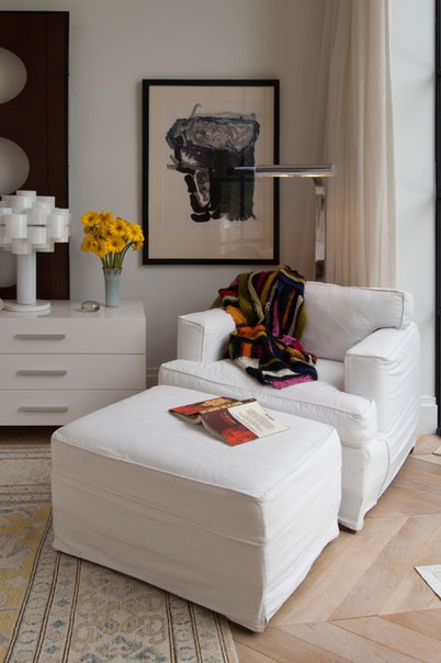
A white chair tucked into a corner provides a cozy spot to catch up on reading.
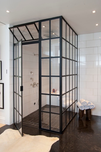
In the master bathroom, the steam shower’s enclosure mirrors the framework of the home’s windows and doors. Large white tiles laid in a subway pattern complete the look of period style with a decidedly modern edge. The couple made the shower large and curbless with the future in mind. “We may need to be able to wheel in and out of there one day!” Weiss says. To the right of the shower is a concealed linen closet.
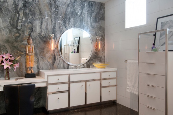
The custom vanities that run along one wall play off the shower enclosure with shiny chrome accents and white Cambria quartz countertops. The accent wall is covered in Arabescato Bronzetto marble. The stone has a dynamic vein pattern that adds subtle texture to the space, and its streaks of bronze give off a warm glow. Weiss found the slabs while on a trip to Connecticut; when it came time to put together this area of the home, she knew this was the spot where the marble should go.
Sconces with ribbed glass shades: Waterworks
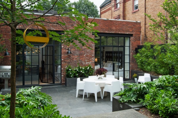
“Keeping our roots in the city, we had to work with what we were given as far as outdoor space,” Carpenter says. When he and Weiss bought the property, the back of the building was just what one might expect of an old commercial building. “The original structure was built in 1923 for use as a mechanic’s garage,” he says. “It was complete with a ramp to get the cars from the back alley down to the concrete shop floor.”
The design of the garden took shape around the couple’s affinity for black basalt pavers. Weiss matched the garden’s retaining walls to them. The dark material gives the outside area a sense of structure without feeling hard or stark.
Glass doors lead into the house through the kitchen and master bedroom, making the garden a true extension of the home.
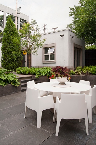
The hardscape is balanced with greenery. The couple planted arborvitae along the perimeter to provide privacy from the back alley. At the back of the garden, an outbuilding is the ideal spot for a studio or supplemental office space. Modern furnishings contrast nicely with the building’s historic architecture.

Although the notion of renovating an entire home may be daunting, for these homeowners it was a well-defined partnership. “For the most part we had different responsibilities,” Weiss says. Carpenter adds, “With Stacy’s skills as owner and buyer for Weisshouse and mine as a general contractor, we thought we could create something really special in this space.”
With crews working mainly on weekends, the renovation took a total of 10 months, wrapping up just in time for the couple’s first party in their new space. “The first was an engagement party for my daughter,” Weiss says. “We worked until the day before to finish. It is a perfect party house!”
Giving them more reason to celebrate, their home was voted 2015 Home of the Year for Renovation by Pittsburgh Magazine.
When asked if they would do it all over again, Weiss replied, “I would do it again in a minute — but we will never move from this wonderful empty-nest home; it is just perfect for us.”
She also offers her best advice to other homeowners: “Have a good contractor.”
My Houzz is a series in which we visit and photograph creative, personality-filled homes and the people who inhabit them. Share your home with us and see more projects.
Browse more homes by style:
Apartments | Barn Homes | Colorful Homes | Contemporary Homes | Eclectic Homes | Farmhouses | Floating Homes | Guesthouses | Lofts | Midcentury Homes | Modern Homes | Ranch Homes | Small Homes | Townhouses | Traditional Homes | Transitional Homes | Vacation Homes
Related Articles Recommended


