Houzz Tour: Designer Makes His Place Chic on a Dime
http://decor-ideas.org 10/20/2015 01:13 Decor Ideas
“Being able to walk to work is my favorite thing,” interior designer Bachman Brown Clem says. Sacrificing some space and having to get thrifty were definitely worth the tradeoff of being able to live in New York City’s West Village. When Clem scored this one-bedroom apartment, which is just steps from great restaurants, shops and bars and surrounded by beautiful architecture, he was short on renovation and decor funds but long on resourcefulness and creativity. Combining hand-me-downs, great eBay and flea market finds, items his clients were no longer interested in, the skills of loyal craftspeople he worked with and even a repurposed wok, he transformed the apartment into a stylish and comfortable home for two.
Photos by Dane Tashima Photography
Houzz at a Glance
Who lives here: Bachman Brown Clem and Alan G. Brake
Location: West Village neighborhood of New York City
Size: 450 square feet (42 square meters); one bedroom, one bathroom
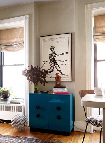
The windows, which retain their fabulous original moldings, are one of the best features of the apartment, letting in loads of light and providing a great view of the iconic New York neighborhood. In decorating his home, interior designer Bachman Brown Clem used minimalist soft Roman shades to accentuate the original trim work. He says they’re rarely pulled down even this far because he loves to enjoy the light and views to the fullest.
Clem is used to turning nothing into something and certainly puts that skill to use at home. His apartment has served as a design laboratory for him for 12 years now. The cabinet was a ho-hum auction find that he made into a toy chest for a kid’s room in a showhouse. He had it lacquered in this deep blue and added red knobs. When he decided to take it home afterward, he painted the knobs black to give it a more adult look.
Wall paint: DKC-7, Donald Kaufman Paints; trim paint: White Dove, Benjamin Moore; art: Raymond Pettibon; sculpture (on floor): Jean Michel Morellet
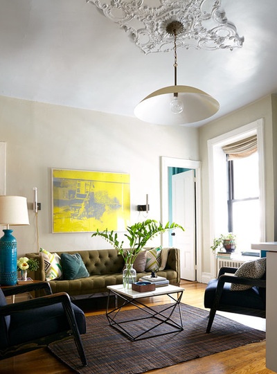
“This has been a labor of love,” Clem says. He has fixed up the apartment bit by bit over the years, repairing moldings, fixing tiles, painting, adding layers of lighting and more. Although the living room looks very chic, almost everything in it was inexpensive (except the Warhol lithograph over the sofa, which is on a long-term loan from a relative’s art collection). “There were such great moldings around the windows, but everything that had been on the ceiling had been erased,” Clem says. He installed the ceiling medallion ornamentation himself — it’s plastic foam.
Not able to afford the kind of light fixture he dreamed of at the time, he bought a pendant light kit and was on the prowl for a shade at Just Shades when inspiration hit. “I was right by the Bowery and thought, ‘I bet I can find something cool in one of these kitchen stores,’ ” he says. He came across the biggest wok he’d ever seen, knew it was just the thing, and his finisher lacquered it in gold for him as a favor.
The contemporary take on a Chesterfield sofa, which Clem can’t confirm but is quite confident is Milo Baughman, was an inexpensive eBay find. He saw past the inexpensive black vinyl upholstery in the listing and envisioned this olive green canvas fabric instead. The traditional tufted part floats atop modern chrome legs.
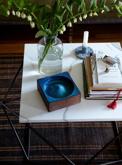
The coffee table base is indeed by Milo Baughman. It was a gift from a client who no longer had a use for it. “Originally it had a gigantic glass top, like 5 feet in diameter, and the little apartment just couldn’t take it,” Clem says.
Instead, another client was gracious enough to gift him a marble remnant from a kitchen project they were working on together. The rug is an inexpensive woven African mat. It adds texture underfoot and helps define the seating area.
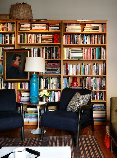
The upholstery on the thrift store chairs was also a donation but it taught Clem a valuable lesson in fabric choice. “I was at my upholsterer’s and he told me I could pick from some leftover stuff he had in the back…. When I saw this cashmere I thought it would be wonderful,” he says. “But while it’s so soft and cozy in winter, you cannot sit on it during the summer — your legs start to sweat immediately!”
The large turquoise ceramic Bitossi lamp is something Clem has had for years. Its scale is a surprise and works well with the petite Saarinen tulip side table. It also provides great reading light — in the months when the chair fabric isn’t too warm anyway!
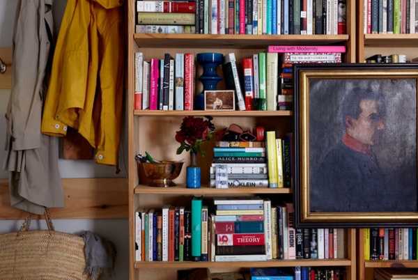
When it comes to arranging books, it’s a big experiment for Clem. He and his partner combined their tomes when his partner moved in, and because they both frequently pull down books to enjoy and for reference, there’s really no rhyme or reason to the arrangement — it’s just sort of happened organically. “We try to keep all the first editions together and that’s about it for the organization,” Clem says.
For hanging artwork on the shelves, he advises editing and experimenting with scale — you don’t want the art to overwhelm the shelves as a whole but you also don’t want a piece so small that it gets lost. Finding the right balance is simply a matter of trial and error. This portrait worked out just right. Clem also tucked the post-WWII West German pottery he collects among the books. The interesting shapes and colors give the eye a place to rest.
The area to the left is the couple’s landing spot where they hang their coats and bags and can take off their shoes as they enter the apartment.
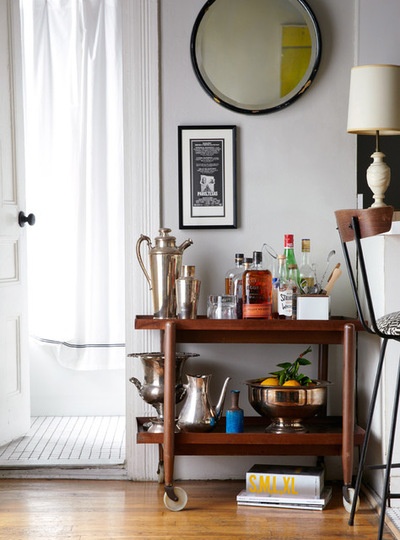
We caught just a peek of this corner in the first shot — there’s a small peninsula on the right that is the edge of the tiny galley kitchen. Clem reupholstered the vintage Paul McCobb stool in a print by Alexander Girard, also seen on throw pillows in the living room.
“I love bar carts,” Clem says. “But punch bowls are my favorite.” This midcentury modern cart by Poul Hundevad has plenty of room for spirits, mixology and extra serveware. The punch bowl provides a spot to display and store citrus garnishes like oranges and limes.
“I like to mix everything. I don’t believe in one style,” Clem says. The cart is a good study in how seamlessly the designer throws together different styles and eras, with traditional and Art Deco pieces looking at home on the little midcentury trolley.
Stool fabric: Maharam
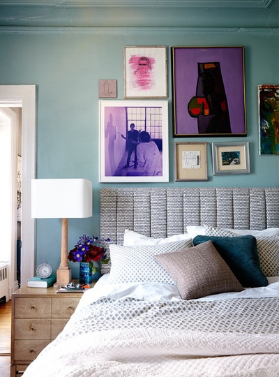
In the bedroom, Hable Construction’s dotted “Beads” fabric continues the geometric play on the headboard. A gallery wall overhead is a mix of different media. Clem’s favorite piece is the portrait washed in bright pink, made by his brother, a professional artist, many years ago. The piece contains a quote from an old Vanity Fair article that cracks them both up. “It’s very sentimental,” he says.
Paint color: Custom mix made by the designer
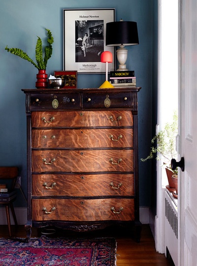
His partner grew up with this dresser in his childhood room. “We get rid of a lot of things often, but this is quite sentimental and it will always stay,” Clem says. Not too sentimental to alter, though — it’s been a lesson in stripping and refinishing for the couple. They got about this far before sending it off to a pro to finish the job.
The items on top are again a mix of eras and styles: The vase is from Clem’s West German pottery collection, the modern sculpture is by Matthew Sullivan, and another traditional alabaster lamp plays off the black-and-white Helmut Newton poster.
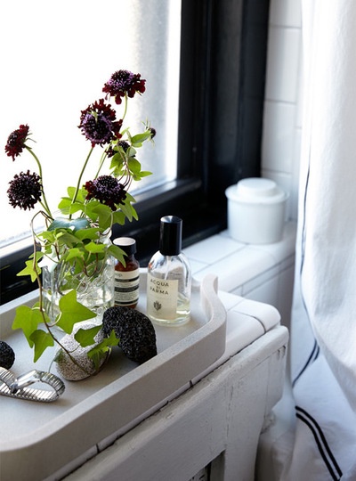
Because the bathroom gets so much natural light and because there was a lot of white tile, Clem knew he could go dark on the walls and painted them black. The room became a study in stark contrast.
Clem mimicked the black border on his shower curtain on the white ceiling. The curved concrete tray was a gift from his assistant.
Shower curtain: Restoration Hardware
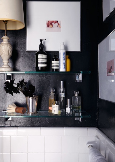
“The best advice I can give regarding bathrooms is to take all of the cheap stuff in the bathroom that came with the place down — shelves, towel bars, medicine cabinets, knobs — get it down to the bare bones and start over,” Clem says. “There are so many great inexpensive accessories today, and it makes a huge difference when you can create a cohesive look for yourself,” he says.
He added these glass and chrome shelves, and the artwork is from a performance piece his brother put on years ago. An alabaster lamp adds a traditional touch and contrasts nicely with the black.
Paint color: Black Forest Green, Benjamin Moore; shelves: Restoration Hardware
Browse more homes by style:
Apartments | Barn Homes | Colorful Homes | Contemporary Homes | Eclectic Homes | Farmhouses | Floating Homes | Guesthouses | Lofts | Midcentury Homes | Modern Homes | RanchHomes | Small Homes | Townhouses | Traditional Homes | Transitional Homes | Vacation Homes
Related Articles Recommended


