Graffiti-Tagged Kitchen Cleans Up Well
http://decor-ideas.org 10/18/2015 20:13 Decor Ideas
Looking at this modern kitchen in a Sydney, Australia, home you’d never guess that for a decade before the current owners moved in, the house had been occupied by squatters. The 1920s property was run-down, outdated and tagged with graffiti. Darren Genner of Minosa led a major renovation of the space, and the new kitchen won the KBDi Award for its sleek, streamlined design. Functionality and durability were the top priorities, along with making the kitchen suitable for entertaining and the family’s busy lifestyle. The owners wanted it to have a warm and inviting aesthetic as well.
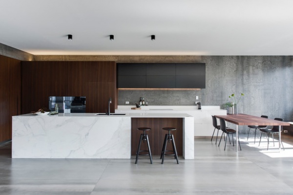
Kitchen at a Glance
Who lives here: A busy young family
Location: Crows Nest suburb of Sydney, Australia
Size: 194 square feet (18 square meters)
Designer: Darren Genner of Minosa
The family intended this house to be its “forever home,” so it stressed to designer Darren Genner the importance of the kitchen being given a timeless design, with durable features that could withstand wear. The design also had to work with the modern architecture of the house’s rear addition.
Genner and his team were originally employed to renovate the three bathrooms in the home, and were only later asked to design the kitchen too. The concrete slab of the addition had already been poured, which meant they couldn’t move the location of the sink or laundry.

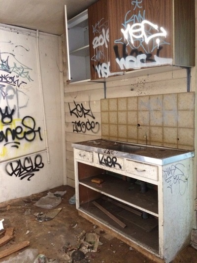
BEFORE: Broken tiles and splinters of glass littered the kitchen space, and what was left of the walls had been covered with layer upon layer of graffiti.
By the time Genner got to it, the architect had already laid down the foundations and the room it would become had started to take shape.
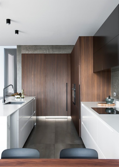
Genner and the family decided to install a galley kitchen, as “the layout that the architect supplied us with really dictated this style,” he says. “It’s also a common style that suits many families with busy lifestyles.”
The family wanted a large island because they regularly entertain. A 13-foot-long unit made of Calacatta marble was put in place, with a double-bowl sink set into it.
To complement the color scheme, plain gray tiles special-ordered from Italy were laid down on the floors. “These tiles add extra warmth and texture to the palette of timber and whites, which included large solid-surface countertops and a crisp white paint finish,” Genner says.
The concrete-style wall tiles were also used in the bathrooms.
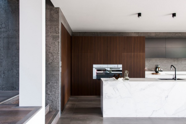
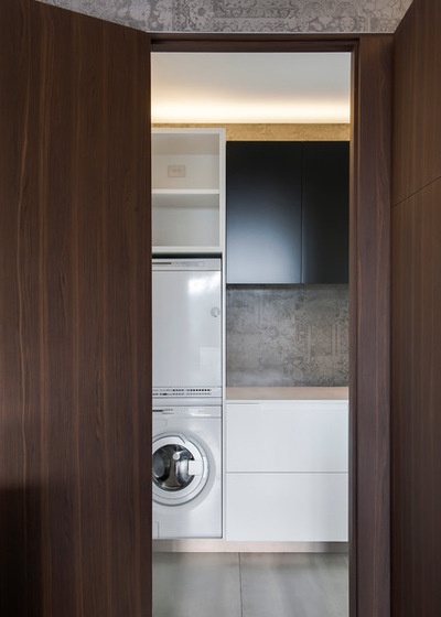
The clients requested that the laundry be accessible from the kitchen. Genner integrated it seamlessly using bifold doors made with a warm wood veneer. The same type of doors also disguise the refrigerator, pantry and ovens.
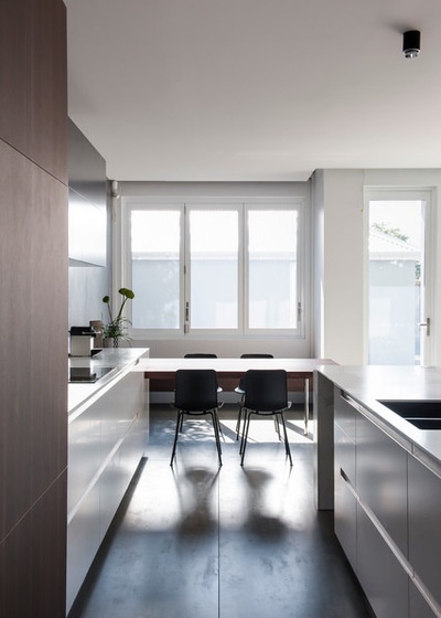
The owners also asked for ample storage space, which they got in the 28-inch-deep drawers under the counters. This freed up space to install a dishwasher and recycling bins in the island.
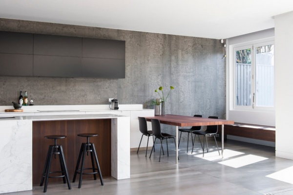
For the social family, it was important that the new kitchen have room to entertain in. Bar stools were added to the island to allow for chats while cooking, and a walnut dining table to the side is where family dinners take place. The color and form of the piece ties in well with the style used throughout the home.
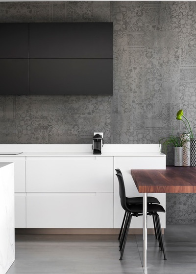
In these new electronic overhead cabinets, the touch of a button lifts the doors by way of a bifold Blum Servo-Drive mechanism.
Browse more before-and-after remodeling projects
Related Articles Recommended


