My Houzz: Colorful Makeover for a Traditional Texas Ranch House
http://decor-ideas.org 10/16/2015 03:13 Decor Ideas
Denise and Mike Silverman bought their dated home in 2004 but weren’t sure whether they would be staying in the area. So they did some minor renovations, including pulling up all of the downstairs wall-to-wall carpeting and staining the concrete floors, removing dated wallpaper, giving everything a fresh coat of paint and doing a very basic and inexpensive kitchen remodel. Other than that, they took a wait-and-see approach. Fast-forward 10 years, and they realized that they loved their neighborhood and it was time to give their home a complete overhaul. Working with designer Becca Stephens, they started with a swatch of wallpaper and wound up with a colorful remodel that is packed with personality.
Houzz at a Glance
Who lives here: Denise and Mike Silverman; their son, Jesse, 10; and their dogs, Vinny and Tony
Location: Austin, Texas
Size: 2,150 square feet (200 square meters); four bedrooms, two and a half bathrooms
Year built: 1963
Designer: Becca Stephens
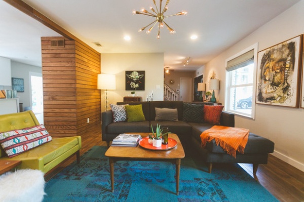
As the couple approached the remodel, one of their main goals was to open up the spaces and let in more natural light. It turned out that one of the walls they wanted to eliminate was load-bearing, and they would need a support beam that would need to hang about 4 inches below the ceiling. Stephens suggested staining the beam to match the walnut color on the floors and then paneling the wall on one end of the beam in the same stained wood, so it would look like a continuation of the beam. It is now one of the couple’s favorite features of their renovation.
Sectional: Oxford, BuildASofa; coffee table: vintage, Craigslist; end table: vintage American of Martinsville from Uptown Modern; area rug: Remembrance in teal, Flor
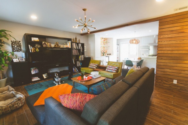
The couple’s decor initially had more Asian- and Moroccan-inspired accents. “The renovation was a 180 in terms of style — we were ready for a change. Our house was so dark with so many walls. We wanted to go modern, bright and retro,” Denise says. “No matter what the style or theme, I like eclectic and unique pieces. I don’t want my home to look like anyone else’s house, and I certainly don’t want it to look like a store or catalog.” The pair of vintage 1960s Gunlocke olive green leather chairs from Uptown Modern are among Denise’s favorite furniture pieces.
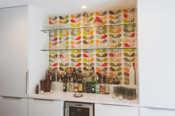
This Orla Kiely wallpaper in the designer’s signature multistem pattern was the main inspiration for the renovation. Stephens suggested that the couple limit where they put the wallpaper and suggested the bar area as the perfect spot.
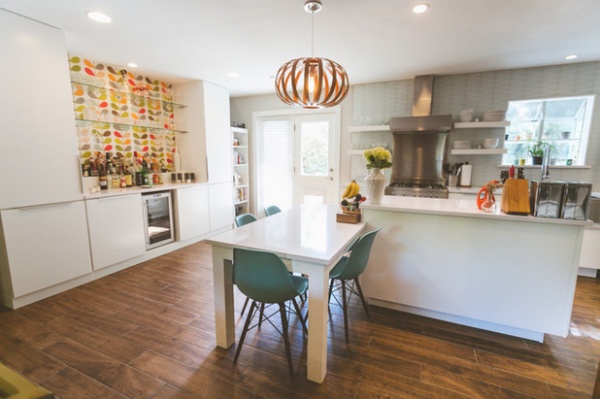
Aqua chairs and an orange pendant light over the eating area reflect the wallpaper colors.
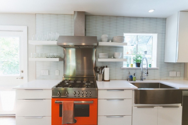
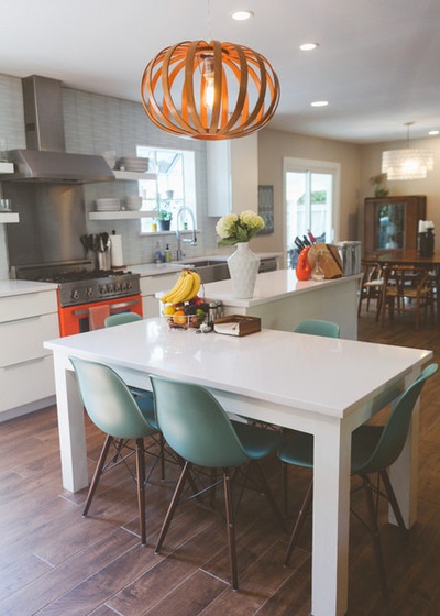
Since Denise wanted the kitchen to be primarily white with splashes of orange, olive and aqua, Stephens suggested incorporating the orange Bertazzoni range, which is a showstopper. She also proposed an L-shaped island with one side a bar-height workspace and the other side at table height for dining. “I cannot recommend hiring a designer enough. They bring your ideas to life in ways you may not have thought of on your own,” Denise says.
Cabinets (with slab doors): Kemper; cabinet hardware: Blankett; range: Bertazzoni, Factory Builder Stores; 33-inch Optimum stainless steel farmhouse sink: Signature Hardware; Parma single-handle pre-rinse faucet in chrome: Danze via Amazon.com; countertops: Silestone in White North; kitchen chairs: Overstock; island pendant: West Elm
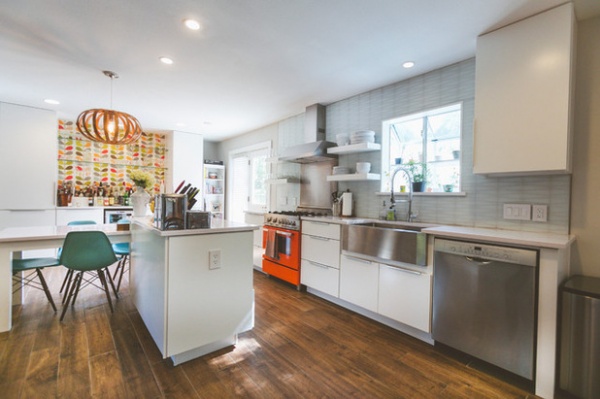
Denise wanted something unique and memorable for the backsplash and accent wall, and wavered between penny tile and these geometric tiles. After the geometric glass tiles were special-ordered, they ended up sitting on a boat in the Pacific Ocean due to a cargo-ship labor dispute that seemed to have no end in sight. Just when the couple was about to give up hope and change back to penny rounds, the tiles arrived.
Backsplash tile: Waveline, Island Stone via ProSource
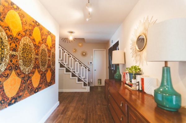
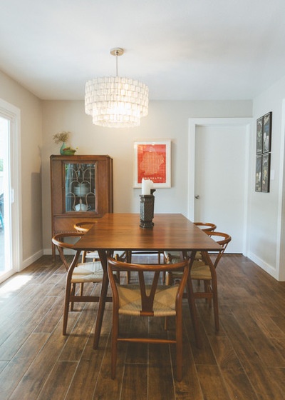
Colorful accents that reflect the wallpaper continue in the hall and dining room.
Pendant and Mid-Century expandable dining table: West Elm; C24 Wishbone dining chairs in Walnut, LexMod via Amazon.com
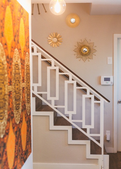
The couple’s creative carpenter, Khanh Nguyen, constructed and installed the stairway railing with its mod geometric pattern.
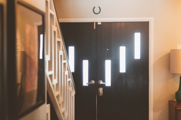
Denise also had her contractor custom-make retro-style doors.
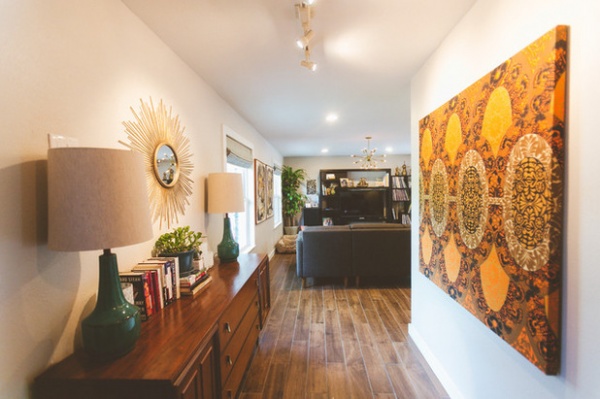
The Silvermans wanted hardwood floors but were afraid they would regret that choice, since they have pets. Stephens suggested plank tile floors. They are pleased they went with them, since the tiles are easy to clean and maintain.
Console: vintage, Craigslist; art: created from vintage Marimekko fabric purchased at Uptown Modern
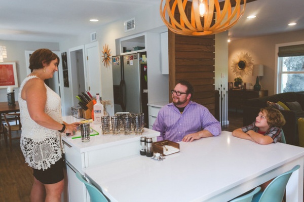
Denise and Mike, seen above with son Jesse, love to entertain in their newly renovated home. “I love having friends over for cocktails and listening to records. We have a couple of gatherings every year, and I usually attach a theme of some kind,” Denise says. “Of course, the holidays are another favorite time for us. We celebrate ‘Christmukkah’ in our house — a mix of Christmas and Hanukkah — and have created our own family holiday traditions. I cannot wait to have our first family Christmukkah in the new house this year.”
See more photos of this home
My Houzz is a series in which we visit and photograph creative, personality-filled homes and the people who inhabit them. Share your home with us and see more projects.
Browse more homes by style:
Apartments | Barn Homes | Colorful Homes | Contemporary Homes | Eclectic Homes | Farmhouses | Floating Homes | Guesthouses | Lofts | Midcentury Homes | Modern Homes | Ranch Homes | Small Homes | Townhouses | Traditional Homes | Transitional Homes | Vacation Homes
Related Articles Recommended


