Rare Modernist Home Uncovered in Palm Springs
http://decor-ideas.org 10/13/2015 20:13 Decor Ideas
By most accounts, modernist architect William Krisel designed more than 30,000 living units throughout Southern California in the form of tract housing, high-rise condos, apartments and hotels. When a rare 1963 Krisel-designed custom home came on the market in Palm Springs, a Canadian couple snapped it up with the intent of using it as a vacation home for their family when the weather got chilly up north.
The house, though, had endured the whims of numerous owners, its clean lines faded under heavy landscaping and layers of not-so-appropriate interior finishes. They asked architect Sean Lockyer, principal of Studio AR+D, to restore the home to its midcentury serenity and to tweak the floor plan to accommodate 21st-century living.
“After” photography by Michael Utterbach
Houzz at a Glance
Who lives here: A Canadian couple and their three young-adult children
Location: Palm Springs, California
Size: 3,300 square feet (307 square meters), three bedrooms, four bathrooms
Architect: Sean Lockyer of Studio AR+D
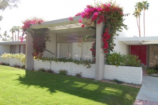
BEFORE: Original architect William Krisel designed the block home in 1963 for a builder friend, creating a U-shaped plan that wraps around a backyard lawn and pool, allowing all rooms to have access to the outdoors and views of the landscape.
Over the years, numerous owners added their own touches, including heavy shrubbery at the front entrance that was trimmed back when the house went on the market in 2012.
Renovating architect Sean Lockyer took on the project’s architecture, construction, landscaping and interiors. Before he tackled the renovation, he visited the Getty Research Institute in Los Angeles, which is the repository of Krisel’s archives, to look at the original blueprints. “We discovered that previous owners had already enclosed an atrium in the master bathroom and a few patios to expand the house,” Lockyer says. “Some of the patios were also enclosed in a wood lattice work, which shrouded the patios and made the interiors seem cavelike. We decided to strip things back and open the house back up to the outdoors.”
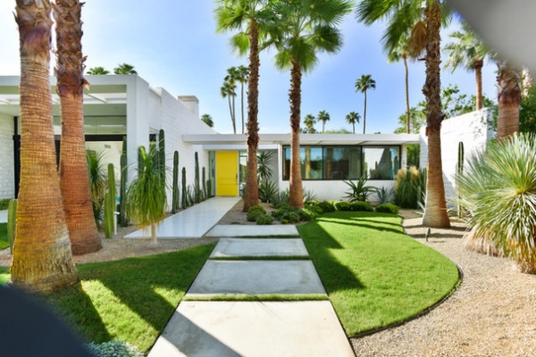
AFTER: Lockyer revamped the front of the home by removing low garden walls and the remnants of heavy shrubbery to reveal a more open street-side view. In keeping with the local oasis aesthetic, he added palms in front. To make the garden more drought-tolerant, he replaced water-intensive plantings with sculptural cactus. Decomposed granite took the place of some of the original lawn. (After these photos were taken, Lockyer says, much of the grass was replaced with artificial turf.)
An offset walkway leads to the new custom front door and sidelight, which replaced a dated stained-glass piece. “I suggested the yellow front door,” Lockyer says. “The color seemed right — and welcoming — in that setting.”
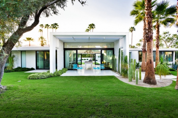
Krisel, known for such Palm Springs projects as the 1957 Ocotillo Lodge (with Dan Palmer) and the late-1950s Twin Palms subdivision, placed the living room at the center of the home, and popped the roof up to 10 feet to give the space emphasis and capture views of trees and mountains.
Lockyer revamped the living room — and the rest of the house — by replacing original sliding glass doors with telescoping window walls that open the interior to the home’s many patios.
Window systems: Fleetwood Windows & Doors
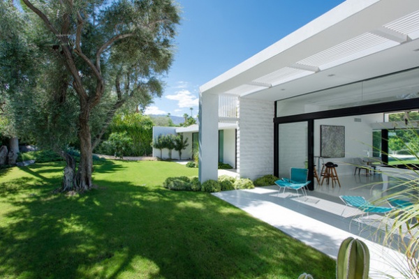
An original olive tree shades the living room’s patio. Lockyer removed tile and carpeting from the interior and installed era-appropriate terrazzo flooring throughout the home, extending it to the patios to create a seamless transition from indoors to out.
The family now uses the living room as a game room, which has a custom-designed pool table fabricated by Gameroom Gallery.
Outdoor furniture: Retrospect
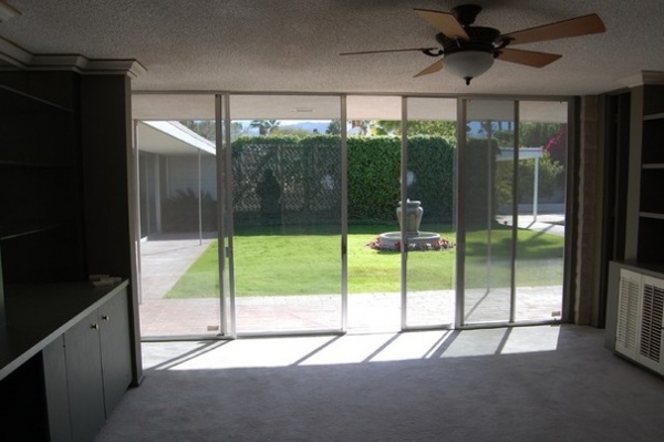
BEFORE: Aluminum sliders, a built-in buffet and bookcases were part of the original dining room.
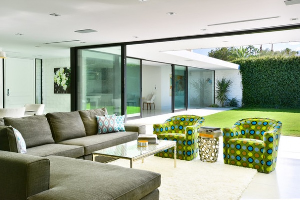
AFTER: Lockyer removed walls between the original kitchen, dining room and family room and enclosed a small patio to create an open great room that includes living, dining and kitchen spaces with access to the backyard.
Popcorn ceilings were also banished and custom linear slot diffusers replaced clunky old-school air conditioning supply vents.
When it came to the furnishings in the living space and throughout the house, the architect kept things simple and spare, choosing a mix of new pieces and local vintage finds, such as the coffee table. The owners added a splash of color with custom armchairs.
Sectional: Minotti; area rug: The Rug Company
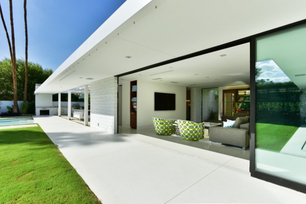
As seen from the backyard, the new living area’s patio is shaded by a broad overhang, a Krisel design hallmark. Lockyer added a misting system under the eaves to cool the patio on hot days.
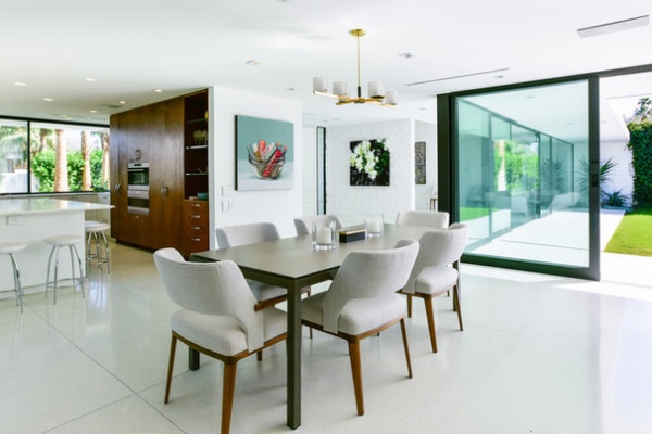
With walls removed, the dining area now opens to both the kitchen and, on the other side, the new living area. A custom steel and glass dining table and upholstered walnut chairs anchor the space. The vintage chandelier is a local find.
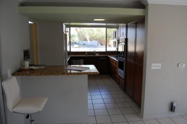
BEFORE: The original kitchen was compact and enclosed. The laundry room was located through the door on the left.
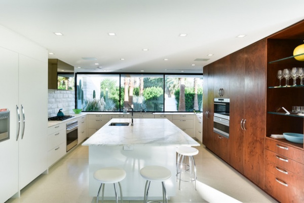
AFTER: Lockyer expanded the kitchen into the original laundry room and moved the laundry to what was once a storage space next to the attached garage.
Brightened with the addition of more windows and made more user-friendly with a marble-topped center island, the kitchen is now a favorite gathering spot for the family members, who like to cook, entertain and hang out on the vintage barstools.
Custom lacquer and Claro walnut cabinetry provides plenty of storage space.
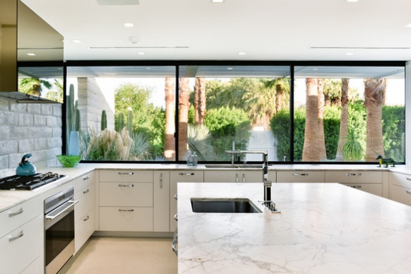
Counter-level windows overlook the front yard. The bronze glass and steel custom exhaust hood reflect garden views.
Refrigerator: Sub-Zero; cooktop and oven: Wolf; wall ovens: Gaggenau; faucets: Dornbracht; sink: Julien
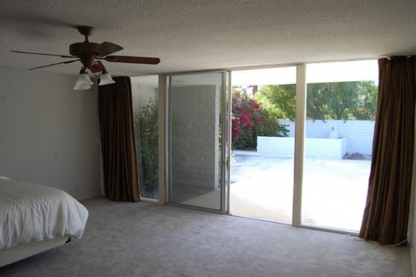
BEFORE: The master bedroom was swathed in heavy draperies and carpeting.
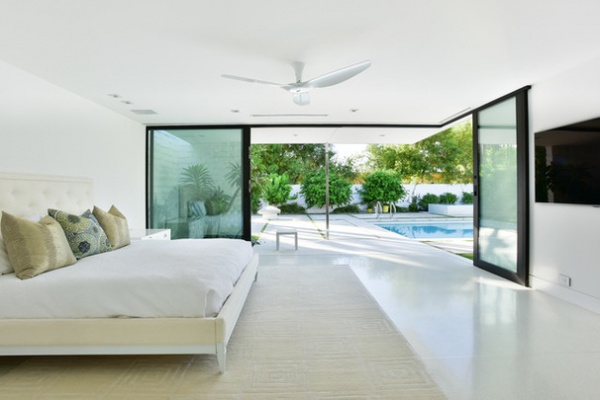
AFTER: The architect removed some of the block walls in the master bedroom to install sliding window walls, which open to create an unobstructed corner, adding a greater sense of space to the room.
Nightstand: vintage, by Paul McCobb; bed and area rug: Jonathan Adler; ceiling fan: Big Ass Fans
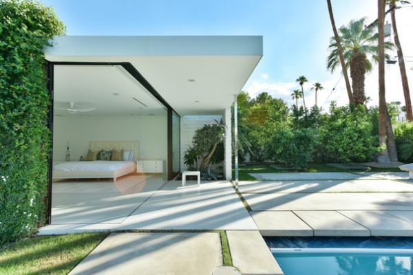
The corner of the house with its renovated master bedroom, viewed here from the pool patio, accentuates several of Krisel’s architectural details, including floating rooflines, linear forms and slender fascias.
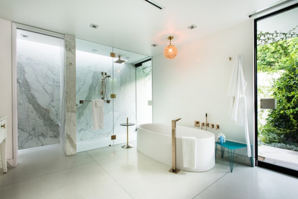
The architect reworked the previously compartmentalized master bath, opening it up to create a greater sense of space. A new glass door leads to a private side patio.
The vintage light fixture is a local find. The turquoise bench is a custom piece.
Tub: Boffi; faucets: Dornbracht
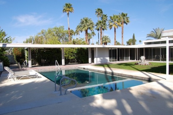
BEFORE: A covered outdoor living space extended from the house, flanking one side of the pool. The original patio material included red brick and concrete.
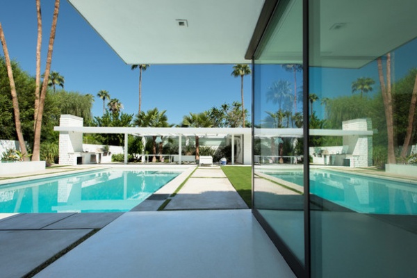
AFTER: Lockyer had the covered outdoor living space rebuilt and turned the original barbecue into a fireplace. “The structure had started to deteriorate and was sagging in spots, so it was easier just to rebuild,” he says.
He replaced the original brick and concrete paving materials with terrazzo near the house and white concrete squares and rectangles around the pool. “I interspersed the terrazzo and the concrete with strips of grass,” he says. “The breaks signal a change in materials from terrazzo to concrete and prevent the backyard from looking like a sea of concrete.”
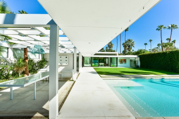
A custom glass table and comfortable seating create an appealing outdoor living area. A television above the chairs on the far wall is covered with a custom set of doors when it’s not in use.
Chandelier and chairs: Niche
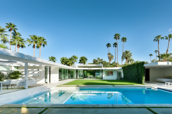
The pool was replastered and remodeled with the addition of a shallow shelf and, to one side, a negative-edge spa.
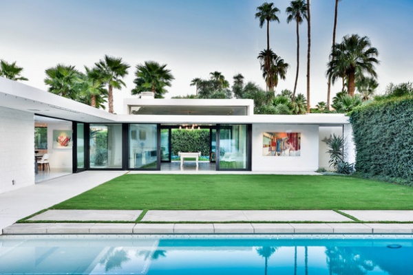
Seen at dusk, the renovated house has become more transparent and connected with the outdoors.
Browse more homes by style:
Apartments | Barn Homes | Colorful Homes | Contemporary Homes | Eclectic Homes | Farmhouses | Floating Homes | Guesthouses | Lofts | Midcentury Homes | Modern Homes | Ranch Homes | Small Homes | Townhouses | Traditional Homes | Transitional Homes | Vacation Homes
Related Articles Recommended


