Room of the Day: Berkeley Living Room Builds on History and Style
http://decor-ideas.org 10/13/2015 19:13 Decor Ideas
After living for 13 years in her home designed nearly a century ago by prominent San Francisco Bay Area architect Henry Gutterson, this Berkeley, California, homeowner decided she was ready to pull the house together for the next phase in her family’s life. She started with the home’s centerpiece: an impressive two-story living room. Interior designer Kathy Farley refinished the room’s architectural details but otherwise focused on decor to make the space more inviting and functional for friends and family to gather. “There was a funkiness and a realness I tried to incorporate,” Farley says.

Living Room at a Glance
Who lives here: A creative writer and filmmaker, her two teenage children and two cats
Location: Berkeley, California
Size: 504 square feet (46.8 square meters)
Designer: Kathy Farley of Art Decor
“She wanted it to be a place where everyone could come together and hang out,” Farley says of the homeowner’s wish for the room to comfortably fit eight to 10 people. It wouldn’t be precious, but Farley also wanted the room to feel current without turning its back on the architecture or appearing as if it had been put together all at once. “My goal was to make the room appear as if it had evolved over time,” the designer says.
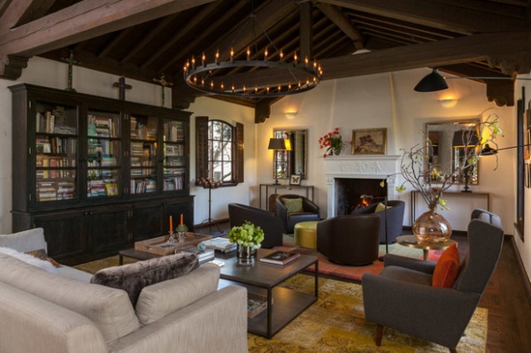
Farley refinished the oak parquet floors in a darker stain and repainted the hand-textured stucco walls but otherwise left the distinctive architecture intact. Standout features include a vaulted ceiling, exposed beams, arched recessed windows with shutters and a decorative fireplace mantel. “I knew it was going to be a very simple material palette in terms of the walls and timbers,” she says.
Farley first found the hand-woven pink rug by Michaelian & Kohlberg, seen in the rear of the photo. She chose it because it’s the homeowner’s favorite color and she thought it matched the house well. The vintage overdyed yellow rug in the foreground, by ABC Carpet & Home, brightens the room as well as the other rug. “They’re like abstract paintings,” the designer says.
The large, simple sofa came next, framing and anchoring the room. Farley continued with neutral, natural materials and colors for the furniture — grays, bronzes, brasses and steels — making sure each piece responded well to the surrounding items and felt in scale with the room. The oversized custom coffee table can accommodate a spread of magazines or an appetizer spread, and the barrel chairs are grouped in front of the fireplace for another seating area to accommodate more guests.
Wall paint: Mountain Peak White, Benjamin Moore; sofa: Restoration Hardware; wingback chair: vintage; coffee table: custom by Aspy Khambatta; leather ottoman: custom by Matthew O’Reilly; barrel chairs: Minotti; mirrors and console lamps: Restoration Hardware; metal and leather console tables: Julian Chichester

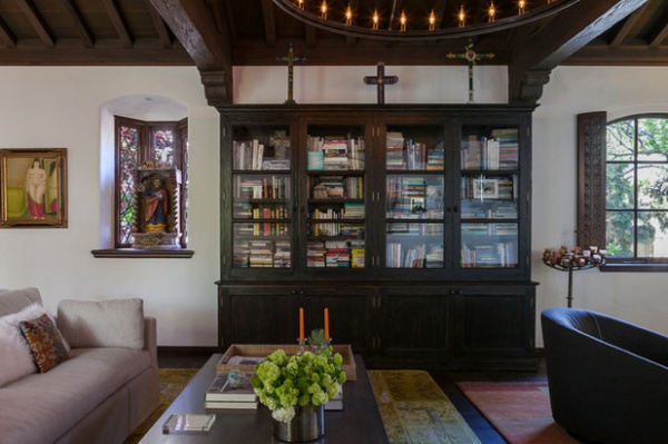
Instead of a media center anchoring the living room, this custom bookcase serves as the focal point. Glass-front cabinets showcase the homeowner’s library, revealing a piece of this family’s story, in what looks like it could easily have come with the house. Collected art pieces from Mexico surround the bookcase.
Bookcase: custom; cast-bronze bookcase pulls: Ted Boerner

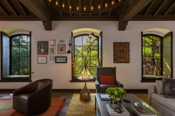
After securing the room’s structure with the main furniture pieces, Farley brought it to life with artwork and accessories. She mostly used artwork the homeowner already had, and she also framed artworks created by the homeowner’s kids and arranged them as a gallery wall in between the windows. A mixed-media piece by Michael Shemchuk, hanging behind the sofa (see next photo), is the only new art she bought for this room. “The modern artwork brought it up-to-date and made everything feel more relevant,” she says.
Art contributes to this room’s richness, and Farley encourages everyone to include art in their decorating projects — at all price points. “I also encourage people to make their own artwork,” she says. Or display artwork family members have made. It could even be a collection of rocks — anything that gives a room meaning and personality.
Colors from the wall art reappear in throw pillows or threads in the rug, keeping the eye moving around the space. Farley mixed textures, prices and design styles to create a well-thought out and comfortable space.
Brass side table: Henri, Ironies; two-arm wall sconce: Serge Mouille

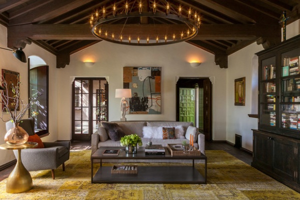
A soft glow of layered light rounds out the room. A large chandelier from Restoration Hardware is the room’s primary light source, but wall sconces, floor lamps and table lamps with varying heights and brightness levels allow the homeowner to control the room’s mood. “You don’t always want to walk in and have a completely lit room from a trove of recessed lighting. Sometimes you just want a couple of cozy, dim lights,” Farley says.
By mixing styles, new things with old things, and pieces she designed with pieces the homeowner already had, Farley created a living space that doesn’t appear artificial. “My goal is to make it feel like a truthful story. It’s living, not a set,” she says.
Plaster lamp: Cleo, Ted Boerner; chandelier: Restoration Hardware; mixed-media artwork: Michael Shemchuk
See more Rooms of the Day
Related Articles Recommended


