World of Design: Discoveries of 10 First-Time Homeowners
http://decor-ideas.org 10/13/2015 01:13 Decor Ideas
Rent or buy? It’s the question most of us face at different times in our lives. These 10 homeowners around the world opted to buy, not only for financial reasons but to have a place they could call their own and tailor to their tastes. Step inside these residences — in Sydney, Berlin, Milan, Moscow, San Francisco and more — and see what these first-time buyers have done to turn their new houses and apartments into homes.
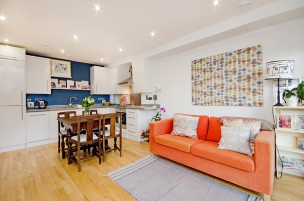
1. Shared-Ownership Flat in the U.K.
Who lives here: Stefanie Loveless, 34
Occupation: Interior designer
Location: Brixton district of London, England
Size: 624 square feet (58 square meters)
Year bought and why this property: In 2014. “I’ve lived in this area for four years and really wanted to stay in south London,” Stefanie Loveless says. “When I saw this flat was for sale, I jumped at the chance, as it’s a vibrant area with lots of cafes and restaurants, plus good transport links. It also has the outdoor spaces of Clapham Common and Brockwell Park nearby.”
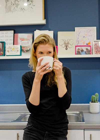
Why buy: “Rent in this area became unaffordable. The previous flat I was living in was falling apart, and I just didn’t want to move into another rented property. So I decided to take part in the government-run shared-ownership scheme, where I part own, part rent the flat. I have a mortgage on the percentage I own, and I pay rent to a housing association on the remaining percentage.
“I love it! Everything is new, clean and working, and the best part is that it’s mine. There are obviously some rules I have to adhere to in living in shared-ownership accommodation, such as no pets, but that’s fine as a first-time buyer.”
Favorite piece or feature: “I like how the dark blue feature wall in the kitchen contrasts against the white units and the Ikea picture shelves, where I display [cookbooks] and photos. I chose a Zoffany’s Velvet Blue paint for this to add some depth and mood. I also love the balcony; it’s such a premium in London to have a bit of outside space where I can grow my herb garden and spend sunny Sunday mornings outside. The large living room windows allow me to gaze out there even if the weather’s not so good.”
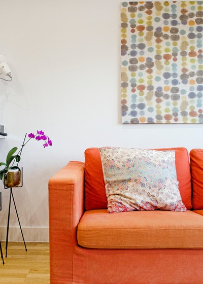
Design style: “Modern with a quirky, colorful twist. I really like the American penthouse look, yet also enjoy mixing brass and bronze and warm colors together, and I also love the works of Suzy Hoodless and Waldo Works.”
What’s next: “When I first moved into the flat, I was still on a tight budget, so everything is furnished from eBay or Freecycle. Having lived in it for a year, I’d like to update some pieces of furniture and get a drinks [cart] and a console table. I’d also like to start collecting some artwork to put up on my bedroom walls.”
See more of this home
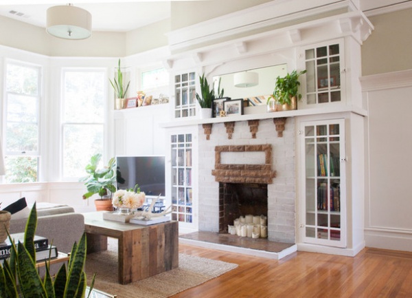
2. Updated Building in San Francisco
Who lives here: Lauren Smith, 28, and Andy Muesse, 29, and their French bulldog, Beatrice
Occupations: Smith is an interior design student and blogger; Muesse is vice president of product at Internet media company Gree.
Location: Lower Haight/NoPa neighborhood of San Francisco, California, United States
Size: 1,000 square feet (93 square meters); two bedrooms, one bathroom, plus a converted attic
Year bought and why this property: “March 2013. Location was one of the biggest factors: We’d lived in this neighborhood before and loved it, so finding a home here was important to us,” Lauren Smith says. “With the San Francisco housing market being so competitive, there weren’t too many options in our budget and also in our preferred neighborhood, so that made it easy when narrowing it down. We also loved that the building itself was more than 100 years old but had recently been renovated with updated features and appliances in both the kitchen and bathroom.”
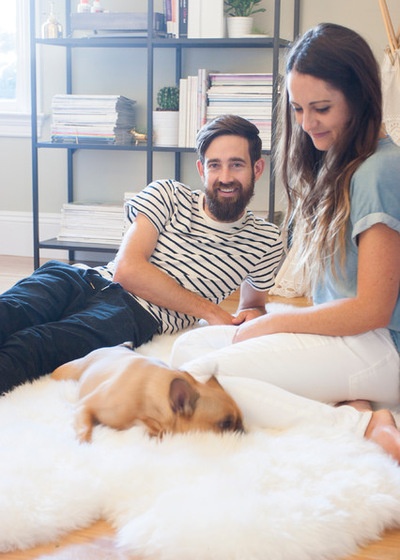
Why buy: “We wanted to invest in equity and not feel like we were throwing money away for rent every month,” Smith says.
Favorite piece or feature: “I love all the beautiful details, such as the original wooden floors, built-in cabinets and bookshelves, brick fireplace and stained glass window,” Smith says. “They give our home character without it feeling overwhelming or dated, like an oppressive artwork or tacky piece of furniture. Historical touches and character are very important to me and help inspire my choices when decorating a space. I also love the views from our back windows — on a clear day, you can even see the tippy-top of the Golden Gate Bridge.”
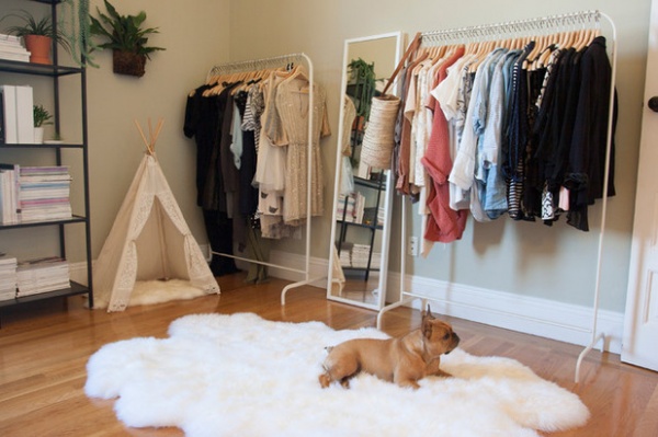
Design style: “Clean, simple, classic. I love mixing trendier pieces with eclectic ones, and one-of-a-kind treasures with cheaper, discount store finds,” Smith says. “We love to travel, so are always pulling inspiration from our adventures around the world.”
What’s next: “We would love some type of outdoor space and are looking into building a deck out from the converted attic, directly above our bedroom,” Smith says. “Much farther down the road, it would be nice to turn the converted attic into a master suite, and having the deck expand from that would not only be incredibly pleasant to wake up to every morning, it would also help increase the resale value.”
See more of this home

3. New-Build Apartment in Russia
Who lives here: Owner Anna Kalinina, 22; her friend, Kirill Karpunin, 23; and her cat, Foster
Occupations: Architects
Location: Moscow, Russia
Size: 667 square feet (62 square meters)
Year bought and why this property: “In 2010, when I was still studying at Moscow Architectural Institute,” Kalinina says. “I just liked this new-build house and the area where it’s located for its good infrastructure and proximity to the river and a lovely park with amusement zones. The apartment itself was a blank canvas to create whatever you wanted. I found it intriguing.”
Why buy: “If you have the chance to buy something, it’s always much more profitable than renting. This apartment was the first place I’d lived on my own. When my mother and I bought it, I was still studying architecture at the university and was already planning to work in interior design in the future. So I designed and refurbished the place together with my mum, who is also an architect.”
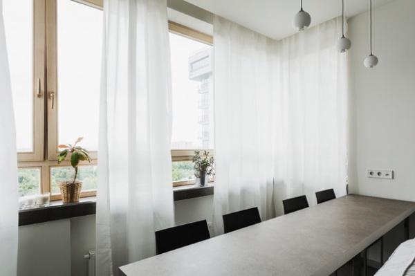
Favorite piece or feature: “The table behind the sofa in my living room. I made it from a kitchen countertop and three pairs of chrome-plated legs from Ikea. I like its irregular proportions and the way that helps it fit in the layout. It’s very comfortable for working at as well.”
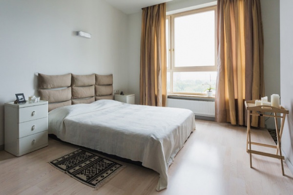
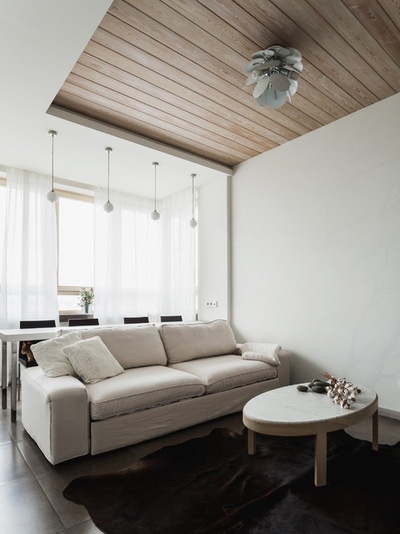
Design style: “My mum and I agreed to give it an eco style, so we mainly used natural materials and colors. To increase this atmosphere, we covered part of the living room ceiling with wooden boards to make the interior more dynamic. In the bedroom, I made a headboard with cushions, which adds volume and rich textures to the space.”
What’s next: “I would really love to start another renovation. First of all, I would change the living room. I’d like to paint it and probably introduce a new, darker shade or cover a wall with wood. Also, I’d like to create a long, G-shaped working surface to replace the existing table that will merge with a bookcase.”
See more of this home
4. Avant-Garde Family Home in Japan
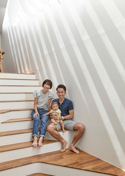
Who lives here: Takanori Manago, 30; his wife, Yuko, 32; and their three children, ages 5, 3 and 6 months
Occupations: Takanori is a corporate manager; Yuko is self-employed.
Location: Yokohama, Japan
Size: 1,700 square feet (158 square meters); four bedrooms
Year bought and why this property: “We bought the plot in 2011, but the building wasn’t completed until 2013,” Takanori Manago says. “A few years after we got married, we began to think of buying a house. We were both big fans of a popular TV program called Atsushi Watanabe’s Tatemono Tanbou (House Tours). We used to check the name of the featured architect in the closing credits, and that’s how we found architect Kazuhiko Kishimoto of acaa. We paid him a visit and asked if he would design a house for us. Our request was to create a unique home where I could relax while my wife runs a gallery.”
Why buy: “My wife and I grew up in Mie, a region far from Tokyo, so we wanted to have our own home in the Tokyo area. I also wanted to have my own family house before I turned 30. As I have some financial knowledge through my job, I believed that if I wanted to buy a house, I should do so while I was young.
“In addition, we once visited the house of a senior colleague of mine that amazed us. It was a very stylish wooden house, the perfect place for the owner, who enjoys playing music. We determined that our house should have a unique design like that, perfectly customized to our lifestyle.”
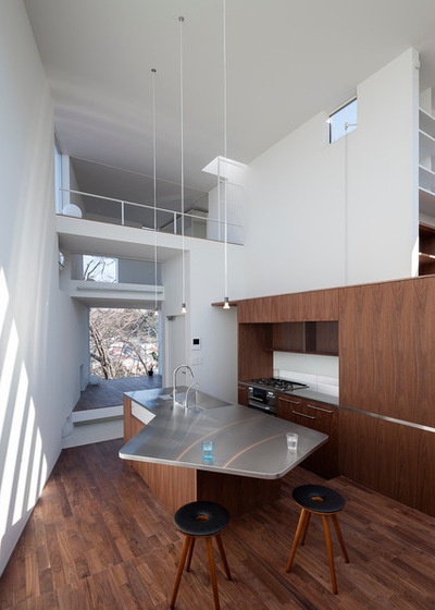
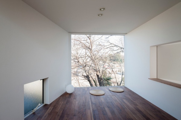
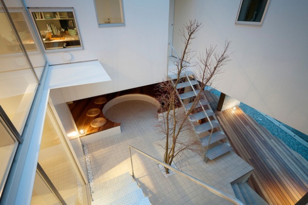
Favorite piece or feature: “I like that the house is an open, fluid space full of stairs and different levels,” Yuko Manago says. “Also, wherever you sit becomes a spot to relax.”
Design style: “We like simple, minimalist style with a touch of natural wood,” Takanori says.
What’s next: “We change the decoration quite often,” Yuko says. “Recently, we have replaced the books in the shelves in the living room with our new collection of natural rocks. Basically, I like decluttering, because I want to live in a comfortable space. My motto is to throw away one existing item if you’ve bought something new. Lately, my children have started to do the same!”
See more of this home
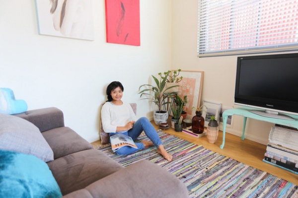
5. Feminine and Eclectic Flat in Australia
Who lives here: Charmaine Viscayno, 28
Occupation: Public relations and youth engagement specialist at Andpeople
Location: Zetland, a suburb of Sydney, Australia
Size: 818 square feet (76 square meters)
Year bought and why this property: “June 2012. At the time, Zetland wasn’t really on my radar in terms of buying a property, as I didn’t know much about the neighborhood,” Charmaine Viscayno says. “In recent years, however, it’s been gentrified. I wanted to be close to the city center, beaches and parks, and I thought it was a great location which I could see myself living in. The building was still relatively new when I bought the apartment, so I had a near-blank canvas to work with and transform.”
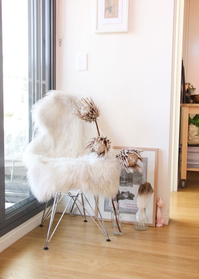
Why buy: “Being able to buy my own place was something I didn’t think would be possible at the time. But a girl I worked with was looking to buy, and after speaking to her, it sparked the idea that maybe I could do the same. I also had some sound advice and initial help from my parents, which is more than I could have hoped for. The property market was actually quite reasonable at the time compared to what it is now! And after looking at some options, it just felt right.”
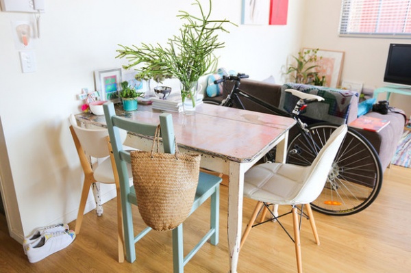
Favorite piece or feature: “The dining table. It was the first piece I bought for the house, and at the time, I hadn’t even properly measured the space or worked out where it was going to go. But I knew I would make it work somehow. It ended up being the perfect size. I was drawn to the fact that it had a story: It had been refurbished in France and brought back to Sydney via a collector. Besides, my favorite color is pink. I also got to pick out mismatched chairs, which I enjoyed doing.”
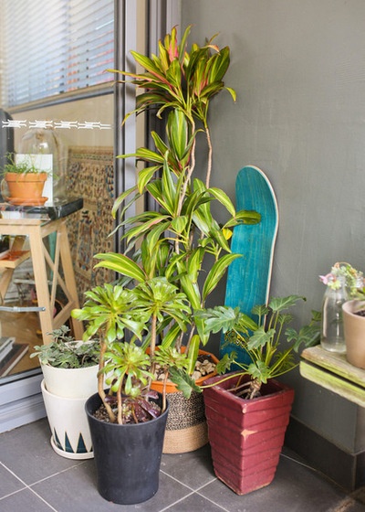
Design style: “My overall style keeps changing. I wouldn’t necessarily define it as one theme, but I do like the idea of collecting items to make the home feel lived-in. My style has a certain structure: I don’t necessarily get drawn to designers, and I like it when pieces have interesting stories. Also, I think my personal interests in film, music, art and fashion have played a huge role in the aesthetics.”
What’s next: “My next focus is to design the balcony space — I still haven’t found the right table and chairs. At the moment, it’s a nice place to sit and relax, but it would be great to incorporate a dining element too. There are currently a lot of plants on display, and they dominate the area. I would like to keep them, as it has taken me a while to build them up. Ideally I’d like a table setting that doesn’t draw attention away from them.”
See more of this home
6. Restored Apartment in Spain
Who lives here: Mónica Álvarez, 38; Héctor Serrano, 40; and their two children, ages 5 and 3
Occupations: Álvarez is a hairdresser; Serrano is an industrial designer
Location: La Petxina, Valencia, Spain
Size: 1,507 square feet (140 square meters) with a 431-square-foot (40-square-meter) terrace
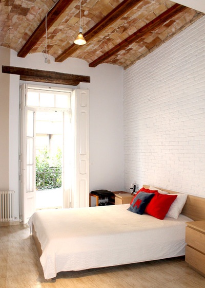
Year bought and why this property: “In December 2013, when we were just back from living for more than 10 years in London,” Héctor Serrano says. “We liked it because it has a lot of character. It’s an old house with high ceilings, original beams, clay vaults and exposed brick walls. All these beautiful features were hidden behind false ceilings and plaster walls. They were brought to light during the renovation and are an important part of the house character.
“We also liked that it’s very bright — as both north and south facades are pretty clear areas outside in spite of being in the middle of the city — as well as the large terrace.”
Why buy: “We wanted our home in this area of the city, but the most important thing was that we wanted it in our own style. It was impossible to find something like that to rent. Also, it was the right time,” Serrano says.
“We spent years in London in a rented house, because we didn’t know how long we’d stay,” Mónica Álvarez says. “When we moved back to Valencia, we were completely sure that we wanted to stay for a long time in this city, maybe a lifetime, so we started looking to buy.”
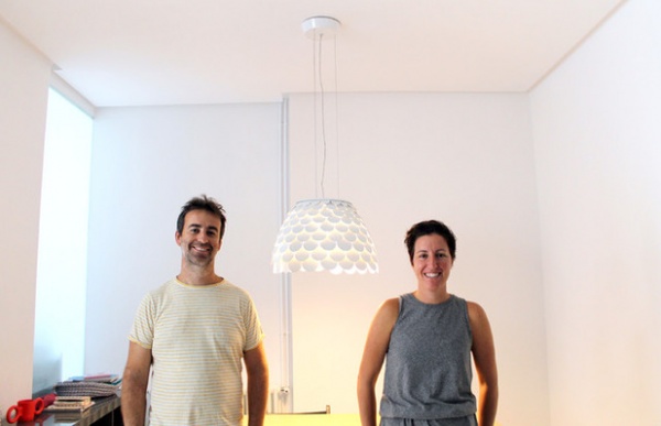
Favorite piece or feature: “There are many pieces of decoration in the house that we like, but perhaps our favorite is the Carmen pendant light over the dining table,” Serrano says. The light, visible in the first photo, is one Serrano designed for the Italian company FontanaArte. It’s made of metallic scales in the shape of a flower.
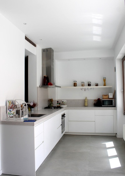
Design style: “Clean, simple and functional,” Serrano says.
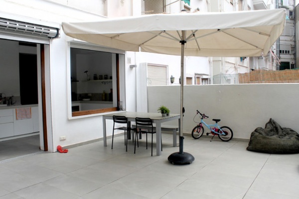
What’s next? “We would like to change the flooring, but there’s a little bit of controversy in that. While Monica would prefer a warm wooden one, I’d like to go for micro cement to highlight the character of the clay vaults and aged wooden beams. We also would like to upgrade the bathrooms and create proper shade on the terrace to make it more comfortable.”
See more of this home
7. Urban Style in a Rustic Setting in Germany
Who lives here: Mignon Fuchs and her husband, Eddi, both in their early 40s, and their sons, Thies, 9, and Philea, 7
Occupation: Fuchs is a business coach and cofounder of The Trainerforce.
Location: Greater Berlin, Germany
Size: 2,153 square feet (200 square meters), plus a 7,481-square-foot (695-square-meter) garden
Year bought and why this property: “We bought the land in 2011 and started planning and building the house in 2012. We wanted to move to the surrounding areas of Berlin but couldn’t find anything we really liked, so we built our own,” Mignon Fuchs says. “It was important for us that the house would be cool in summer, thus we focused on a massive construction and made sure it was energy-efficient.”
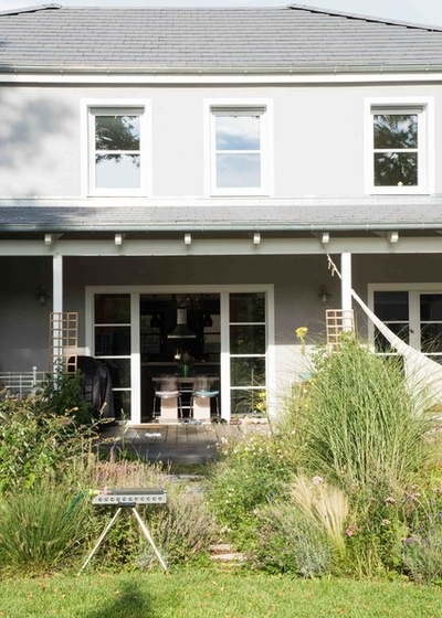
Why build: “We already had some renovating and restructuring experience in our former rented home, but we started to feel that renting was not worth it. We built our own house according to our expectations, a house for our family, which perfectly reflects our personalities,” Fuchs says.
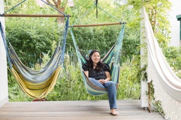
Favorite piece or feature: “The terrace, as we love to sit or lie in the hammocks, sometimes all of us at the same time — they are strong enough for the whole family. Also, the display cabinet in the dining area is a very important piece to me. It has been moving with Eddi and me as long as we’ve known each other. In addition, it’s filled with personal items, heirlooms and things our children have made.”
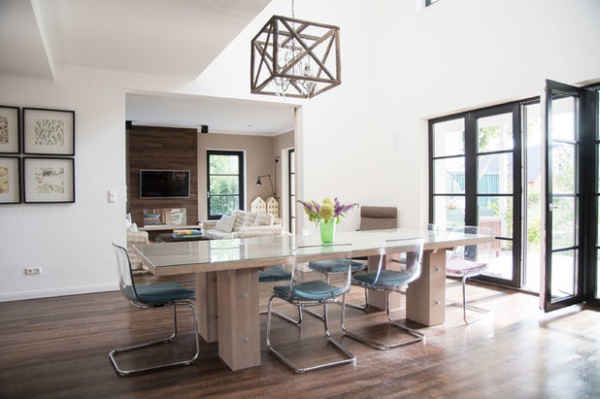
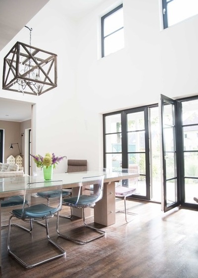
Design style: “It took us a while to find the perfect style for us. Some time ago I liked it colorful and grandiose, but with three men in the house it cannot be that playful. Personally, I always had a Swiss chalet style in mind, sort of rustic meets urban. So our house is now full of all these contrasts, but with a cleaner style and maybe also kind of American.”
What’s next? “The porch roof! And the bedroom, but since we haven’t found the perfect idea for that up to now, we still have to work on it. To be honest, we already do think about building our next, second house…. I pick up a lot of ideas from Houzz!”
See more of this home
8. Mid-City Eden in Italy
Who lives here: Kate Axelsson, 34, and Cristiano Belloli, 37
Occupations: Axelsson is an interior designer; Belloli runs a restaurant.
Location: Milan, Italy
Size: 915 square feet (85 square meters), plus a 323-square-foot (30-square-meter) terrace
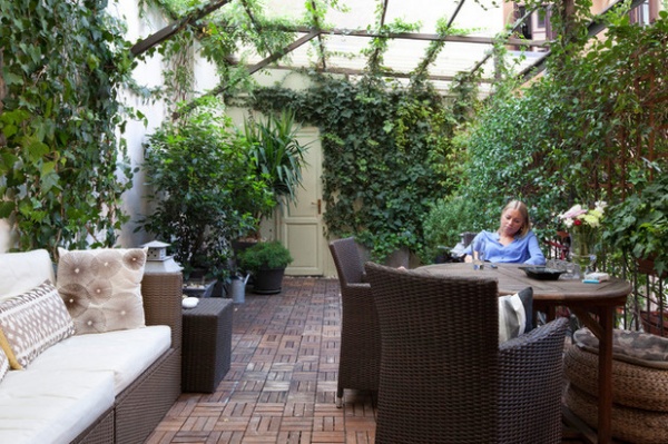
Year bought and why this property: In 2010. “We love this part of the city because it’s central, near a park and buzzing at the same time,” Kate Axelsson says. “Then we fell in love with the terrace. Last winter we spent almost all weekends in renovating it, in order to have it ready for the summer.”
Why buy: “It’s always better to invest if you have the possibility,” Axelsson says. “When we decided to live together, we rented at first. After two years, we decided to buy a new one, as we wanted to design and furnish it ourselves, and have the chance to make big changes.”
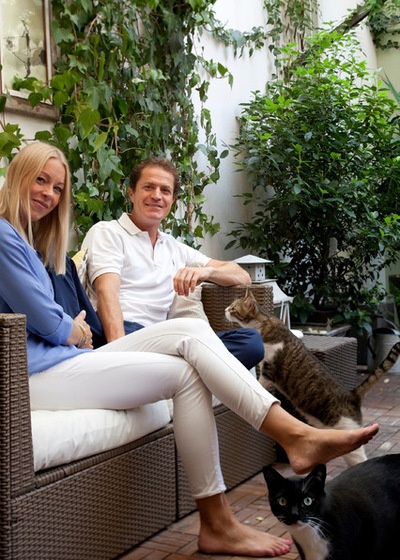
Favorite piece or feature: “The couch on the terrace. We love to spend lazy time on it, together with our two cats.”
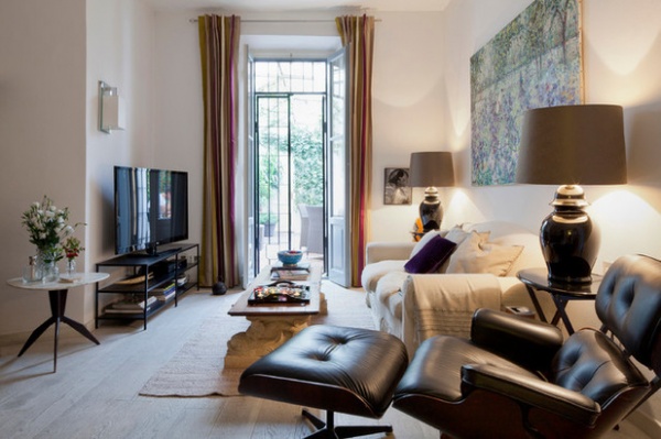
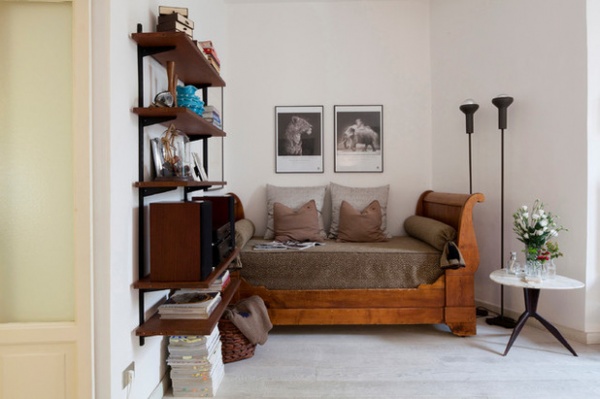
Design style: “There is no precise definition for it — we just like to collect antiques, vintage classics and design pieces. We try to find a good balance between our tastes, which feels necessary when you live under the same roof! That has led us to a living room where you can find a coffee table made with two ancient stone sculptures and an antique door, mixed with a vintage Eames lounger and ottoman, two classic lamps and a postimpressionist painting by Massimo ‘Antime’ Parietti.”
What’s next: “Well, the bathroom is being renovated right now, and we are looking for a new sofa and a new cover for the antique daybed in the living room too.”
See more of this home

9. Flat That Instantly Felt Like Home in Sweden
Who lives here: Charlotte Gunnarsson, 31
Occupation: Works in finance
Location: Kungsholmen, Stockholm, Sweden
Size: 431 square feet (40 square meters); one bedroom
Year bought and why this property: “I bought it in 2012, though I was actually looking in a completely different part of town — Södermalm, the southern island in central Stockholm. A friend suggested I should come and have a look at this small flat, and as soon as I crossed the threshold, I knew this was home. I fell in love. The flat just spoke to me, and it still does.”
Why buy: “It’s almost impossible to get a rental contract in central Stockholm, and I wasn’t interested in a short-term lease. My intentions were never to move to Stockholm, but as I went to university in Linköping, I began to realize that if I wanted to have a career in Sweden, this is where I had to be. And I wanted a proper home, as I’ve moved around since I left home for boarding school at 16.”
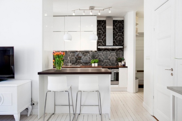
Favorite piece or feature: “The open-plan kitchen is so great, as I love to cook and socialize. With this layout, I can do both at the same time. There are glass bricks between the small bedroom and the kitchen, so I get daylight in there though there are no windows.”
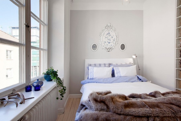
Design style: “Super light and Scandinavian, with soft touches for coziness. I didn’t have to do much when I moved in — the floors and walls were all white, and the bathroom was pristine. I did check out some renovation projects when I was looking at properties, but they are weirdly almost more expensive than flats that are done up. People want to start from scratch, I guess.”
What’s next: “Though I love it here, I’m subletting the flat at the moment to tenants, as I’ve moved to London for work. I have no intention of selling — the thought makes me feel quite emotional — but it seems my globe-trotting isn’t quite done. But when I return, I’m guessing I might need something a bit bigger, preferably in the same house, as I love the street and the neighbors are so lovely.”

10. Do-It-Yourself Home in France
Who lives here: Lucile Warlet, 26, and Dorian Caudron, 27
Occupations: Warlet is a Chinese-medicine practitioner; Caudron is a logistics manager in a home equipment store.
Location: Pontoise, Val d’Oise, a suburb of Paris, France
Size: 700 square feet (65 square meters); two bedrooms
Year bought and why this property: “January 2014. Val d’Oise is the area where I grew up, and we wanted to stay close to our friends and families,” Lucile Warlet says. “Pontoise is a great choice, as it’s like a city, with all the facilities you need. But at the same time, you are just a 15-minute walk away from the woods or the countryside.”
“We didn’t want to live in a high tower with hundreds of flats — this is only a three-story building,” Dorian Caudron adds.
“We liked the layout too,” Warlet says. “The living room is spacious, and the two bedrooms are big and separated from each other. Plus, it’s very bright.”
Why buy: “We didn’t want to waste our money on rent, so we decided it was best to invest in a comfy flat,” Warlet says. “It gives you peace of mind, so you stop thinking what will you do with the furniture if you move in the future. This is our home sweet home.”
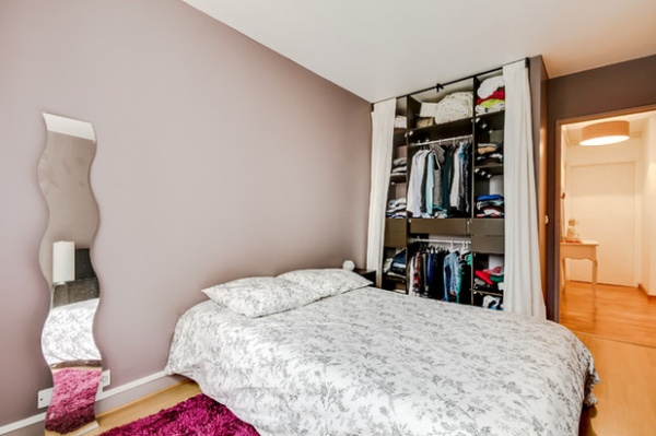
Favorite piece or feature: “The buffet in the living room we found in a secondhand store,” Warlet says. “We both like old objects with a story behind them, and we bought it for only 200 euros [about $225]! I also love the wardrobe in the bedroom, as Dorian built it for us. It perfectly fits our needs, and we spent much less money than if we had bought a new one.”
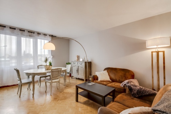
“I love the table and the chairs in the living room; I gave them the patina they have now,” Caudron says. “I also made the lamp after seeing one I liked in a store. It cost around 200 euros [about $225]. I cut the timber and screwed it together before adding the lampshade, which I also made. It was such a pleasure to build it by myself. I also love the hallway: I covered one of the walls with brick plaster panels in white to add charm and light.”
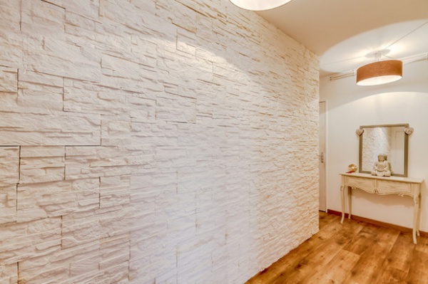
Design style: “I would say country chic, as we love wood, wrought iron and neutral colors, such as gray, brown and white. Plus a Zen touch,” Warlet says.
What’s next? “We’re planning to renovate the kitchen. I’d like to change the countertop for a wooden one, add new furniture and paint it,” Caudron says. “We want everything bright and new.”
See more of this home
Tell us: Did you buy and decorate your own house recently? Please share a photo in the Comments and tell us where you live.
Related Articles Recommended


