Room of the Day: Suburban Foyer Makes a Powerful First Impression
http://decor-ideas.org 10/12/2015 23:13 Decor Ideas
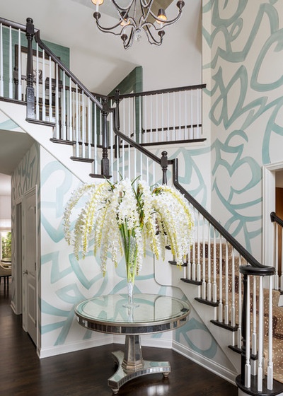
“In order to create a room like this, I need my clients to take a big leap of faith with me,” Chicago interior designer Anthony Michael says. When he was hired by these homeowners, the foyer in their suburban Georgian-style home was “a little boring,” but now it’s anything but. A dynamic custom mural pays homage to artist Henry Moore in turquoise with metallic glints, and striking seasonal flower arrangements offer a fresh welcome. The foyer makes a dramatic impression on all who enter. “Everyone who comes through the door is wowed,” the designer says.

Photos by Jacob Hand Photography
Foyer at a Glance
Who lives here: A young family of four
Location: A suburb in Chicago’s North Shore area
Designer: Anthony Michael
“I knew a conventional-scale wallpaper wouldn’t work; we needed something to cover the walls that was two-story scale,” designer Anthony Michael says. He also knew that these clients, who found him on Houzz, had placed their full trust in him and would let him really push the envelope.
“This is our tribute to Henry Moore,” Michael says. He commissioned artist Steven Hettrich, a frequent collaborative partner, to create the large-scale mural, which differs on each wall without repeats. “We started with very light gray walls and then let Steven work his magic.”
Gilded accents on some of the edges of the pattern take advantage of the natural light, highlight portions of the design and give a 3-D effect.
The table is gilded as well. The beautiful silver-leaf backing on the glass is a treatment known as eglomise. “It has a mirrored feeling, but it’s full of character,” Michael says.
The homeowners like to change the flower arrangements seasonally. “These are all orchids; I love to do floral arrangements en masse,” Michael says. The size of the table, vase and arrangement stands up to the soaring two-story height and welcomes guests.

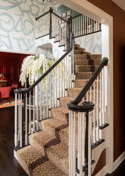
When I told Michael that I had absolutely no idea why the antelope-pattern runner on the stairs worked, but it just did, he laughed and said, “I have no idea either — thank God it did!” Perhaps it’s because while the space is sophisticated, it is also playful.
He had the floor and handrails ebonized, a process that darkened the existing light maple wood for a sharp contrast with the lighter elements. To make his clients’ existing chandelier work with the rest of the room, he changed its gold finish to black.

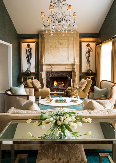
The designer says of the open foyer: “One part of a room like this that is tricky is to figure out where you start and where you stop.” Realizing that continuing the mural pattern onto the walls of the upstairs hall would be too much, he instead used the same turquoise grasscloth that’s in the living room, seen here, adjacent to the foyer. Turquoise, white and gold appear throughout the house.
This room has two more works by Hettrich: the figures flanking the fireplace. “I love working with Steven,” Michael says. “We talk about the idea and he does research, makes recommendations and then enhances it — we have a shared vision between us and also with the clients. He brings so much to the table.”
Paintings: Steven Hettrich; wallcovering: Kravet

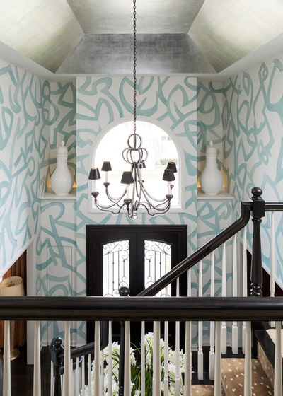
The view from upstairs was important to consider as well. Two giant white-on-white applique jars perch in niches, uplit by LED strips hidden behind molding.
Previously the ceiling had been covered in a dark gold leaf. “It was horrible,” Michael says. “I called the owners and said, ‘I’m killing the gold in the foyer — trust me, it will be fine.’ ” He replaced it with platinum leaf.
If you squint, you can see two closets flanking the front door. Originally they were so narrow that they couldn’t accommodate hangers, so Michael made them a little deeper and then used jam switches and jib doors to hide them. This gives the illusion that the wall simply continues across the trimless doors.
The clients are thrilled with the surprising results. “I told them that if they took this leap of faith with me and they didn’t like it, I would put it back exactly as it was at no charge,” Michael says. “But they love it…. This is a real showstopper for them.”
More
Single Design Moves That Can Transform an Entry
Key Measurements for Entrances Great and Small
Related Articles Recommended


