New This Week: 3 Living Rooms That Ditch the Tech for Family
http://decor-ideas.org 10/10/2015 03:53 Decor Ideas
These days, it’s nice to have a spot at home without any distracting screens — no TV, no computer, no phone. Just a place where you can sit quietly, read a book, converse with friends and family or enjoy a great view. The following rooms, uploaded recently by their respective designers, promote less tech and more talk.
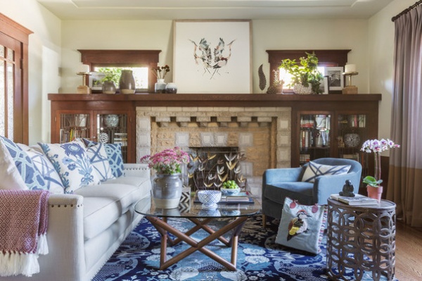
1. Craftsman Cool
Designer: Leslie Harris-Keane
Location: Berkeley, California
Size: 14½ by 14½ feet, or about 210 square feet (4.4 by 4.4 meters, or 19.5 square meters)
Year built: 1930s
Homeowners’ request: A cozy, comfortable and kid-friendly space for a renovated 1930s Craftsman house. “They loved the original Craftsman architecture but wanted to infuse a more modern vibe to keep the room looking youthful and fresh,” designer Leslie Harris-Keane says.
Plan of attack: “The fireplace and original built-ins are so special, we knew we wanted to make them the focal point of the room,” Harris-Keane says. From there, she chose a blue area rug as a jumping-off point. “The richness of the blue really brought the space to life,” she says. A full-size sofa in stain-resistant indoor-outdoor fabric with a frame that has slender arms maximizes seating without taking up too much space. The round teak coffee table creates a central element around which to gather. Two small stools are tucked under the entryway table and can be pulled out as needed for extra seating.
Why the design works: “The entry and living room are high-traffic spots for the family, so they needed the space to be durable and functional,” Harris-Keane says. “All the selections had the kids in mind. We chose darker rugs to hide dirt and indoor-outdoor fabric on the sofa. We opted for minimal, inexpensive but fun accessories at kid level — coffee and entry table. This allowed for the kids to interact with the room, but my client didn’t need to worry if something accidentally broke.”
Meanwhile, the blue, turquoise and light-gray palette keeps the dark floors and massive fireplace from making the room feel too dark and heavy.
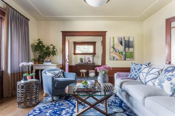
What goes on here: Family gatherings. “There’s a ton of natural light from the big picture window, so it’s a great place to catch up on some reading during the day,” Harris-Keane says. “The fireplace is a huge draw during the fall and winter.”
Who uses it: A young couple with two preschool-age girls.
“Uh-oh” moment: “The biggest challenge came during installation day,” Harris-Keane says. “I ordered custom art for over the fireplace. When it arrived with the frame, it was 2 inches too big to be hung. We decided to lean it against the wall. We loved having the large-scale piece and thought leaning it gave the room a slightly more cool and casual vibe. If we went with a smaller-scale piece of art, it wouldn’t have nearly as much impact.”
Splurges and savings: The owners splurged on the rug because it anchored the room and brought so much vibrancy. The durable, stain-resistant indoor-outdoor fabric on the sofa was also a splurge, but the owners felt it was necessary to keep it looking great with kids in the house.
The nitty-gritty: Rug: Feizy; sofa frame: Lee Industries; sofa fabric: Rough and Rowdy Ash, Perennials; club chair: Restoration Hardware; coffee table: West Elm; pillows: custom made in Trellis fabric by Duralee, Channels fabric by Kelly Wearstler and fabric from Quadrille; art over fireplace: Minted; metal side table: HomeGoods; accessories: mix of vintage HomeGoods pieces; white painted table: French antique; entry table: West Elm; abstract art: HomeGoods; curtains: custom
Team involved: David Duncan Livingston (photographer)
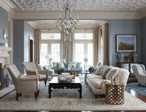
2. Dignified and Durable
Designer: Cindy Rinfret
Location: Greenwich, Connecticut
Size: 30 feet by 34 feet, or 1,020 square feet (9.1 by 10.3 meters, or 94.7 square meters)
Year built: 2010
Homeowners’ request: “The client had built a rather grand estate but requested the interiors be family-friendly and embracing,” designer Cindy Rinfret says. “They desired that every room in the house would be accessible and not just a stage set. The color palette desired was blue, tan, gray and neutral.”
Plan of attack: “The most important element in a house with rooms of these proportions is to make sure the furniture is to scale and arranged so there can be real conversation areas,” Rinfret says. She started with a well-thought-out floor plan and then added custom-made and custom-colored rugs. In fact, everything was designed specifically for these rooms, including the fireplace mantels and ornamental ceilings. “Everything is balanced, and the room works perfectly for entertaining,” she says.
Why the design works: “If there had been only one rug, a room of this size would have ended up looking like a hotel,” the designer says. “The layering of different conversation areas by using three rugs to ground each separate area created an intimate room that is perfect for entertaining.”
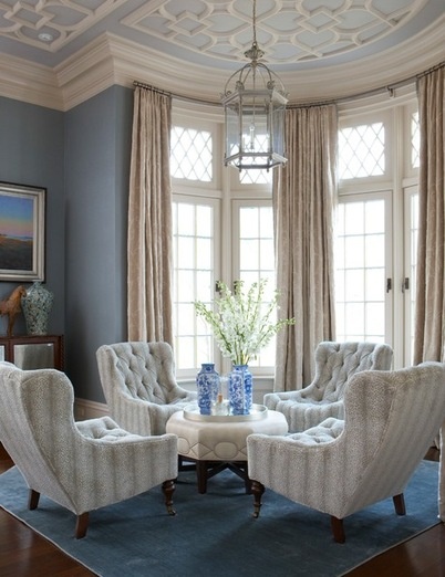
Who uses it: An active, sporty family with three middle-school-aged children and a golden retriever. “The request was to have no room in the house be off-limits to any member of the family — including the dog,” Rinfret says. “The home is made for real life, and all the rooms are used on a daily basis by the entire family.”
Designer secret: “I have a thing for ceilings, especially in large spaces,” Rinfret says. Instead of painting the 12-foot (3.6-meter) ceiling in this room white, she added limestone-colored ornamental plaster to a pale sky-blue background.
Take-away: “You’re only as good as your client. If you present complete thoughts and your client can ‘see’ the concepts, they can make decisions and keep the project rolling,” Rinfret says. “I guess I could also say the client is only as good as their organized designer.”
The nitty-gritty: Rugs: J.D. Staron; group of two chairs: Althorp, covered in Norbar fabric by Classic Upholstery; group of four chairs: Lee Industries, covered in Schumacher fabric; sofa: Lee Industries, covered in Clarence House fabric; rectangular coffee table: Amy Howard; octagonal coffee table: custom, covered in Norbar fabric by Classic Upholstery; chandeliers: two Vaughn and one Dennis & Leen: window treatments: Hemming Birds, in Cowtan & Tout main fabric; wall covering: Innovations in Wallcoverings; assorted pillows and accessories: Cindy Rinfret
Team involved: Dinyar Wadia (architect); Soundbeach Partners (builder); Michael Partinio (photographer)
3. Soft and Neutral
Designer: Kate Marker
Location: South Barrington, Illinois
Size: 23 by 20 feet, or 460 square feet (7 by 6 meters, or 42.7 square meters)
Year built: 2014
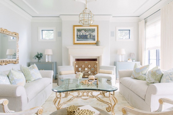
Homeowners’ request: A soft and subdued palette and the incorporation of existing furniture into their new, custom-built home.
Plan of attack: Set the tone with a soft, classic palette and reupholster existing peach and red furniture with cream, beige and soft blue fabrics. The only new furnishings were the rug, light fixtures and two chests flanking the fireplace.
Why the design works: “This ‘new traditional’ look now reflects the clients in the best way possible: preserving what they had loved for years but reinventing it for the next chapter of their lives,” designer Kate Marker says. Linen helped encapsulate the relaxed neutrals. Texture lends interest to the soft color palette, while a geometric light fixture gives a modern touch.
What goes on here: Relaxing while enjoying the view of the lake that the house overlooks.
Who uses it: A retired couple.
Designer secret: “Rethink what you have,” Marker says. “If an item has good bones, a new fabric or wood finish can refresh a dated piece for you to love all over again.”
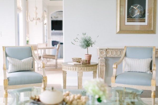
“Uh-oh” moment: “The metallic finishes were predominantly gold and a bit ornate for the relaxed look we were seeking,” Marker says. “Rather than swap them out, we paired them with soft, textured neutral fabrics that complement them. We also added organic touches in the form of various greenery, a turtle shell, wooden beads, small ceramics and more for accessories that give it an overall more rounded, and grounded, look.”
Splurges and savings: The homeowners saved by reupholstering their existing furniture rather than buying new pieces. This allowed them to splurge on the Oushak-style rug. “It lays a beautiful foundation for the room and the detailed ceiling for an overall light, airy feel,” Marker says.
The nitty-gritty: Paint: Silver Satin, Benjamin Moore; blue chests: Lillian August; rug: Rugport; drapery fabric: Brochier; pillows: custom made with fabric by Holland & Sherry and Jane Shelton; lamps: Visual Comfort; pendants: Morris lantern, Visual Comfort
Team involved: Grand Traditions Builders; Barbara’s Design Studio (drapery)
More: 5 Fully Decorated Living Rooms That Don’t Go Overboard
Related Articles Recommended


