Kitchen of the Week: Goodbye, Honey Oak — Hello, Minty Green
http://decor-ideas.org 10/09/2015 19:13 Decor Ideas
Diana and Harvey Kloesel bought their 1905 Victorian home with wraparound porches in 1978. Three years later a fire in the garage damaged part of the kitchen, which they fixed up in line with the style of the time: honey oak cabinets, laminate countertops and linoleum flooring. And that’s the way they kept it for the next three decades before recently deciding it was time for a major update.
Kitchen at a Glance
Location: Moulton, Texas
Size: 19 feet, 5 inches by 15 feet, 2 inches (about 6 by 4.5 meters)
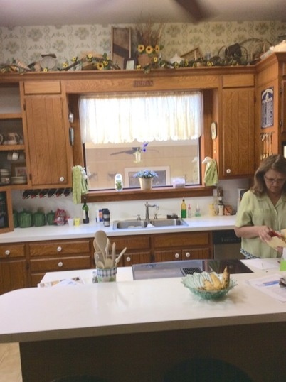
BEFORE: Dated materials dominated the old kitchen. Meanwhile, despite the 10-foot ceiling, the cabinets were standard height. “There was too much bad use of space and not enough storage,” says designer Sarah Stacey, whom the Kloesels hired to help modernize the kitchen while honoring the home’s old-school style.
The center island held a stove, which had only two out of four working burners, and a bar counter that rose 8 inches (about 23 centimeters) above the island, blocking views to and from the adjacent dining room. “We thought it took away from the kitchen and was too high,” Harvey says. Finally, a pantry about 6 by 4 feet (1.8 by 1.2 meters), to the right of the island and out of view here, took up a lot of space and boxed in a window that could have been bringing more natural light into the kitchen.
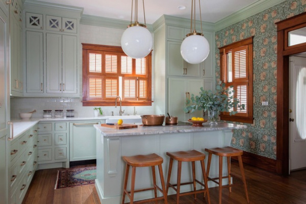
AFTER: New cabinets go all the way to the ceiling to maximize storage. Their country style honors the rural Texas town of Moulton, where the Kloesels reside, as well as the style of the home. “The previous kitchen definitely didn’t,” Stacey says. Paneled appliances also help keep an authentic look. “We didn’t want to see any stainless steel in here,” she says.
She showed the homeowners an option for white cabinets and an option for minty green, secretly hoping they’d go for the latter. “Luckily they went with green,” she says. “Diana is really cool in that she takes big design risks. It’s a lot of fun to work with someone like that.”
Removing the pantry added the window on the right, but it also created a large blank wall with which to contend. Instead of painting such a large surface area, they decided to go with a floral patterned wallpaper that fit with other wallpaper and ornate furniture throughout the house.
Cabinet paint: Clary Sage, Sherwin-Williams; hardware: Mulholland, Amerock; wallpaper: Pimpernel in Bayleaf Manilla, Morris & Co.; Hood classic globe pendants: Rejuvenation
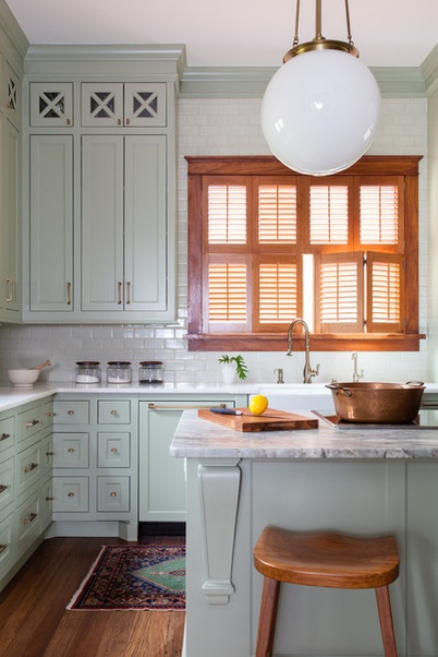
Stacey first began the project by helping the couple select marble for the countertops, the material being the single biggest investment for the homeowners. For the new island, which opened up the kitchen more, they chose a green tinted marble. A bright white version with very little veining spans the perimeter. Stacey didn’t want a backsplash with too much contrast, so she selected a handmade clay tile in a very light green.
Island marble: Sequoia with leathered finish; perimeter marble: Namibian White, polished
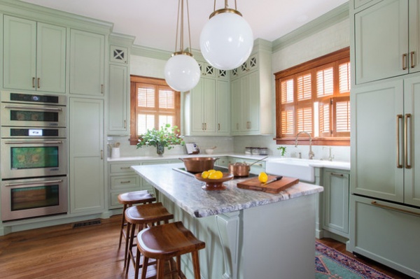
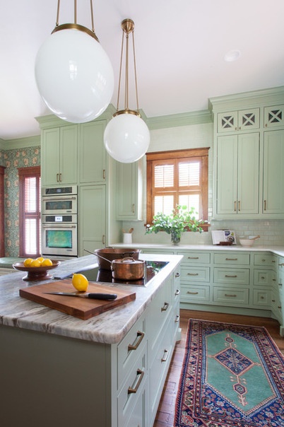
They ripped up the linoleum to reveal antique longleaf pine floors consistent with the rest of the home. Moving the oven from underneath the cooktop to a wall helped break up the traffic pattern so it wasn’t all centralized in one location. The homeowners chose an induction cooktop for its energy efficiency and safety around their grandkids. “The new equipment is a blessing,” Harvey says. “It’s amazing how much technology has advanced since 1981.”
One of Stacey’s favorite features is the brass rod and ball pendants, which fit the scale and style of the room. Recessed LED lights and undercabinet lighting, all on dimmers, provide additional illumination. “You turn them all on and it’s like daylight in there,” Harvey says.
Slide-out shelves next to the oven and numerous drawers that take up the entire bottom cabinetry space make up for the lost pantry storage.
Sink: Whitehaven with Smart Divide, Kohler; Extended Reach pull-down faucet: Waterstone; induction cooktop: Jenn-Air
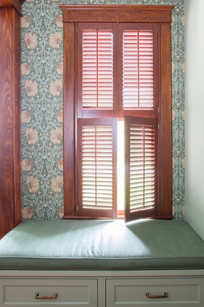
A window seat replaced a cluttered desk area.
The Kloesels own and operate Kloesel’s Steakhouse in downtown Moulton, and when they have time off, they enjoy cooking big family meals of shrimp scampi, lobster and crab legs for their grown kids and grandkids. In fact, having more connectedness to family during big meals and holidays was one of the main catalysts for the project. To achieve this, the Kloesels removed part of a wall to widen the doorway to the adjacent dining room from 3 feet (0.9 meter) to 8 feet (2.4 meters) to encourage more flow between the two rooms.
Wallpaper: Pimpernel in Bayleaf Manilla, Morris & Co.
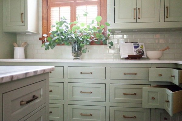
Corner drawers take advantage of what could have been voided space.
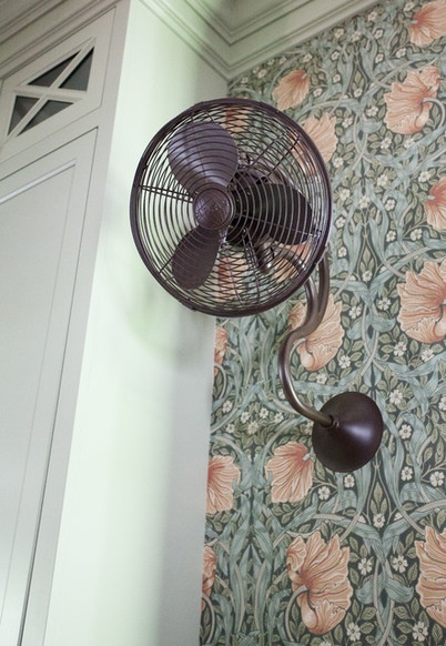
After losing a ceiling fan in the room to accommodate the recessed lights, the Kloesels wanted something to help cool them off on hot Texas days. Stacey found modern oscillating fans that look like they were made in the 1800s.
One of the main challenges on the project was finding skilled labor to help it come to fruition. In rural Texas, the Stacey and the homeowners didn’t have too many options. Nobody in town had a website or was in the phone book. “You had to know somebody who knew somebody that could install materials,” Stacey says. Harvey tapped his nephew in Brenham, more than an hour away, to build the cabinets, and the Kloesels ended up acting as their own general contractors. “We had a hard time finding anybody to do anything,” Stacey says.
Luckily, the effort paid off.
Fan: Melody, Matthews Fan Co.
See more Kitchens of the Week
Find a Kitchen Designer near you
Related Articles Recommended


