Room of the Day: Serene Sophistication in a Master Bathroom
http://decor-ideas.org 10/08/2015 19:13 Decor Ideas
“We wanted this bathroom to flow with the rest of this house, which is contemporary, yet not look like it was the last room they renovated,” says Jo Rabaut, principal interior designer at Rabaut Design Associates. She and her team transformed a tired and dated room, cohesively fitting it right in with the rest of the home. The finished clean-lined space is a great lesson in scale and plays off juxtapositions — light versus dark, smooth versus rough and linear versus curved. Carefully lining things up and rearranging the elements in a symmetrical way put the focus on a large window view and created a calm, relaxing and high-functioning space.
Photos by Jeff Herr Photography
Bathroom at a Glance
What happens here: This is the master bathroom for a couple originally from Europe.
Location: Atlanta
Size: 168 square feet (15.5 square meters)
Designer: Rabaut Design Associates Inc.
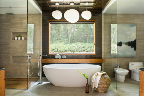
This is the view from the double pocket doors that serve as the entry to the bathroom. The existing window offered a wonderful opportunity to create symmetry. The design team placed the oval free-standing bathtub front and center, creating a focal point. Its strong curves are echoed by the light fixtures overhead. “We chose these lights to add a sense of playfulness to the room,” Rabaut says. “At the same time, they are sophisticated.” The homeowners have interesting chandeliers and other light fixtures throughout the rest of the home, so this move also created cohesion between the bathroom and the rest of the house.
The team worked within the footprint of the existing bathroom, which is generous in size. “We created three distinct zones that gave it a cozier feel and made it feel symmetric,” Rabaut says.
They placed an enlarged shower stall on one side of the tub and the water closet area on the other. While it wasn’t functionally necessary to repeat the glass surround next to the water closet, it reinforces the symmetry. Many careful drawings helped them strategically place all of the seams of the large-format tiles. Note the way the shower niches and the painting on the wall reinforce the symmetry as well.
Bathtub: Victoria + Albert Baths; lights: Gregg Suspension line, Foscarini; landscape painting: Mel Rea via Huff Harrington
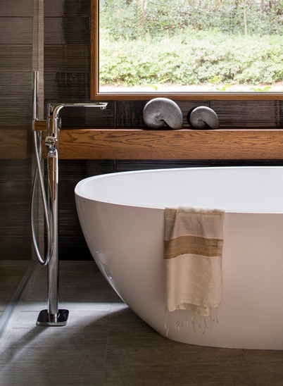
“The husband loves the touch and feel of chrome fixtures and wanted them to have significant stature — nothing too delicate,” Rabaut says. These details work well with the large scale of the room.
Another juxtaposition is the coolness of the shiny metal versus the warmth of the wood. The hefty piece of oak underneath the window functions as a shelf for the bather. This adds a warm touch and a strong horizontal line, and is repeated on the wood on the custom vanities across the room.
Tile on bathtub wall and ceiling: Koi Shibo ceramic tile in Ironrod, Ann Sacks; field tile (on other walls and floor): Q Stone, in Stone Natural Gray Provenza, Speciality Tile Products Inc.; bathtub fittings: Hansgrohe
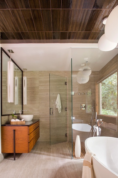
While the field tile extends seamlessly from the walls of the shower and water closet down to the floor, the dark, glossy tile from the bathtub zone extends up the wall and across the ceiling.
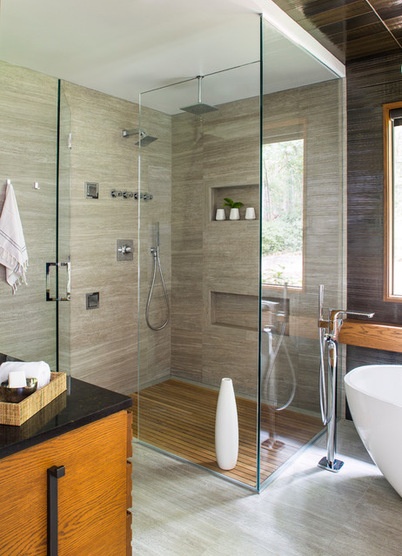
The team chose Starphire glass for the enclosures. “It’s more expensive, but I think it’s worth it every time,” Rabaut says. Starphire glass is clearer and has much less of a green cast than regular glass.
The shower has a teak floor. “This floor is also linear and reinforces the warmth of the wood,” she says.
Shower fixtures: Kohler
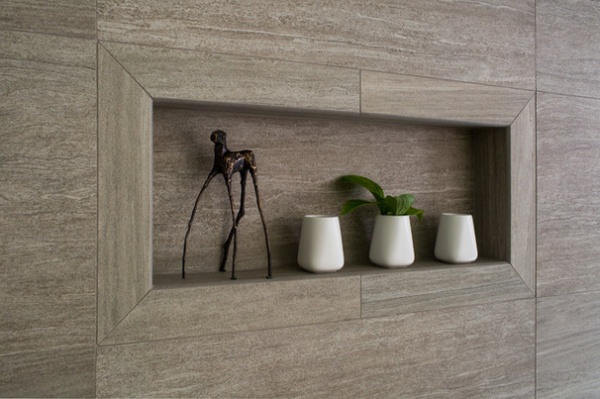
Before planning out the niches, Rabaut made sure to find out what size shampoo bottles the couple uses (you have to go bigger if you use Costco size). The homeowners did not want a shower bench, so the second niche is for leg shaving.
Here you can catch a glimpse of one of the double doors that leads to the master bedroom. “We chose frosted glass to keep the feel of lightness, provide privacy and diffuse the lighting coming through into the bedroom for when one of them is sleeping and the other one is in here,” Rabaut says.
The frosted glass on the light fixtures echoes the look of the pocket doors. The door pockets also influenced the choice — the team was unable to mount wall sconces because there was not enough room behind the wall where the pockets are.
“These are mounted from the ceiling, but we treated them like wall sconces,” Rabaut says. Their long, vertical form adds another strong linear touch.
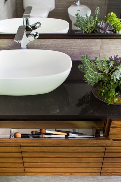
The homeowners have separate individual vanities. Rabaut talked extensively with them about how they each function at the vanity, how much counter space they would need and which items they had to store close at hand; as a result they decided to forgo medicine cabinets. Instead there are clever fold-out and pullout drawers and cabinets. Each vanity is complete with plenty of counter space. The vessel sinks play off the curved shapes of the bathtub and light fixtures over it.
Vessel sinks: Victoria + Albert Baths; faucet: Kohler; counters: HanStone quartz
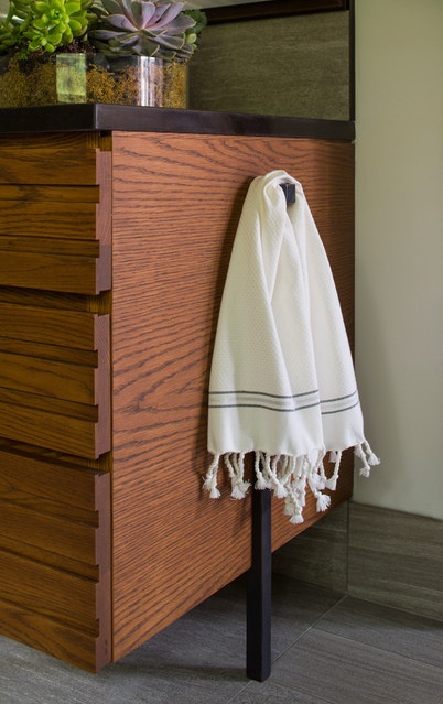
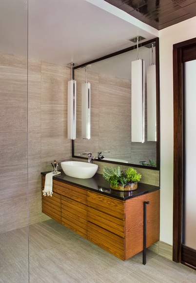
“We chose large mirrors because we wanted them to look as clean and as open as possible, like the window,” Rabaut says. “She is petite and he is quite tall; she says this is the first time she’s really been able to see all of herself in her bathroom mirror.” The designers framed the mirrors out in a bronze-colored metal that coordinates with a structural detail on the vanity that doubles as a towel hook.
Contractor: Keiffer Phillips - Patricia Brown Builders Inc.
Custom shelf and vanities: Eric Evans
More: A Designer Shares Her Master-Bathroom Wish List
Related Articles Recommended


