How to Design Garden Paths That Bring Your Landscape to Life
http://decor-ideas.org 10/07/2015 23:13 Decor Ideas
Paths, whether stretching from street to door or winding through gardens, have always intrigued me. Perhaps it’s because their lines lead the eye and there are so many great design and material options for them, yet they often are so unimaginatively designed. Paths can and should tell a story, elicit emotion, promote exploration and make a meaningful connection with land and architecture. How do yours measure up?
If you see your garden as a living being, as I do mine, begin to think of your pathways as its circulatory system. It may be time for a transfusion, one that will breathe new life into your landscape and bring cohesion to it.
Assess What You Have
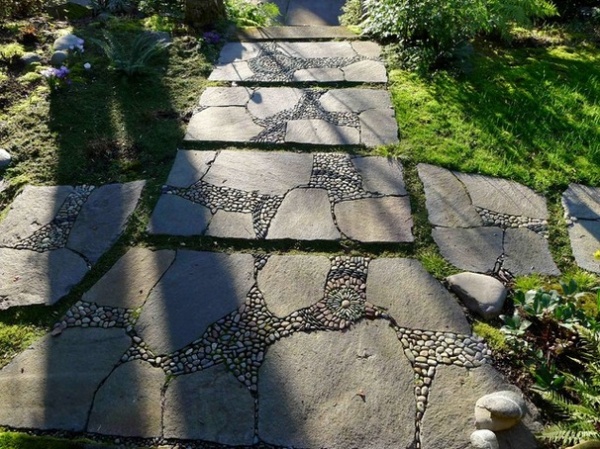
While i’s true that the function of paths is to safely move from Point A to Point B, who says the journey has to be boring, predictable or mundane? They key word here is journey. Think of a journey you’ve taken overseas or to the opposite coast, or think of a fictitious journey, perhaps the Banks children popping in and out of sidewalk chalk drawings in Mary Poppins. There’s a story attached to every journey. What story does your garden have to tell? Perhaps it’s about your family, your personality or your heritage. Now ask yourself how your path or walkway fits into that story.
The walkway shown here quickly begins to tell a story. The square lines of each section suggest order, the larger stones form an organic relationship with the land, and the mosaics speak of artistry and slightly subdued whimsy. It’s an interesting marriage, one that ignites the imagination. The lesson is this: Your story can begin to unfold with your choice of paths.
Consider Shape
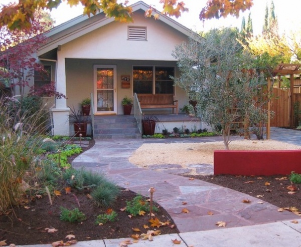
Shape is the manipulation of a line, and certain lines, I believe, speak universally to our minds and emotions. This is why it’s important to consider the shape of your path. Let’s look at some different shapes.
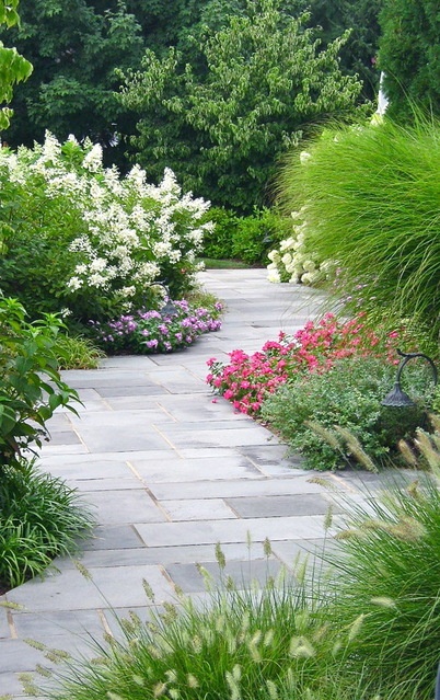
Serpentine. A serpentine line creates a feeling of tranquillity because it’s natural and organic. It pulls your eye forward to create curiosity about what’s just around the bend, which is intentionally out of sight. Consider this shape if you enjoy creating garden vignettes or have several pieces of garden art that aren’t meant to be viewed all at once.
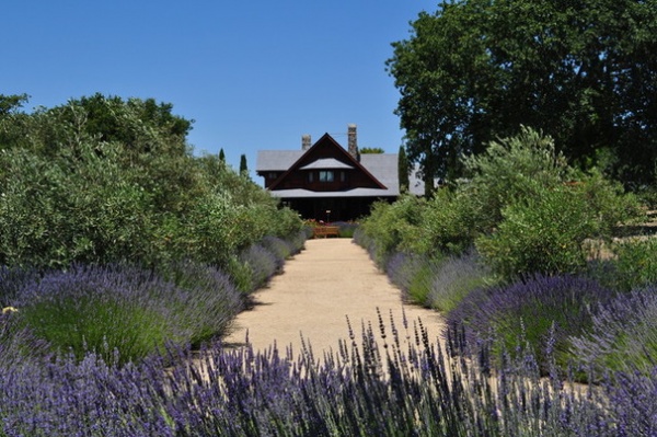
Straight. A straight line reads as much more utilitarian, directing visitors quickly, efficiently and safely from one place to another. Straight paths can be mundane, so what makes the one shown here different? First, the edges are softened by the lavender (Lavandula sp., zones 5 to 9; find your zone), as it has been allowed to spill over. Second, the decomposed granite substrate forms a natural and organic relationship with the land. Third, the path is wide enough for several people to walk side by side, allowing for the possibility of conversation.
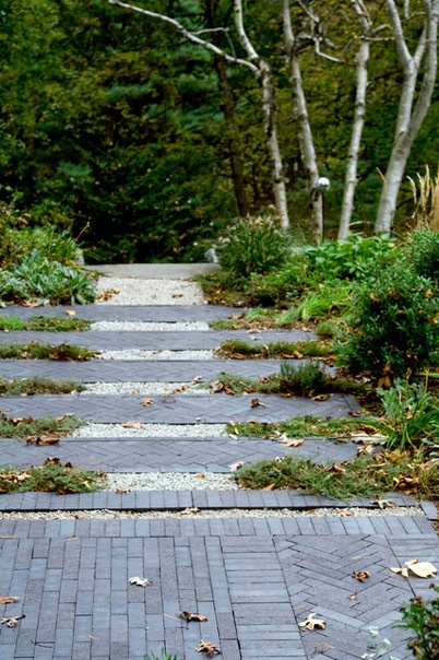
Here we see another straight path. What sets this one apart is the rhythmic placement of brick cross sections. The introduction of these rectangles does several things: It slows the visitor down by creating an imaginary barrier (the mind is forced to take a moment to process the arrangement); it creates a meditative vibe not unlike a labyrinth; and, because it extends outward into the planting beds, it forms a homogenous relationship with the garden.
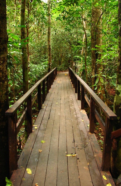
This photo shows a boardwalk, or raised pathway. Its straight line is certainly utilitarian, but because of its context, it allows the surrounding forest to tell the story as it stands as a silent witness. The elongated configuration of boards leads the eye forward and makes the space feel larger and longer, an important thing to remember with today’s ever-shrinking lot sizes.
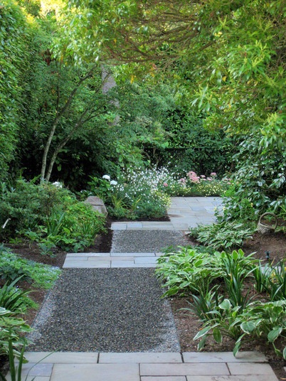
Zigzag. The zigzag pattern is historically seen in the yatsuhashi or, “eight bridges,” paths of Japan. The cultural theory was that evil spirits could not navigate 90-degree angles, so paths laid out in this manner provided safety. This shape lends a Zen, meditative feeling to a path. Additionally, it slows the visitor down, allowing him or her to enjoy the garden. Zigzag paths are also quite appropriate in contemporary spaces, and the lines can be simplified to make them appropriate choices for more traditional spaces as well.
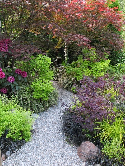
Consider Width
Traditionally, most residential paths, particularly walkways, are 4 feet wide, allowing two average-size adults to walk side by side through a space. However, this is a guide, not a rule. Begin by asking yourself what you want the path to do for you, functionally and philosophically.
A path that’s wider than average, perhaps 5 to 8 feet, allows groups of people to walk together and converse. It can also be used as additional entertaining space. Side garden paths, as shown here, can be much narrower, perhaps only 2 to 3 feet wide. The narrower width causes visitors to walk single file through the space and slows them down long enough to notice focal points or garden vignettes. The narrower path is also philosophical: We all experience life individually and our journey is, in reality, our own.
Consider Materials
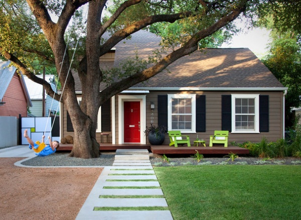
Concrete. Concrete has long been the most popular pathway material. It’s safe to navigate and easy to maintain. But it doesn’t have to be boring. Concrete can be tinted at the time of installation or easily stained at a later date. It can also be poured or cut into unexpected configurations, as shown here. The turf inserts provide interest and rhythm for visitors and passers-by. For safety, inserts should always be low or out of the traffic flow.
Guide: Pros and cons of cast-in-place concrete and precast concrete paving
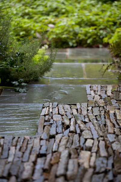
Stone pavers. Stone can bring a formal, informal or contemporary feel to a space, depending on its installation, shape, color and texture. Different types of stone can be combined, as shown here, for added textural interest. Stone is generally a more expensive choice, but it works well in most applications since it’s a natural material that makes a meaningful connection with the land.
Guide: Pros and cons of limestone, travertine, granite, slate and bluestone paving
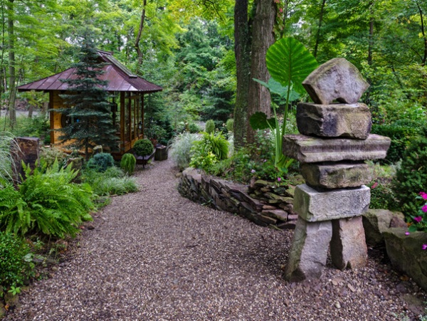
Gravel. People have mixed views on the functionality of gravel; I’m in the camp that loves it. While it may not work well in every situation — for example, on steep slopes or where wheelchair access is necessary — it’s a material that’s from the earth and therefore adds to a garden’s natural feel. It crunches when walked upon, adding another layer of interest to the garden experience.
Guide: Pros and cons of gravel paving
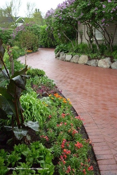
Brick. Brick is a traditional choice through much of the U.S. and Europe. Though it doesn’t make a natural connection with the land, it can ground a brick home into the landscape, proving its value as a hardscape material. It can be dry-laid in sand, mortared in place or used as a veneer over previously paved surfaces. When properly installed, brick is long-lasting.
Guide: Pros and cons of brick paving
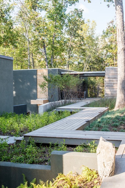
Wood. Lumber, either a dense wood like ipe or one that has been pressure-treated, is a good choice for boardwalks that don’t make direct contact with the soil. Lumber should generally be sealed, stained or painted; the last two options provide a plethora of design choices with regard to color. In this case, the path itself can suggest and manipulate the mood of the garden.
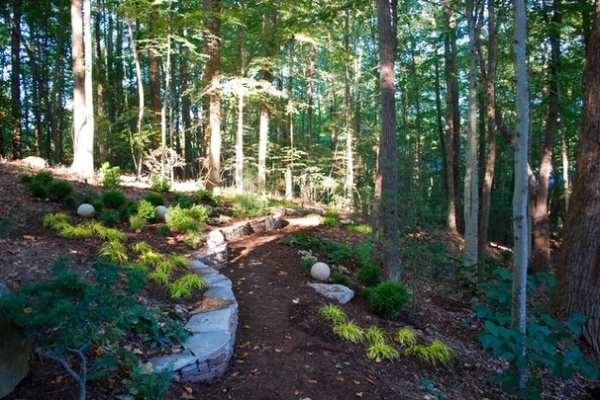
Mulch. There are few things as peaceful as walking on a mulched path through a woodland garden. Mulch is inexpensive, easily sourced and installed, and is available in a variety of types and hues. It may be contained within a framework of timber or metal edging, or, as seen here, spread freely to give the suggestion of a path without rigid formality. Generally, more finely textured mulch requires replenishing more regularly than does a larger grade of mulch.
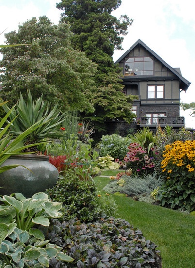
Grass. Few think of turf as being a material suited to paths, but this is probably its most environmentally friendly use. As seen here, turf can separate planting beds, blend in with the planting scheme and bring a different and useful texture to the garden.
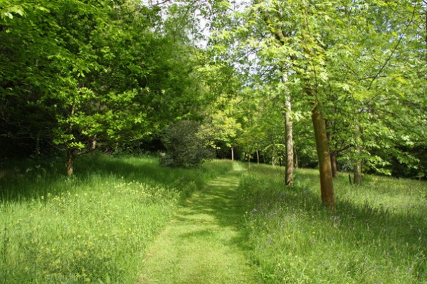
Impromptu paths can also be mowed through fields, conjuring up childhood feelings of exploration and delight. Who wouldn’t appreciate some of that?
How to Combine Path Materials
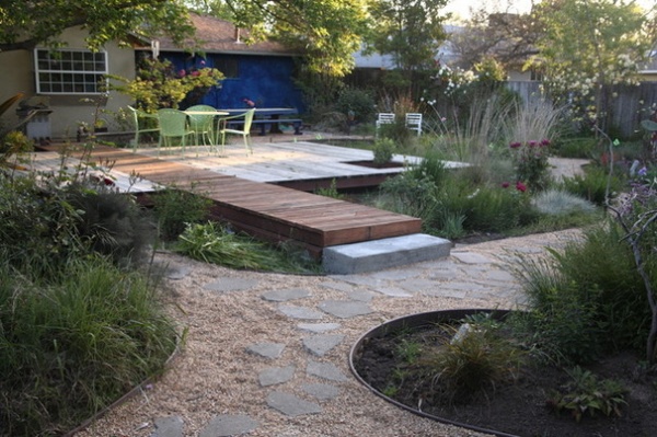
For added interest, or to create a connection with nearby architecture, various materials may be combined, as shown here. The key to accomplishing this successfully is to remember the four attributes of juxtaposition: size, shape, color and texture. If none of these are matched, a space looks confusing and disjointed. The best course of action is to form relationships between materials by matching one or two of these and varying the others.
In the example shown here, the gray flagstone’s texture and color relate to the concrete step. The gravel’s color relates to the section of stained boardwalk. The flagstone’s texture relates to the gravel, and the stained boardwalk’s shape and texture relate to the deck. As a result, this area reads as homogenous instead of disjointed and it’s full of interest.
More
What Kind of Gardener Are You? Find Your Archetype
More ways to get your landscape right
Related Articles Recommended


