What We Can Learn From the Minimalists
http://decor-ideas.org 10/06/2015 01:13 Decor Ideas
“Perfection is achieved, not when there’s nothing left to add, but when there’s nothing left to take away.” — Antoine de Saint-Exupéry
How often have you heard someone wish for “a simpler life”? I often find myself hankering for fewer commitments and less mess, muddle and mayhem. Maybe the first step in clearing life’s clutter is to apply the “subtraction” concept to decor. Instead of focusing on what to add to a room, why not consider removing items? Let’s talk about the benefits of a less-is-more decorating approach and how to bring it home.
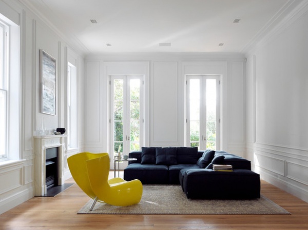
Simplicity draws attention. Simplicity can be visually exciting and fun to live with. Plus, beautiful things can look more beautiful in uncomplicated rooms. Frank Lloyd Wright put it succinctly: “Space is the breath of art.” Galleries use negative space to accent an exceptional piece by displaying it in an otherwise empty room. Apply this idea to shine a light on a sensational chair, rug, picture or other feature you want to show off.
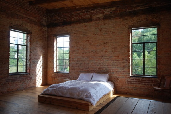
This bedroom is almost monastic and for many would be going a step too far — or would it? The mellow scene of aged bricks, beams and boards, peaceful rural views and sunlight through tall windows needs little embellishment (maybe some blinds and a reading light?).
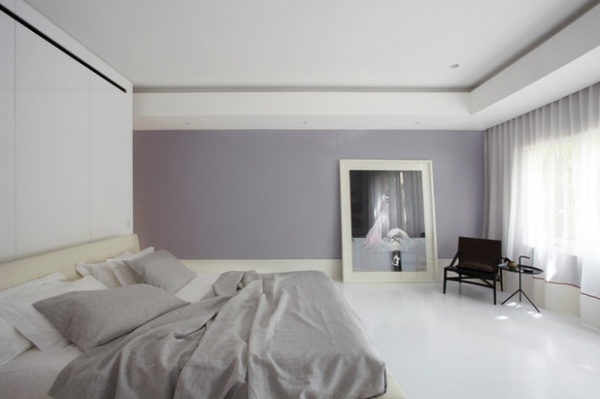
Simplicity is calming. You may think calm, uncluttered spaces are impossible if your home is a hive of activity. But serenity is within reach even in the midst of chaos. Make one spot yours to practice the art of less — no unnecessary furniture or visually stimulating artwork. See how entering it from the hurly-burly of the rest of the house instantly changes your mood from uptight to unruffled.
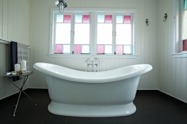
The bathroom can be a tiny corner of heaven when there’s less in it competing for attention. Spend a few minutes before bathtime putting away everything but fresh towels and a table or ledge to hold lotions and potions, and let your mind float to nice things while you soak or shower away the day.
Marlborough bathtub: Victoria + Albert Baths
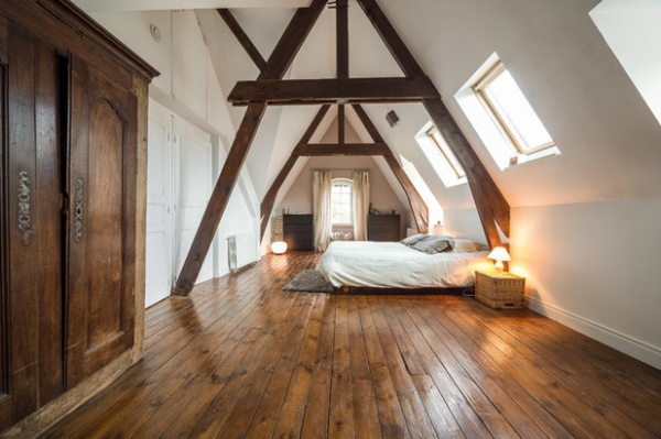
Simplicity inspires creativity. Removing the distractions of objects concentrates the mind wonderfully. Perhaps that’s why many masterpieces were penned or painted by impoverished artists and writers in spartan attics. Tap into your creative spark or come up with your next brilliant idea in spaces free of superfluous visual interference.
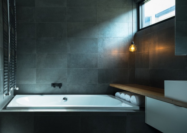
Simplicity reduces “designer anxiety.” Creating an attractive home is high on many lists and is an engrossing and important part of life. But when it begins to verge on an obsession, stress and discontent take over — is this color wrong; what if I move this; what if I add that? Learn to prune back decor to its essentials and then sit back and enjoy it — or better still, accept its idiosyncrasies.
Docks Nero tiles: De Fazio Tiles & Stone
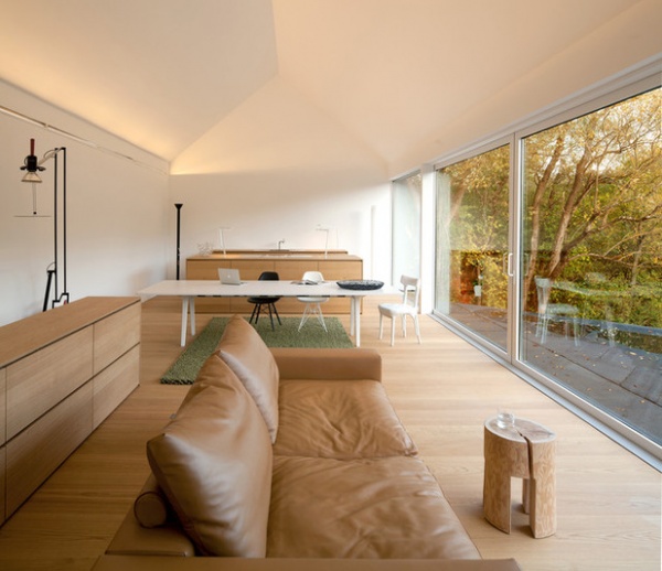
Simplicity is thrifty. A few quality pieces that you love to see and use may trump a house full of unremarkable and less durable items that need to be replaced more often.
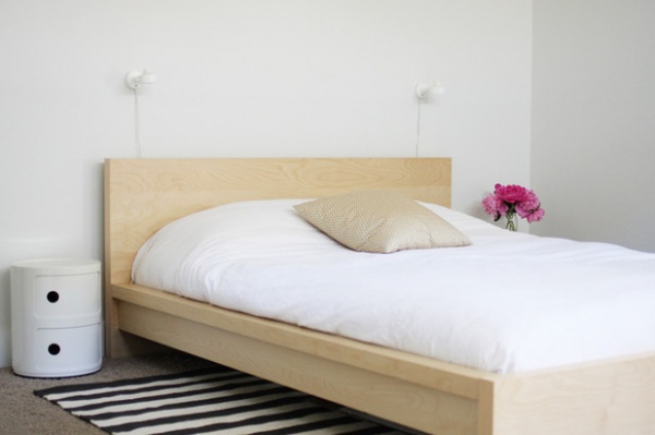
Simplicity is low-maintenance. Housework time is significantly reduced when there is less to clean. Clear the decks for more meaningful pursuits, family activities, reading, sleeping, exercising or hobbies. A room where a quick vacuum and wipe do the job has it all, over one where you have to move objects around and clean lots of high-maintenance surfaces.
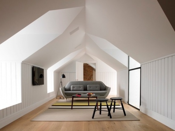
How to Get Started
Cull furniture. Is every piece of furniture in your space useful, comfortable and lovely to look at? Remove a “white elephant” object and see if you miss it. Often, so-called “occasional” chairs, small tables and cabinets serve no purpose other than to clutter a space. Be ruthless.
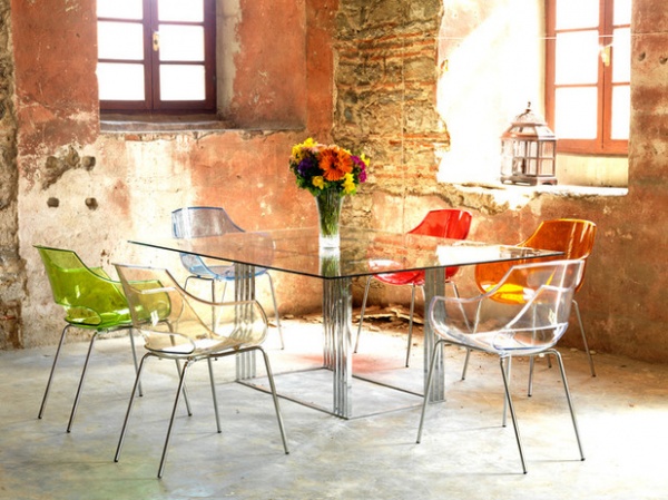
Now-you-see-it, now-you-don’t furniture is an effective way of cutting down visual elements. In this unusual room, transparent chairs and a table shift focus to the delightfully decrepit walls and floor. It demonstrates the design ploy of “eliminating the unnecessary so that the necessary may speak,” as artist Hans Hofmann suggests.
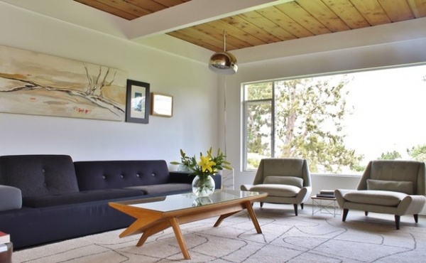
Reduce style confusion. Although it’s fun to mix styles and eras, it’s harder to nail. An easier strategy is to stay within one style camp. Midcentury furniture’s triumphant comeback owes much to its tactile unfussy profile, its easy functionality and how it fits hand-in-glove with contemporary design aesthetics.
Polder sofa: by Hella Jongerius, Space Furniture
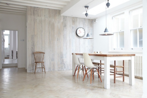
Simplify color. Colors have the power to calm or complicate your decor — and your life. Choosing a monochromatic palette is a great way of taking guesswork out of decorating and leaves options for future color injections. Textures are important in one-color interiors. This all-white room has plenty from whitewashed timber walls and painted parquet flooring.
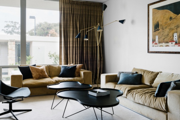
Confine key colors to just three. A couple of tones of the same color plus a contrast color against a barely there neutral coordinate this sophisticated and comfortable room.
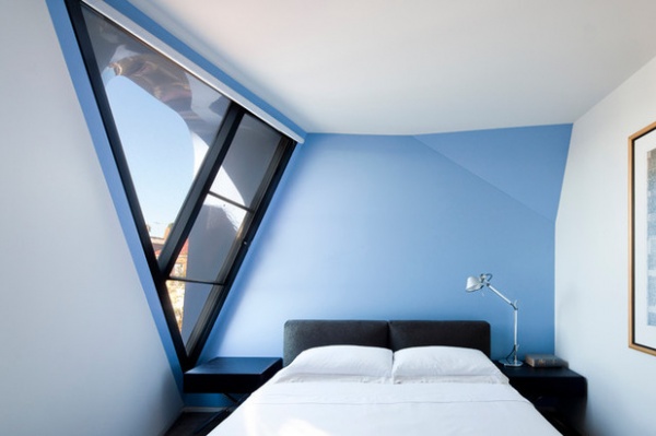
Simplicity doesn’t mean colorless — there’s nothing bland about a reduced color palette when blue-black and white bounce off a strong shade like this intense sky blue.
Wall paint: Prompt 252136 and Diplomatic 251668, Dulux
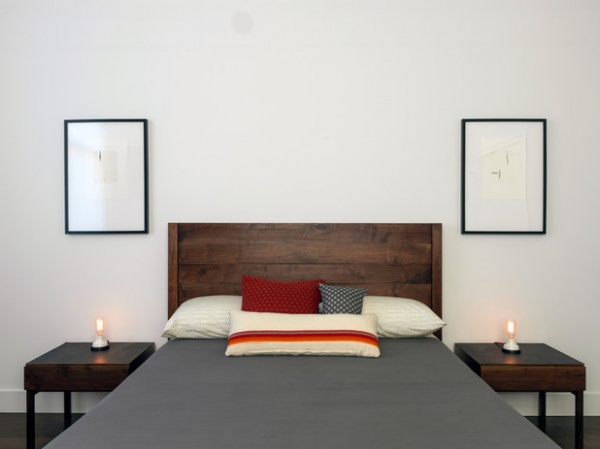
Do a balancing act. Balance is another device for visually simplifying a space. Our eyes enjoy symmetry, as it makes it easy for our brains to discern the visual flow of a space. Symmetry is subconsciously relaxing and undemanding.
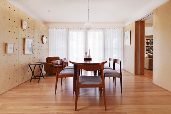
Go rugless. Try leaving a fabulous floor to speak for itself. Experiment with removing rugs and see the effect it has on opening up a space. And you won’t need to move them to vacuum!
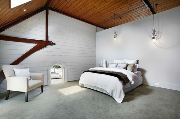
If your floor is nothing to write home about or you prefer carpet for warmth or acoustic reasons, stick to a luxurious, plain carpet and avoid the temptation to double dip by putting rugs on top.
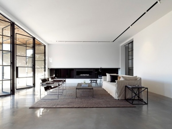
Be artless. I couldn’t live without art, but ask yourself what your artworks add to the room. Take some or all away and see whether it reduces the room or pulls something else into sharper focus, like a striking rug or look-at-me sofa. Serious art aficionados will balk at bare walls, but big, bold art or lots of small pictures can detract rather than add. These artless walls keep the focus low, on the functional section of the room: the furniture, fireplace, textured rug and polished floor.
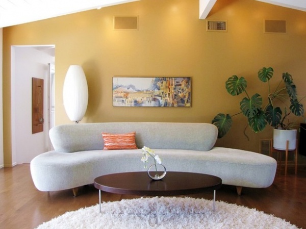
Take patterns out of the picture. A sofa like this deserves star billing. Patterned wallpaper behind it would be a design crime, as would upholstering it in a fabric with a complex pattern. In the long run, you may be glad you opted for a plain fabric for major furniture pieces. Save patterns for pillows or throws. Speaking of pillows, don’t overdo them — they often get tossed on the floor.
Wall paint: Butterscotch 251565, Dulux; George Nelson for Modernica Bubble Lotus Cigar lamp: Luke Furniture
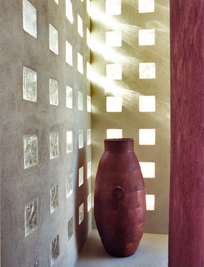
Think before you add. Many people can’t see a bowl, pot or basket without wanting to put things in it. I can’t think of anything to add to a beautiful antique pot such as this — it stands on its beauty just as it is. If you have a lovely vessel, give it room and don’t succumb to the temptation to fill it with an aspidistra or a bunch of bananas.
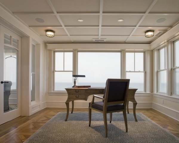
Let nature decorate for you. When assessing your decor, look to the best decorator of all — Mother Nature. Whether it’s of a garden, a cityscape or the ocean, a view may be the feature you want to emphasize. Draw attention to it by minimizing the busyness of rooms that look to it. If privacy is not an issue, go without window coverings and orient furniture toward that gorgeous outlook.
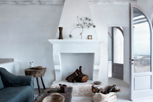
Embrace organic, natural elements for rustic, textural appeal. The integrity and lack of artifice of back-to-nature materials speak subtly to us of simpler times.
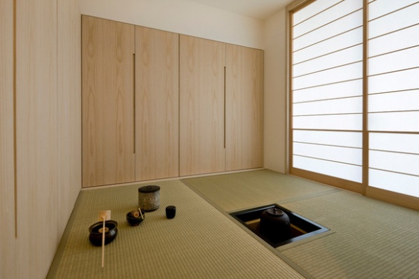
Take a tip from Japan. Japanese architecture and interiors are held up as shining expressions of the beauty of simplicity. We can forget that the primary purpose of a house is to be lived in, not merely to contain our possessions. A Japanese notion puts it sweetly: Enjoy the tea, not just the teacup. Read up on the elegance of the Japanese aesthetic and why it is becoming an influential design direction outside Japan.
More: A Few Words on the Power of Simplicity
Related Articles Recommended


