New This Week: 4 Surprising Backsplash and Countertop Combinations
http://decor-ideas.org 10/03/2015 03:13 Decor Ideas
When it comes to backsplash and countertop combinations, white subway tile and granite countertops are good standbys. But if you’re looking to make your kitchen stand out, consider some of the following material pairings. Here, the respective kitchen designers share why they chose the materials and how they fit with the larger scheme of the overall space.
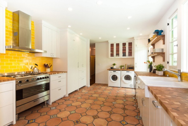
1. Yellow Ceramic Tile and Butcher Block
Designer: Neil Donnelly of Pobal Construction Group
Location: Santa Monica, California
Size: 260 square feet (24.1 square meters)
Year built: 1930s
Homeowners’ request: A new and vibrant kitchen for themselves and their two young children.
Backsplash material: An imported traditional Mexican-style ceramic tile with antique-white grout. “The property is Spanish-inspired from the 1930s, and we wanted to try and maintain that theme and add a backsplash tile that had a really dramatic color to give that wow, fun factor,” designer and builder Neil Donnelly says.
Countertop material: End-grain quarter-sawn hickory and pecan butcher block. “The family loves to cook — what better way than by doing this on such a beautiful countertop?” Donnelly says. “With the end grain of hickory and pecan woods, there are so many colors that come through, and we knew this would tie the kitchen together in abundance.”
Plan of attack: The existing kitchen was just too small for the growing family. They eliminated a dividing wall and closet to gain more space. Then they worked with Donnelly on choosing everything from the new layout to custom cabinets, finishes and appliances, all the way down to which type of water filtration system to use and where to put a USB charging port. “Small details, but very important,” Donnelly says.
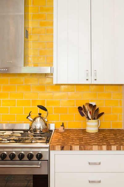
Why the design works: The new space has nearly doubled the size of the previous layout and allows for an island in the future.
“Uh-oh” moment: “The family did without a usable kitchen for the good part of six weeks, which is trying for anybody, never mind having two children as well,” Donnelly says. “As a builder and contractor, you have to hold all your crew responsible in making sure there is a quick turnaround to get the family back in there, but at no point is the quality or integrity of the project going to be devalued.”
Take-away: “In today’s world there is a lot of ‘trying to keep up with the Joneses next door’ sort of mentality, with the ultramodern and clean-line design features,” Donnelly says. “This family and the project was a breath of fresh air. They knew the kitchen style and function they wanted, and they stuck to their own and the house’s roots.”
The nitty-gritty: Tile: imported from Mexico, Westside Tile & Stone Inc.; countertop: California Butcher Block; sink: Ikea; cabinet hardware: Snyder Diamond
Team involved: Erika Bierman Photography
See more of this kitchen
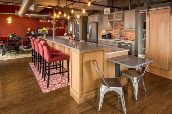
2. Brick and ‘Concrete’
Designer: Tyson Leyendecker of Silent Rivers Design + Build
Location: Des Moines, Iowa
Size: 350 square feet (32.5 square meters)
Homeowner’s request: Incorporate more traditional yet contemporary finishes while keeping the raw, exposed look of the existing renovated warehouse space.
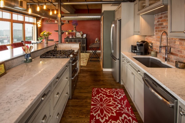
Backsplash material: Thin brick created specifically for the backsplash. A sealer was applied prior to installing the mortar.
Countertop material: Silestone quartz chosen for its resemblance to concrete.
Plan of attack: Close the space between the existing back wall of the kitchen and the top of the ceiling with translucent ribbed polycarbonate sheeting to allow natural light to pass through to the guest room while reducing sound. And create a new doorway into the room with a barn door for privacy.
On this end of the island, a custom cafe table protrudes on steel brackets. Custom gas-pipe light fixtures with LED filament bulbs resemble traditional Edison-style bulbs.
Who uses it: This home is for a soon-to-be empty nester whose last of three children is almost off to college. She wanted to downsize from her large suburban house to a smaller urban loft.
The layout stayed the same, but a new gas range was added to the island, requiring the installation of a gas line hidden in a steel column at the far end, to which custom steel shelves were attached for displaying cups and dishes and for providing visual separation between the dining and kitchen areas.
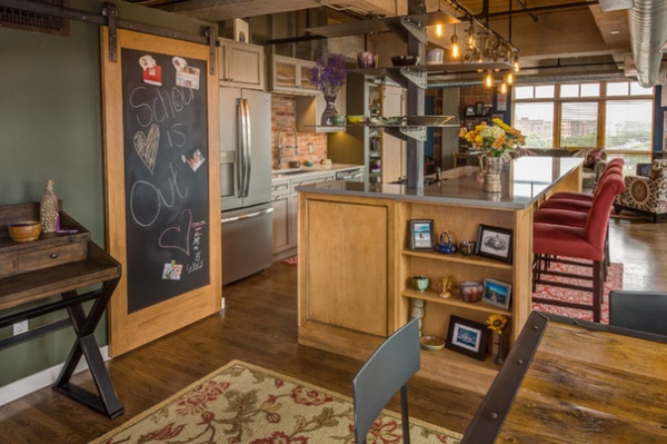
A collapsible ironing board hides in a sliding cabinet door on this end of the island.
Nitty-gritty: Backsplash: American-clay thin brick in Bell Tower color, Hebron Brick Co. via United Brick & Tile; countertop: Silestone in Grey Expo and Helix-Nebula
Team involved: Jay Reichenbacher (project coordinator); Jason Anderson (lead artisan); Tom Bloxham and Alex Schlepphorst (cabinetry and finishing); Cox Design & Metal Fabrication (metalwork); United Brick & Tile; Chris Boeke (photographer)
See more of this kitchen
3. Green Back-Painted Glass and Caesarstone
Designer: Ken Bridges of Blueline Architects
Location: Vail, Colorado
Size: About 18 by 11 feet (5.4 by 3.3 meters)
Year built: 2013
Homeowners’ request: Plenty of storage with few, if any, overhead cabinets; a spacious island with additional storage and counter space; a kitchen sink with a view; a pantry; and top-of-the-line appliances.
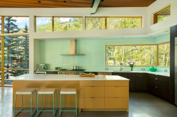
Backsplash material: Plate glass back-painted in a sea glass, seafoam green color that goes from counter to ceiling with minimal grout lines.
Countertop material: Two-centimeter slab Caesarstone in Organic White with slight gray mottling.
The island forms an asymmetrical quadrilateral shape that’s meant to draw the eye into the adjacent living space. The countertop widens slightly into an overhang that can seat three people.
Plan of attack: A desire to keep the kitchen open to the dining and living areas pushed the functions of the kitchen to the two exterior walls. Bumping out the exterior walls of the house created a place for the cabinets to live, helping to define the kitchen as a separate space within the larger living space.
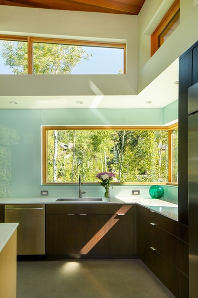
The soffit and clerestory windows bring down the scale of the room over the work areas for better task lighting, while filling the room with views and natural light. Making the walls “white” provided a nice backdrop for the darker cabinets, allows natural light to bounce around the space, and tied the kitchen in with the rest of the house.
Who uses it: Heather and Eric Schultz, owners of Holy Toledo
Designer secret: “Instead of the more typical walk-in pantry, which requires additional square footage for circulation, I use tall cabinets with pullout trays as the pantry,” architect Ken Bridges says.
“Uh-oh” moment: “Initially, we did a true butt-glazed corner window,” Bridges says. “This is a great detail aesthetically but functions terribly in a cold mountain climate. In a humid environment, like the kitchen or bathroom, the windows constantly had condensation on the inside of the glass.
“One way to fix this would have been to ‘wash’ the inside of the glass with warm air, but this would have required cutting open the base cabinets, so we decided to swap out the single-pane glass for double-pane insulated glass units and ended up with a piece of wood and metal trim in the corner. Not quite the same structure-free aesthetic, but still a minimal visual obstruction.”
The nitty-gritty: Cabinets: melamine boxes with Echo Wood veneer finish, Davis Mill & Cabinets via Mountain Craft Cabinetry; flooring: polished natural concrete (800-grit); countertops: Caesarstone in Organic White; backsplash: back-painted glass in sea glass or seafoam green color; faucet: Brizo Solna with SmartTouch Technology; range: 48-inch dual-fuel, Wolf; range hood: 48-inch Streamline, Futuro Futuro; refrigerator: 42-inch built-in side-by-side, Sub-Zero; lighting: combination of 3- and 4-inch recessed can lights; windows: Sierra Pacific; bar stools: Room & Board
Team involved: KRM Consultants (structural engineer); Marcin Engineering (civil engineer); Golf Resort Homes (contractor); James Florio Photography
See more of this home
4. Red Back-Painted Glass and Caesarstone
Designers: Gloria Carlson and Lisa Sten of Harrell Remodeling Inc.
Location: Los Altos Hills, California
Size: About 25 feet by 13 feet (7.6 by 3.9 meters)
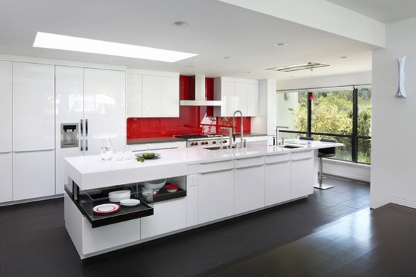
Homeowners’ request: Create an ubermodern aesthetic using high-gloss cabinets with lots of interior storage features, new integrated appliances, and popping red and high-contrast colors, all while providing an overall dramatic wow factor.
Backsplash material: Red back-painted glass. This material was chosen for its easy maintenance, one solid surface, customizable bright color and clean, modern aesthetic.
Countertop material: Caesarstone in Concrete color for the perimeter and Silestone in White Zeus color for the rest.
Plan of attack: Open up the disconnected kitchen to the family room and replace drab 1980s finishes that didn’t complement the contemporary, brightly colored artwork found in the home. Implement a red, white and gray color scheme.
Who uses it: An empty-nest couple who entertain family and friends frequently. They cook together and in groups.
“Uh-oh” moment: “We all loved the look of the glass-sided drawers, but supporting the countertops was a challenge,” designer Lisa Sten says.
Take-away: “We thought glossy-finish cabinets could damage easily, but with high-quality materials, the durability is not a factor,” Sten says.
The nitty-gritty: Cabinets: Laminate in Polar White, Poggenpohl; perimeter countertops: Caesarstone in Concrete; island countertop: Silestone in White Zeus; floor tile: porcelain, 12 by 24 inches, Imola Koshi; backsplash: custom back-painted glass slab, SodaGlass; refrigerator, ovens and dishwasher: Miele; range: 48-inch Wolf; range hood: Best, Cirrus; island grill: Cook-N-Dine Teppanyaki; sink: Peak, Franke; faucet: Dornbracht
Team involved: Scott Marshall (site manager); Tom Dack (structural engineer); I-Ching Ueng of Poggenpohl (cabinets); HeavyLux (glass backsplash fabricator); Fox Marble (countertop fabricator); Bernard Andre (photographer)
See more of this kitchen
Related Articles Recommended


