Room of the Day: Wall Flowers Dance in a Girl’s Bedroom
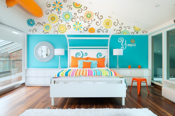
Designer Shari Mullen’s client was a distinguished pro football player soon to retire, a single father of a 13-year-old girl and 9-year-old boy, who was intent on building his future life in Lexington, Kentucky. The house he purchased had good bones, Mullen says, for a complete makeover. When it came to designing the daughter’s bedroom, “I knew her father wanted the room to be special for her, a new chapter in their lives where he would be home and available a lot more,” she says. Using her intuition as well as some input from the daughter, Mullen, who started her career as a decorative artist before getting her master’s degree in architecture, hand-painted a floral pattern on the walls, creating a whimsical and personal multipurpose space that delighted both dad and daughter.
Photos by Brian Wilson
Bedroom at a Glance
Who lives here: A teen girl
Location: Lexington, Kentucky
Size: 400 square feet (37 square meters)
Architect: Shari Mullen of Pillar 3 Design and Construction
Creating a room for a 13-year-old — particularly one in absentia — can be tricky. “We knew she wanted aqua, something bright and fun, and her name on the wall. That’s where we started,” Mullen says. “We went back and forth with sketches and watercolor renderings and let her have input that way. It was a bit of an evolution.”
Design sometimes takes its cue from the unexpected. In this case, Mullen says she “stumbled across a fabric swatch” they liked for a colorful floral mural. With her background in decorative arts and her artist daughter-in-law in to assist, Mullen used the swatch as inspiration to hand-paint a lively floral mural that rises into the pitch of the ceiling. The mural set the color palette for the room as a whole — mainly aqua, orange, yellow and pink, with white as the accent. It established the bold, animated design theme as well.
“She liked patterns, so this seemed like a bright, fun way to achieve that,” Mullen says. “It makes the whole room come to life, and it’s special, just for her.”
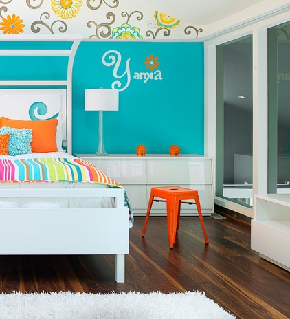
Considering the bold strokes of color — the aqua wall, the bright orange exposed ductwork — plus the busy floral mural, Mullen chose cool white as her foundation. White furnishings provide the perfect foil, allowing the patterns and hits of color to take center stage. The white bed frame provides a backdrop to the colorful striped comforter and bright pillows. It is flanked by matching glossy white, low side dressers whose horizontal lines are the visual base for the color and pattern above. Mullen continued the look with matching white lamps, a mirror she painted white, and a white media cabinet and bookshelf on the adjacent wall. Anchoring it all is beautifully variegated Kentucky walnut flooring, which adds warmth and depth to the palette.
The room, which opens to indoor corridors and an exterior balcony, can be something of a fishbowl, with two sides made of glass panels and glass doors. “The challenge of this project was the glass itself, and finding a way to provide some privacy,” Mullen says. Since these photos were taken, she has installed pale gray opaque sliding curtain panels that telescope into themselves at either end of the walls.
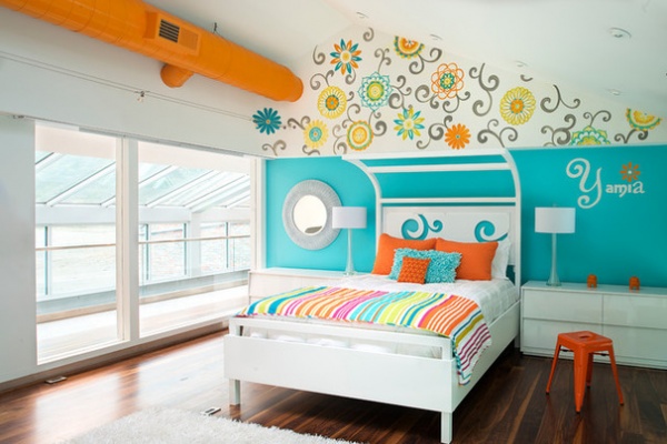
Mullen wanted the bed, with its partial canopy rigging, “to be a real centerpiece of the room, and complement and continue the character we started on the wall.” The daughter had wanted a canopy bed, “but we didn’t want to put a traditional canopy bed in this room. I didn’t want posts at the end of the bed. I knew I wanted it to be open.”
Mullen solved the issue by designing a steel frame that gracefully curves back on itself, giving the suggestion of a canopy without its visual clutter. The headboard, also designed by Mullen, lights up, providing a surprising and fanciful touch. It may look flat, but it is actually a light box fashioned from a white acrylic panel and an aqua painted plywood back, with a color-changing LED tape light installed along its interior perimeter. The curvaceous tendril cutouts in the acrylic panel, a design borrowed from the floral mural, were incised with a CNC router. “The whole thing glows,” Mullen says. “I think it really works.”
Bed: designed by Shari Mullen and fabricated by Garrett Stovall, GDS Metal Worx; matching glossy white dressers and media cabinet: CB2; mirror, stool and hippo bookends: HomeGoods; comforter: Eddie Bauer; paint by Sherwin-Williams: Extra White SW 7006 (walls); Carnival SW 6892 (ductwork); Mariner SW 6766 (aqua wall)
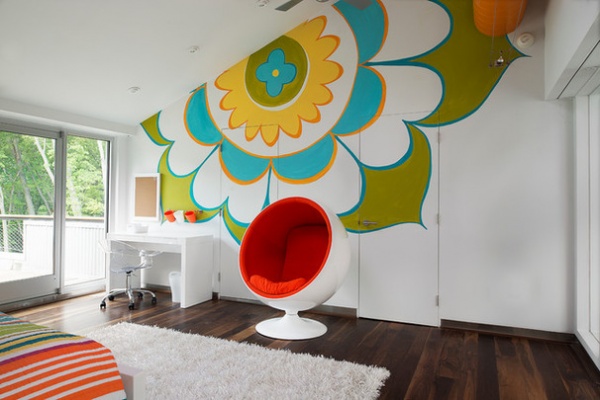
The desk area opposite the bed is a graphic showstopper. Mullin chose to take one flower pattern from the mural and “blow it up” across the entire wall, including the bathroom and closet doors. “Yeah, my artist and I were working together late one evening and just experimenting, and it worked,” she says.
“I think the scaling up was almost as though one of those motifs had just jumped off the wall to the other wall,” she adds. The brilliant orange Ball chair, which sits between the bathroom and closet doors, serves as focal-point punctuation.
Donald desk: Eurostyle; wall organizer: Ikea; Ball chair: Lexmod
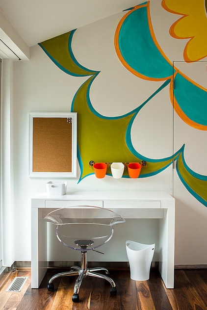
“It was definitely a consideration to make it more a teenage room that she can enjoy up until at least her college years,” Mullen says. The sophistication of the graphics and the strong yet simple color scheme create a certain timeless quality that ensures design longevity.
For anyone looking to mix strong patterns, Mullen has some advice. First, “if you keep the palette cohesive, that will help a lot,” she says. And next, “give the eye places to rest.” In this room, the wide swath of aqua wall behind the bed is a critical calm counterpoint to the lively floral mural above it. On the desk wall, with its single blown-up flower, “the white space within the flower is crucial,” Mullen says. “It’s like white space on a page — it gives your eye a place to rest.”
More: 5 Teen and Tween Girls’ Rooms With Fresh-Faced Style


