Houzz Tour: Manhattan Penthouse Is High on Style
Manhattan architect Donald Billinkoff knew his clients well: Some years earlier, he had designed a modern loft for the couple in SoHo. That was before the birth of their son. “They decided that space wasn’t optimal — no parks in the area, noisy,” he says. “So they sold that loft and bought this apartment before it was out of the ground.” The new glass-and-steel, two-story penthouse, perched on the edge of the West Side’s fashionable High Line park near the Meatpacking District and the new Whitney Museum, came completely finished. That was just the beginning for Billinkoff. “There wasn’t a significant learning curve to understand what they wanted,” he says. “They really like simple, minimal detailing, and they have a strong interest in midcentury design. The vocabulary we used was not too dissimilar to the vocabulary we used in the loft. The mission for them was contemporary, clean lines.”
Houzz at a Glance
Who lives here: A young couple with a son
Location: New York City
Size: 4,500 square feet (418 square meters); three bedrooms, six bathrooms
Architect: Donald Billinkoff
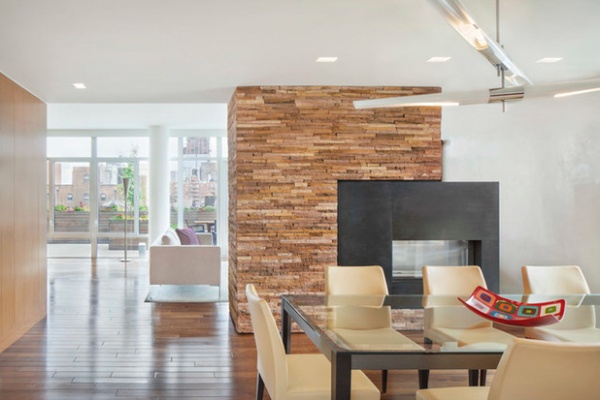
“I personally really like to identify a palette of materials and use them throughout the entire project,” architect Donald Billinkoff says. In this home, that includes Brazilian walnut for the flooring and rift-cut teak for all the cabinetry. Blackened steel appears in the fireplace surround, the staircase and even some furniture pieces.
“The apartment was completely finished, so we made some effort to use some of the existing features of it,” Billinkoff says. “But, in fact, as we continued to work on the design, we abandoned the kitchen, the bathrooms, the finishes, and we reshaped the fireplace.”
The dramatic see-through gas fireplace that dominates the dining and living rooms mixes random-length stone tile and blackened steel. Everything about the mass is offset — surround to column, fireplace opening to surround. The asymmetry is a dynamic creative stroke driven by necessity. As Billinkoff notes, the design “was the result of some existing flue and plumbing pipes running through that column. We had to create a way to make the whole thing work.”
The fireplace is also not centered on the dining table, a fact that doesn’t bother Billinkoff or his clients in the least. “It wasn’t a strong interest on our end to make it central,” he says. “Gas fireplaces are a little atmospheric, but they don’t have the drama of a wood-burning fireplace. You don’t need to make them as big a deal as a wood-burning fireplace, which always wants to be central.”
Dining table, chairs: Poltrona Frau; chandelier: David Weeks; Vegas Rock thin-split ashlar fireplace stone: Stone Source
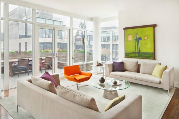
“We essentially had this notion that the walls would be white, and become background to whatever else was on in in the apartment,” Billinkoff says. The neutral palette of the living room is a prime example of this design directive.
The neutral couches and rug are enlivened by the pop of the orange chair and the lime green artwork, part of the homeowners’ art collection that made the trip from their previous home. The lively west Chelsea scene visible through the surrounding glass walls further animates the space. Double doors provide access to the terrace.
Charles sofas: B&B Italia; orange chair: B&B Italia; coffee table: Warren Platner for Knoll; wall paint throughout: Benjamin Moore OC-57 White Heron
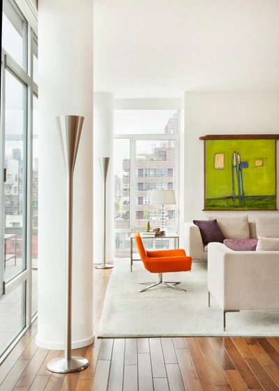
The public spaces, including the living and dining rooms, kitchen, breakfast area, playroom and family room, are on the first floor, while the three bedrooms and a large study are on the second. The apartment’s furnishings, some of which were purchased for the couple’s previous home, are a collaborative effort between Billinkoff Architecture and the homeowners.
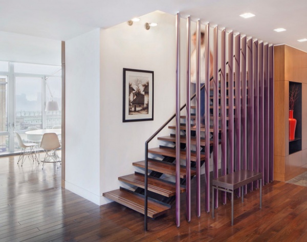
“The heart of the apartment,” Billinkoff says, is an open staircase of blackened steel not original to the apartment. Functioning as a type of kinetic sculpture on its own, the staircase is set behind a series of angle-set, wooden, wing-shaped fins painted silver on one side and eggplant on the other. The vertical fins both reveal and conceal the stairs, depending on the angle from which they’re viewed, and the color shifts as you walk past.
“It was the first time we had done this design,” Billinkoff says. “We were looking for a strategy to screen the stair. We didn’t want it completely open, but we didn’t want to obscure it completely, either.”
The staircase design was “fairly difficult technically,” Billinkoff says. Each vertical fin is set at about a 60-degree angle and is attached separately to the floor and ceiling. “They are perfectly vertical, with a perfectly straight space between them, like louvers,” he says.
The entry features a blackened-steel display niche inserted into the teak entry paneling. It houses a brilliant red ceramic vase purchased by Billinkoff. “We were looking for something over-scaled,” he says. “There was a very strong red wall in the original loft which they loved and we loved as well. We decided to get something red as a sort of memory of that space.”
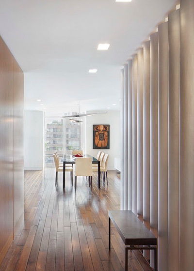
Looking from the entry to the dining room beyond, the silver side of the staircase fins appear to be an undulating solid wall. “As you walk past it, you begin to experience the shape of the fins and the space between them,” Billinkoff says. “As you walk past them, you start to see the eggplant.” The teak cabinetry wall in the entry conceals a coat closet behind a press-open flush-mounted door.
Bench: Donald Billinkoff design, fabricated by Roverhead Metal Works
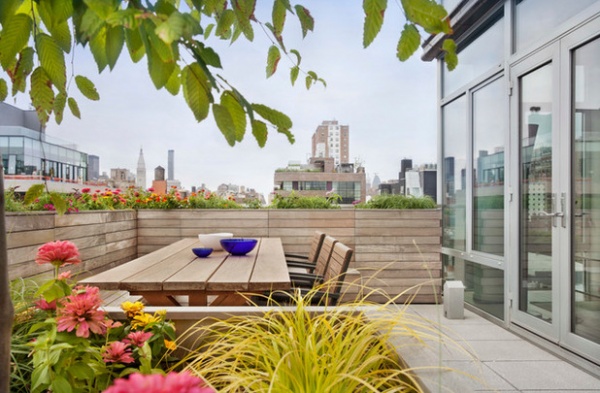
One of the penthouse’s pluses is its 1,000-square-foot (93-square-meter), north-facing terrace. “This apartment was all about using the outdoor space,” Billinkoff says. “They do sit outside a lot; they love it.” There is easy access from the living room to the custom 10-foot-long (0.9-meter-long) outdoor dining table, bench and chairs, made of weather-resistant ipe wood. The terrace has a wraparound glass-and-steel railing, but Billinkoff set a long course of ipe wood planter boxes inside that. At 42 inches tall, the planters not only create a fetching flowering perimeter, but provide some needed privacy from High Line strollers.
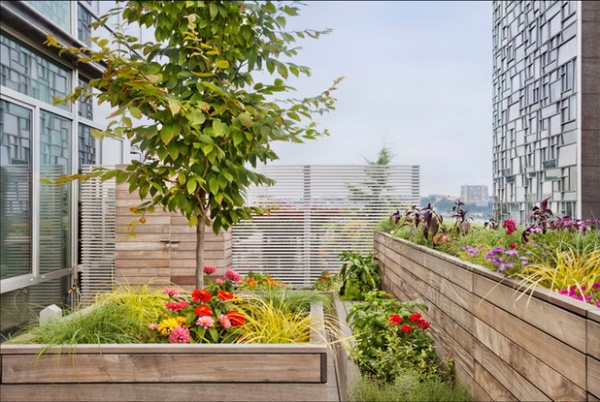
Billinkoff terraced the space, using three elevations of ipe wood planter courses to add visual interest and texture to the otherwise flat surface. At the western end, he set a translucent screen “for some privacy” where the terrace meets the neighbors’ property. “We wanted to have a little translucency to see the [Hudson] river, and to see New Jersey beyond,” he says.
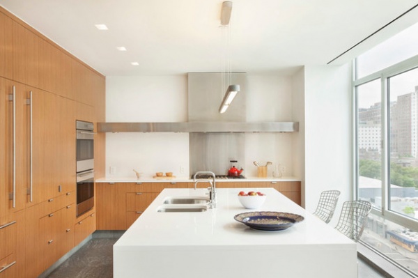
The glass-walled, 350-square-foot (33-square-meter) kitchen comes complete with a view down onto the High Line. “We wanted to keep it very neutral, very clean, extremely functional and very light,” Billinkoff says.
As in the rest of the apartment, the cabinetry is elegant teak. Not all the work surfaces are exposed. Between the refrigerator and the wall ovens, for example, a pair of doors pull back to reveal a counter equipped with coffeemaker and toaster oven. Behind a second vertical bar in the wall is a pullout pantry.
The focal point is the beautifully executed cooktop wall. The backsplash is stainless steel, as is the extended horizontal line of the hidden hood, which also houses lighting and runs the entire length of the counter.
The 10-foot-long island, clad in white quartz, is a sizable presence and the main work surface, but its pale profile allows the city view to dominate the scene. “Granites have been used so many times,” Billinkoff says. “The quartz gives you an opportunity to do something a little different.” Pots, pans and dishes are all in undercounter drawers.
Quartz island: Caesarstone No. 1141; Bertoia counter stools: Knoll; cooktop, wall ovens: Wolf; hood: Donald Billinkoff design, fabricated by Roverhead Metal Works; refrigerator: Subzero; sink: Franke; faucet: Dornbracht; dishwasher: Miele; Talo Suspension light fixture: Artemide
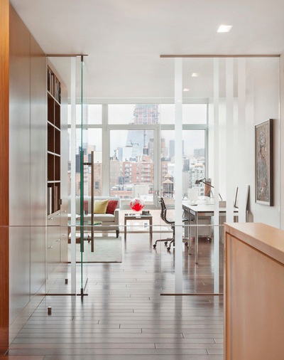
The stairs lead to the second-floor hallway, which leads to an airy study that overlooks the terrace. The area, originally a bedroom with a conventional door and solid wall, was replaced with a glass wall. “We really wanted to bring in natural light to the center hall of the apartment,” Billinkoff says. “And then we used teak cabinetry to visually connect it to what was going on downstairs.” The cabinets, which feature open and closed shelving, turn the corner from the hall to the study, providing ample storage and room for a built-in television. A pair of desks at opposite ends of the room make it a study for two.
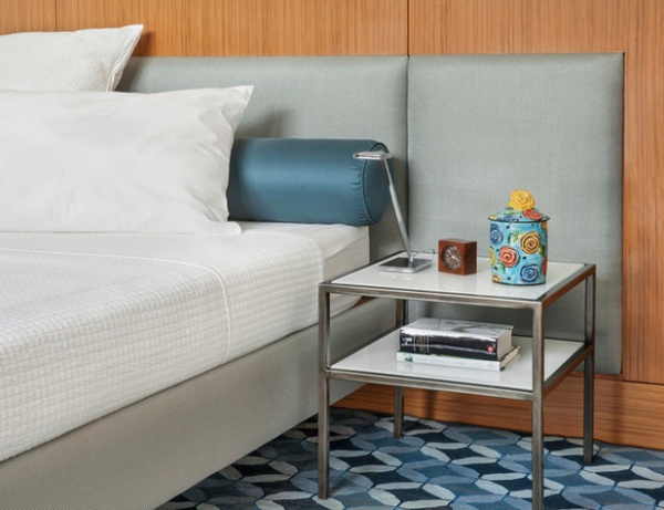
Billinkoff’s material choices continue into the master bedroom, which also overlooks the terrace. The upholstered headboard is set into teak paneling that cloaks the walls. The custom blackened-steel-and-white-glass night table was designed by Billinkoff.
Bed, side table: Donald Billinkoff design
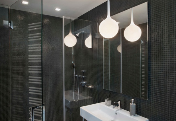
The master bath is mainly white, but this bathroom off the study — “essentially his bathroom” — is sheathed in black mosaic tile to “give it a masculine feel,” Billinkoff says. It includes a frameless, walk-in glass shower.
Mosaic tile: Trend glass tile, ¾-inch mosaic No. 155; sink, toilet: Duravit; faucet, shower set: Dornbracht; mirror: Robern; Castore pendant light fixture: Artemide
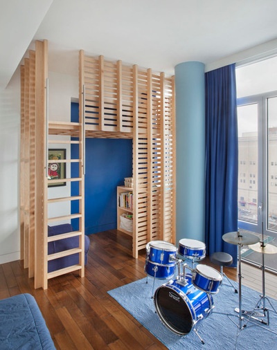
A little touch of SoHo: The son’s bedroom comes with its own loft, a latticed two-story play space. “I had designed something similar to that play loft for my kids,” Billinkoff says. “This is a more refined version of the original.” Unlike the other rooms, in which the windows are bare, custom blackout curtains allow for shutting out the busy world.
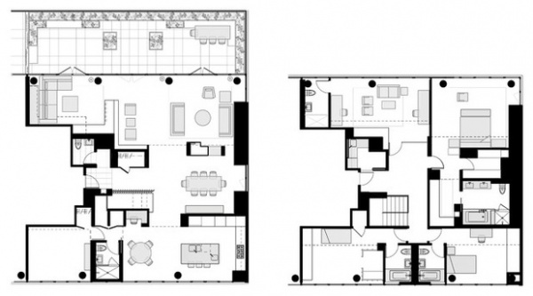
The floor plan shows the layout of the first floor, at left with the terrace. It includes an entry hall, dining room, living room, family room and playroom, kitchen, powder room and full bath. The second story, at right, has three bedrooms, master bath, three other bathrooms, study and laundry.
Browse more homes by style:
Apartments | Barn Homes | Colorful Homes | Contemporary Homes | Eclectic Homes | Farmhouses | Floating Homes | Guesthouses | Lofts | Midcentury Homes | Modern Homes | Ranch Homes | Small Homes | Townhouses | Traditional Homes | Transitional Homes | Vacation Homes


