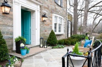
Exterior Color of the Week: Tasteful Taupe
http://decor-ideas.org 09/29/2015 03:03 Decor Ideas
Taupe derives its name from the French term for the burrowing mammal we call a mole. Despite this reference to the humble critter, taupe is a solid color choice for any style of home in any climate or geographical location. It can, however, be a tricky color to get right, because of the warm or cool undertones taupe hues tend to exhibit. They can easily veer pinkish and mauve-like, or they can get dingy-looking with heavy yellow or green undertones. Read on for tips on picking out the best shade for your home’s exterior, and see seven stunning examples of taupe-clad homes.
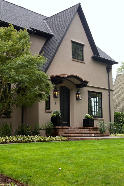
The best way to evaluate the undertones of a particular hue is to gather various paint color swatches and lay them side by side. When you view them this way, it’s much easier to pick up on the subtle undertones the colors exhibit. Some taupe paint colors will appear warmer than others, with slight red, orange or yellow tones, and others cooler, showing green or blue undertones. I prefer neutral taupes — shades that don’t veer too far to the warm or cool end of the spectrum.
Once you settle on a taupe you like, paint a large sample on a spare piece of drywall, plywood or white poster board. If you use plywood, be sure to prime it white first so that the color of the board doesn’t throw off the color of the paint. Now you can move this sample around to different areas of the exterior of your house, at different times of day, to evaluate how the color changes in the varying light conditions.
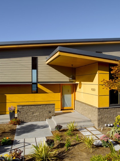
While the previous image showcases a traditional home, you can see here that taupe also works well on a more contemporary-style home. If your home has architectural charm or is constructed of high-quality materials, let the form and materials stand out by using color in a supporting role. Here the medium taupe siding color picks up on the stone details on the home, and also doesn’t fight with the wood panels.
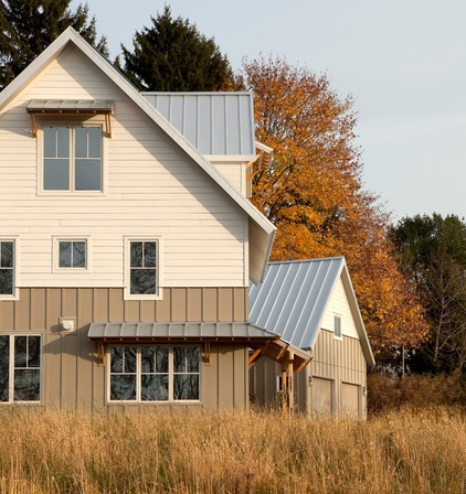
Two-toned exterior color schemes are surging in popularity, which unfortunately means that if you are considering such a scheme, you have to stress about picking two siding colors rather than just one. But taupe is a compatible color partner for such a scheme, because it contrasts light neutral hues in a nonjarring way. Or it can offer a visual break from a more vibrant pairing.
When working with a dual color scheme, put the darker color on the bottom of the house to make the house appear larger and more substantial. If you want to downplay the stature of a home on its lot, then put the darker hue at the top.
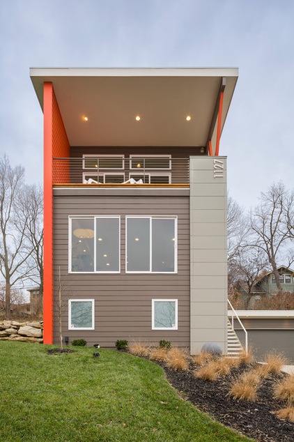
Here’s an example of how taupe makes a terrific background color for a bigger, bolder hue — in this case, bright red-orange. Don’t be timid and go with too light a shade here, because exterior colors tend to look washed out in full sun. One caveat to this, however, is that if you live in a mostly hot and sunny climate, a darker color will fade and age faster than a lighter hue, requiring more frequent repainting. It will also absorb more heat than a lighter hue, which can raise the cost to cool your home.
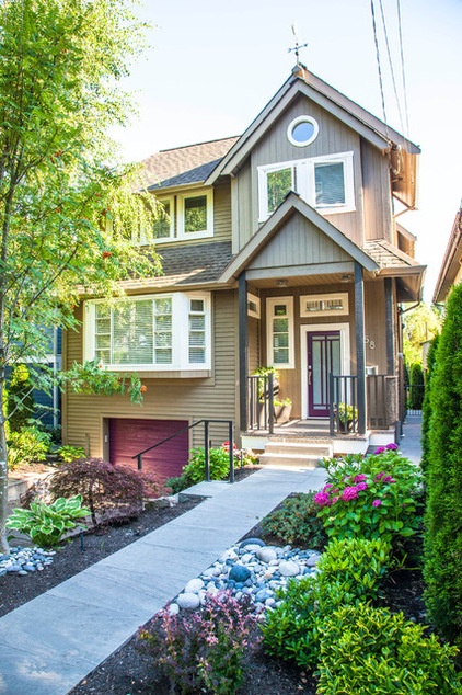
Fun color palettes aren’t just for contemporary-style homes. This gorgeous traditional house sports a fetching medium taupe siding paired with pretty plum-colored accents. When you use a neutral hue for your main house color, it opens up numerous unusual color options for the small accents, such as on doors. It’s much easier to repaint a door down the road than the entire house, so be bold.
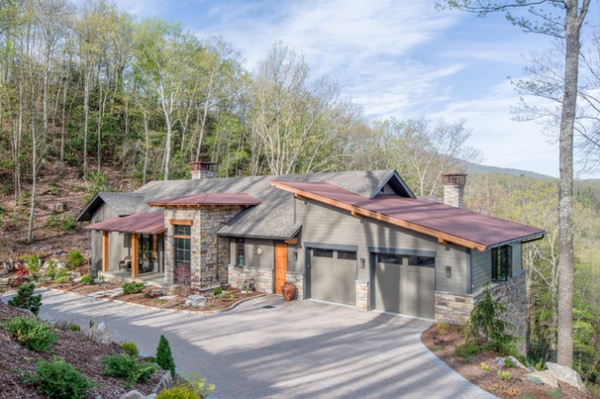
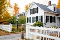
Color is a powerful tool that can be used to make your home stand out or blend in. Here, the taupe helps ground this large home and allows it to blend into the bucolic landscape that surrounds it. If you live in a cookie cutter subdivision home or a row house in the city, you might want to incorporate a more unusual color to make your home stand apart from the crowd.
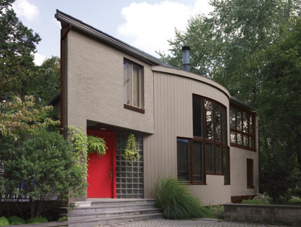
Practically speaking, a medium shade of taupe is the best color choice for hiding dirt and grime. So if you live someplace dusty, or where grit tends to accumulate quickly on your siding, this neutral hue will hide the grime better, allowing you to get away with less frequent cleanings.
Try These Palettes
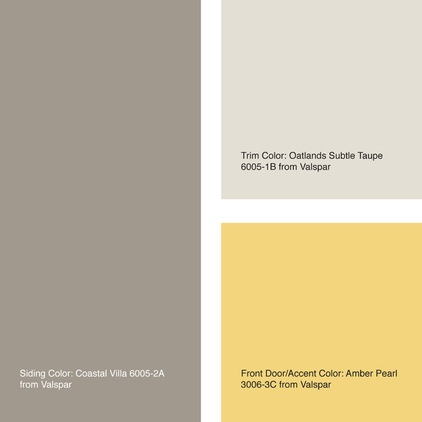
Here are three sample paint palettes that feature a nice neutral taupe color for the siding. Typically I like to pair it with a darker or lighter taupe hue for the trim (look for a shade a few notches darker or lighter than the siding color on the paint color card). For the front door and accent areas, you have a wide range of options, as shown here.
Siding color: Coastal Villa
Trim color: Oatlands Subtle Taupe
Front door and accent color: Amber Pearl
All from Valspar
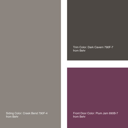
Siding color: Creek Bend
Trim color: Dark Cavern
Front door and accent color: Plum Jam
All from Behr
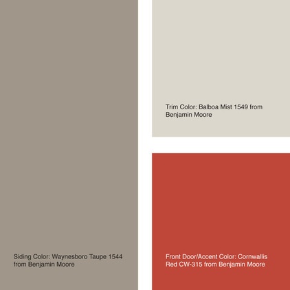
Siding color: Waynesboro Taupe
Trim color: Balboa Mist
Front door and accent color: Cornwallis Red
All from Benjamin Moore
Tell us: Do you have a taupe home? Share the color name and a photo in the Comments below.
See more exterior colors: Navy | Orange | Green | Gray | Red | Black
Related Articles Recommended


