Room of the Day: Bedroom Takes a Creative Approach to A-Frame Design
http://decor-ideas.org 09/28/2015 21:13 Decor Ideas
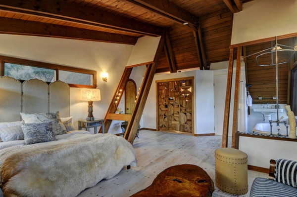
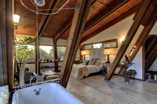
Faced with slanted walls that limited storage space and exposed A-framing that made furniture arrangement a headache, ceramics artist and interior designer Desanka Fasiska could have changed the architecture in her Los Angeles bedroom to be a bit more accommodating. Instead, she decided to celebrate it. She offset the rustic wood framing with lighter textures and earth tones, added dormers to create a walk-in closet and played up the strange layout by putting a vintage claw-foot tub right out in the open.

Bedroom at a Glance
Who lives here: Desanka N. Fasiska of Lux / Eros, also the designer
Location: Hollywood Hills, Los Angeles
Size: 1,300 square feet (about 120 square meters)
Year built: 1963
Homeowner’s goal: Give a luxurious twist to the rustic A-framing. “I wanted a Biba-meets-Big Sur vibe for my space,” says interior designer and homeowner Desanka Fasiska.
Game plan: “The home had not been updated in many years and had a lot of issues regarding layout and modernity,” Fasiska says. To tackle the tricky A-framing and reimagine the “strange layout” of the master bedroom, which had been added by previous owners, she hired architect Mario Fonda-Bonardi. She then tapped Bulson & Co. Inc. to handle construction, which involved demolishing the back half of the home, where the kitchen, bedrooms and two bathrooms stood. She chose to leave the original A-framing intact but removed the carpeting to expose the original pine floors.
“There were so many challenges that became opportunities for fun design features,” Fasiska says. “It was Mario’s idea to put a vintage claw-foot bathtub in front of the large window and keep it open and exposed in the bedroom.”

Why the design works: “I was careful to not go too modern but not too hippy-dippy rustic,” Fasiska says. She sourced all the materials for the project, making a point to mix textures and earth tones that would work in a space that’s basically 90 percent wood. “I also wanted to make sure to lighten and brighten the space to offset all the existing wood,” she says.
What wasn’t working: The slanted walls. To solve this, Fonda-Bonardi added dormers to create a large walk-in closet.
What goes on here: Fasiska is an artist and a designer, and uses her home to host networking events and workshops. “But I do live here too,” she says.
Who uses it: “I live and work from home with my two dogs and cat,” Fasiska says. “I have turned my garage into my ceramics studio, and I do the rest of my work from my living room or out in the garden. I also have a little apartment attached to my home downstairs that I rent out on Airbnb and use to host out-of-town guests. My friends love coming over for the weekends to have mini ‘staycations’ as well. It really is the ultimate hosting home.”
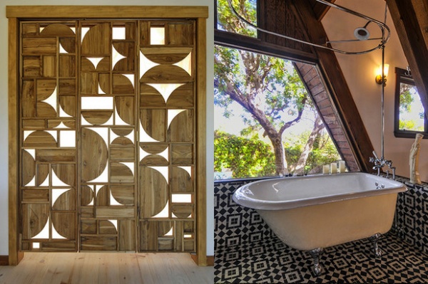
Favorite element: “I think keeping the integrity of the A-frame space was really important to do and ultimately the biggest success of all,” she says. “Also, I really wanted an interesting closet door for my bedroom. I found a beautiful carved teak room divider by Roost that I had Bulson make into accordion doors.”

Biggest challenge: “Being that this home is an A-frame with walls that are exposed wood, there is not insulation and no place to really run electricity and pipes,” she says. “But the team was genius in creating fake beams and capping off existing beams so that the end product was clean and beautiful.”
Splurges and savings: “There were definitely some splurges on materials, and the work was not cheap,” she says. “However, I feel like when you hire good people for a little more money, who are honest and realistic about the budget and duration of the project as well as use higher-quality materials, you ultimately save money.”
The nitty-gritty: Vintage claw-foot tub: local salvage yard; tiles: black and white Moroccan style, Mission Tile West; closet door: Timo teak screen by Roost, bought at HD Buttercup; floors: pickled white pine
Team involved: Delta Quality Electric (electrician)
See more Rooms of the Day
Related Articles Recommended


