Midcentury Modern Home Gets a Family-Friendly Retro Refresh
http://decor-ideas.org 09/28/2015 20:13 Decor Ideas
When a midcentury modern house hasn’t been touched in decades, the good news is that the wonderful original architecture is intact. The bad news is that the home can be tired and dated, as was the case with this midcentury modern ranch in Encino, California. These new homeowners, a couple with two young children, needed a refresh for their favorite rooms that would honor the original funky vibe. “These homeowners fell in love with the house as it was and could see the potential,” says interior designer Asher Richter, who led the team at Weego Home on the project. “They just needed some help to bring it to that point.”
Photos by Gregory Arbit
Houzz at a Glance
Who lives there: A young family of 4
Location: Encino, California
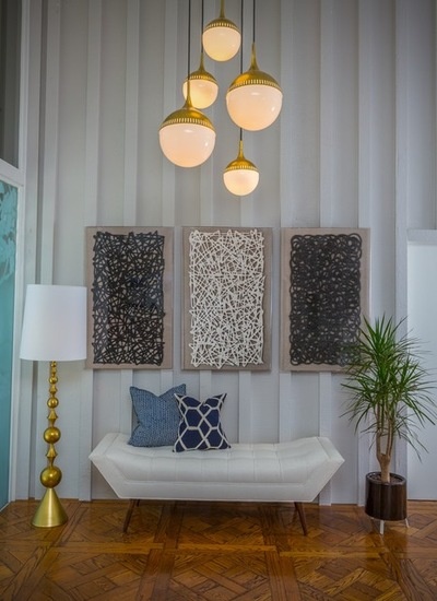
The project incorporated all of the public spaces that were open to one another, including the entry, dining room, living room and breakfast room. For the entry hall, the team wanted the space to make a great first impression that would set the tone for the rest of the house. “Because the rooms are open to one another, we wanted to include elements that created cohesion throughout the open space,” Richter says. This included repeating colors and geometric elements and, of course, honoring the midcentury modern era.
They chose a light fixture that could stand up to the scale of the ceilings and looked like something that could have been there since the home was built. A similar fixture with just two pendants is right outside the front door and can be seen through the glass. A trio of artworks has a midcentury feel. “They are really three-dimensional,” Richter says. “They are made up of yarn-like pieces encased in acrylic frames. They add a lot of depth to the space.”
Because the family enters the home through the garage, there was no need for a place to throw keys or stash their things. Instead, the team gave the area a comfortable lounge-y feel. They chose the bench because it can be moved into the living room for additional seating with ease.
The parquet floors are original to the home. “They are unique, and we knew we could work with the floor with the right rugs and save the homeowners a lot of money,” Richter says.
Art: Natural Curiosities; lamp, sofa and pendant chandelier: Weego Home
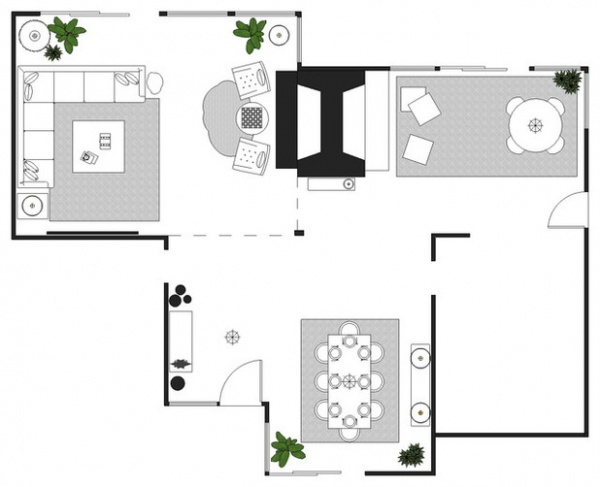
This plan shows how the spaces are open to one another. The dining room is completely open to the entry and has views into the living room and breakfast room. The two-sided fireplace is between the living room and breakfast room, and the kitchen (not tackled during this phase) is almost completely closed off on the bottom right.
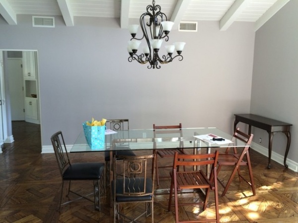
BEFORE: The dining room was more or less a blank space.
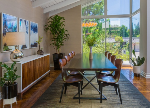
AFTER: In the dining room, they continued the deep blues of the entryway throw pillows. “While we carried some of the same elements throughout the rooms, each one has its own individual vibe,” Richter says. He custom designed the console and the dining table himself. The console is walnut wrapped in lacquer. Each walnut slat has been placed at a different depth to add dimension. The table is maple with an oxidized finish and has an X-base.
Richter chose grass cloth for the walls, which suits the midcentury modern era and ties into the expansive views outside. Likewise, they added lots of plants to create a strong connection to the trees and shrubs seen through the windows.
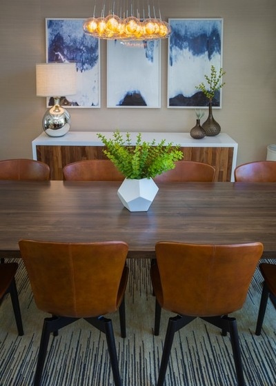
“We searched the globe for the right chairs,” Richter says. They finally found these leather ones, which were made in Finland. While the X-bases match the table, the seat shape throws some comfortable curves into the room.
The artwork is an abstract landscape that brings in more deep blues. The chandelier adds a cluster of glass globes.
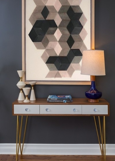
A console table sits in a transitional area in the middle of the space (see it on the plan against the chimney). The large geometric print helps tie it to the other spaces. The vases and lamp are in keeping with the retro style.
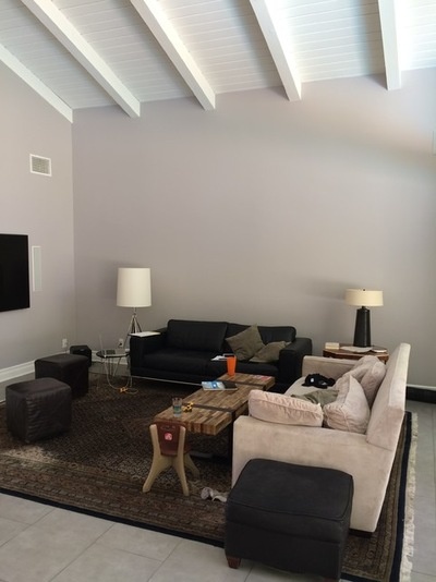
BEFORE: The family room’s furnishings did not stand up to the scale of the ceilings, and the walls were wide, flat expanses.
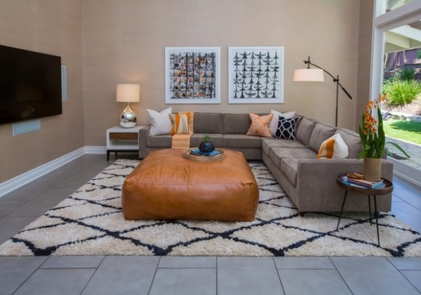
AFTER: Because the homeowners have two young children, child-friendliness and comfort came first. However, this didn’t meant they scrimped on style. First, Richter and his team designed the largest leather pouf they could. “It’s all about the kids being able to flop down and relax,” he says. The leather can take a beating, as can the other fabrics. He chose a 100 percent polyester covering for the sectional sofa so that it could take spot-cleaning with soap and water. Rather than wool, he opted for a nylon rug that also could be spot-cleaned with ease. “We wanted to keep things clean-lined but also make sure it was comfortable for the family,” he says.
The floor was existing; the soft rug and colors work with it. The pillows bring in pops of orange and geometry, while two large giclées have a funky midcentury modern look. The team used the same grass cloth wallpaper that they did in the dining room, as the spaces have views through to one another.
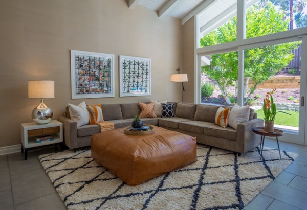
“The windows and the angles in the house are just beautiful,” Richter says. To keep the windows as clear and clean-lined as possible, he installed top-to-bottom cellular shades. These tuck into boxes near the floor and are nearly imperceptible when stowed.
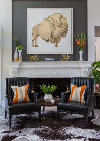
The other end of the family room has a fireplace and a large piece of art, a portrait of a big buffalo. “He’s so funky, unexpected and full of character, he just makes the house,” Richter says.
The chairs are vintage and were the homeowners’ own. Because the fireplace surround was such a disconnect from the rest of the style of the home, they painted it and the inset over it to put the attention elsewhere. Chain-stitched pillows and unusual vases bring in the geometry, while the hide area rug adds an organic shape. “With the large square rug in the sectional area, another rectangle wouldn’t have worked,” the designer says.
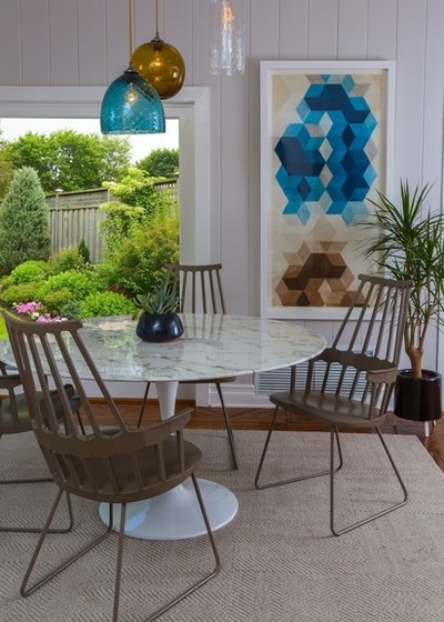
On the other side of the chimney, this breakfast room enjoys another fireplace and is the only space that’s open to the kitchen. “This is probably the room where they spend the most time together,” Richter says.
Another art piece adds the geometry, while a Saarinen Tulip table adds a midcentury modern icon. The chairs are a fresh take on the classic Windsor.
The team searched high and low for just the right light fixture. The three hand-blown glass pendants in different colors and textures they chose hail from England. They had to have the lighting retrofitted to meet UL codes.
Now the spaces that were most important to the family are freshened up and suited to their lifestyle. Further updates may happen through the years, but for now this is plenty.
Carpet tiles: Flor; light fixture: Rothschild & Bickers; chairs: Kartell
More: So Your Style Is: Midcentury Modern
Related Articles Recommended


