My Houzz: Surprise Revealed in a 1900s Duplex in Columbus
http://decor-ideas.org 09/27/2015 23:13 Decor Ideas
Catherine and Bryan Williamson expected to run into the usual issues when planning cosmetic changes and utility updates in their 1900s duplex in Columbus, Ohio, but it was soon apparent that the previous owners’ neglect had taken a toll. “We knew we would be living through some level of chaos, but didn’t expect it to be nearly as bad as it was, which was a complete gut job of the entire house,” Catherine says. Along the way, they discovered some surprises hidden behind the walls and fell in love with the idea of a neutral palette to play off the architectural details of their new space.
Houzz at Glance
Who lives here: Bryan and Catherine Willliamson
Location: Franklinton neighborhood of Columbus, Ohio
Size: 1,800 square feet (167 square meters); three bedrooms, one and a half baths, plus guest quarters on the third floor
Year built: Early 1900s
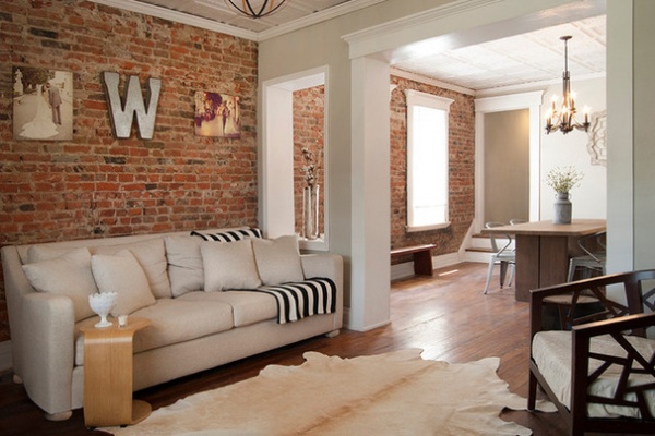
Starting with a clean slate allowed the couple to create the space they really wanted. They began by removing paneling and carpeting and dismantling the drop ceiling. Bryan also created pass-throughs from the living room to the dining room to let more light into each room and create a better environment for conversations and mingling during larger gatherings. “We didn’t want to take down the entire wall, because we wanted to keep as much of the original layout as possible, so this was a good compromise,” Catherine says.
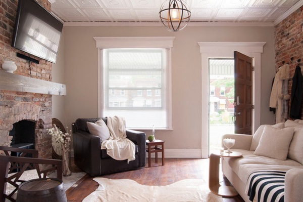
A mix of clean lines and natural materials gives the home an urban edge. “We wanted to keep as many of the old original details as possible, but add our own spin to it,” Catherine says. A leather club chair, Bryan’s favorite piece in the house, anchors this grouping in the living room and imbues the space with a loft-like feel.
The couple used classic-style furnishings to provide a neutral backdrop for seasonal decorating. “We would rather have a plain beige comfy couch that we can easily add different pillows to as moods and seasons change,” Catherine says.
Davis leather swivel chair: Crate & Barrel
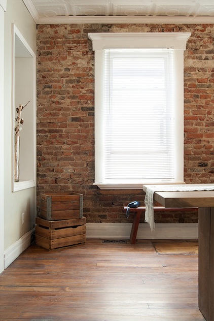
The Williamsons were not expecting to completely gut their house, but the discovery of invasive pest and mold problems required that walls come down. As a result, the couple discovered a double brick wall beneath the layers of paneling lining every room. “We hit the jackpot on that one,” Catherine says with a laugh.
This was the point when their design intentions shifted. Their previous home had been full of color and decorative accents. For this home, they opted for a more neutral palette. “We felt that the walls and ceilings and floors spoke for themselves, and we didn’t want our furniture to take away from these features,” Catherine says.
Vintage crates handed down from Catherine’s family are used as storage for household items like books, blankets and collectibles.
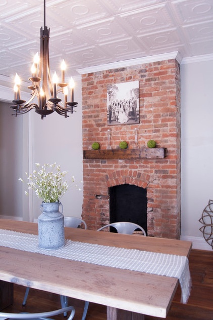
The original plan was to refurbish the existing mantelpieces in the living and dining rooms. “One thing led to another, and they came out,” Catherine says. “First, we removed them to check if the pest problem that had hit the rest of the house had hit the mantels — and it had.” After removing the original pieces, the couple fell in love with the brick arches underneath.
The couple designed and built a floating mantel to highlight the lines of the dining room fireplace. Its modern lines play against its rich grain and warm tones, embodying their style. “Our style is unique, because we tend to mix elements of different design styles,” Catherine says. “We love mixing old and new, masculine and feminine, and so on. [Bryan] tends to gravitate toward contemporary, sleek designs, where I gravitate toward more eclectic, feminine elements.”
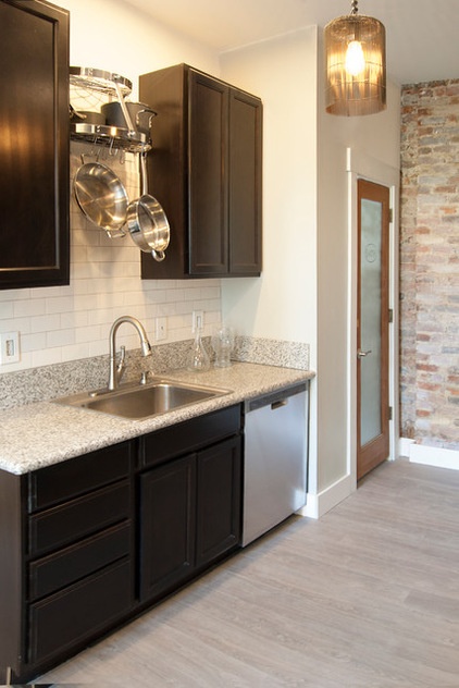
Budget and durability topped the list of priorities with the renovation, so the couple chose affordable units and did much of the work themselves, achieving a quality kitchen on a budget. They kept to a neutral palette in this room as well, going with a speckled granite countertop and espresso-finish cabinets. “We chose the most affordable cabinets offered but got them in an espresso finish, so right off the bat they looked nice,” Catherine says. “[The] granite countertops cost us less than $500, because we cut and installed them ourselves.”

When the couple added a half bath off the kitchen, they decided on a glass door to maximize the natural light. They used an etching compound and a vinyl stencil to give their stock door a dose of personality while maintaining privacy.
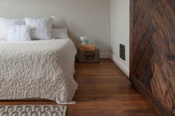
Bryan designed and built their low platform bed in the master bedroom. Stacked vintage crates are used as a nightstand. “We both are busy people, so we like to create calming, cozy spaces, especially in the bedroom,” Catherine says. “We love buying throws — we have way too many.”
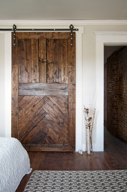
The deep wood tones of the closet’s sliding barn door create a focal point in the master bedroom, and the barn hardware provides easy access to the closet area without infringing on the room’s available space. The couple designed and built the door.
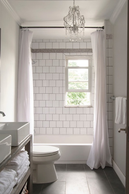
The couple gutted and completely redesigned their bathroom. White square tiles offset with dark grout give it a vintage vibe, while stainless penny tile trim and open storage add an industrial feeling The chandelier is Catherine’s touch. “We joke that our style is ‘the Bryan and Catherine mash-up,’ because it really is a compromise of both of our styles,” Catherine says. “I would say my style is more eclectic — I like curvy lines, whereas Bryan likes things straight and sleek and clean.”
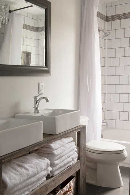
Simple open storage in the vanity provides easy access to towels and other daily necessities. Bryan designed and built the vanity unit. Two vessel sinks let him and Catherine get ready at the same time in the mornings.
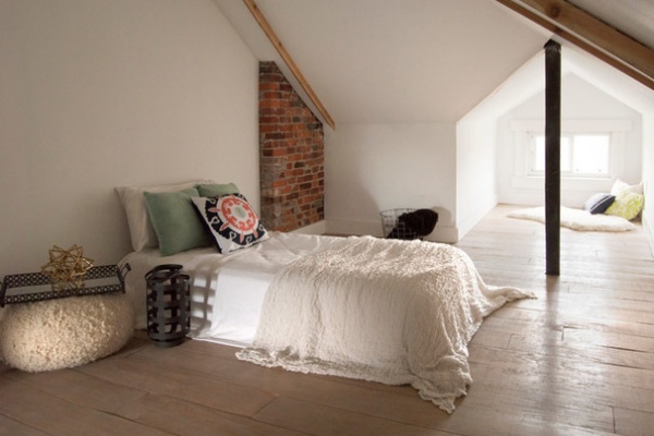
The third-floor attic is a cozy multipurpose hideaway tucked beneath their home’s eaves. “We can use [the attic] as an extra bedroom, an office and an extra space to read or watch TV,” Catherine says. “It is just a big, cozy, secluded space that is ideal for relaxing. Bryan tried to claim it as his man cave but hasn’t succeeded in that just yet.”
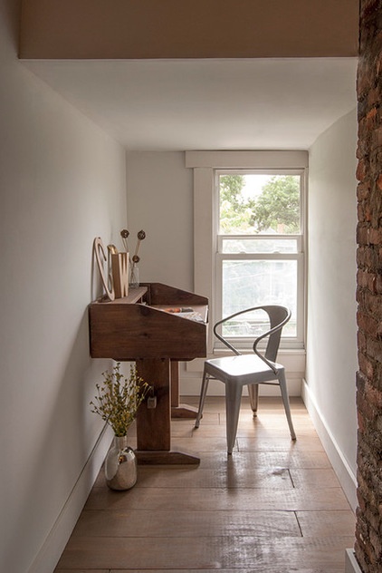
At the opposite end of the attic, a dormer has been claimed as the perfect spot for catching up on paperwork or jotting down thoughts at a vintage desk.
Once the space was gutted, the couple cut and fit planks of plywood in lieu of conventional hardwood flooring. The wide-cut planks add vintage ambience to the attic.

“A lot of people say that doing a renovation with your spouse is bad news, but it actually brought us closer,” says Catherine, pictured with Bryan. “This one renovation really changed us in that the house was in way worse shape than we expected, but it also turned out way better than we could have imagined.”
Their Franklinton neighborhood of Columbus was once dubbed “The Bottoms,” referencing its below-river-level location on the west side of the Scioto River. After many years and a few significant floods, the area was officially declared a floodplain, ending all structural and economic development during the 1980s. That’s changing now with young professionals like the Williamsons moving in.
“We love that Columbus is a growing city with lots of opportunities for entrepreneurs,” Catherine says. “It was recently ranked the No. 1 opportunity city by Forbes, because it has all the amenities of a larger city with a smaller-city feel.”
Photo courtesy of Love in Theory
My Houzz is a series in which we visit and photograph creative, personality-filled homes and the people who inhabit them. Share your home with us and see more projects.
Browse more homes by style:
Apartments | Barn Homes | Colorful Homes | Contemporary Homes | Eclectic Homes | Farmhouses | Floating Homes | Guesthouses | Lofts | Midcentury Homes | Modern Homes | Ranch Homes | Small Homes | Townhouses | Traditional Homes | Transitional Homes | Vacation Homes
Related Articles Recommended


