Houzz Tour: Sonoma Home Maximizes Space With a Clever and Flexible Plan
http://decor-ideas.org 09/26/2015 22:13 Decor Ideas
This couple had a lovely home in the hills of the wine country outside Sonoma, California, but they were craving the walkability to the restaurants, shops and culture that downtown Sonoma had to offer. In designing their new house, architect Amy Alper addressed several challenges: The couple wanted a contemporary space where they could display their extensive art collection; they sought privacy in the house and yard on a compact shared lot in a densely built neighborhood; and they desired a good view of the mountains. Alper’s toughest challenge was to get the plans approved by the design review board as the lot is in the Historic Overlay zone. But her design passed the board unanimously, and the owners are thrilled with their new space.
Photos by Eric Rorer
Houzz at a Glance
Who vacations here: A couple from Portland, Oregon, who divide their time equally between home, Sonoma and traveling
Location: Downtown Sonoma, California
Size: 1,850 square feet (172 square meters); two bedrooms; two and a half bathrooms
The good news was the couple already owned an income-generating bungalow on a block of Sonoma Square, on a lot that was zoned for a second home to be built on it. As they spend only about four months a year in Sonoma, they wanted something that would be much lower maintenance than their home in the hills was.
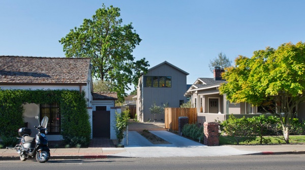
Let’s start with the trickiest challenges first. This photo shows how Alper’s solution addresses two of them, providing a view of the mountains above the neighboring rooftops while passing design review.
“We had more latitude with style because the house was set back from the street,” Alper says. The new house is mostly hidden from the sidewalk and street by the bungalow in front of it, except for the tower Alper designed to take advantage of the views of Sonoma Valley’s northern hills. The tower mimics the forms, scale and materials of nearby homes — something important to the design review board.
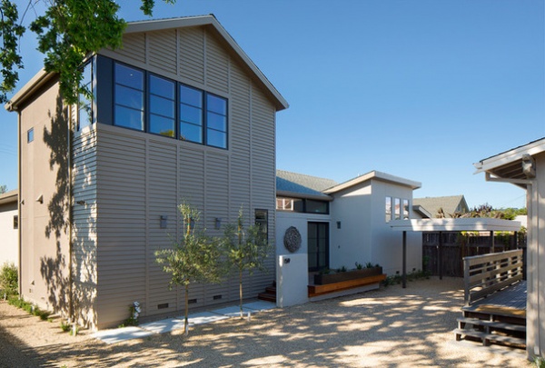
“We studied the typology along the street to make it contextual,” Alper says. She combined the board and batten and shiplap that are common around the neighborhood in a unique way. “These materials also give the facade texture and dimension,” she adds. She placed the tower’s windows to take advantage of the best views.
The house’s facade is broken down into different forms to give it scale. The master bathroom is located to the right of the entryway doors, with high windows that let in plenty of light while providing privacy.
Alper created a gravel courtyard between the existing bungalow in the front and the new house in the back; it serves as a parking court. She believes in making a space flexible, that is, to provide several uses at once. “The covered carport can also serve as a place where they set up a table when the family is in town and staying in both homes,” she says.
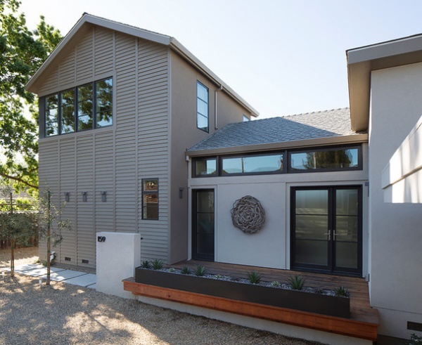
The homeowners generally park on the left side of the house, where there is a side door into a mudroom. But for guests, the entry sequence is more of an experience, going from the gravel parking court up the concrete pavers, past two olive trees and onto a redwood deck. The homeowner says that in the short time since these photos were taken, the landscaping has substantially grown in, and thus the plants play a bigger role in the exterior.
Because the deck in front of the entry is less than 30 inches (about 76 centimeters) high, a railing was not required, but Alper added the long planter for safety and to provide a long horizontal line. It is filled with succulents.
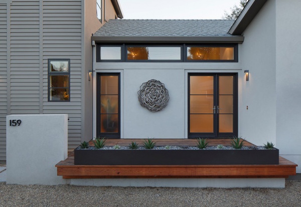
Designing with the couple’s art collection in mind began right next to the front doors. The circular wood piece is from Southeast Asia and adds welcoming texture to the front entry.
Windows and doors: VistaLuxe, Kolbe & Kolbe Millwork Co.
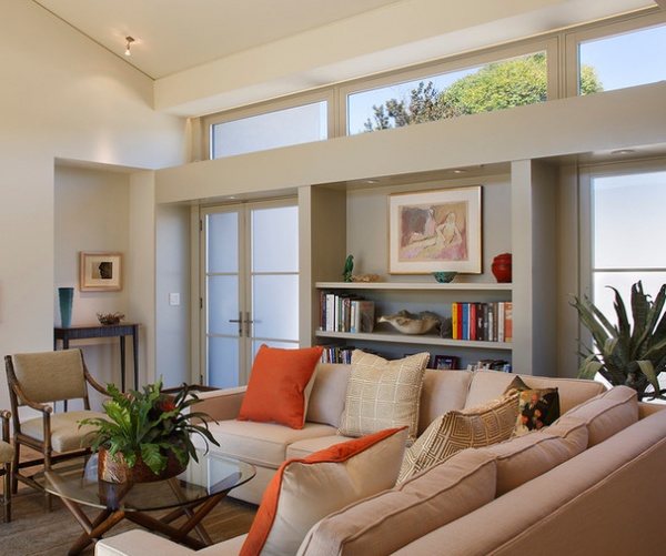
“Part of stretching the square footage was eliminating as many hallways as possible, which are often wasted space,” Alper says. In lieu of a foyer, she created additional space at the front doors, which includes a recessed area for a table. The niche gives it more of a foyer feel, so people don’t just walk right in to the living room furniture. “There is appropriate room to greet guests here,” the architect says.
The built-ins give the owners a place to display art and other objects. The built-ins have an enhanced presence thanks to thick lines. The architect was also careful to make sure everything in the house lined up. For instance, note the way the soffit meets the top of the foyer niche.
Clerestory windows let in lots of natural light and let out the hot air. “There really is not a need for overhead lighting during the day,” Alper says. Extended eaves keep out the sun’s glare.
Painting above shelves: Robert Colescott
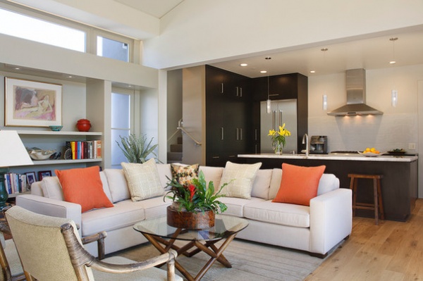
The living room is wide open to the kitchen, which extends the space for entertaining. “The idea was to keep the focus on the art and let the kitchen just blend in,” Alper says. She accomplished this by using a simple palette and color blocking. The backsplash matches the wall paint, and the countertops are a subtle and elegant Lumix quartz. “The Lumix is very beautiful; it’s more translucent than other kinds of quartz,” Alper says.
“This setup works really well for extending the social area and for serving guests,” she adds. To the right of the vent hood, a door leads to a pantry and the side entrance of the house. A handy charging station for mobile phones, tablets and so on is back there, which helps keep electronics from cluttering up the house.
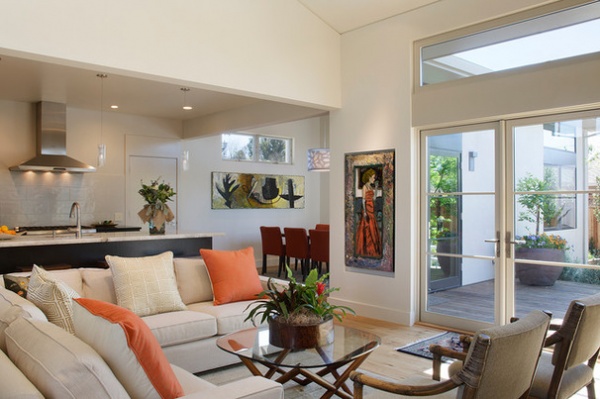
Here is another great example of how the design works with the art. This wall was meant for this painting of a woman holding a cocktail. It’s one of the first things people see when they walk in the front door, and it sets the tone for a visit. A high window in the dining space leaves room for a long horizontal painting and provides privacy from the house next door while still letting in the light.
Painting of lady with cocktail: Gregory Grenon; oil on canvas in dining room: Lucinda Parker
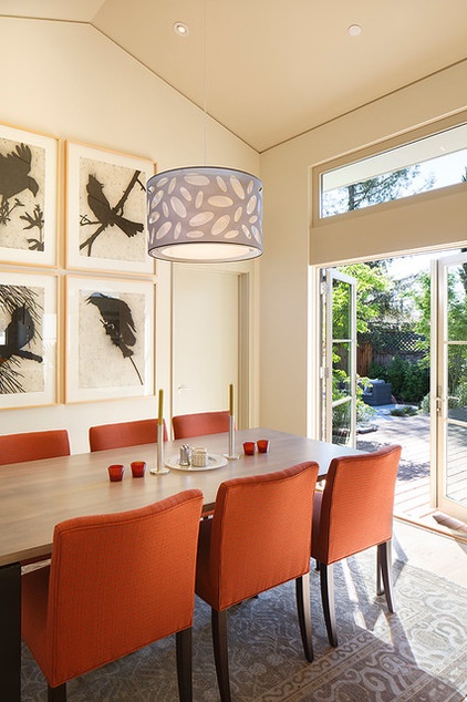
The one hallway in the home is located through the door to the right of the artwork in the dining space, and leads to the guest wing.
Bird artwork: Lennie Pitkin
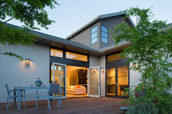
Another big part of the design was indoor-outdoor living. The living area, dining area and master bedroom have large pairs of doors that lead out to a large deck and backyard. Trimwork around the doors and windows breaks up the exterior facade. The trim is a truffle color.
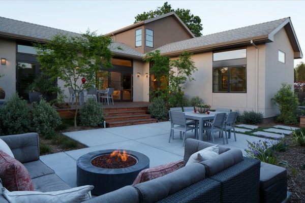
The L-shaped plan of the house creates a private backyard; there are planting beds behind the guest wing at right. The couple loves to entertain, and Alper reports that at a recent gathering, there were about 50 guests, who all found comfortable places to have intimate conversations inside and out.
Sculptural Japanese maple trees mark the separation between the deck and the patio. The yard was also designed to comply with water restrictions and to be drought-tolerant.
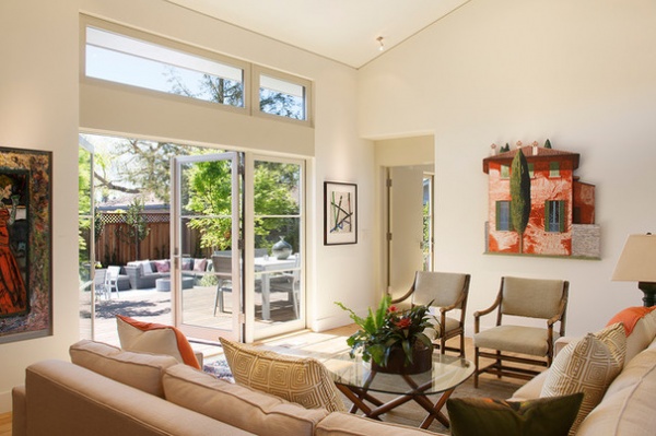
This house takes a lot of second looks to determine what makes it so pleasing to the eye. One example is the recess around the door to the master bedroom, with everything lined up — the tall trim above the doors is aligned with the header between the door and clerestory windows.
Another is the subtle streamlined reveal where the walls meets the ceiling, used in lieu of crown molding. “These kinds of elements add detail and depth throughout the house,” Alper says.
Italian villa painting: Tom Fawkes
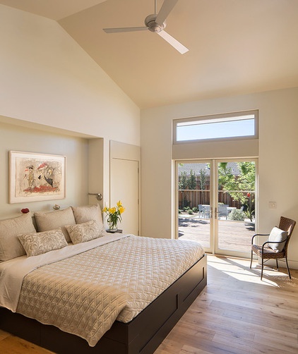
On the other side of the same door, molding matches up with the molding above the double doors. The bed fits into another recess that’s cozy yet streamlined.
The couple also picked up on all the latest technology from professionals who worked on the house. For example, they had the house wired for smart lighting, installed a Nest thermostat and placed USB outlets in key places for charging personal devices, like next to the beds and in their side entry space.
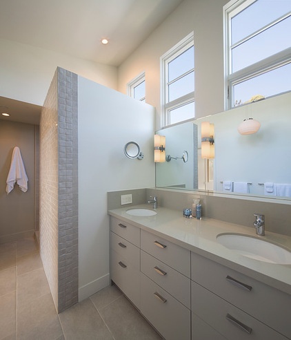
The windows we saw on the shed roof side of the facade of the house provide privacy in the master bathroom.
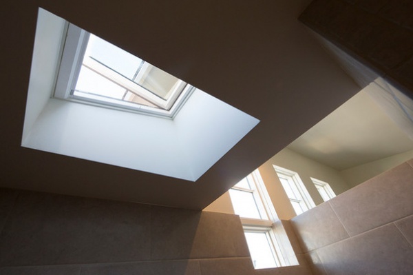
There is another clever arrangement of lines where the shower surround meets the window. A motorized skylight provides extra daylight to the shower. Alper designed the windows to minimize the need for lots of lighting. One of the homeowners says they originally had an outdoor shower on their wish list, and when it proved impractical, the shower skylight was the next best thing.
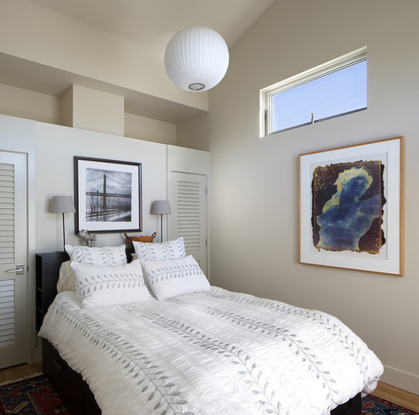
The guest room was a tight space just big enough for a queen bed, which Alper flanked with two closets. The high window provides privacy and light, and lines up with the recesses over the closet doors.
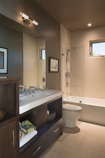
The design for the guest bath was inspired by a photo the couple saw on Houzz. In fact, the couple found lots of inspiration on Houzz to show Alper the style they liked.
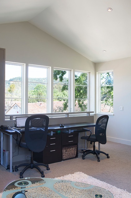
The tower room serves as an office and a playroom for the homeowners’ nine grandchildren. The home’s only TV is here — great for when their grandchildren gather up here, as it keeps the noise out of the rest of the living spaces downstairs.
A sofa across from the desk offers another place to enjoy the views.
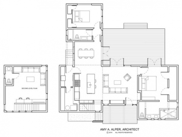
The plan shows how it all comes together. One of the homeowners’ favorite things about the house is how expansive it feels, particularly because it flows so easily from indoors to out. They also appreciate that it is deceptively minimalist and well thought-out, down to the last detail.
They enjoy leaving the doors to the backyard open, connecting the indoor rooms to the outdoors. They also like how they can enjoy the outdoor view from every room. Perhaps most of all, they also love the walkability of their neighborhood. Sonoma Market, a bank, restaurants, shops and the Sebastiani Theatre are just steps away.
Architecture: Amy A. Alper
Interior design: Leslie Whitelaw Interior Design
Landscape design: Rozanski Design
Contractor: Earthtone Construction
Gallery that provided most of the art collection: Laura Russo Gallery
Browse more homes by style:
Apartments | Barn Homes | Colorful Homes | Contemporary Homes | Eclectic Homes | Farmhouses | Floating Homes | Guesthouses | Lofts | Midcentury Homes | Modern Homes | Ranch Homes | Small Homes | Townhouses | Traditional Homes | Transitional Homes | Vacation Homes
Related Articles Recommended


