New This Week: 5 Fully Decorated Living Rooms That Don’t Go Overboard
http://decor-ideas.org 09/26/2015 03:13 Decor Ideas
There’s a fine line between filling a room with too much furniture and too many accessories, and not having enough. The following living rooms strike the right balance. Here, the designers talk about how paying attention to scale, light, function and more helped them fill the rooms with plenty of furniture, art and accessories — without overdoing it.
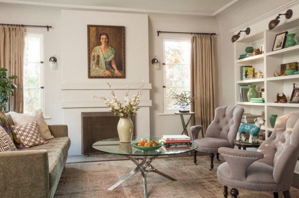
1. Spanish Symmetry
Designer: Adrian Koffka and Cynthia Phakos or Koffka/Phakos Design
Location: Atwater Village, Los Angeles
Size: 14 feet by 16 feet (4.2 by 4.8 meters)
Year built: 1926
Homeowner’s request: Homeowner David Collins, a television producer and co-creator of Queer Eye for the Straight Guy, wanted to create a friendly, serene and light-filled living room that elevates the style of the house.
Plan of attack: While the design team reconfigured the rest of the rooms during the whole-house remodel, they kept this formal living room intact in its 1920s-built dimensions to preserve the symmetry of the fireplace, which was originally brick but restored with “a simpler, more elegant surround,” designer Adrian Koffka says, and handmade faded sage-green tiles for the hearth. To further preserve the symmetry, he and design partner Cynthia Phakos created the bookshelves by pushing into the room on the other side of the wall rather than have them protrude into the space. This solution also kept the ceiling cove intact.
New windows in a traditional wood style re-create bullnose plaster details. New wide-plank, vertical-grain, white oak floors with a custom oil stain and a wax finish continue throughout the house. The vintage chairs and coffee table mix with a sofa by George Smith. Collins selected the fabrics and rug and chose the natural linen for the curtains.
Why the design works: “We avoided any moves that would have altered the perfect symmetry,” Koffka says. “Once this order was established, the room could be decorated and furnished more playfully without losing the inherent calm it enjoys due to the strong centeredness.”
What goes on here: This is a formal living room for lounging and reading.
Who uses it: Collins, his young twin daughters, a cat and a dog. “While it was meticulously designed and artfully crafted, it is a family home and meant to be used, not looked at,” Koffka says.
Designer secret: “Don’t mess with symmetry if it works,” Koffka says.
“Uh-oh” moment: “This house was in very bad shape when the client purchased it,” Koffka says. “Many features we wanted to keep from the original design actually had to be rebuilt, including the ceiling cove, as the lumber was in bad condition. Los Angeles outlawed wood-burning fireplaces, and this one was in bad shape. It was rebuilt so extensively that it almost did not pass as a ‘repair.’ That was definitely an ‘uh-oh’ moment.”
Splurges and savings: “Painted cabinetry, windows and baseboards are less expensive than those built in stain-grade wood,” Koffka says. “Saving money on these items allowed for a high-grade wood flooring and custom floor finish that gives the house a distinct old-world elegance.”
Take-away: “Keep it simple and finish it well,” Koffka says.
The nitty-gritty: Sofa: George Smith; wall paint: Farrow & Ball; light fixtures: Schoolhouse Electric & Supply Co.
Team involved: First Point Construction; John Ellis (photographer)
See more of this home
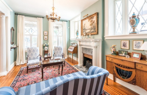
2. Painted Parlor
Designer: Stephanie Theofanos of Modern Traditions Interior Design
Location: Richmond, Virginia
Size: 400 square feet (37.1 square meters)
Year built: 1908
Homeowners’ request: The homeowners felt this room was too dark, and that it was lackluster compared to other newly decorated rooms nearby, such as the adjoining entry with its new Thibaut Bastille Beige wallpaper, the dining room with its deep, dark blue and the kitchen with its lighter blue.
Plan of attack: The homeowners wanted to keep the existing furnishings, but the muted cream walls had left everything feeling washed out, designer Stephanie Theofanos says. “I wanted a color that could stand up to the dramatic decor of the adjoining rooms, but that would not read too dark or too blue.”
She used a small detail in the Oriental rug and the painting over the mantel to arrive at a blue wall paint with a lot of aqua green in it (Stratton Blue by Benjamin Moore). “The color is deep enough to stand up to the dark blue dining room while simultaneously bright enough to take advantage of the front window exposure,” Theofanos says.
Why the design works: “This space is a prime example of how a small investment in a new paint color can make a big change,” Theofanos says. “The homeowner felt this room was too dark, but by using a darker paint color, we were actually able to brighten up the space. Now all of the white trim and windows are really emphasized.”
What goes on here: This is a traditional Southern front parlor used for entertaining.
Who uses it: The homeowners are recent transplants to Richmond, Virginia. They lived most recently in Portland, Oregon, and are originally from the Midwest. They entertain often, hosting large and small parties and out-of-town family and friends.
Designer secret: “Don’t shy away from color,” Theofanos says. “Even neutrals can have a little depth to them, and a deeper color can actually brighten a space.”
“Uh-oh” moment: “After trying to steer clear of blue because other rooms on that floor are also shades of blue, I laughed when I saw the name of the paint color [Stratton Blue],” Theofanos says. “But I assured the homeowner it was not as blue as the name implied.”
The nitty-gritty: Wall paint: Stratton Blue HC-142, Benjamin Moore
Budget: $500 for paint and labor
Team involved: Sara Eastman Photography (photographer)
See more of this home
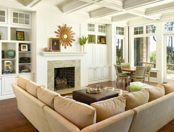
3. Multigenerational Marvel
Designer: Margaret Donaldson and Alexis Lee Wilks of Margaret Donaldson Interiors
Location: Cassique, Kiawah Island Club community, South Carolina
Size: 23½ feet by 18½ feet (7.1 by 18.5)
Year built: 2014
Homeowners’ request: A vacation home that would entice their three grown children in their 20s and their young grandchildren to escape their busy lives and come together in a relaxing space.
Plan of attack: “The emphasis was always on the view outside,” interior designer Alexis Lee Wilks says. This living room, which is adjacent to the kitchen, serves as the heart of the home. Wilks and interior designer Margaret Donaldson started with the neutral sectional sofa, which the homeowners already had. The surrounding golf course and marshland then inspired the color choices.
Why the design works: The view. Plus, the large sofa and nearby game table establish the room as the main gathering spot for three generations of family members.
What wasn’t working: The house is high-tech, but the designers and homeowners didn’t want components and wires hanging all over the place. The wall of cabinetry hides everything until needed.
What goes on here: Game nights, doing puzzles, large gatherings, movies and fireside chats.
Designer secret: “The intricate coffered ceilings provide a visual anchor, while the green grass cloth [seen here below the large window] adds texture and interest,” Wilks says.
Splurges and savings: By reusing the oversized sectional sofa in the living room, the designers and homeowners were able to splurge on appliances and finishes in the kitchen.
The nitty-gritty: Wallpaper: Seabrook Wallcoverings; game chairs: Lorts; trim paint: Horizon, Benjamin Moore; throw blanket: Mohair International
Team involved: Wayne Windham (architect); Koenig Construction (builder); Grey Bell Millwork (casework); Holger Obenaus (photographer)
See more of this home
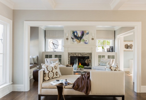
4. Zen Den
Designer: Julia Cutler
Location: Marblehead, Massachusetts
Size: About 200 square feet (18.5 square meters)
Year built: 2013
Homeowners’ request: A space that would reflect a modern, simple elegance with an overall Zen feel.
Plan of attack: Interior designer Julia Cutler created a furniture plan for the room, then selected specific pieces that worked together with a general fabric scheme. Once the homeowner signed off, she first selected area rugs, then other pieces that fit with the color palette of the house. She made sure her selections balanced other forms and fabrics in adjacent rooms.
Why the design works: “The overall space for this room is very small and compact,” Cutler says. “Given that the homeowners like to entertain, what helped this space come together was using a tête-à-tête sofa, which opens into the extended kitchen area and sitting room to maximize the entertaining space.”
What wasn’t working: The size restraints. The solution was to maximize seating while balancing form, function and the overall aesthetic.
What goes on here: This living room is the most formal space in the home, and is used primarily when entertaining guests.
Who uses it: The homeowners are a middle-aged professional couple who frequently entertain out-of-town guests.
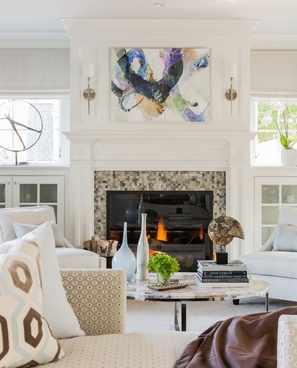
Designer secret: Fine art and accessories. “Without it, the room is bare and lacks personality,” Cutler says.
“Uh-oh” moment: “There were many moments throughout the project where the homeowner asked what she got herself into,” Cutler says. “Tackling an entire home can be daunting. What helped push the project forward was always staying focused on the original vision and making choices based on that. It is very easy to get distracted by the numerous decisions you are faced with daily during the construction and design phases. It is the role of the designer to maintain the vision and forward momentum.”
Splurges and savings: Cutler splurged on key furniture pieces and area rugs in the common spaces used mostly for entertaining, and saved on fabrics and items in the guest bedrooms.
The nitty-gritty: Area rug: Tibetan, Steven King; window treatments: custom, Drape It; tête-à-tête sofa, taboret and garden seat: A. Rudin, M-Geough; lounge chairs: Barbara Barry, Baker Furniture; pillows: custom, Sewfine; sconces: Lucía; fireplace surround tile: Ann Sacks; fine art: Jules Place; accessories: Webster & Co.; paint by Benjamin Moore: La Paloma Gray (walls), Balboa Mist (ceiling) and White Dove (trim)
Team involved: Rob Bramhall Architects; Tom Jacobs Construction; Michael J. Lee (photographer)
See more of this home
5. Coastal Farmhouse
Designer: Wendy Blackband
Location: Newport Beach, California
Year built: 2015
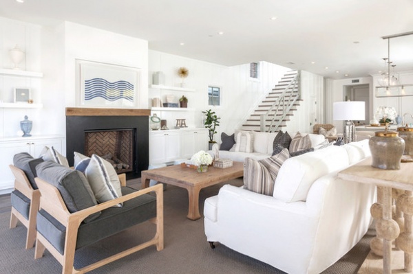
Homeowners’ request: A space for entertaining with a contemporary coastal farmhouse feel. A large seating arrangement inside, as well as on the front patio to which the living room opens through folding doors, helped achieve this.
Plan of attack: The house was a new build, so designer Wendy Blackband visited the site several times during construction to better understand how things should flow, how the layout should take shape and how the materials and finishes would come together before she selected furnishings. Maintaining open pathways became a challenge once the furniture filled the room. But proper space planning and a few minor adjustments allowed Blackband to create two adequate walkways through the space.
Why the design works: “What immediately stood out to our design team was the huge open floor plan encompassing the kitchen, dining room, living room and bifolding doors leading out to the patio,” Blackband says. “With one large seating arrangement focused on the fireplace, it helped break up the open layout. The large folding doors to the front patio help bring the outdoors in, allowing extra seating and table space.”
Designer secret: Keeping the furnishings and accessories muted using grounded neutrals and bright whites. “Because sometimes understated is best,” Blackband says. She also used soft and tonal furnishings so they wouldn’t distract from the architectural details inside the home. “One thing that makes this home tricky is that the entire home can be viewed from the street or from people walking by,” she says. “So by having two chairs back up to the folding doors, it makes the space feel more open versus putting a sofa there that would have blocked off the view of the interiors.”
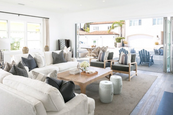
“Uh-oh” moment: The main entrance and garage open to the kitchen, but the way the house is positioned, it’s more convenient to enter the home through the bifolding doors. “Creating an arrangement that was welcoming but functional for the space was our biggest challenge,” Blackband says. “By leaving space behind the sofas with the sofa table, we were able to create a makeshift walkway that gave the impression of an entry.”
Splurges and savings: Blackband saved on the area rug, which is carpet that she had bound. She then used the savings to splurge on accessories.
Take-away: “You don’t have to go overboard with color to make a bold statement, and never be afraid of white sofas,” Blackband says. “A good fabric protectant can be a lifesaver.”
The nitty-gritty: Sofas, coffee table and pillows: custom made by Blackband Design; sofa table: cFc
Team involved: Chris Brigandi of Arbor Real Estate (home design and build)
See more of this home
Related Articles Recommended


