Houzz Tour: Townhouse Redesign Creates a Roomier Feel and Fit
http://decor-ideas.org 09/21/2015 03:13 Decor Ideas
From the outside, this home looks like a smart, ordinary Victorian townhouse, architecturally comparable to the many others on English streets, give or take the odd addition or attic conversion. But in addition to having had these alterations, this house has also been cleverly enlarged on the inside and restructured to create way more space than you’d ordinarily get with just those two changes. The house also now has higher ceilings, larger rooms and features that include a utility room, two full bathrooms, underground storage for bikes and bins, a downstairs powder room and a stylish study-media room — and not a megabasement in sight. How did they fit it all in?
Photos by Simon Maxwell
Houzz at a Glance
Location: Chiswick, west London
Size: Four bedrooms, two bathrooms
Designer: Reuben Spiring of JLB Developments
That’s interesting: The exposed bricks in the kitchen were taken from the original chimneys, which were all removed in the renovation.
“We pretty much took down the house completely, just leaving the front and side walls, and then rebuilt it within the same footprint, stealing 5 centimeters from here, 5 from there and expanding the space,” designer Reuben Spiring says. He removed bulky chimney breasts, put in a new staircase and added skylights, windows and a cathedral ceiling in the spare room, designed to let light flood in. He also added mirrors to further trick the eye into seeing more space, and the floor was lowered enough to create the higher ceiling.
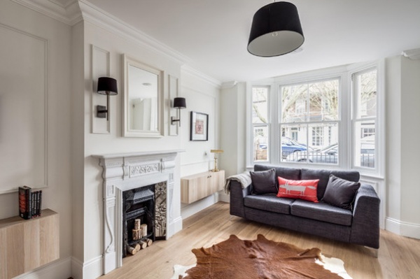
This room provides a visual clue to the luxurious sense of space in this house. One of the ways Spiring’s team expanded the space here was by removing all the chimneys. Though the sense of a chimney remains, the protrusion is purely decorative and the fireplace is not usable.
“If you want more space in a small property,” Spiring says, “you have to lose a few things. This was one of them. In small houses, every little detail makes a difference. And you could always have a bioethanol fire in there.”
The sleek-looking wall cabinets are from Ikea. Spiring’s cabinetmaker customized the size and added new handles for a custom look. The finish was a great match for the American white oak flooring, which Spiring bought unfinished and oiled by hand with Osmo oil. “It just feels better than a sprayed factory finish,” he says.
Cabinets: Bestå, Ikea
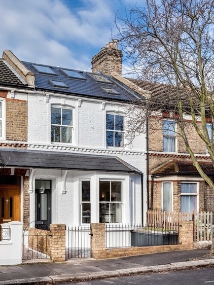
The most dramatic expansion of space came vertically, and ceiling heights were raised on every floor. Spiring achieved this by digging out the foundations and laying new concrete floors, insulated and heated yet still much thinner than the originals. This added about 16 inches to the overall interior height, allowing ceilings of slightly more than 8 feet (about 2.5 meters) high. (The average in a terrace house like this, Spiring says, is about 7½ feet, or 2.2 meters, high and as low as 6½ feet, or 1.9 meters, for a standard loft conversion, which often lowers the ceiling height of the room below.)
The underfloor heating also means there are no space-sucking radiators in any of the rooms.
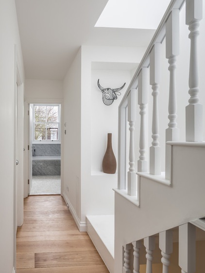
A new staircase was custom-built to be space-efficient and provide optimal flow.
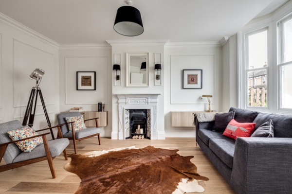
The “period” details in the house are not genuine or even especially historically appropriate, including the wall panels that Spiring’s team designed and made. “We weren’t trying to replicate the exact era,” Spiring says. “We just tried to make it look aesthetically pleasing, with a nod to the era. There were no original features left in the house when we got it, and there’s no hiding it’s a contemporary house — but we tried to give it a traditional twist.”
The fireplace is Victorian, salvaged when another house was gutted. The original tiles were missing, so Spiring added modern encaustic designs. The cast iron surround was rubbed down and spray-painted white.
Armchairs: Ikea; New England sofa: World Stores; rug: City Cows; wall paint: Strong White, Farrow & Ball; Mr. Fox pillow: Scion
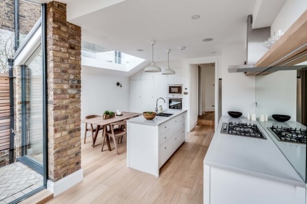
The back of the house was extended and flooded with light via plenty of glass. Spiring’s company custom-designed and made the skylights in the largest size possible.
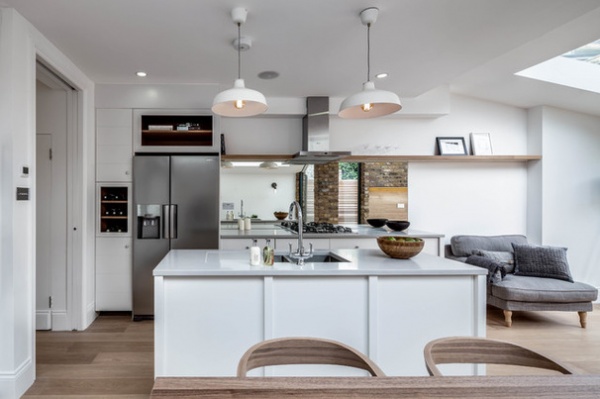
“Using mirrors to increase space is such a classic interior design trick that I was almost reluctant to do it,” Spiring says with a laugh. But if you’re putting a range against a wall, he says, a mirror is a great idea for a backsplash, especially in a family space where you want to be able to see what’s going on behind you.
The shelf above the range, stretching along the wall, is a floorboard. Häfele makes systems for invisible attachment. The countertops are quartz stone.
Pendant lights: Ikea; lightbulbs: Edison; refrigerator: Samsung; faucet: Abode Designs
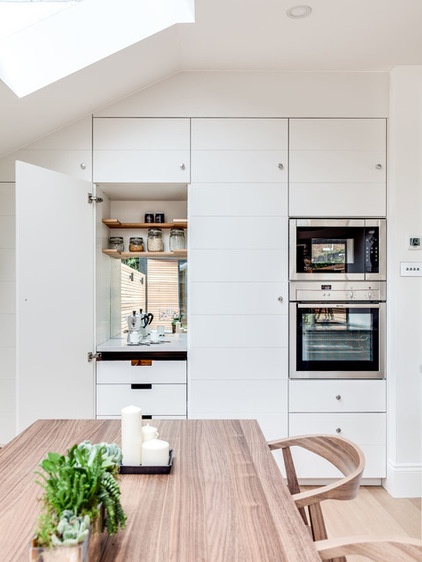
Mirrors have been used cleverly throughout the house to boost light and trick the eye into seeing more space. Here, one is tucked inside the cabinet hiding the tea- and coffee-making area. Spiring’s team handmade the kitchen cabinets.
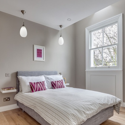
In the first-floor bedroom, a cathedral-style ceiling above the window with a skylight above it increases the amount of light. “It’s a really nice feature,” Spiring says. “You get more volume and sense of space and light.”
Bed: Ikea; pendant lights: The Lighting Centre
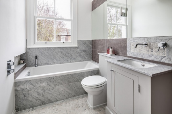
The family bathroom is clad in sheets of Carrara marble, inlaid in some places with hexagonal honed tiles, as on the sink backsplash. The darker tiles are made from porcelain, and all are from Mandarin Stone.
Cabinet paint: Farrow & Ball
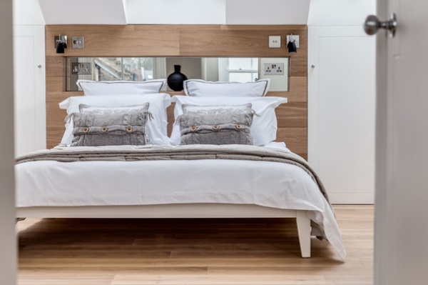
The headboard on the bed was custom-made from flooring and mirror, and has a shelf and handy sockets for charging phones and tablets.
Bedside lights: The Lighting Co.
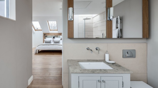
The entire top floor of the house has been given over to a spacious bedroom and an en suite, with gorgeous high ceilings. The walls are painted in Farrow & Ball’s Elephant’s Breath, which carries through to a corner of the bedroom.
The top of the vanity is Jura Grey limestone, and the wall tiles are made of Moleanos limestone.
Wall paint: Farrow & Ball
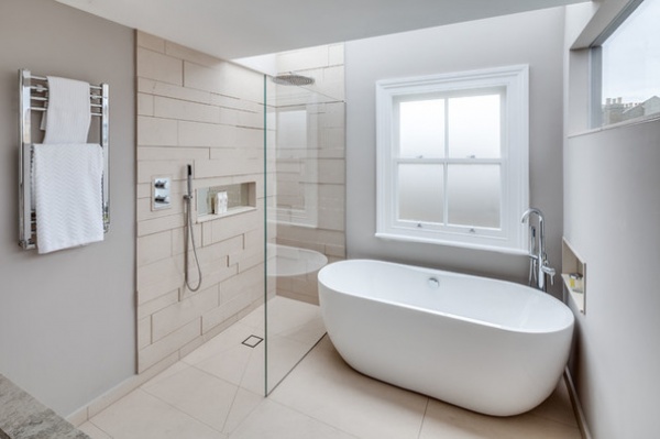
The luxuriously large en suite has a bathtub as well as a walk-in shower. The unusual stepped tiling in the shower area was “a nightmare” to put in, says Spiring, and involved getting tiles cut at different widths, using different thickness levels of adhesive and waiting for one lot to set before doing the next. “You can buy ready-made panels like this,” he says. “Much easier!”
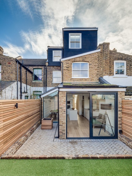
The grass in the compact garden is artificial. “I’d always been against it, but it’s getting so good and feels really nice and thick,” Spiring says. “It’s worth paying a bit more.” The fence is western red cedar and was made by alternating panels in two widths.
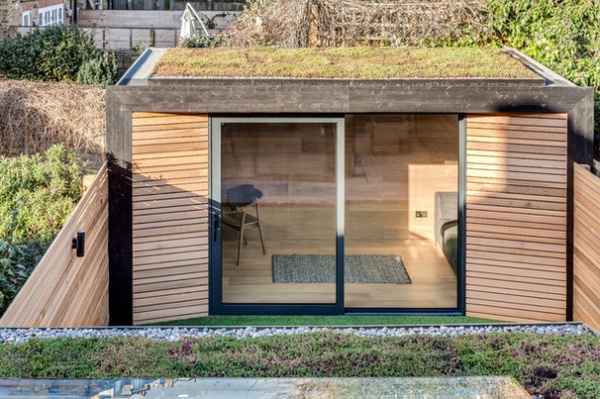
The garden study-media room is fully wired for electricity and cable TV, and has underfloor heating and plenty of storage. “It’s a small garden,” Spiring says, “but we decided that however big your garden is, you never use all of it.” He says that taking 6 feet of it to gain an extra room offset what was lost.
You can just see a bit of the sedum roof over the kitchen-dining room in the foreground.
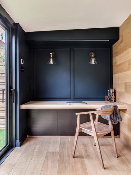
A pull-down screen is above the desk, and a projector is in the cabinet on the opposite wall. The black finish on the wall is linseed oil paint from Sweden, where it is widely used on house exteriors to preserve the wood. “It has a lovely matte finish,” Spiring says.
Stockholm chair: Ikea
My Houzz is a series in which we visit and photograph creative, personality-filled homes and the people who inhabit them. Share your home with us and see more projects.
Browse more homes by style:
Apartments | Barn Homes | Colorful Homes | Contemporary Homes | Eclectic Homes | Farmhouses | Floating Homes | Guesthouses | Lofts | Midcentury Homes | Modern Homes | Ranch Homes | Small Homes | Townhouses | Traditional Homes | Transitional Homes | Vacation Homes | Homes Around the World
Related Articles Recommended


