Houzz Tour: Would-Be House Flipper Falls Hard for a Florida Bungalow
Architect and interior designer Elizabeth Hallock didn’t have to look very far when she was looking for a house to flip. She heard that a neighbor was moving and scooped up the bungalow before it ever hit the market. She didn’t have to look very far for a business partner either. “A former client of mine [Hyla Griesdorn] who had become a friend told me to text her if I ever wanted to do a flip together,” she says. “I texted her that I’d found one, and all she wrote back was, ‘I’m in!’”
But there was a twist — her new business partner fell hard for the house and decided she wanted it for herself before the duo had even finished the project. “So she started as a client, became my friend, then my business partner and now she’s my neighbor too,” Hallock says. It’s easy to see why the new homeowner couldn’t let this charming home go.
Photos by YourDigitalPro.com
Houzz at a Glance
Who lives here: Hyla and Tom Griesdorn
Location: St. Petersburg, Florida
Size: 1,308 square feet (121.5 square meters)
Year built: 1920
Team: Architecture and interior design: E+D Architecture and Design; contractor: Brooks Hart of Hart Construction, Palm Harbor, Florida
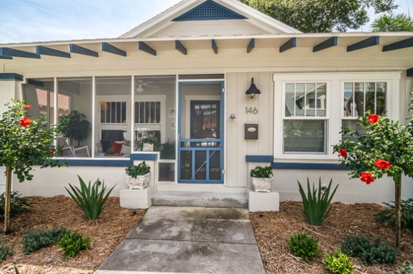
“We started with grays on the interior and then decided to carry it to the outside,” Hallock says of the main exterior color choice. To add curb appeal, she chose colors appropriate to the neighborhood and painted the trim, rafters and fretwork in the pediment in blue.
Paint colors: Revere Pewter and Van Deusen Blue, both by Benjamin Moore
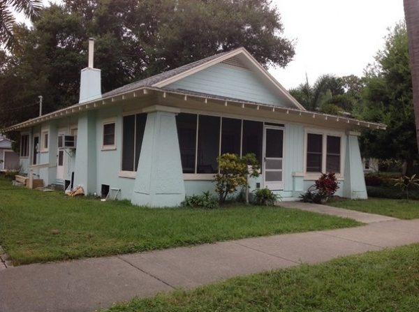
BEFORE: The house had some Craftsman bungalow style, but years of neglect had taken a toll on its curb appeal.
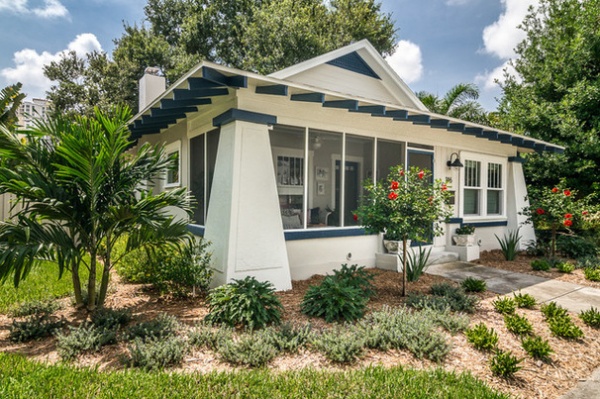
AFTER: The cheery paint and new landscaping have created a welcoming facade, restoring the home to a neighborhood gem.
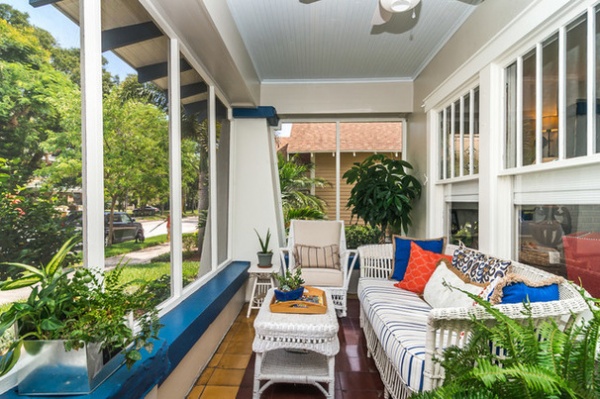
Once Griesdorn decided to keep the house for herself, she moved in her own furniture. Wicker pieces set a relaxed Southern tone on the front porch. The duo kept the original tile floor.
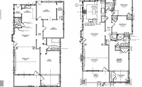
For years the house had been divided into two units — a studio on the left and a two-bedroom unit on the right. Hallock reconfigured the layout to turn it back into a single-family home. “The new layout gives a clear separation between the public and private spaces,” she says.
On the plans (click or tap them to enlarge), you can see how she turned the main unit’s kitchen into the master bedroom on the front of the house and reconfigured the back of the house into the new kitchen (left). Also, the middle and rear bedrooms (right) had a railcar-like setup; you had to walk through the middle bedroom to get to the back bedroom and bathroom (the dashed door on that plan is not yet existing). Hallock reconfigured the rooms to allow for a hall bath and a more functional flow.
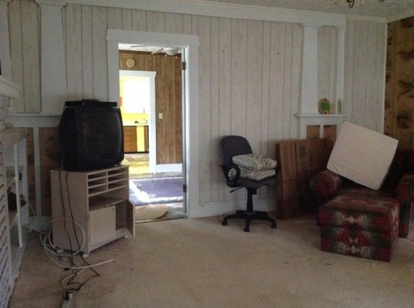
BEFORE: Paneled walls divided the public spaces. This was the studio apartment. It became the living room, the space beyond it became the dining room, and the peek of yellow you see in the back became the kitchen.
To orient yourself when comparing this “before” photo with the next photo, you can just make out the fireplace and shelves on the left side.
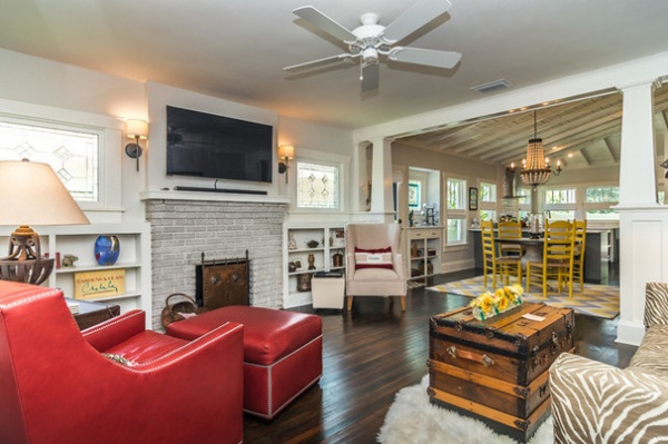
AFTER: Hallock removed walls to open the public spaces to one another. “I wanted people to be able to see all the way through and out to the backyard as they entered the house,” she says. “We also wanted to take advantage of the light from the southern exposure on the back of the house.”
Wall paint: Sheep’s Wool, Benjamin Moore; sconces: Rejuvenation
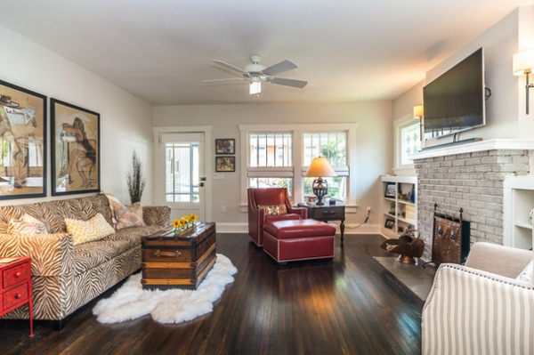
The front door, two front windows, built-ins and fireplace are original, as are the heart pine floors, which the duo sanded and stained dark. They commissioned Florida stained glass artist John Wallace, whom they found on Etsy, to create colorful leaded glass windows for period-appropriate character.
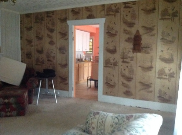
BEFORE: This doorway was between what is now the dining room and the hallway to the bedrooms.
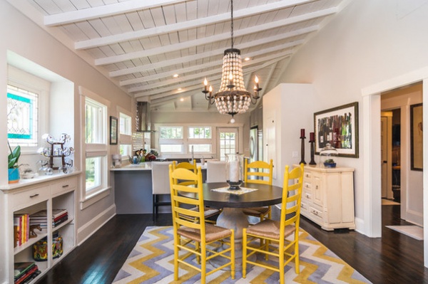
AFTER: You can see how Hallock enlarged the opening seen in the previous photo and created the bedroom hallway on the right side of the room. Because there were two roofs applied over the years, adding insulation, they were able to tear down the low ceilings and go all the way up to the rafters. The higher ceilings make the space feel larger, and the rafters add a rhythm overhead.
The dining table was an Overstock find. Griesdorn painted the chairs herself with milk paint to inject bold color into the room.
Chandelier: The French Nest Marketplace
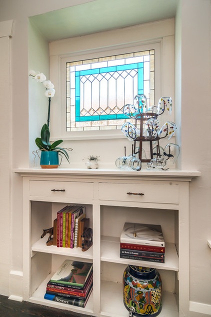
This charming dining room built-in was existing. The new window made by Wallace adds color and character, and lets in light while providing privacy.
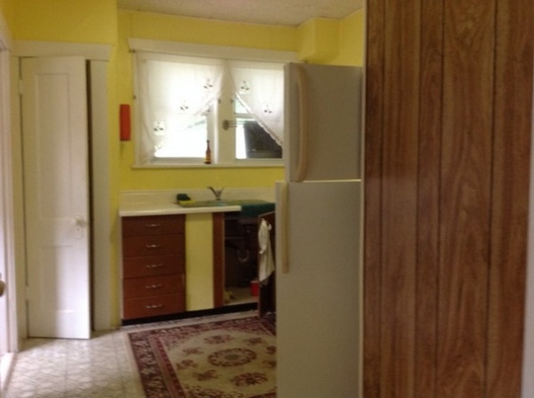
BEFORE: The back-left side of the house had a kitchenette, a bathroom that served the studio apartment and a closet.
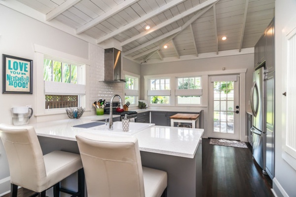
AFTER: Hallock removed the bathroom and the closet and added windows and a French door to take advantage of the Southern exposure.
In the right foreground, the white bumped-out area is a linen closet for the hallway. On the kitchen side, the cabinet on the front used to house an ironing board; Hallock turned it into a spice cabinet. The bump-out lines up with the cabinets and refrigerator, creating a nice transition between the dining room and kitchen.
Poster: Strands of Sunshine
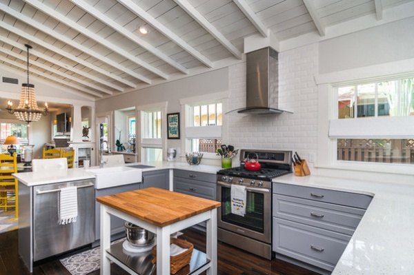
Hallock created a work triangle with a small island between the refrigerator, sink and range. The dishwasher is placed so one person could work at the sink and dishwasher and another at the range without their getting in each other’s way.
Cabinets, sink and Nougat quartz countertops: Ikea (the gray cabinet color is standard); range and refrigerator: KitchenAid; dishwasher: Bosch; vent hood: Whirlpool; beveled white subway tile: Lowe’s
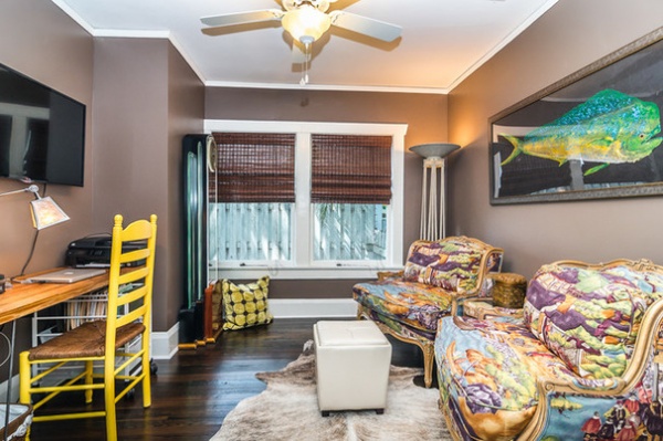
This cozy study was formerly the middle bedroom. None of the bedrooms had closets before, so Hallock had to work them in. The bumped-out area in the back-left corner is the closet in another room. The closet for this room is on the other side of the desk, just out of view. The two closet bump-outs create a niche for the desk.
The colorful fish rubbing is by local artist Greg Aragon.
Wall paint: Tilled Soil, Martha Stewart Living (discontinued)
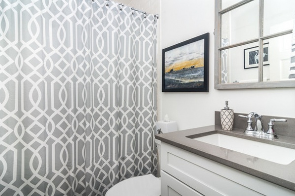
For the new hall bath, Griesdorn painted a mirror made from a reclaimed window. The artwork is by Florida artist Sarah Mullins of Indian Shores.
Shower curtain: HomeGoods; mirror: The French Nest Marketplace
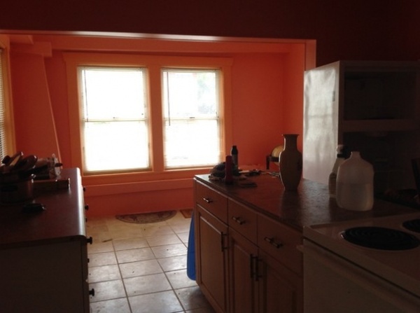
BEFORE: The front room was the kitchen in the two-bedroom unit. The section in front of the two windows had served as part of the front porch before a previous renovation enclosed it — the column you see here on the left side can also be seen in the alcove sitting area in the photo below.
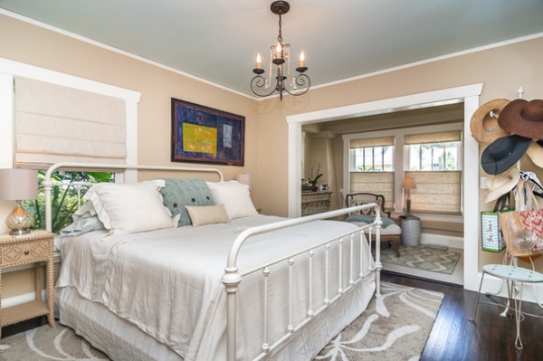
AFTER: The master bedroom replaced the former kitchen at the front of the house. Hallock made way for two double closets and kept the porch enclosed as a separate sitting area.
Paint by Benjamin Moore: Shaker Beige (walls), Serene Breeze at 50 percent (ceiling) and White Dove (trim)
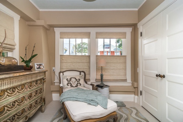
The cozy sitting room has ample space for a chest of drawers and one of the master suite’s two double closets.
The five-paneled doors are new but appropriate to the period. The knobs are antique. “Our contractor, Brooks Hart, went above and beyond when it came to tracking down antique hardware, the right doors and other elements for this project,” Hallock says.
Chaise: Mis en Chic; chest: John Widdicomb Co.
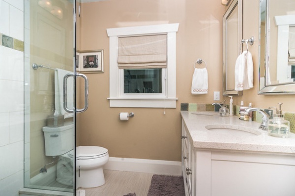
Hallock used the same color paint in the new master bathroom for continuity throughout the suite. She added handmade clay tile as an accent around the vanity and shower. “These are wonderful. Each one is different,” she says.
Wall paint: Shaker Beige, Benjamin Moore; accent tile: Agape’ Tile Works
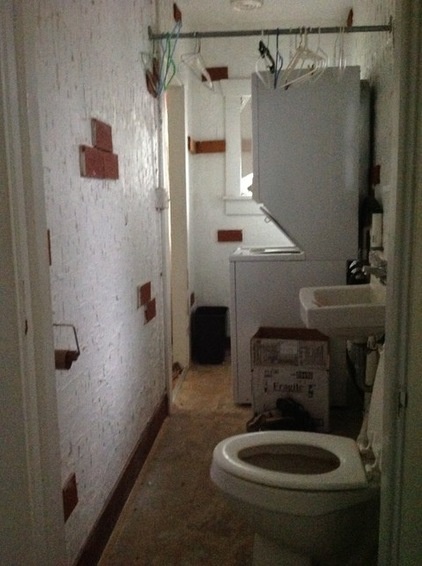
BEFORE: This bathroom-laundry occupied the back corner of the house. It was accessible only via the existing middle bedroom (now the study) and the back bedroom. Also, one had to walk through the middle bedroom to access the back one. Match up the small window to orient yourself in the following photo.
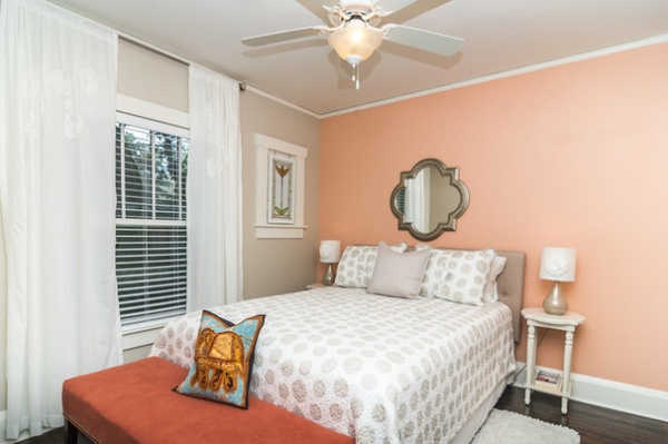
AFTER: Hallock reconfigured the space, moving the bathroom off the hall and taking over the space with the back bedroom, which now has its own door for access to the hall. She and Griesdorn mounted the stained glass piece on top of an existing window for privacy.
Hallock isn’t sure exactly when her business partner began to envision herself in this home, but the investment project turned into a labor of love — Griesdorn wound up creating her own home.
Paint: Edgecomb Grey and Daylily, both by Benjamin Moore
Browse more homes by style:
Small Homes | Apartments | Barn Homes | Colorful Homes | Contemporary Homes | Eclectic Homes | Farmhouses | Floating Homes | Guesthouses | Lofts | Midcentury Homes | Modern Homes | Ranch Homes | Townhouses | Traditional Homes | Transitional Homes | Vacation Homes


