New This Week: 3 Must-Try Ideas for Your Bedroom Project
http://decor-ideas.org 09/19/2015 02:13 Decor Ideas
As far as design goes, bedrooms are pretty straightforward. Pick the typical necessary components — bed, nightstands, dresser — and you’ve got a bedroom. But too often homeowners stop there. The designers for these three bedrooms didn’t. They took a holistic approach, embraced built-ins and celebrated simple white walls to turn what could have been ordinary rooms into spaces worth bragging about.
1. Holistic Approach
Designer: Architect David Edrington
Location: Eugene, Oregon
Size: 14 by 28 feet (4.2 by 8.5 meters)
Year built: 2007
Homeowners’ request: A cozy bedroom with a great view and access to an outdoor room with a comfortable place to sit. This was part of a new home.
Plan of attack: Architect David Edrington used an architectural method detailed in a book titled A Pattern Language to help flesh out the deeper idea of how the homeowners wanted the bedroom to function and how it should be experienced in terms of intimacy, which direction the bed should face and the flow to other rooms. “The primary patterns were ‘intimacy gradient,’ ‘sleeping to the east,’ ‘sleeping alcove’ and ‘the flow through rooms,’” Edrington says.
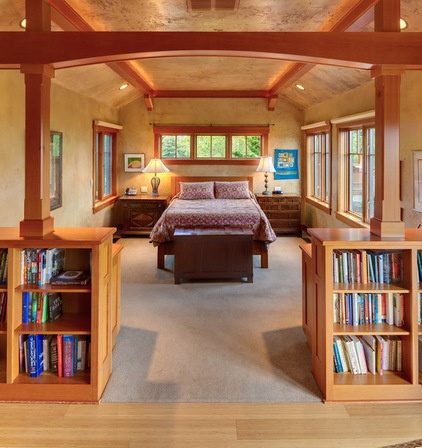
Why the design works: Simplicity and smart planning. “My work is about the common principles that come from the human experience with spaces,” Edrington says. “The beauty of this bedroom comes not from any unique situation or odd problem that needed to be solved. The beauty comes from the simplicity of the decisions guided by A Pattern Language. The bed is in an alcove-like space that is just big enough for the bed, side tables and room to move around. It has windows on three sides, including one on the east for morning light and several on the west for the evening view of the Oregon Coast Range.
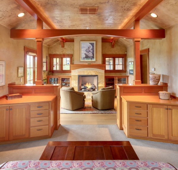
“Opposite the bed is a sitting space just big enough for two people, with a fireplace and some book storage. The fireplace is raised, so it’s visible from the bed. The proportions of the room are about 2:1, which means it’s naturally two spaces. In between the two spaces there is a thick half wall made of cabinets and columns and beams, which is a continuation of a theme used throughout the house.
“The room has a gently vaulted ceiling that supports the cozy human scale. The walls and ceilings are made of integral colored plaster, which is also a continuation of the wall finishes used throughout the house. The cabinets, windows, trim and other wood detailing is done in Douglas fir, because that’s our local wood and it has a beautiful color and grain.”
Who uses it: A couple in their late 50s and early 60s, who work at home
The nitty-gritty: Cabinets: clear Douglas fir, The Cabinet Factory; walls: colored plaster; floors: bamboo, Imperial Floors
Team involved: Dorman Construction (general contractor); Erik Bishoff (photographer)
2. Embracing Built-Ins
Designer: Garcia Stromberg
Location: Stuart, Florida
Size: 14 by 20 feet (4.2 by 6 meters)
Homeowners’ request: A contemporary yet classic look with clean, straight lines
Designer secret: Strategically planned built-ins save space.
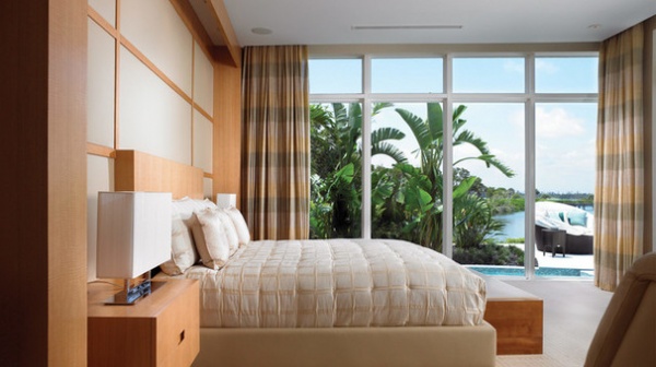
Plan of attack: Create as much livable space as possible, then focus on the view. “Then the built-ins brought the whole room together,” designer Garcia Stromberg says.
Why the design works: “The design of the linear lines worked flawlessly with the natural colors that were incorporated from the view of the outdoors,” Stromberg says.
What wasn’t working: “The biggest challenge was the narrow space and fitting a comfortable amount of furnishings and decorations in the space while still portraying a contemporary look,” Stromberg says.
Splurges and savings: The homeowners saved on furnishings but splurged on built-ins.
Team involved: Palm City Millwork Inc.
3. Off-the-Shelf White Walls
Designer: Carley Montgomery
Location: Silver Lake neighborhood of Los Angeles
Size: 20 by 28 feet (6 by 8.5 meters), or 560 square feet (52 square meters)
Year built: 2015
Homeowner’s request: This home was built on spec for a future owner. Carley Montgomery acted as the architectural designer, interior designer, general contractor and developer. She envisioned modern clean lines and flexible living space for this house, which could be used as a guest house, an office or an artist’s studio.
Designer secret: Plain white walls. “Everyone gets all crazy trying to pick the perfect white,” Montgomery says. “While in many circumstances this is vital to match the furniture or warm a space with a hint of color, I find off-the-shelf white is the most universal, easy and safe color for modern homes.”
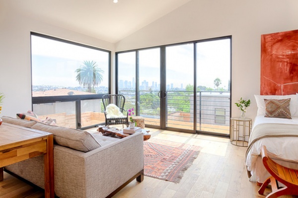
Plan of attack: Montgomery designed the home from the ground up, positioning it to capitalize on unobstructed views. Large floor-to-ceiling windows bring in light and views of downtown Los Angeles, which Montgomery wanted to highlight by keeping the interior design minimal. “It’s incredible at night,” she says. “The desk behind the sofa allows you to work and also enjoy the view.”
Why the design works: “This entire space is only 560 square feet and feels so much larger,” Montgomery says. “The ceilings are vaulted, creating a loft-like feel. But the flow of the space is what really works. We fit a full kitchen, full bath, dining area, living area, desk and bed in the space, and it doesn’t feel crowded. This has everything to do with the placement of the entry door, kitchen and bathroom inside the space. It is vital to place your furniture on your plan when in design so that you maintain flow through the finished space.”
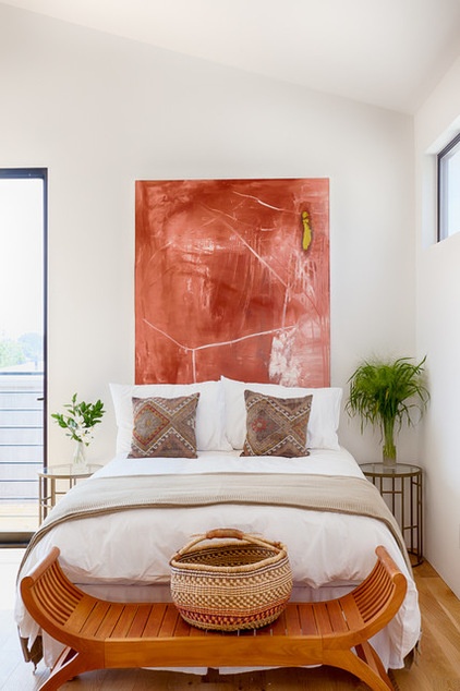
“Uh-oh” moment: “If this were a project being built for a homeowner, there would have been numerous ‘uh-oh’ moments. There always are,” Montgomery says. “Being that this is my business and I’m acting as owner representative, designer and contractor, decisions are quite simple. The only issue is trying to anticipate what the buyer of the property is going to want. It’s like working for a mystery client.”
Take-away: The value of well-planned and thought-out design
Team involved: Jordan Christian (artist); Corbin Poorboy of The Here Co. (styling); Eric Charles (photographer)
More: A Guide to Updating Your Master Bedroom
New This Week features designs from projects most recently uploaded to Houzz. Have a great project? Here’s how to share your photos on Houzz.
Related Articles Recommended


