Room of the Day: A Bathroom Remodel to Celebrate a 50th Anniversary
http://decor-ideas.org 09/16/2015 21:13 Decor Ideas
Joe Pieralde knew exactly what his wife, Judy, wanted for their 50th wedding anniversary. Not a leisurely trip to Europe or a sparkly diamond ring, but instead a more spacious, spa-like master bathroom for their ranch home.
The Pleasant Hill, California, couple asked designer Jennifer Hobson of Altera Design & Remodeling Inc. to help them create a private retreat that felt more open. Removing key obstructions and going with a calm, neutral color palette featuring a rich cherry vanity and an open glass-enclosed shower gave the couple the soothing and stylish space they desired.
“After” photos by Douglas Johnson Photography
Bathroom at a Glance
Location: Pleasant Hill, California
Who lives here: Joe and Judy Pieralde
Designer: Jennifer Hobson of Altera Design & Remodeling Inc.
Size: About 55 square feet (5.1 square meters) before; about 66 square feet (6.1 meters) after the wall and furnace were removed
Year built: 1967
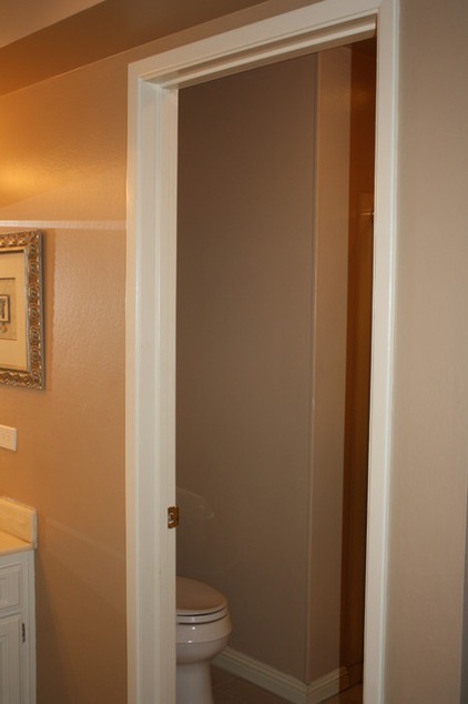
BEFORE: Prior to the renovation, the beige master bathroom with brass fixtures felt broken up due to a wall separating the vanity, on the left, from the toilet and the shower (to the right of the toilet). In addition, a furnace in a closet took up floor space and left the Pieraldes with room for only a compact shower. (For more details, see the floor plans below.)
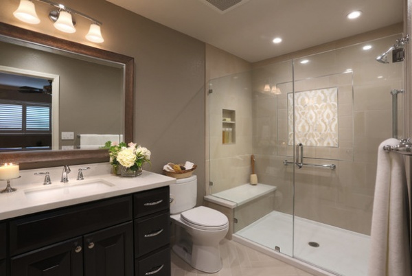
AFTER: Shot from the same angle, this photo shows how removing the wall between the vanity and toilet, and between the toilet and shower, created better flow and a feeling of spaciousness. A dropped ceiling over the vanity was also removed to create more openness.
Removing and relocating the furnace to the attic freed up floor space and allowed room for the larger glass-enclosed shower with a built-in niche and bench seat. The seat has a slab top in the same material used for the vanity counter. Having a slab in place of tile cuts down on grout maintenance.
Paint by Benjamin Moore: Shenandoah Taupe AC-36 (walls), Athena 858 (ceiling) and Cloud Cover 855 (trim); toilet: Toto
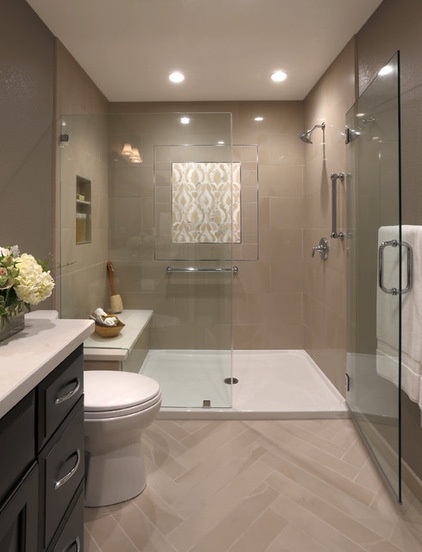
Because the updated bathroom has a monochromatic and neutral color scheme, designer Hobson played with textures to give the space depth and layers. For example, the floor tiles have a matte texture, while the shower field tiles have a polished finish. “We used a herringbone layout for the floor, with the points of the tiles pointing towards the shower and medallion, almost beckoning you inside,” she says.
Floor tile and shower field tile: Crossville Inc.
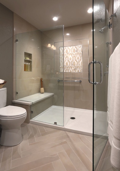
The star of the shower is the medallion, made with laser-cut tiles inspired by damask fabric. A heavy glass pivot door offers clear views inside and easy access in and out of the shower.
The shower wall’s 12-by-24-inch field tiles and matching grout contribute to the room’s sense of calm. Using a shower pan underfoot created a more seamless look and avoided grout lines.
Shower head, arm, flange and valve trim: chrome, Moen; shower pan: Maax Bath Inc.
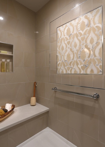
The medallion was a splurge, so the designer gave it a chrome and tile frame to visually increase its size and appeal.
Shower wall accent tile: Damask Classique, Artistic Tile; shower wall metal trim: chrome, Schluter Systems; grab bar: Jaclo
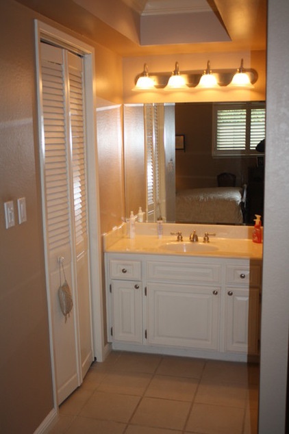
BEFORE: The bathroom’s old white vanity, seen in this photo taken from the open doorway to the master bedroom, had a thin cultured marble top with a small round sink and a frameless mirror. Joe and Judy wanted a taller vanity with improved storage and a richer look. The double white louvered doors seen on the left remained after the remodel, and conceal the master closet.
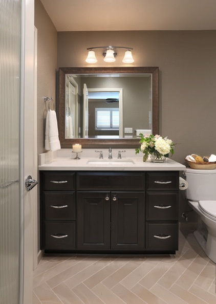
AFTER: A reeded glass door provides privacy for the bathroom, replacing the open doorway. The glass door, which was Joe’s idea, lets in the natural light from the bedroom windows, while still allowing a more private feel for the bathroom.
The new cherry vanity with a rich java finish has a roomy rectangular sink and six drawers for bathroom essentials, with chrome knobs and pulls. The vanity’s thick top has a marble-like pattern for a soft feel.
Vanity cabinet with java finish: Crystal Cabinets; vanity hardware: Top Knobs; vanity counter: Caesarstone in Frosty Carrina; sink: Artisan Manufacturing Corp.; faucet: Moen; framed mirror: Valley Moulding & Frame; light fixture above mirror: Progress Lighting; glass door: Trimlite Inc.
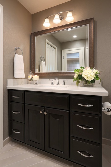
The distressed framed mirror above the vanity offsets the room’s polished finishes. “There’s more of a furniture appeal with the framed mirror,” Hobson says. “We purposely chose a mirror with a frame that didn’t match the vanity for a more custom look.”
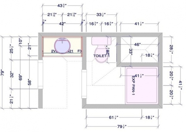
BEFORE: This floor plan shows how the old bathroom was chopped up, with the wall separating the vanity from the toilet and the furnace enclosure reducing the size of the shower.
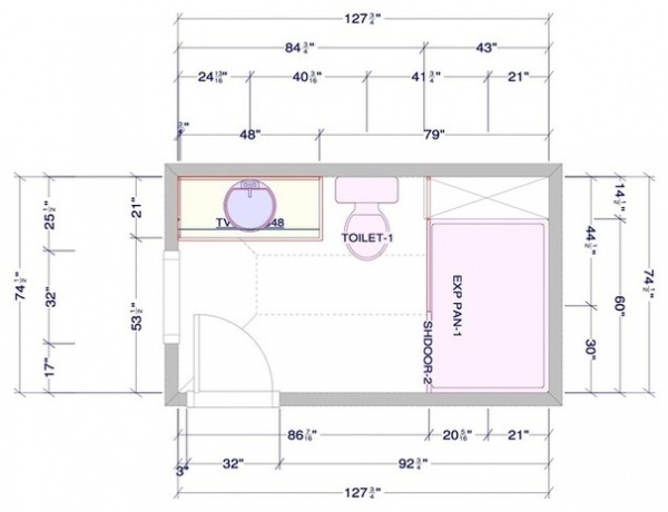
AFTER: As this “after” floor plan illustrates, removing the wall and the furnace closet allowed for a user-friendlier layout and a spacious feel.
The updated bath has given the couple the tranquil space they wanted. “Before, I couldn’t wait to get out of there. Now I love going into my bathroom,” Judy says. “Having that extra space has made a huge difference.”
More: 12 Design Tips to Make a Small Bathroom Better
Related Articles Recommended


