Houzz Tour: A Ranch House Gets a Reboot
http://decor-ideas.org 09/15/2015 21:13 Decor Ideas
Over the years this Northern California ranch house had seen some ill-considered additions and updates. The new owners were looking for a refresh, and a home that was done with heart and integrity. They hired interior designer Laura Martin Bovard to create character-filled spaces with a modern homestead feel.
Photos by Eric Rorer
Who lives here: A couple and their three children
Location: Lafayette, California
Size: Five bedrooms, four bathrooms
Designer: Laura Martin Bovard
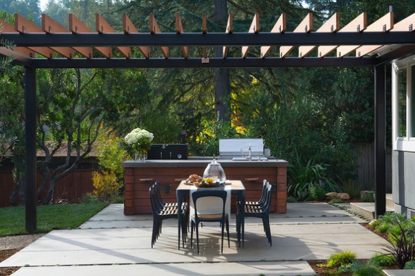
The best ranch houses live as one with the land, and this one was no exception. However, before the remodel, this outdoor kitchen was merely a few cement slabs ringed by gravel.
“There was a giant tree here, but it was dying and had to be removed,” Bovard says. “We replaced it with a trellis for shade. It also defines the space and makes it feel like an outdoor room.”
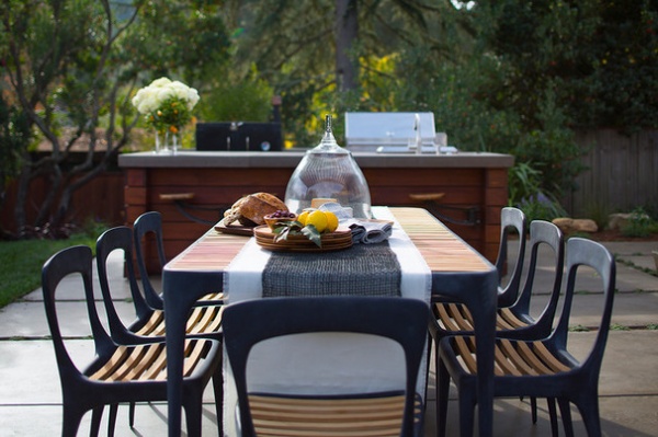
The elegantly proportioned metal and wood chairs and table would be at home in most indoor dining rooms. By keeping the shapes svelte, the designer says, she made the space feel open and airy.
Table and chairs: Dunkirk
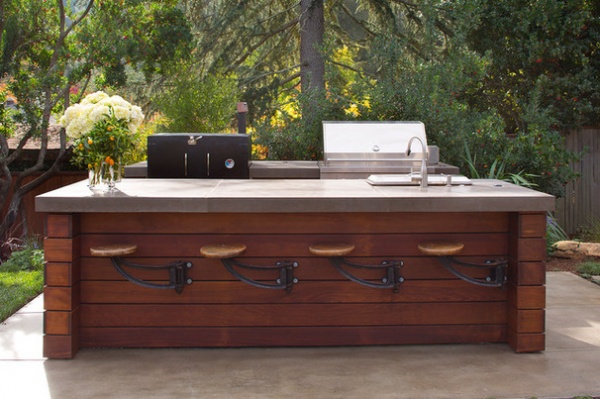
Bovard says the outdoor kitchen (equipped with a grill, a smoker, a sink and concrete countertops) is the entertaining command center for the husband.
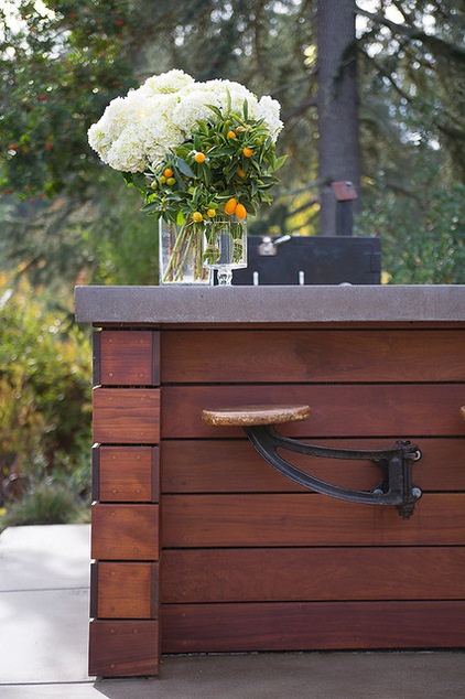
Vintage factory seats are mounted to the island and can be swung away when not in use. Not only do these keep the space uncluttered, the designer says, but they add a sense of playfulness.
Vintage factory seats: Big Daddy’s Antiques, Inc.
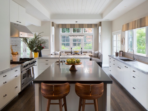
But not every meal can be made under a blue sky. Inside, the kitchen was reconfigured to suit the family. Quinn Morgan of Laura Martin Bovard Interiors conceived a layout that would allow people to work and spread out. “When you have three kids, you will often have their three friends in the house,” Bovard says. “Since the kitchen is a household hub, it’s helpful to have room for working and gathering for that many people.”
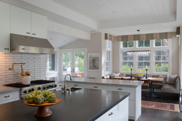
The new kitchen features more countertop space for prep work and serving. Bar stool seating at one end of the island and along the peninsula between the kitchen and the banquette allows for gatherings of two or four.
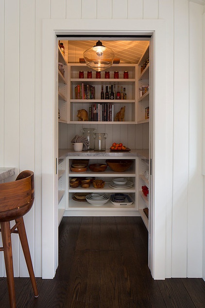
A pantry is tucked between the chairs at the end of the island and the dining room. Bovard notes that edible gardens ring the house, and the pantry acts as a storage spot for the owner’s home-canned goods.
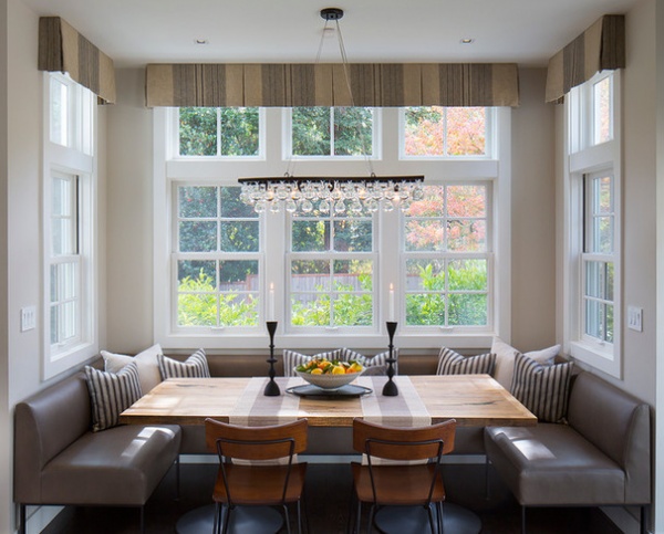
For family dinners, a three-sided banquette is just outside the kitchen. The table is custom, crafted from boards salvaged from a winery. The light fixture is see-through, so no light or views are blocked.
“There’s a high-low mash-up in this house,” Bovard says. “I find that no matter how much clients have to spend, they appreciate a few well-chosen, cost-effective items. The light fixture is from Ochre, and the chairs are West Elm.”
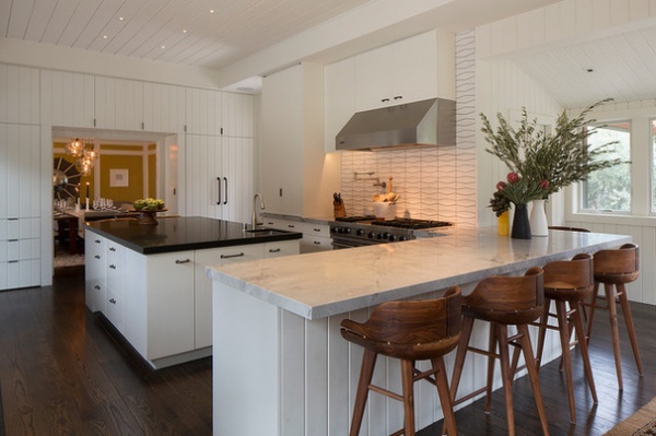
The designer says paneling was used on the ceiling and cabinets to create a casual and cheerful effect. Through the passageway at the left, you can see the more formal entertaining option.
Tile: Heath Ceramics; countertops: IRG
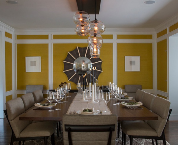
The yellow wall covering and white moldings were already in place when Bovard was hired. She gave the room a more modern vibe with midcentury-style chairs and a modern chandelier.
Light fixture: John Pomp; mirror: Arteriors; wall covering: Phillip Jeffries
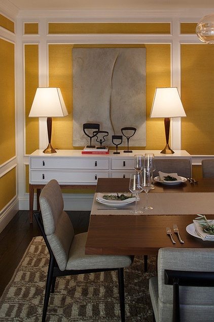
The table is custom and double-wide, so two chairs can fit at each end. “The clients wanted to be able to seat 10, but we just couldn’t get the length in this room,” Bovard says. “Putting two chairs on each end was the solution.”
She notes that no matter how many people are sitting at the table, they will be at ease. “These chairs are so comfortable, you could sit in them all night long,” she says.
The console table serves as a buffet with storage. The vintage gardening tools that decorate it are a nod to one of the owners’ love of gardening.
Chairs: Conde House
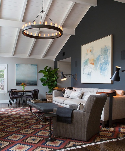
The family room provides another color note in the home, and this one is a deep tone with resonance. Bovard says they were going for cozy — not an easy feat when you have soaring ceilings.
One of the owners discovered a vintage rug that she loved, but it was too small for the space. Using that piece as a springboard, Bovard designed a rug with the same look and feel.
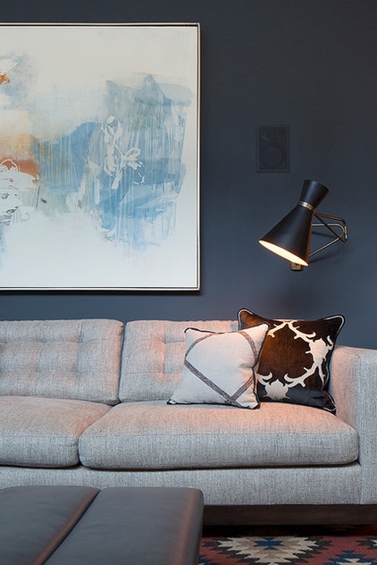
The designer used dark blue to make the room feel grounded, warm and comfortable. Because a sectional would have cut off the flow of the room, Bovard custom-designed an extra-long sofa.
Wall paint: After Midnight, Benjamin Moore
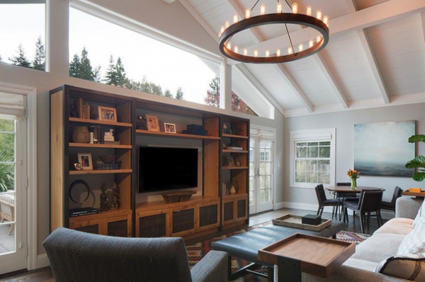
On the other side of the room, an entertainment center balances the deep blue wall. Bovard installed automatic shades that come down over the window, making watching television a movie theater-style experience.
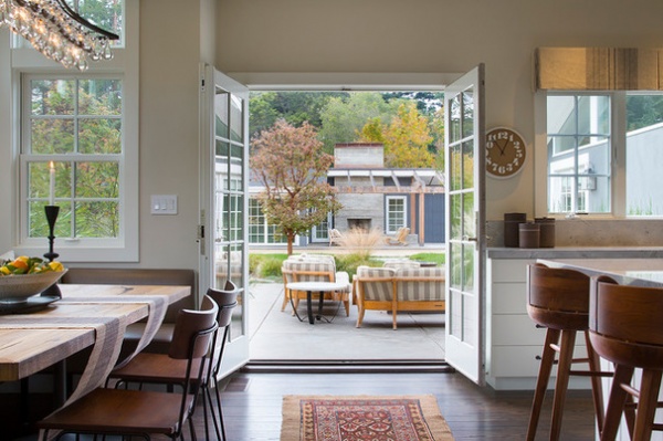
Throughout the house, French doors now open to outdoor living areas, and looking through this portal, you can see the pool house, the first project Bovard worked on for this household.
See more photos of the pool house
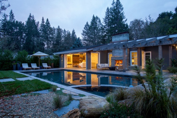
With all the home’s beautiful options for gathering, many would agree that the new space is (much) better than OK.
Interior architecture: Quinn Morgan
Contractor: McCutcheon Construction
Landscape design: Susanne Arca Design
Browse more homes by style:
Apartments | Barn Homes | Colorful Homes | Contemporary Homes | Eclectic Homes | Farmhouses | Floating Homes | Guesthouses | Lofts | Midcentury Homes | Modern Homes | Ranch Homes | Small Homes | Townhouses | Traditional Homes | Transitional Homes | Vacation Homes
Related Articles Recommended


