Wasted Space Put to Better Use in a Large Contemporary Bath
At about 260 square feet (24.1 square meters), this bathroom had loads of space, but most of it was going to waste. Though it was the master bath, a hallway separated it from the bedroom. Extended storage had no space for hanging items, the shower was small, and a large tub was a space hog. Not to mention that the finishes and the fixtures were dated. Nathan Kyle of Astro Design Centre recomposed the floor plan, created a direct connection to the bedroom, added smart and sleek new cabinets that serve as the closet, placed the toilet in its own private water closet space, installed a steam shower, gave the couple his-and-her vanities and even incorporated the TV that was on their wish list into the mirror. The result is a luxe retreat that feels like a spa.
“After” photos by DoubleSpace Photography
Bathroom at a Glance
Who lives here: This is the master bathroom for a couple who have two young children.
Location: Ottawa, Ontario, Canada
Size: 260 square feet (24.1 square meters)
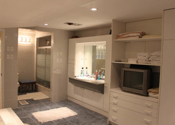
BEFORE: This master bathroom is located on the walk-out lower level of a midcentury modern split-level ranch. This floor has low ceilings and includes the master bedroom, the laundry room and a TV den, while all of the public spaces and three bedrooms are upstairs on the main floor.
Even though this layout gave the couple a large bathroom, it felt all wrong. The toilet and elbow-bonking shower were crammed into one small space, at left in the photo, and the couple shared one sink and counter. The space also served as a closet but didn’t have anywhere to hang clothing. Just to the left of the toilet was more wasted space, a hallway that cut the bathroom off from the bedroom.
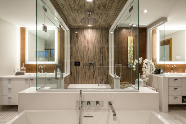
AFTER: For the new layout, Kyle set up a beautiful two-person shower with a clear glass surround in the center of the room, working in everything around it. “Now the shower is like a jewel-box cube in the center of the room,” he says.
The ceilings are just a little over 7 feet high. The designer oriented the mosaic tile vertically and continued it up the shower stall walls and across the ceiling to draw the eye and make the low ceilings look higher.
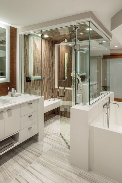
Universal design elements played a part as well. The shower is curbless, which will help allow the couple to age in place. The floor is matte and has texture, which prevents slipping, and the shower has a built-in floating bench.
A porcelain floor tile made to look like Cipollino marble determined the room’s color palette. “Because there aren’t any windows in here, we wanted to keep it light and bright, but without being too stark,” Kyle says. “We started with the veins in the tile, plucking out taupes and grays from there, which balance the white vanities.”
Wall tile: 12-inch-by-12-inch Runway clay mix, MudMosaic; floor tile: 24-inch-by-24-inch Bianco Ossigeno porcelain
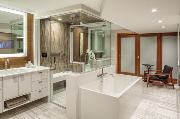
He chose a covering for the vanity walls that looks like wood but stands up to moisture, and faced new wardrobe cabinets with taupe acrylic that stands up to moisture as well. Now the bathroom also serves as a closet, and the couple have hanging space for their clothes. Kyle placed the wardrobes along the right side of the bathroom because the existing ductwork left a lower ceiling there. He saved the portion under the higher part of the ceiling to house the rain shower head at a comfortable height.
The area behind the new sliding doors at the far end of this photo is the laundry room.
Tub: 62 inches by 30 inches, Wetstyle; Edge collection wall-mount tub filler: Cabano; shower fixtures: Edge collection by Cabano and Raindance collection by Hansgrohe; steam unit: Mr. Steam
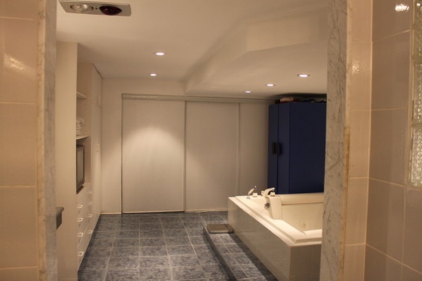
BEFORE: This photo shows how much wasted space there was in the room before the renovation. The bathtub was a space hog. There was a lot of storage, but none of it was for hanging clothes.
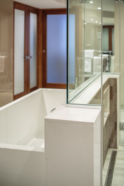
AFTER: Kyle placed the soaking tub in front of the shower stall. The knee wall between the shower and the bathtub also houses the shower faucet, and is topped with the same Caesarstone as the vanity countertops. This creates a pleasing cohesion throughout the space.
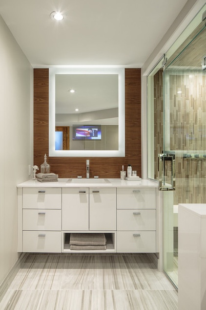
Despite how large the existing bathroom was, the couple had to share one sink. Now they have his-and-her vanities on either side of the shower complete with space-saving electric mirrors. The man of the house loves to watch the news while shaving in the morning, so Kyle set him up with a mirror with a built-in TV to replace the clunky old set the couple had before. Both mirrors also have built-in defoggers, so if one of them is showering, the other can see to shave, do hair or put on makeup at the same time.
Mirrors: Electric Mirror; vanity: custom, Astro Design Centre; faucets: Edge collection widespread faucet: Cabano; square built-in basin: Alape; countertops: Caesarstone in Pure White 1141
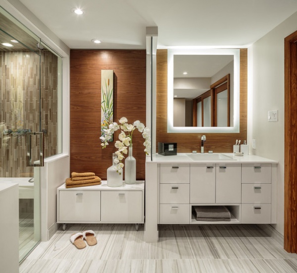
The vanities incorporate towel storage on the bottom, while the electric mirrors eliminate the need for makeup lights overhead. This also helps mitigate the low ceilings. On the woman of the house’s side is an extra storage cabinet-bench on casters. The casters not only allow her to roll it around for sitting while getting ready, but also allow easy access to an electrical panel that’s hidden behind the cabinet.
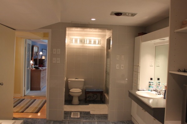
BEFORE: Here you can see the previous connection between the bedroom and bathroom. The hardwood area with the runner on the left was an open hallway. Kyle enclosed this area (just to the left of the bedroom-bathroom doors seen in this photo) with French doors to create a true en suite. He then closed off the toilet room from this side, reconfigured it a bit and added a door from the area between the bedroom and bathroom. This is clearer in the plans below.
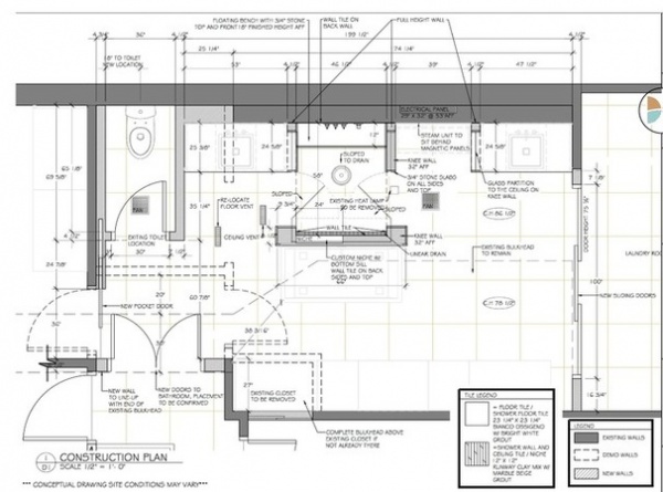
This plan overlays the existing conditions (dotted lines) with the new design (solid lines). Other things like the placement of the existing toilet are marked. However, if you’re trying to wrap your head around the new layout, see the plan below, which is easier to read.
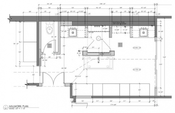
This plan shows more clearly how Kyle created the connection between the bedroom and bathroom. The bedroom is to the left, and the bathroom is to the right. The new French doors are on the bottom-left side of the plans; just above them you can see the new entry to the reconfigured water closet. This keeps the toilet separate from the rest of the bathroom for efficiency and privacy.
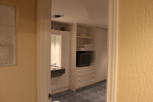
BEFORE: This is the existing hallway that stood between the master bedroom and the bathroom. The toilet was parallel to the glass block window, just behind it. The new water closet entry is located where you see the glass block in this photo.
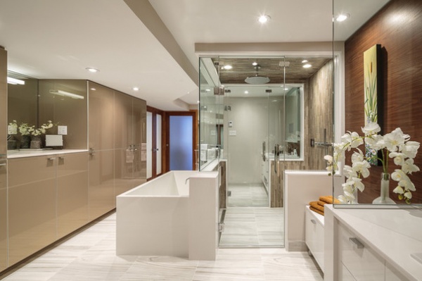
AFTER: You can see the new French doors at the far end of the taupe cabinets on the left side of this photo. The wall you see through the shower closes off the water closet from the rest of the bathroom.
Now the bathroom makes the most of its extensive square footage, gives the couple more privacy and has ample storage for everything they need to keep organized. The only problem is that now their kids want to use their master bathroom too.
More
A Designer Shares Her Master-Bathroom Wish List
18 Dream Items to Punch Up a Master-Bath Wish List


