New York Loft Meets Scandinavian Style in a London Kitchen
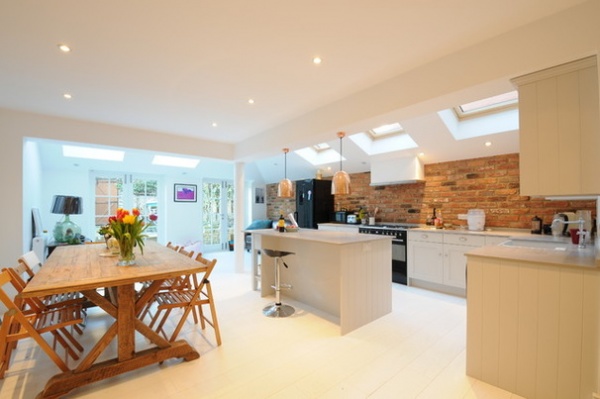
A New York-loft look was the goal for this chic London family kitchen with a striking exposed-brick wall. “The feature brick wall almost dictated the project,” says Will Gemmel, director of Affleck Property Services, which was behind the kitchen’s build and design. “It was a must-have.”
Look beyond the bare bricks, though, and you can also detect a faint touch of northern European chic. “It’s quite [Scandinavian] in terms of the white wooden floor and the fact that it’s open-plan,” Gemmel says. Crisp white walls and a row of skylights add to the uplifting, bright feel.
The owners mixed things up further, opting for a few rustic touches to ensure that the room didn’t feel cold or clinical. So the cabinets have a subtle, countryish charm to them, with Shaker-style paneling, while copper pendant lights add warmth and color, along with simple wooden dining furniture.
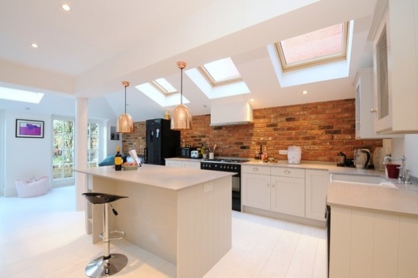
Kitchen at a Glance
Who lives here: A professional couple with 2 young children
Location: Hammersmith, west London
Size: Part of a 5-bedroom, 3-bathroom home
Designer: Affleck Property Services
New York inspiration aside, cast aside ideas of a Sex and the City lifestyle — this is very much designed to be a family hangout. “The owners had just had their first child and wanted a nice new kitchen,” Gemmel says. “They’re a young, busy family, growing into their home and planning for the future.”
The previous kitchen was dark and lifeless, and the owners felt it was high time to open it up and add light. “They wanted modern, New York style, with a few rustic touches,” he says.
The solution involved extending into the side yard and the backyard, creating space for a lounging zone leading into the garden, as well as the kitchen. The owners had already done work on the floor above, which caused headaches in this space. “We couldn’t insert steel joists in the ceiling, as this would have involved opening up into the rooms above and causing damage,” Gemmel says.
If you’re planning a whole-house makeover, think bottom up, he advises. “So many people make the mistake of not planning ahead. I’ve had to be the bearer of bad news to many potential clients where they didn’t realize this.”
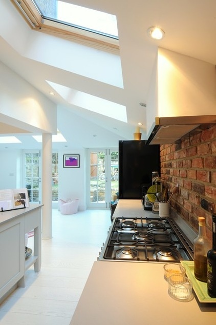
The owners went for bare bricks behind the range. “I always advise clients to put [backsplashes] in last,” Gemmel says. “First put your [countertop] in and choose your colors, then decide [on the backsplash] later.”
While glass was discussed, the clients decided to keep the loft look going to avoid breaking up the bricks. “Ultimately, the decision is always about practicality versus style,” Gemmel says. The bricks used here are reclaimed, but Gemmel says he’s using more brick slips in projects — used like tiles, but they have a more authentic brick-like effect.
The new extension and rear roofs are pitched, rather than raised, for a more traditional look, and a row of skylights keeps the space cheerful on the cloudiest of days. “A glass roof was ruled out, as there are a lot of trees in the garden, plus it would have been more costly. The skylights require less maintenance,” Gemmel says.
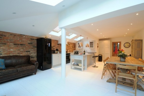
This is a relatively wide room, and Gemmel laid the floorboards crosswise to accentuate the effect. “Having the floorboards run across the width of the room definitely makes it seem wider,” he says.
The owners wanted the floor to be pale to create a sense of space. Some might flinch at the thought of white floorboards in a high-traffic kitchen (all those muddy footprints), but Gemmel says the owners are laid-back about it. “They have a very easy outlook on life and were well aware that this was not going to be a show home with kids in the house,” he says.
A steel post, painted white to blend in, supports the brickwork above. A round post was chosen instead of a hard-edged squared one to add a softer feel.
The island doubles as a breakfast bar for morning coffees and a bar for predinner drinks. The sofa area, meanwhile, is where the family can chill out, and the children can play or watch TV. “The adults can keep an eye on them from the kitchen if necessary,” Gemmel says.
Bar stool: Atlantic Shopping; dining table: The Woodstore; refrigerator: Samsung
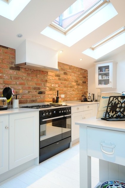
Handmade off-white cabinets with a pared-down feel were chosen, rather than a slick, ultramodern design. These help soften the feel of the kitchen and add character, along with the bricks. “I’d describe the kitchen’s style as clean-lined but mixed with splashes of modern rustic,” Gemmel says.
The elegant off-white coutertop is Silestone, a tough quartz composite that’s stain- and scratch-resistant, so it’s ideal for kitchens.
It’s the details that really add character to this kitchen. Wire-front wall cabinets, allowing just a peek at the dishware and glassware within, add to the charm, as do the cabinet handles and knobs. According to Gemmel, such attention to detail should be at the forefront when you’re planning a kitchen. “Know what you like; know what you dislike,” he advises. “Know your plates, think how you will use the kitchen, and plan yourself working in your new space.”
Cabinets: Harvey Jones; countertop: Silestone, Marble City
The kitchen project took 16 weeks to complete. Fortunately, all went smoothly. “The only potential glitch was when the client wanted to extend out after we’d poured the foundations and started to build the brickwork. We talked them out of it,” Gemmel says.
“Overall, it was very much a work in progress, with quick decisions being made once the right item had been put in front of the owners — they have an eye for detail and taste,” Gemmel says. The result feels easy to live in and welcoming, as well as chic.
Copper pendant lights, Furnish.co.uk
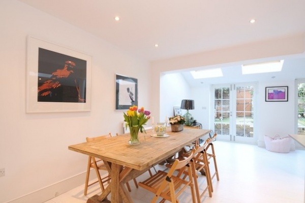
The owners went for simple wooden dining furniture with a rustic edge that contrasts with the white walls and floor. “Originally, we talked about using scaffolding boards as a shelf, so the furniture choice fits with that idea,” Gemmel says.
The finished kitchen has tons of character while still being eminently user-friendly. So what does Gemmel like best about it? “The bricks and floor are my favorites,” he says. “And it’s a place that works for everything it was designed for.”
More: Homeowner’s Workbook: How to Remodel Your Kitchen


