Kitchen of the Week: Midcentury Meets Sweden in Minneapolis
http://decor-ideas.org 09/04/2015 21:13 Decor Ideas
As a retired food writer, Lynda Kochevar now spends time in her kitchen testing recipes without the stress of deadlines. But Kochevar, who purchased her 1951 midcentury home 10 years ago, wanted to give her tired kitchen more counter space, better function and a fresher look.
She found kitchen designer Christine Nelson on Houzz and the pair set out to create a space that felt “midcentury modern meets modern Sweden,” Kochevar says. A gray Marmoleum floor, white paint-grade maple cabinets, a white ceramic stacked subway tile backsplash and warm wood counters provide a neutral Scandinavian-inspired backdrop, while orange walls and lift-up avocado green cabinets on the range wall give the kitchen a fun burst of color worthy of the Mad Men era.
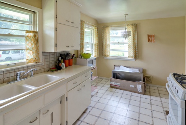
“Before” and “after” photos by Mark Ehlen of Ehlen Creative Communications
Kitchen at a Glance
Who lives here: Lynda Kochevar, a retired food writer, and her two dogs
Location: Minneapolis, Minnesota
Size: 133 square feet (12.4 square meters)
BEFORE: Prior to the renovation, the kitchen had an aging floor, a small corner for a table and chairs, an old cast iron drop-in sink, basic wood cabinets with blind corners, no dishwasher and a microwave housed on a rolling cart.
“There was also a big lack of counter space on the stove wall,” Kochevar says. “I didn’t even have a spot to rest a spoon.”
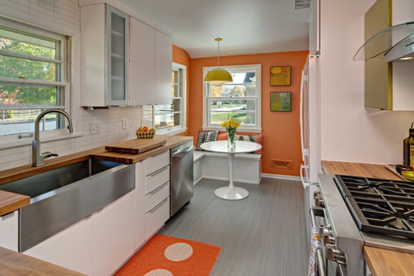
AFTER: Designer Christine Nelson had the idea to use a built-in banquette with lift-up benches with storage inside to replace the table and chairs that at one time sat in the far corner of the kitchen. This allowed for more clearance around the eating area and better traffic flow.
The kitchen’s new gray striated sheet Marmoluem floor almost looks like bamboo, adding needed pattern to the room. “Gray is a great color for livability,” Nelson says. “It doesn’t show dirt as much as other colors.”
Kochevar found the vintage light fixture over the banquette online, and the framed midcentury paintings seen in the banquette area were done by Nelson’s father, an artist, in the 1950s.
Custom banquette: contractor Joe Hamel; table: Knoll; paint color for benches: Super White, Benjamin Moore; paint color for walls: Copper Harbor SW6634, Sherwin-Williams; paint color for trim: Decorators White, Benjamin Moore; flooring: Marmoleum in Grey Granite, Forbo Flooring Systems
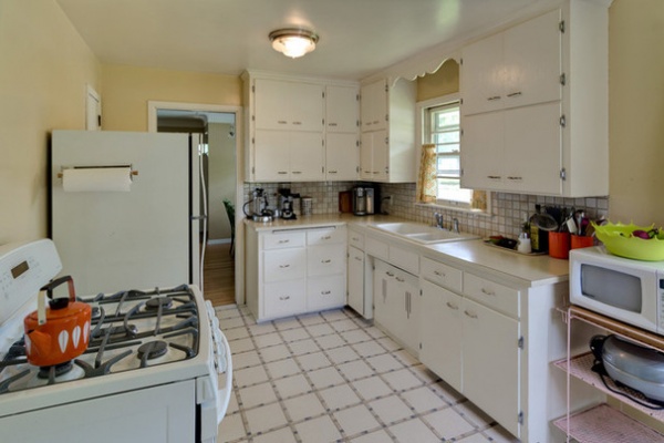
BEFORE: This view of the kitchen prior to the remodel shows a scalloped detail over the sink that made the kitchen feel dated, and a single ceiling fixture that was the only source of light for the sink and cooking areas.
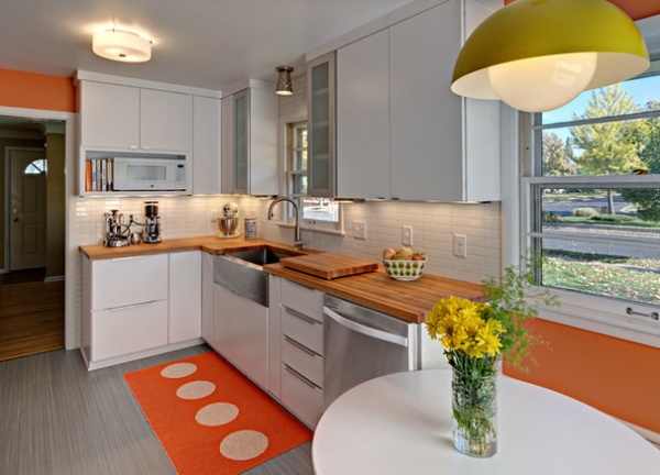
AFTER: The updated sink area now includes a stainless steel dishwasher. An open upper shelf to the left of the sink provides a home for the kitchen’s microwave and some of Kochevar’s cookbook collection.
The white paint-grade maple cabinets with slab doors and simple aluminum finger pulls offer lots of organized storage. A two-tier lazy Susan sits in the lower cabinet to the left of the sink, where a blind corner once prevented proper storage. A pullout spice rack sits to the right of the sink.
Two tall aluminum-framed frosted-glass upper cabinets flank the sink window. “I love putting glass doors on either side of a window because it makes it feel like the outdoors are coming inside,” Nelson says.
A stainless steel light fixture Kochevar found provides illumination over the sink. Undercabinet lighting and an updated ceiling fixture also brighten the sink and cooking area. The backsplash of stacked 2-by-8-inch white ceramic subway tile with a light-gray grout offers a clean look and contrast to the orange walls.
Cabinets: Holiday Kitchens; cabinet hardware: IKEA; dishwasher: Whirlpool; light fixture over sink: Rejuvenation; ceiling light fixture: AllModern; tile backsplash: Tile By Design; orange recycled plastic area rug with white dots: Pappelina
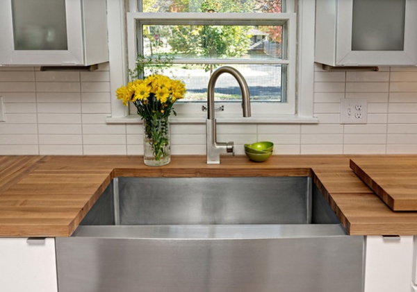
The 36-inch-wide stainless steel farmhouse sink makes a strong statement and was one of the first components Kochevar told Nelson she wanted for her kitchen. “I knew I didn’t want porcelain because that would be too traditional,” she says.
The sink and the range are surrounded by 1½-inch-thick butcher block wood counters that add softness and warmth to the contemporary kitchen. The counters have an oil finish to protect the wood from water, and Kochevar uses a designated wooden board for cutting her food.
Sink: Kraus USA Inc.; faucet: Delta Faucet; countertops: John Boos
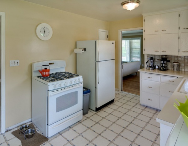
BEFORE: This photo shows the lack of work space and storage by the range and refrigerator, and how the appliances felt randomly placed in the room.
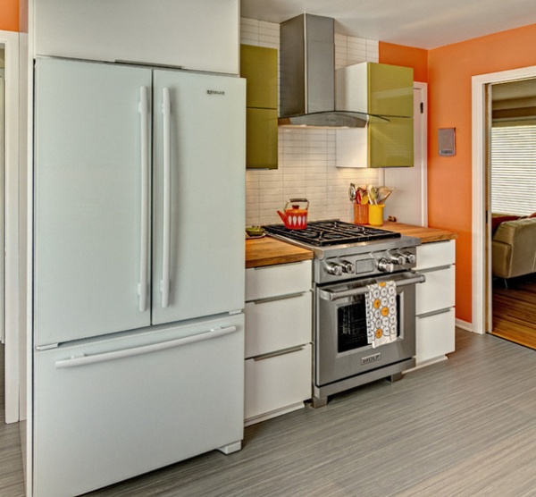
AFTER: Countertops on each side of the new dual-fuel range offer much-needed work space. The drawers that flank the range store an in-drawer knife rack and pots and pans.
The large French-door refrigerator with hinges hidden behind a floating glass front fits the modern feel of the kitchen. A cabinet above the refrigerator with dividers provides storage for cookie sheets, platters and cutting boards.
Refrigerator: Jenn-Air; range: Wolf; range hood: Zephyr
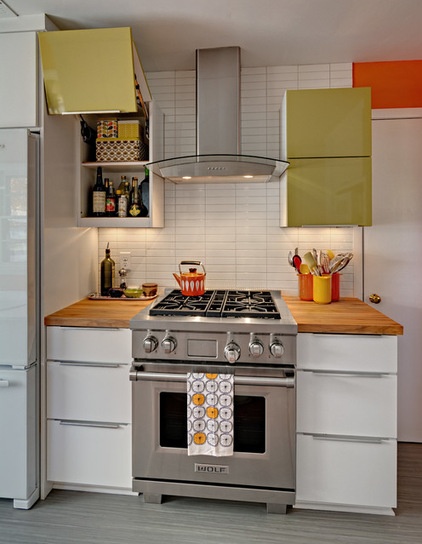
Avocado green lift-up upper cabinets on each side of the range add a punch of color to the room and provide storage for bottles of oil and vinegar.
“There’s nothing I would change, which is nice,” Kochevar says. “When I pull a pan out now, I think, ‘Life is good.’ ”
See more Kitchens of the Week
Related Articles Recommended


