8 Architectural Tricks to Enhance an Open-Plan Space
http://decor-ideas.org 09/03/2015 23:13 Decor Ideas
People are increasingly excited by the lifestyle possibilities offered by open-plan living, but sometimes are frightened off by the idea of rattling around in a big, soulless space. To avoid having an open-plan space that looks dull and flat, borrow ideas from the best designs and incorporate interior devices that define different zones. This means playing with the separation between areas, changes in floor level, finishes, islands, furniture groupings, light and so on. These deliberate layers can change the perception of space as well as create a more interesting room to be in.
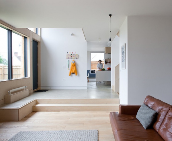
Define your zones. People often think they must have either separate rooms or an open plan. The reality is not so black and white, as the relationship between different zones can be manipulated by varying degrees, to emphasize their separation or integration. Changes in floor level, floor finish, ceiling condition, furniture arrangement and many other devices can all contribute to this fine-tuning.
In the example seen here, there is a strong sense that you are entering the living space when you come down the steps, despite the area’s being one open-plan space leading to the kitchen.
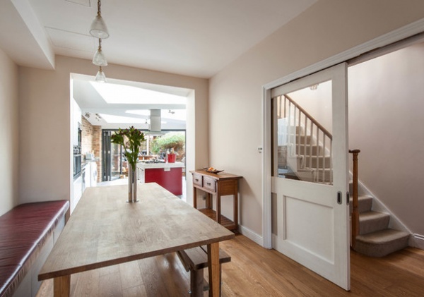
Create layered views. When considering ideas for opening up your interior, look for opportunities to set up views with layers. The home in this image illustrates the layer idea well, as you can see across a dining area (first layer), through a kitchen area (second layer) to a garden beyond (third layer). These layers give an illusion of much greater space and depth than would otherwise be felt.
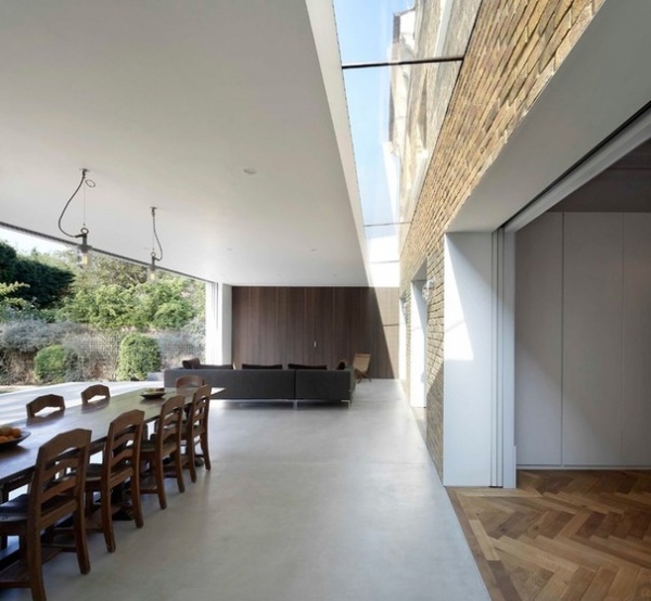
Go for visual separation. When adding to or altering a building, creating a clear visual separation between the new and existing elements of the building can really enhance the sense of extra space.
In this home, the extension is held away — meaning it’s visually separated — from the original back wall of the house. The glass gap in the ceiling is also a visual highlight, doubling the effect. This really creates the sense that you’re passing from one space into another, and not just looking across a single unified area.
The room in this example is a generous size already, but in a much smaller house — say, a Victorian terrace house — visually separating the extension in a similar way could be even more dramatic.
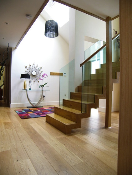
Use daylight as a highlighter. Daylight is the most wonderful magnifier of interior spaces. If you can bring more natural light into your home, it will have a great effect in maximizing the sense of space — and even in an already opened-up area, this is generally a benefit.
It does need to be done intelligently, however, as too much daylight flooding in — particularly too much direct sunlight — can be overwhelming, reducing overall contrast and bleaching everything out (and reducing the impact of all of your carefully created layers). So try to use daylight to create highlight points among the layers, enhancing the visual separation and creating greater depth.
In this open-plan hallway, daylight is brought in from a roof light above the midground of the view; this means that the middle layer is highlighted by the sunlight, increasing the overall sense of depth.
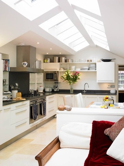
Think about angles of light. As well as using daylight to create focal points, as previously described, another good tip is to think about the angle from which the light is coming and how that light illuminates the different spaces and zones in your views.
Daylight from a high angle is generally more intense and will reach farther into an interior than that from a low angle, so use roof lights and position windows and glazed doors as high to the ceiling as you can to maximize the airy feeling. Avoid heavy curtain valances above windows, as these block out useful high-angle light.
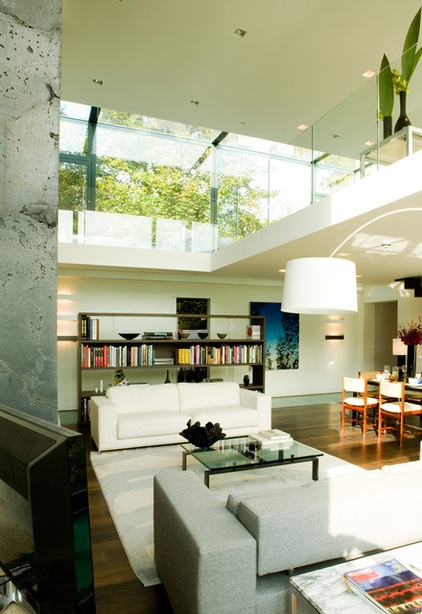
Aim to “read” spaces more than once. A great way to give the impression of more space is to set things up so that you see — or, in architectural terms, read — the same space more than once from different viewpoints within the house. The aim is not just to set up one layered view, as described earlier, but to set up several layered views that use the same spaces but are seen from different perspectives.
This works particularly well in double-height spaces with a landing, where you see a space as you come in, then you see it again from above.
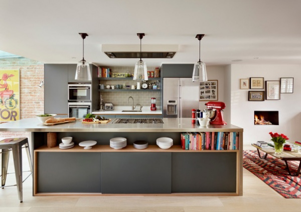
Use an island to give purpose to individual spaces. Kitchen islands are probably the most common device for defining zones within an open-plan space, and this is one of the main reasons they are so popular (although many people do not realize that this is why).
By clearly signposting where the different zones within an open-plan space are, you get the benefits of the openness and daylight penetration while retaining a comfortable domestic scale.
Well-defined zones are not just functional, they also help people feel more comfortable. In a room with a kitchen island, for example, visitors will subliminally be aware that as long as they stay away from the kitchen side of the island, they will not be in the way of the cook.
See key measurements for designing a kitchen island
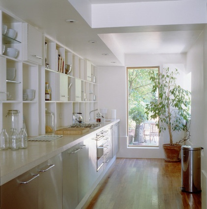
But in really small spaces, blur your zones … Having described the importance of defining zones, it might seem contrary to talk about blurring the boundaries between them. In smaller homes, however, it’s sometimes good to deliberately overlap these boundaries.
In this example, a kitchen that was previously a small box of a room has been opened up by removing the wall (the beam at the top of the photo shows the line where the wall used to be). With the wall gone, the kitchen has been allowed to expand out into the neighboring dining area, creating not just an increased feeling of space but a physically bigger kitchen, too. The additional daylight and depth also benefit the dining space, making it feel larger, too.
Here, a separating device, such as a kitchen island, would have prevented the kitchen space from spilling into the dining area, so the feeling of its being larger would have been lost. In this case, blurring the lines of zones enhanced the space.
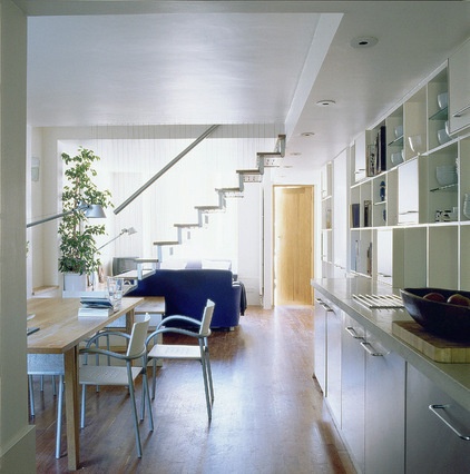
… like this. Here is the same room seen from the opposite angle, showing how the kitchen and dining areas are merged.
Your turn: How do you use the open-plan spaces in your home? Tell us in the Comments.
Design Workshop: How to Separate Space in an Open Floor Plan
Related Articles Recommended


