Exterior Color of the Week: 5 Ways to Make Orange Work for You
http://decor-ideas.org 09/01/2015 03:14 Decor Ideas
After featuring a couple of muted yet captivating house colors — navy blue and sage green — it’s time for us to cover an exterior color with a bit more zing. Orange, especially a bold, citrusy orange, is an unusual exterior color choice that’s not for everyone nor for every home. But for those with the right location and style of house, it can be a fantastic, eye-catching option. I’ve rounded up examples of homes that I think pull off this daring color choice well, and I offer tips and example palettes for those of you looking to bring the zing.
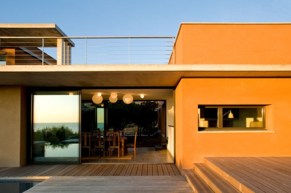
Citrusy orange hues are such vibrant, happy colors, it’s no wonder you see them often inside homes. But due to its intensity, this color is tricky to pull off on the exterior. Here are a few of my tips for making it work:
1. Consider the architectural style of the home. This hue works best with modern and contemporary architectural styles. Because the color is so eye-catching, I think it can all too easily become garish or over-the-top if used on a more traditional-style home with lots of decorative details. It’s best to let the orange color be the focal point and keep all other elements to a minimum.
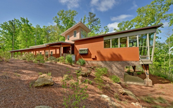
A low-slung house with lots of windows is a terrific candidate for a bold exterior color. Here we have a linear strip of orange that’s broken up by plenty of glass. If this were a three-story home with minimal glazing, I think the orange would be overwhelming.
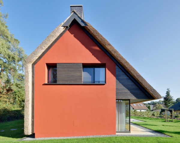
2. Use the color sparingly and strategically. A little of this bold hue goes a long way, so think about using it strategically on just a part of the house — an exterior accent wall, if you will. Then incorporate other light and neutral hues to balance out the vibrancy.
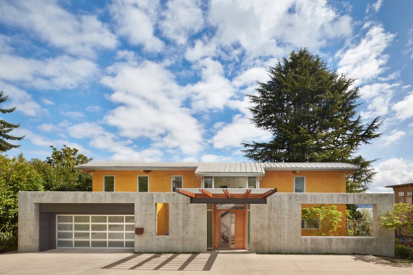
I like when bold colors are somewhat hidden or obscured. This “peekaboo” glimpse of color hints that an interesting home lies just beyond the front wall. The concrete fencing structure also softens the impact of the bold, glowing orange hue on the house.
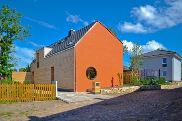
3. Think about the context. As I said in the intro, this color is not for everybody; it’s important to make sure the color works in your neighborhood. For instance, will this color clash with the styles and colors of other homes in your neighborhood? Will it rankle your neighbors? I’m not saying you have to get all of your neighbors onboard with your exterior color selection, but I do think it’s important to pick colors that will complement, rather than clash with, your neighbors’ homes.
Additionally, many of you live in neighborhoods that have strict rules about exterior paint colors; this pumpkin orange color would likely not be approved by your homeowners association’s approval. If that’s the case, and you really want to incorporate this color on your home somehow, perhaps you can limit its use to your front door or employ it as an accent color on the rear elevation only, if allowed.
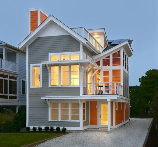
4. Location, location, location. Not all colors work in all geographic locations or climates. Bold oranges feel most at home in mild and sunny climates, such as in the southwestern United States, where orange hues abound in the surrounding mountains and dirt. I think vibrant colors such as orange also work well in coastal areas — you can get away with a fun exterior color palette for a vacation cottage on the beach.
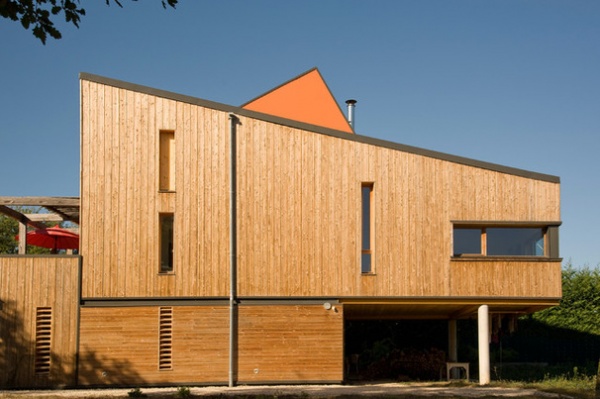
5. Have fun with it. Picking out paint colors should be fun, not stressful. It’s just paint, after all. I know it can be expensive sampling dozens of colors, or having to repaint because you end up hating the color you chose. So if you are struggling with selecting colors, think about hiring a design professional who specializes in paint color consultations. Many will work for a fixed fee of a few hundred dollars. Or if you have a color- and design-savvy friend, see if he or she will help you out for a discounted rate or an exchange of services.
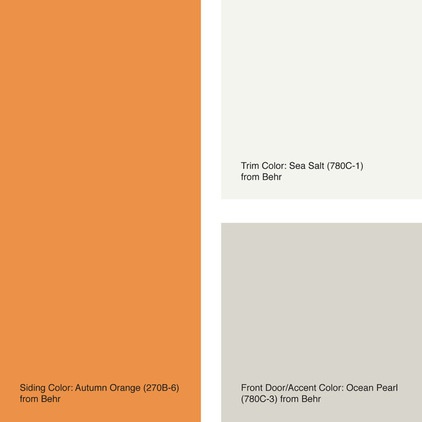
Try These Palettes
When you’re working with bold hues, it’s all about balance. Allow the orange to be the star of the show and select coordinating colors that support, rather than distract from, the star. If you’re ready to give this vibrant hue a try on your home, here are a few example palettes to consider.
Siding color: Autumn Orange
Trim color: Sea Salt
Front door and accent color: Ocean Pearl
All from Behr
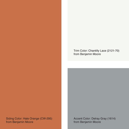
Siding color: Hale Orange
Trim color: Chantilly Lace
Front door and accent color: Delray Gray
All from Benjamin Moore
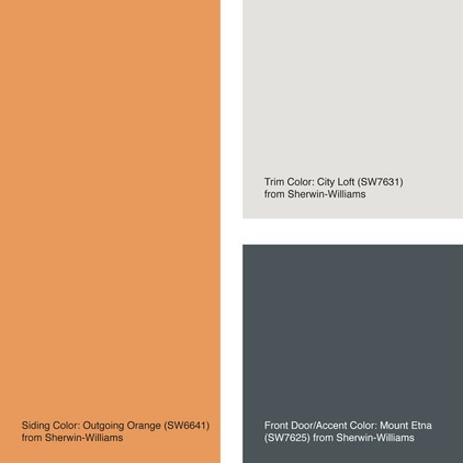
Siding color: Outgoing Orange
Trim color: City Loft
Front door and accent color: Mount Etna
All from Sherwin-Williams
Tell us: Is it too bold, or are you sold on orange for the exterior of a home? Please share your thoughts in the Comments section.
More: How to Work With Orange | When to Use Orange in the Kitchen | When to Use Bold Orange in the Bath | When to Use Orange in the Dining Room | Orange in the Garden: Do You Dare?
Related Articles Recommended


