Houzz Tour: After a Fire, Reimagining a Home
http://decor-ideas.org 08/30/2015 00:14 Decor Ideas
No one wants to start a remodel this way: On Christmas Eve, a house caught fire, and the flames destroyed it and spread to the Victorian building next door, which housed three condominiums, including the one profiled in this story. The good news is that no one was hurt. The bad news is that several families lost their homes and everything in them.
The owners of this condo decided to rebuild, and they took the opportunity to reimagine the floor plan and decor, making the house a better fit for their growing family (the wife was carrying their second child at the time). They had never embarked on a remodel before, and they hired interior designer Tineke Triggs to guide them through their trial by fire.
Photos by Eric Rorer
Houzz at a Glance
Who lives here: A couple and 2 small children
Location: NOPA (North of the Panhandle) neighborhood of San Francisco
Size: 2,000 square feet (232 square meters); 3 bedrooms, 2 bathrooms
The home is the middle unit in the building, and as in many Victorian buildings, the layout was long and narrow. Triggs was charged with rehabilitating the space while making it more open and functional.
Before the fire, the home had a layout that was typical of homes built in that era: The kitchen was in the back of the unit, and the front was composed of a formal living area and a sitting room. A small bedroom was tucked off to the side. If you live in San Francisco, or if you have visited someone who lives here, it’s a familiar setup.
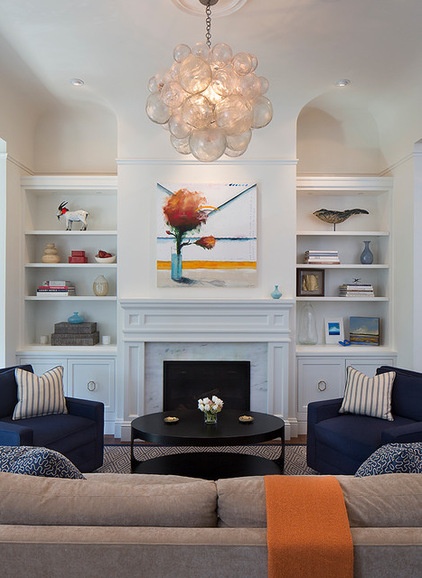
Cabinet hardware: Classic-01, Nest Studios; rug: Kurien, Stark; sofa and chairs: custom, Plantation; coffee table: Eclipse Oval, Noir; light fixture: Muriel, Oly
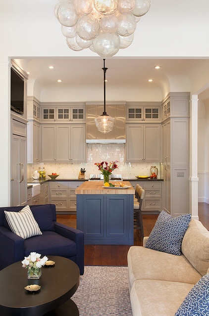
Triggs’ big move was to relocate the kitchen to the front of the house and to open it to the living area. The small bedroom was moved to the back of the home, and a dining room took its place. The walls that separated the rooms are long gone.
Countertops: Surround Coastal Grey, IRG; backsplash: Calcutta, Mosaic House; gray cabinet paint: Berkshire Rock, Benjamin Moore; blue island paint: Newburyport Blue, Benjamin Moore; pendant: Rose City, Rejuvenation Hardware; stools: custom, Plantation
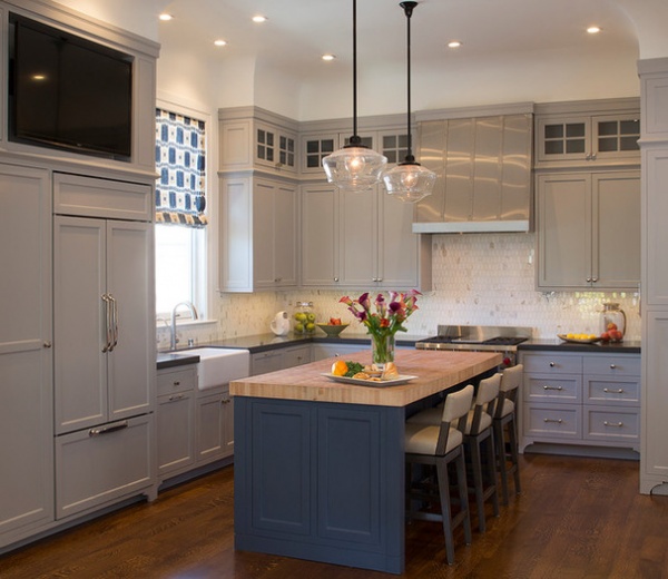
“These people love to entertain and have lots of friends over, so we gave them entertaining space that has a big, open flow,” Triggs says. When explaining the color choices, Triggs says these clients are not white-wall people. She adds, “Balancing the soft gray and dark blue creates a focal point in an open environment.”
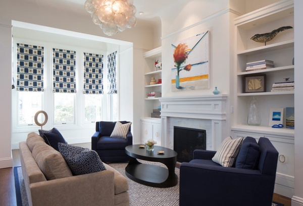
Now, the living room is not considered formal. Triggs calls it an extension of the kitchen and the dining room, and the center of entertaining.
After the fire, there was nothing left of the fireplace surround and mantel. “The new design replicates what was existing,” Triggs says. “The family wanted to start fresh and new, but kept the original Victorian character with the moldings.” During initial walk-throughs of the burned-out home, the designer and her team salvaged pieces of charred trim to replicate later.
Triggs notes that the high ceilings call for a fun and playful element, and she feels this bubble-like fixture is the perfect answer.
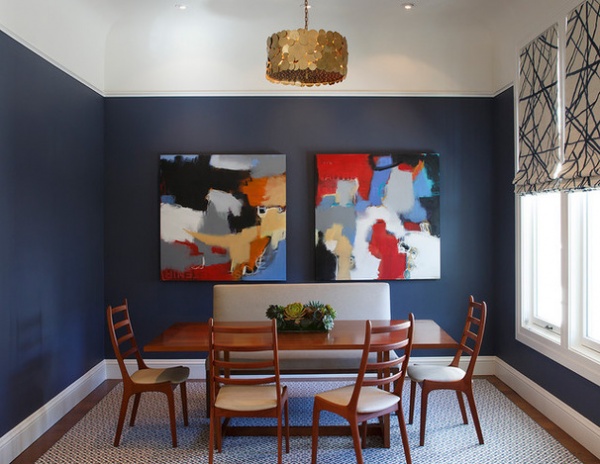
The dining room is beside the living room, and open to it and the kitchen. Triggs painted the dining room walls a deep blue to separate the space from the lighter walls of the living room. “Painting the walls with a contrasting color allows the eye to understand you are in another space,” she says.
Because these people enjoy gathering with friends around the table, a bench seat along one side of the table allows them to squeeze in additional guests without the clutter of additional chairs.
Rug: Odelle, Stark; dining table: custom; dining chairs: vintage
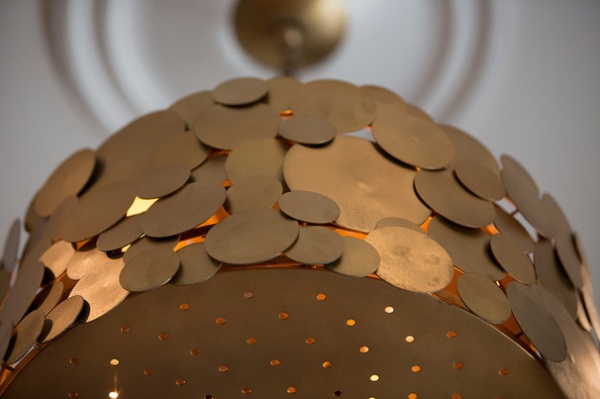
A brass light fixture mimics the circular shapes of the living room light fixture.
Light fixture: Ulysses, Arteriors
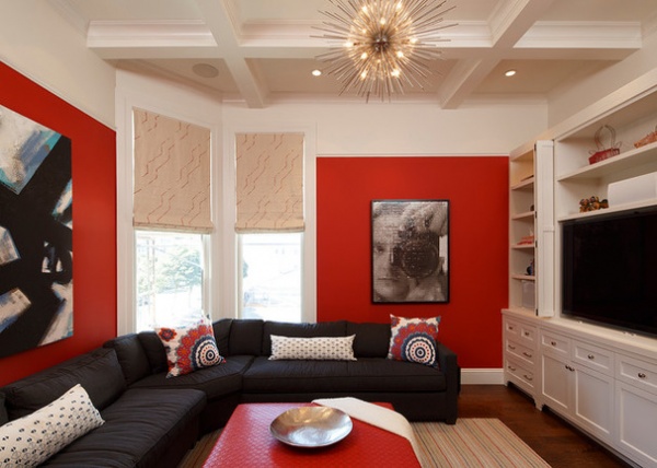
The media room is a deep orange color that reads red. “A media room should be about fun,” Triggs says. “This Asian orange screams energy.”
Throughout the house, the owners selected bold artwork. Triggs says that the statement-making personal choices help to make a homier environment where everything is completely new.
Zanadoo chandelier: Arteriors; sofa and ottoman: custom, Plantation; rug: Jaipur
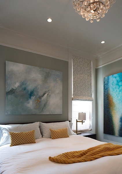
To make a master suite, the designer replaced one of the original bedrooms with a bath. For the master bedroom, Triggs chose colors that are soothing and serene. “Making the client feel comfortable in their new home was our goal,” she says. “Since we couldn’t replicate what was lost, the design was inspired by memories the couple had of their travels.”
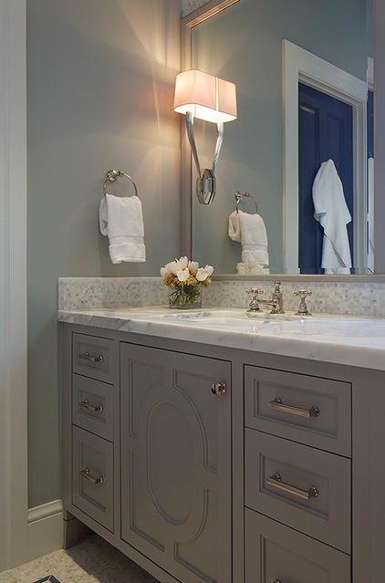
In the master bath, the millwork on the custom vanity was inspired by the original molding.
Hardware: Empire, Schaub & Co.; countertop: Seat Calcutta, IRG; floor tile: Artistic Tile; sconce: Ruhlmann, Visual Comfort
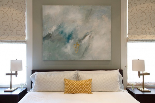
Triggs found herself inspired by her clients’ outlook. “They had lost their possessions, but they maintained a good attitude,” she says. “From them, I learned that it’s not really about the things we gather, but the people we surround ourselves with — our family and friends.”
Browse more homes by style:
Apartments | Barn Homes | Colorful Homes | Contemporary Homes | Eclectic Homes | Farmhouses | Floating Homes | Guesthouses | Lofts | Midcentury Homes | Modern Homes | Ranch Homes | Small Homes | Townhouses | Traditional Homes | Transitional Homes | Vacation Homes
Related Articles Recommended


