Houzz Tour: Soft Neutrals Create a Calming Vibe
http://decor-ideas.org 08/29/2015 21:13 Decor Ideas
In many city apartments, space is at a premium. And so it was for this family of four moving into a three-bedroom, top-floor apartment in a Victorian building in northwest London. They enlisted the help of interior designer Anna Richmond of Conley&Co. to gut and renovate the entire property, to give them as much livable and usable space as possible. Clever tricks and a little reconfiguring mean the family — and all of their things — now fit comfortably and elegantly into this laid-back home.
Houzz at a Glance
Who lives here: A young family of 4
Location: Maida Vale, northwest London
Size: 3 bedrooms, 2 bathrooms
Designer: Anna Richmond of Conley&Co.
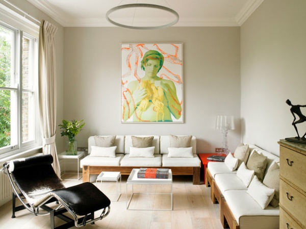
“The client is an artist, so was quite creative and had a good sense of what she wanted,” Richmond says of the renovation. “She wanted to bring it up to date and create something quite Zen.” In the living room, they went for whitewashed oak flooring with pale gray walls to bring in a little color and make it feel cozy. “A lot of it was about having space to display the client’s art,” Richmond says, and many of those works are now on display throughout the flat.
Beautiful old Brazilian wood sofas were reupholstered to bring in texture, and a Le Corbusier LC4 chaise longue provides an interesting contrast to the wood.
Wall paint: Cornforth White, Farrow & Ball; LC4 chaise longue; Le Corbusier; tray tables: Hay
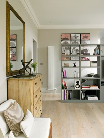
A custom bookcase acts as a room divider as well as storage and a media unit. There’s a wall-hung TV just to the right, and the area underneath (just visible) continues under the stairs for storage of suitcases and other large items.
“It’s a big room with a high ceiling, so we fitted recessed downlights above the stairs to create a walkway going up to the kitchen in order to zone it off a bit,” Richmond says.
Bookcase paint: Plummett, Farrow & Ball
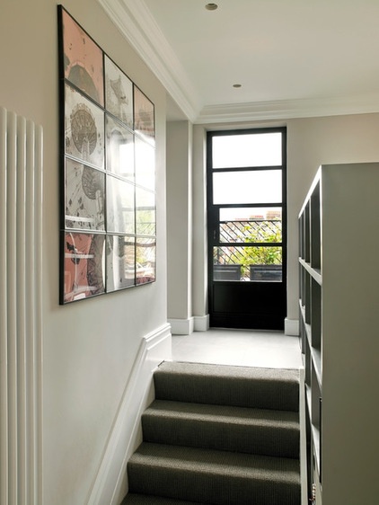
Steps lead up to a custom Crittall-style aluminum door that leads out to a terrace, and to the left is the entrance to the kitchen. The client’s artwork provides a focal point for this space and adds a touch of color.
“The client was worried about having a hard wooden floor with sharp edges for her young children,” Richmond says, “so we went for a gray sisal carpet, which is still very robust.” Porcelain tiles at the top of the stairs begin the transition into the kitchen.
Carpet: Blenheim Carpets
An Art-Buying Guide for Beginners
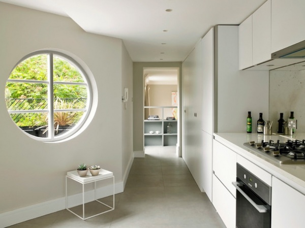
The kitchen features soft colors, with concrete-like porcelain floor tiles in lieu of a poured concrete floor, which would have been impractical in a top-floor flat, given its weight. A bank of full-height cabinets stores many of the utilities, with a washing machine, dryer and broom space all nicely hidden behind custom white doors.
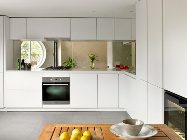
Handleless cabinets with a marble-look countertop and an antique mirror glass backsplash make for a sleek and contemporary kitchen with a hint of glamour. “The cupboards are a matte lacquered finish, which keeps the look very simple and soft,” Richmond says. “We went handleless to maintain the simplicity.”
Cabinets: Schroder
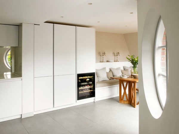
Richmond went for a built-in bench with drawers underneath in the dining area to maximize storage. “It also meant we could have a nice, comfortable seating area without lots of chairs, and it just adds a little bit of softness,” she says.
A circular wooden window looks out to the terrace, accessed through bifold doors opposite the dining area.
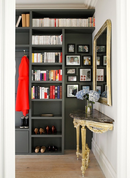
Richmond took out the whole wall in the hall and in its place built this unit from MDF with a sliding pocket door (to the left) that opens to the living room. It provides storage for everything from books to shoes.
The console table is an antique that belonged to the client’s parents. “It was a little broken, so we fixed it to the wall,” Richmond says. The mirror was bought to match.
Storage unit paint: Down Pipe; wall paint: Blackened, both by Farrow & Ball
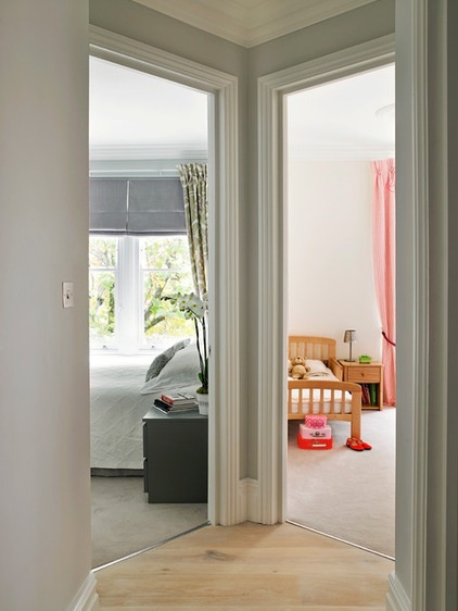
As you enter the apartment, the storage wall with pocket door into the living room is on your left, while to the right of the antique console table, the hall leads to three bedrooms. Wooden floors were swapped for plush carpet in these rooms to make the sleeping spaces soft and comfortable.
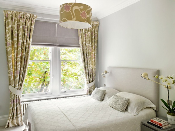
A relaxed color palette creates a serene and calming master bedroom, jazzed up by a statement fabric for the curtains and lampshade. The Roman blinds and headboard were custom-made in a Romo fabric, and Jieldé wall lights keep the nightstands free for other items.
Wall paint: Dimpse, Farrow & Ball; bedside lights: Jieldé; nightstands: Malm, Ikea; headboard and blind fabric: Milani, Romo; curtain and lampshade fabric: Cocoa Beach, Rapture & Wright
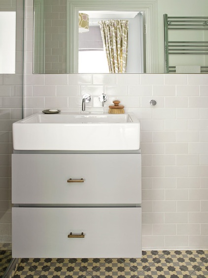
Even in the compact en suite, Richmond was careful not to compromise on style. Moroccan floor tiles add interest and color, and are offset nicely by simple white subway tiles on the walls. Brass drawer handles on the custom vanity pick up on the slightly Moroccan feel, while the square white sink keeps the look clean and contemporary.
Sink: Duravit; sink fixtures: Crosswater; tiles: Terrazzo Tile; vanity handles: Chloe Alberry
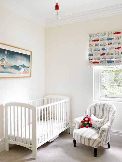
“The nursery was a super simple room to do,” Richmond says. “The client just wanted it to be neutral and calming.”
Chair fabric: Lindford Grey Seal, Romo
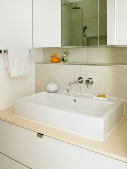
The family bathroom is largely custom. “It’s quite a small room with no windows,” Richmond says, “so we had to be quite clever to fit it all in.” The shower is all tiled and includes a tiled niche to store shampoos and soaps. The vanity, with its stone top, and mirrored cabinets are custom.
Sink: Duravit; sink fixtures: Crosswater
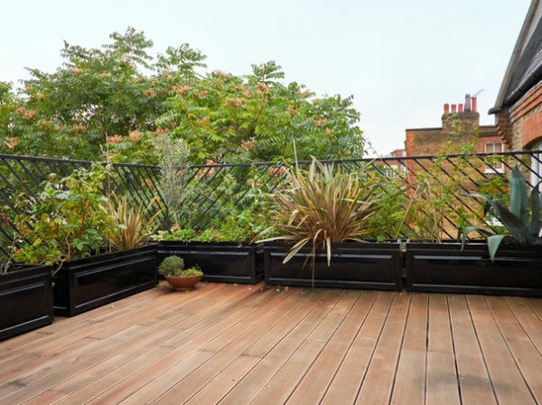
“The terrace was like this when the owners moved in,” Richmond says. “We just jet-washed it for them.”
Browse more homes by style:
Apartments | Barn Homes | Colorful Homes | Contemporary Homes | Eclectic Homes | Farmhouses | Floating Homes | Guesthouses | Lofts | Midcentury Homes | Modern Homes | Ranch Homes | Small Homes | Townhouses | Traditional Homes | Transitional Homes | Vacation Homes
Related Articles Recommended


