Houzz Tour: An Aussie Pavilion Throws Its Home a Curve
http://decor-ideas.org 08/29/2015 00:14 Decor Ideas
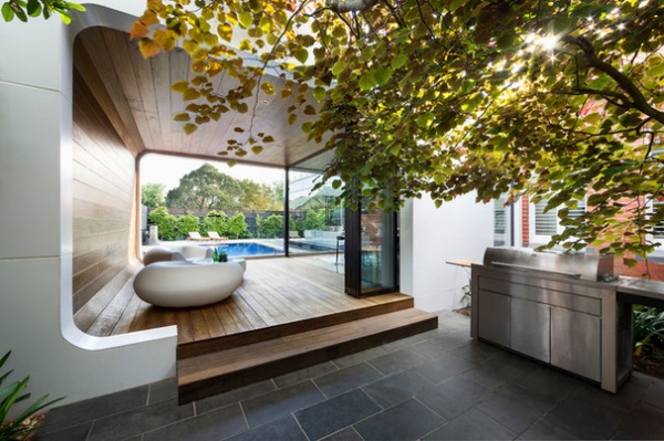
A curvaceous addition provides this Melbourne, Australia, house with its most distinctive feature — and its name, Curva House. Attached to the side of the home, the pavilion blurs the boundary between indoors and outdoors with openings to front and back gardens and floor-to-ceiling wood paneling that flows through bifold glass doors and into the main house.
Houzz at a Glance
Who lives here: A family of 4
Location: East Malvern, near Melbourne, Australia
Size: About 3,300 square feet (306 square meters); 3 bedrooms, 2 bathrooms
Architect: Linda Simons of LSA Architects
The homeowners wanted a house in which to entertain friends and enjoy family life. This desire was at the core of their goals, and they hired architect Linda Simons to design the renovation and extension plans.
A dream kitchen was at the top of the couple’s wish list. “One of the owners is a professional chef, and he wanted the kitchen space to be as functional as it would be beautiful,” Simons says. “We added a large butler’s pantry with lots of storage, double sinks and hardworking appliances. This area can be opened and connected to the goings-on in the living room or completely hidden behind bifold doors.”
Simons was also asked to seamlessly blend the old with the new. The rooms of the older part of the house have been updated and include three bedrooms, an en suite for parents, a separate family bathroom for children and guests, a sunny sitting room and a study. These rooms are all accessed via a central hallway, which leads through to the back of the home and from there to a spacious new extension that accommodates the expansive living areas. For the owners, the results couldn’t have been better. The home’s heritage values have been left intact, while the family has gained a contemporary extension of generous proportions.
One of the underlying principles of Simons’ design was to slowly reveal the contemporary additions at the rear of the home. During the design phase of the project, Simons says, she was particularly mindful of the heritage context for these additions — the large brick Federation house to which they were added is part of a historic area in East Malvern known as the Gascoigne Estate.
From the front, the house appears in its original form, but to the side a visitor can just discern the most distinguishing architectural feature of Simons’ design — an outdoor sitting area and dining room enveloped in a Tasmanian oak-lined curved addition, or pavilion. It essentially marks where the (old) front part of the house meets the (new) extension. “Glimpses of the pavilion can be seen from the street and driveway,” Simons says. “However, a low canopy of trees protects the privacy of anyone sitting in it.”
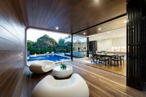
Adjacent to the dining room and providing extra living space for the family, the pavilion is accessed via aluminum-framed bifold doors. There is also a door from the pavilion leading to the pool, “which is handy when supervising children splashing about in it,” Simons says.
“The design and position of the pavilion allow for entertaining all year round as desired,” Simons says. “The area is sheltered from the elements but is light and airy. The family uses it as an outdoor living room, but they can also extend the dining space into it to accommodate a very long table.”
The white bulbous outdoor furniture seen here was purchased by the homeowners after a trip to the Milan furniture fair one year. “The coffee table is actually lit from within and is perfect for summer evenings,” Simons says.
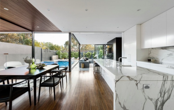
Immediately behind the dining setting is an all-white kitchen. It is the hub of the new interior, and Simons wanted to make it shine. She honored its importance to the family, and especially to the man of the house and his culinary interests, by using high-quality materials in its construction, including Calacatta marble for the countertops and backsplash.
“The kitchen is at the axis of the modern extension,” Simons says, “with the dining, living, outdoor entertaining area, pool and garden radiating off this central space. Linking these zones has allowed the family to live together while still being able to separately enjoy different areas.”
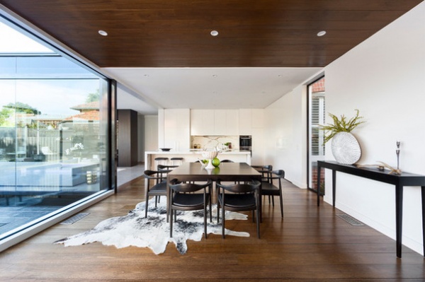
The dining room connects the curved pavilion to the main living area via the kitchen, and these three zones wrap around the pool. Everywhere is flooded with light, despite the fact that the house faces south (the equivalent of facing north in the Northern Hemisphere). Vast panes of floor-to-ceiling glass facilitate the brightness while separating the inside of the house from the outside pool.
Furniture and decorative items: Coco Republic
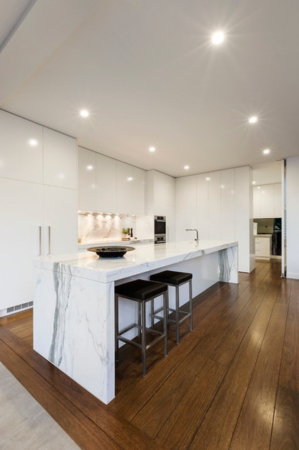
Gleaming white polyester-finished kitchen cupboards complement the marble counters. The look is sleek and hides all the modern conveniences the chef of the house expects to be at the ready. There is an integrated fridge-freezer at one end, plenty of cupboard and drawer space for pots and pans in the midsection, and a butler’s pantry at the other end. The butler’s pantry is separated from the kitchen by bifold doors. They are closed here but are seen open below.
More marble ideas for kitchens
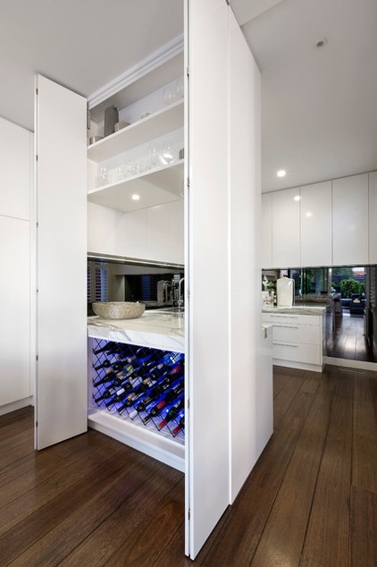
With the bifold doors open, the family can look through from the kitchen into the butler’s pantry. “The butler’s pantry can be completely closed off, both with bifold and full-height pivot doors,” Simons says. It means any mess can be swiftly hidden away.
“Note the generous storage area for wine under the small [counter],” Simons continues. “This small [counter] is useful for additional food preparation. It’s where the homeowners can set up snacks for their kids, prepare food quickly and leave the toaster and kettle out if need be.”
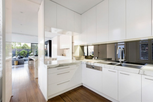
While the kitchen proper has a small single sink, the butler’s pantry is expected to work harder and therefore includes large double sinks and a dishwasher. “We also decided to extend the marble [counter] for the continuation of the luxurious feel we’ve achieved in the kitchen,” Simons says.
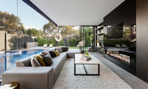
Through the kitchen and flanking the pool is a large contemporary-style living area. Simons chose a subdued but warm monotone palette for this room. The gray sofa, imported from Italy, is long and low, perfect for the family to spread out on and watch television.
The reflective black glass cabinetry above the fireplace encircles the TV and somewhat obscures it. “The cabinet unit’s surface also reflects light from the pool beyond,” Simons says. The dark wood-lined shelving complements the wall unit. There are also wall-hung drawers to hide audiovisual equipment and provide general storage, while floating shelves are useful for displaying decorative pieces.
Simplicity fireplace: Real Flame; coffee table, tall lamp, throw pillows and rug: Coco Republic
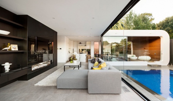
Forming an L shape that hugs the pool, the home’s modern extension accommodates this new living area and kitchen on one side, while the covered outdoor dining and seating area is in the curved pavilion.
“The site orientation was the biggest challenge to success, as the living rooms at the back of the property were south-facing, so they didn’t offer the best light,” Simons says. “We overcame this by installing windows, literally walls of glass, to overlook the pool, which in turn reflect light back into the living area.”
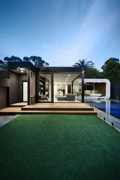
The design of the extension can be fully appreciated from the grass yard. “You can clearly see the contrast of three architectural elements — namely, the white timber-clad curved annex, the squared black steel that boxes the living room, and decks that will fade to gray over time,” Simons says. “Also, from here at the back of the property, you can see the covered back-door entry — the property also has rear-lane access.”
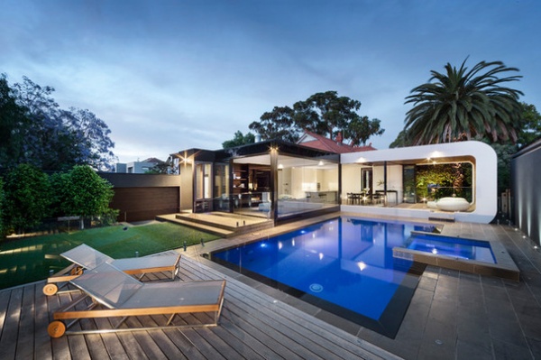
All rooms in the extension overlook a sapphire blue pool and a lawn area. The decking encircles the pool, softening its angular edge. “This is a home where formality, fun and family are melded into a cohesive whole,” Simons says.
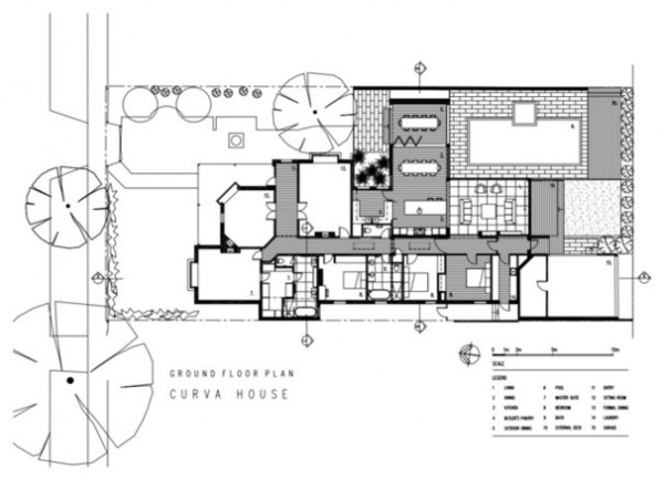
Simons’ floor plan clearly shows how the old and new parts of the house were designed to blend into one streamlined whole. All the rooms are accessed from a central hallway, except for the curved pavilion, seen off the dining room on the right-hand side of the plan at the midway point. The pavilion distinctly marks the shift from Federation house to new extension.
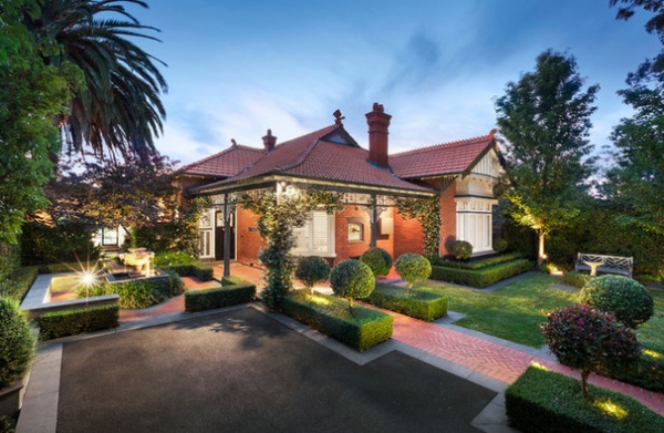
Some of Melbourne’s finest heritage homes are in East Malvern. They are framed by greenery provided by the many trees that line the streets.
The homeowners’ house is set back on the block, with deep front gardens. “The formal gardens, heritage facade and bedroom zones of the stately Federation home welcome you. Then the house opens up to reveal a thoroughly modern and playful family area,” Simons says.
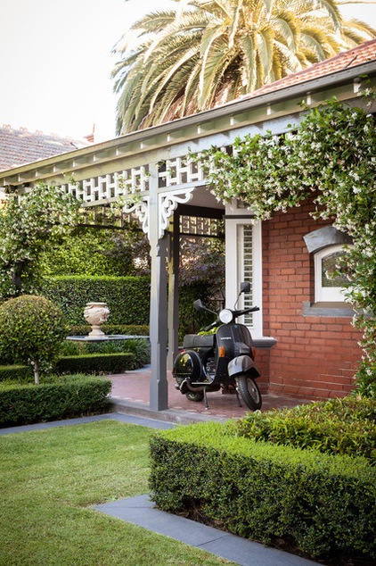
A Vespa motorbike is parked under the generous veranda roof, protected from the weather.
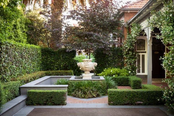
The homeowners planted the front gardens when they bought the house. The gardens are now well-established and include clipped hedges, flowering vines and topiary bushes, contrasting the low-maintenance plantings in the backyard.
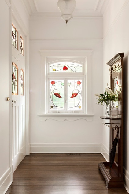
The entrance to the home is graced by original stained glass in the front door and in the veranda windows, but elsewhere the renovation has brought about new updates. For example, new floorboards have been laid in the front of the house to match the flooring in the new extension.
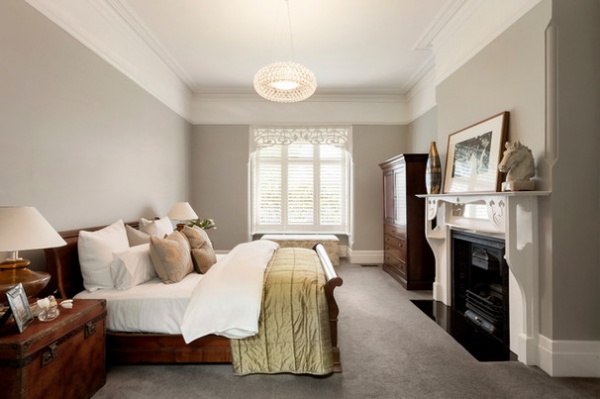
There are three bedrooms as well as a study that can be counted as a fourth bedroom. Pictured here is the master, which is furnished with a large mahogany sleigh bed.
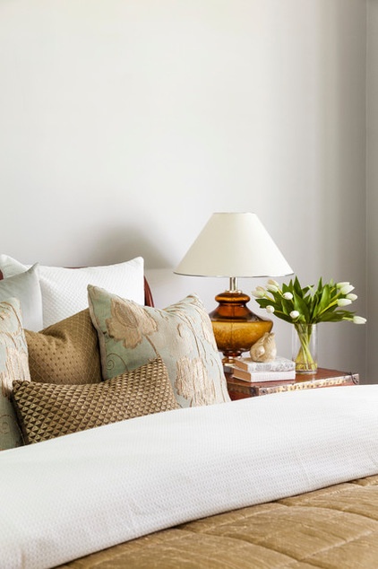
Nightstands, lamps and pillows: Coco Republic
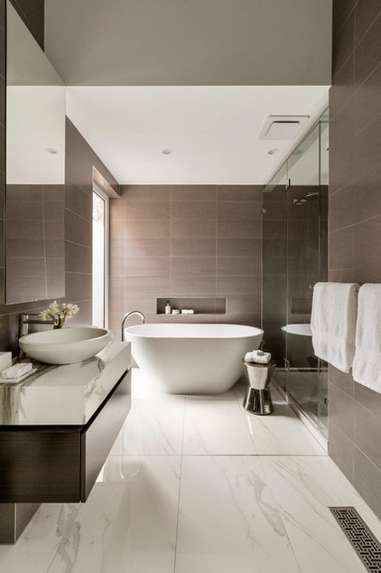
What used to be a smaller bedroom next to the master has been split into two parts to accommodate a walk-in closet and an en suite (see space 7 in the lower left of the floor plan).
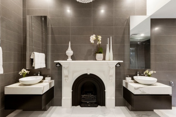
The homeowners wanted an original fireplace to be kept as a design feature in the new master en suite. Simons had it painted white to so it would stand out as a special feature, and also installed a gas-fueled fireplace so that the family members could enjoy its warmth while taking baths. There are matching vanities, which feature the same Calacatta marble as in the kitchen and flank the fireplace.
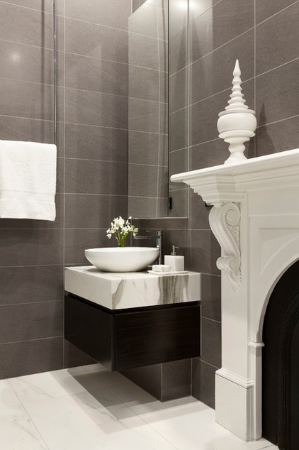
A towel rail, imported from Italy, is suspended from the ceiling.
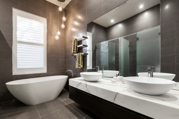
With the same vanity marble and floor tile as in the en suite, the family bathroom is a slightly larger version of the master en suite. It sits between the children’s bedrooms, which are down the hall from the master bedroom. This bathroom includes a shower and toilet enclosed in glass walls that are frosted for privacy (you can see the glass in the mirror’s reflection). An engineered-stone bath sits at the far end of the large wall-hung vanity, which features twin basins for the two children.
Browse more homes by style:
Apartments | Barn Homes | Colorful Homes | Contemporary Homes | Eclectic Homes | Farmhouses | Floating Homes | Guesthouses | Lofts | Midcentury Homes | Modern Homes | Ranch Homes | Small Homes | Townhouses | Traditional Homes | Transitional Homes | Vacation Homes
Related Articles Recommended


