World of Design: 11 of the Globe's Most Creative Storage Solutions
http://decor-ideas.org 08/26/2015 04:13 Decor Ideas
Is there such a thing as too much storage? These clever homeowners and designers from around the world have come up with creative solutions to add space to a home. Take a look at their 11 ideas and find inspiration in under-floor toy boxes, moving walls and hardworking staircases. Which solution would you choose?
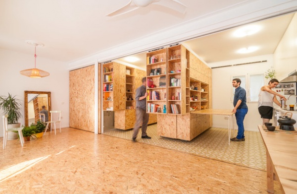
1. Shape-Shifting Storage Cubes in Spain
Location: North of Madrid, Spain
Who lives here: A woman in her 20s
Designer: Estudio PKMN
This plywood cupboard was custom-made for a young woman when she first moved into this home (formerly her grandmother’s). It’s composed of three mobile cupboards that are easily moved on industrial rails.
The setup makes the interior extremely easy to transform, while keeping everything accessible and incredibly well-organized, from books to electrical appliances to even the bed. The setup gives the owner multiple “houses” in just 474 square feet (44 square meters) of space. If she wants to practice yoga, her favorite activity, she can simply push the cupboards out of the way and have plenty of space in which to stretch out.
View more of this home
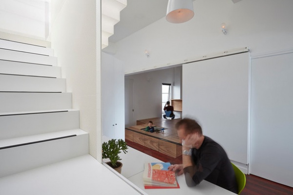
2. Under-Floor Toy Box in Australia
Location: Melbourne, Australia
Who lives here: A young couple and their toddler
Designer: Andrew Maynard Architects
The under-floor storage seen above in the background is referred to as a “toy box floor"because it swallows up all the mess made by the family’s newest member. Rather than having to pick up their toddler’s toys, Mom and Dad simply sweep all the Lego and puzzle pieces into the floor. It’s essentially an elevated floor space, or platform — about 15 inches (380 millimeters) deep — which can be opened and accessed from hinged panels, both from the top and side. It’s fun for little ones too, as they can easily climb in and out of the storage and use it as a hiding place.
The principal architect came up with the idea, armed with the hindsight of raising his own child. His biggest concern was the radical day-to-day changes a baby brings, and the endless management of “stuff.”
See the rest of this project
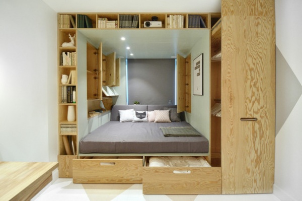
3. Integrated Bed, Wardrobe and Bookcase in Russia
Location: Moscow, Russia
Who lives here: The eldest girl in a family with four children
Designer: Alex Malinin and Anastasia Sheveleva of INT2architecture
This plywood cube is shaped around a window. It contains a full-size bed; a built-in, pullout wardrobe on the right; a bookcase up the left side and across the top; and two additional boxes for bedding and blankets under the bed.
There’s also a built-in sound system and projector among the books on the top shelves, paired with a screen on the opposite wall. This project was made as part of a TV show.
See the rest of this project
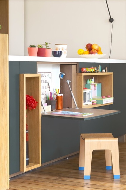
4. Fold-Down Coloring Spot in France
Location: 18th arrondissement of Paris, France
Who lives here: A couple and their young daughter
Designer: BKBS Architectes
A fold-down desk in this island unit enables the parents to optimize the space and keep an eye on their daughter while they’re cooking. The little girl can draw or play at her desk or hold little tea parties (a nice way to involve the whole family and to encourage cooking from a young age). To keep the open feel of the room and avoid wasted space, the desk can be folded away when not in use.
Tour this home
5. Space-Smart Spiral Design in Sweden
Location: Gothenburg, Sweden
Who lives here: A professor of history
Designer: Torsten Ottesjö
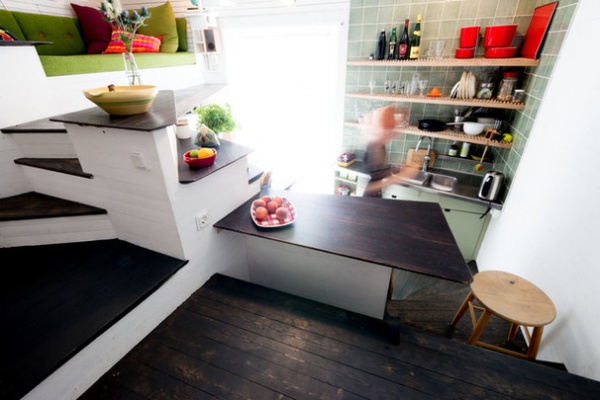
This tiny flat is a mere 56 by 12 feet (17 by 3.6 meters), but it still contains two stairways, a bedroom, a bathroom, a fully equipped kitchen, an office, a wardrobe, a living room-guest bedroom and a dining area.
In the kitchen, storage is everywhere, but always placed in such a way that the room doesn’t feel cluttered. It’s in nooks and crannies and even under the steps that lead up to the platform housing the living area.
Architect Torsten Ottesjö is interested in creating small, livable places with inexpensive, local materials, and this apartment serves as a powerful example of how we can create more sustainable cities. His aim, above all, is to “build apartments that hug you,” and it’s safe to say he has succeeded in that here.
See more of this project
6. Petite Pantry in Japan
Location: Tokyo, Japan
Who lives here: A couple and their two daughters
Designer: LiB contents
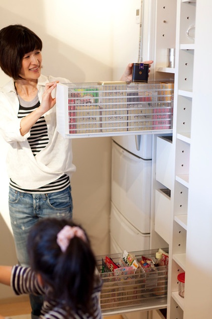
This flat was originally equipped with a built-in kitchen, which is typical in a Japanese ready-built house. However, it was too small for the family, so the owners asked a kitchen designer to widen the space. The cupboard and appliances unit took up more than half the space, so there was only a 6-inch (15-centimeter) strip left between the fridge and cupboard. To make optimal use of this tiny gap, it was turned into pantry drawers.
The designer struggled to find the best material for the drawers, as they needed to be breathable for food storage, but there wasn’t a ready-made product available in this non-standard size. She finally found a sheet of mesh metal at a DIY store and sent it to the factory just in time.
View this apartment
7. Double-Height Library Wall in Italy
Location: Torino, Italy
Who lives here: A freelancer working from home
Designer: MARC architects
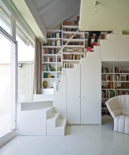
In this 1,075-square-foot flat (100 square meters), there wasn’t enough space in which to both work and live. The architects decided to take advantage of the area under the roof and demolished most of the ceiling that separated the apartment from the attic, creating a double-height space. The client asked for a big bookcase, so the whole wall was filled with shelves. To make every book accessible, the architects designed a smart, L-shaped staircase that contains additional storage.
The city of Torino is famous for its Gianduiotto chocolate, Fiat car factories and great views of the Alps. Fred Buscaglione, a noted Italian jazz singer of the 1950s, used to live in this building, and he would have enjoyed the same view of the mountains.
8. Hidden Storage Gems in Germany
Location: Prenzlauer Berg district of Berlin, Germany
Who lives here: A single man
Designer: Dagmar Reinhardt and Alexander Jung of reinhardt_jung
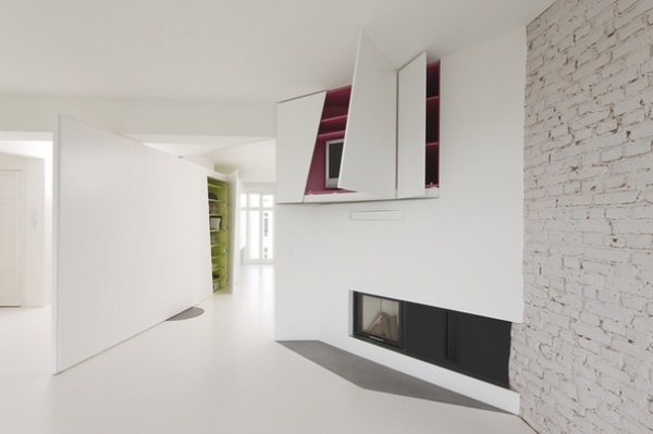
This Berlin apartment, originally built about 1900, was completely remodeled, and instead of just putting up new dividing walls, the designers created walls that double as storage solutions. “The storage was intended to glow from the inside, like an oyster,” says architect Alexander Jung — so he had the interiors painted in bright colors, contrasting with the different whites of the apartment. The glossy white exterior also serves to disguise the storage, so you can’t immediately see it when entering the apartment.
See more of this space
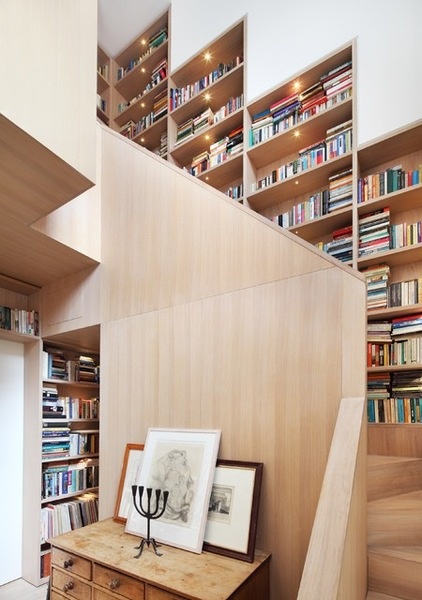
9. Ingenious Book Tower in the U.K.
Location: London, England
Who lives here: A family with four grown children
Designer: Platform 5 Architects
Book storage has been designed into the very structure of this home, which has been nicknamed “The Book Tower House.” A double-height space at the heart of the house was turned into a vertical library, with a feature staircase wrapped in oak bookshelves.
Because storage was a key consideration of the build, there are clever shelves tucked in everywhere, including alongside and over the tops of doorways. This staircase leads up to a compact built-in desk and study area with views over the ground floor. The use of a restrained color palette and building materials allows the books to add color and texture without overpowering the scheme.
See the rest of the project
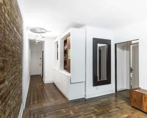
10. Cool Expanding Cocktail Bar in the United States
Location: New York City
Who lives here: A bachelor who does marketing for a software company
Designer: Michael Chen of Michael K Chen Architecture
To pack multiple cocktail hour functions into a less-than-93-square-meter Manhattan apartment, designer Michael Chen created a wood-panelled and white-lacquered MDF panel bar niche in the entryway that holds and displays the homeowner’s scotch and boutique bourbon collection, various glasses and a keg tap. A small drawer made from solid cedar with a glass top creates a humidor for the homeowner’s collection of cigars.
Meanwhile, a sturdy bar portion slides out to establish an intimate dining spot for two, and slides back to keep the apartment feeling spacious.
Read the full story
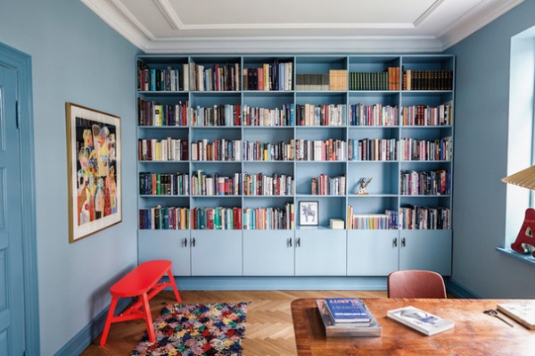
11. Colourful Bespoke Shelving in Denmark
Location: Copenhagen, Denmark
Who lives there: The Lønberg family
Designer: Design by Us
This storage was custom-made for the wall of the home office so it matches and blends into the surroundings. The design company wanted to keep the old Patrician villa style of the house while modernizing the office, so it decided to emphasize the previous use of the space as a “gentlemen’s room.” Historically, this was a place for men to smoke, talk and discuss politics.
In such a space, designers used to paint the shelving and doors a tone darker than the walls, which the designers have echoed here.
“We wanted to create a holistic room that catered to the owner, and just loved the dove blue color. The shelving is made of MDF with an auto lacquer finish,” says Lisette Bernhoft of Design by Us. The company defines itself as not typically Scandinavian by taking a more vibrant, eye-catching and fun approach to the color palettes they use, as opposed to the white, clean and minimalist Scandinavian look that Danish homeowners are used to.
View the rest of this project
Tell us: Do you have a clever storage solution? Please share a photo in the Comments and tell us which city, region or country you live in.
Related Articles Recommended


