New This Week: 5 Living Rooms Designed Around the Fireplace
http://decor-ideas.org 08/22/2015 03:13 Decor Ideas
There are plenty of obstacles to laying out a living room, but a fireplace has got to be near the top of the list. Should you make it a focal point or try to hide it? Hang the TV over it or to the side? Face furniture toward it, away from it or both?
The following rooms — uploaded recently to Houzz by their respective designers — show five ways to tackle furniture arrangements in relation to a fireplace. Clearly, there’s no universal right answer, but there are a few common ideas from which everyone can learn. Here the designers share their plans of attack, “uh-oh” moments and more.
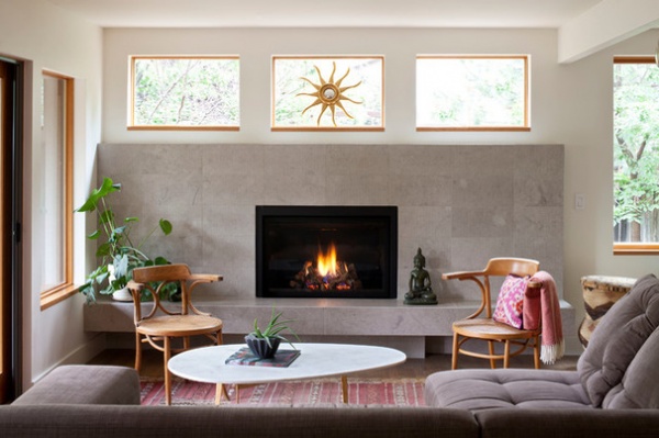
1. Original Zen
Designer: Shandele Gumucio of Studiovert Design
Location: Boulder, Colorado
Size: 18½ feet by 13 feet (5.6 by 3.9 meters)
Year built: 1984
Homeowners’ request: “The first thing I learned about my clients is that they are Zen practitioners and prefer to sit on the floor,” designer Shandele Gumucio says. “My clients wanted to create a warm, modern, peaceful and cozy space for their family to gather, and there had to be plenty of available floor space. By using a modern aesthetic and natural materials, we maintained an authentic material philosophy. The original room was dark, and we knew we needed more natural light, and we opened up two walls with windows and doors. The custom built-in cabinet keeps clutter behind closed doors. One of the cabinet bays hides a workstation with a pullout desk.”
Plan of attack: “The home’s original bulky, angular fireplace was stuck in the northwest corner, and the first decision we made was to remove it. The space is now occupied by cabinets and a tall window, which connects the indoors to a lush yard and play structure for 5-year-old Liam. A fireplace was an absolute necessity for my clients, and the room evolved around the new fireplace location.
“Because of the structural beam, I defined the space on one side as lounge and the other as storage and open space. The custom cabinet needed to occupy the entire wall to have presence and maintain simplicity. We always knew the entire house would be painted a soft white to complement the natural materials. Choosing the fireplace surround material was the last decision. We had all the furnishings ordered and the clients were moved in before we could decide. We considered concrete, Heath tile and many limestone options. The limestone was most compatible with our concept.”
Why the design works: “The original 1970s home was missing windows and vistas in all the key locations, and it was a pleasure to open up corners and walls with light.”
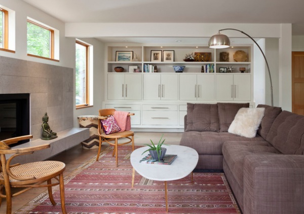
What wasn’t working: “The post supporting the structural beam in the living room was something we all wanted gone. We eventually embraced the fact that the post was functional and served our honest-materials concept. We incorporated the post into the furnishing layout, and now I find the post to be an integral element.”
Who uses it: “The homeowners are a professional couple in their 40s with a 5-year-old son. Their household includes a Buddhist monk who has a suite on the lowest level of the home. A large room adjacent to the monk’s quarters has been set aside to become a Zendo. As Zen practitioners, Jodie and Mike are kindhearted, honest, beautiful people, and it was a great pleasure to work with them.”
Splurges and savings: “The marble coffee table was a bargain. Thirty-six-inch limestone tiles were used for the hearth instead of a slab, which saved approximately $2,000. We splurged on the custom built-in cabinet; it was costly but integral.”
Take-away: “A custom sofa is worth the extra work and wait.”
The nitty-gritty: Wall paint: Swiss Coffee, Benjamin Moore; sectional sofa: customized Colton from Brownstone with Romo Dune fabric in Peppercorn from Town Studio; tile: 9-by-18-inch Textura limestone in Smoke and 18-by-36-inch Hones limestone in Smoke, Decorative Materials; built-in cabinet and shelves: custom, Interior Construction Services; side chairs: vintage handmade cane chairs from Belgium, Hari Vintage; coffee table: midcentury Wisteria Egg table; rug: vintage Moroccan hand-woven soumak, Babaee Rug Gallery
Team involved: Interior Construction Services; Evolution Tile + Stone (tile installation); Emily Minton Redfield (photography)
See more of this home
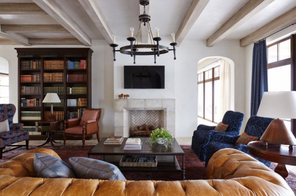
2. Book It
Designer: Andrew Howard
Location: Ponte Vedra Beach, Florida
Size: 25 feet by 19 feet (7.6 by 5.7 meters)
Year built: 2014
Homeowners’ request: “The homeowners wanted to incorporate their existing chesterfield sofa, the antique rug and their books,” interior designer Andrew Howard says. “We wanted the room to feel comfortable, but at the same time feel like something that had been lived in and could be lived in.”
Plan of attack: “The rug was existing and was a very important possession, and it set the tone for the color palette, since I loved it. We knew the TV needed to be accessible, because this is a room the family truly lives in. Everything evolved from there, and it was fun to work with the colors from an antique rug and draw them into the furnishings and pillows. As a general rule of thumb, I don’t like anything to be off-limits in a room like this, and the surfaces are all designed to wear over time.”
Why the design works: “I think it works because it is comfortable and [because of] the amazing family that gets to spend time together in it. The decorating helped create the environment that a family will be able to share memories in for years to come. For me that is more important than any fabric or pillow decision that was made.”
What wasn’t working: “I am always challenged to get the television low enough so that necks don’t have to strain to watch. I made the mantel out of stone so that we did not need additional noncombustible material, like you would have on a wood mantel, to keep the television at a workable height.”
What goes on here: “Reading, homework, TV watching, fires in the wintertime and general family gatherings.”
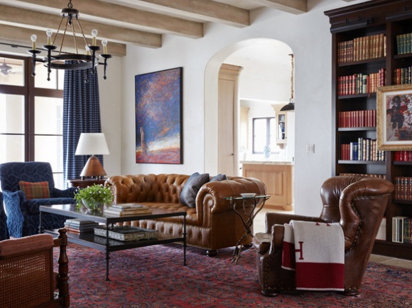
Designer secret: “I like the coffee table to be something that people feel comfortable putting their feet up on, or putting a drink on should they feel inclined. The distressed top hides any blemishes that it might sustain over the years.”
“Uh-oh” moment: “The ‘uh-oh’ moment was absolutely the bookcases. I always tell people that they need lots of books to do large bookcases, and if not, I don’t want to fill them with a bunch of mismatched knickknacks. Bookcases are meant for books. It is OK to mix in something here and there, but predominantly books on the shelves, please. I was worried they did not have enough to fill them as we were making them, but sure enough they had more than enough.”
Take-away: “I feel like it is always important to use some of the client’s existing things, while as a decorator still putting your stamp on the room. As designers we sometimes tend to want to have total control over what goes in a house, but I feel that since the client is the one that is actually going to live in the house, we need to make a place for things that have played an important role in their life before this project may have come along.”
The nitty-gritty: Tile: travertine; stone mantel: custom: lamp and chair: antique: coffee table: custom made of stone and iron; chandelier: Visual Comfort; chairs: Century Furniture with Scalamandré fabric by Kathryn Ireland
Team involved: Bill Jaycox of Jaycox Architects; Aurora Builders
See more of this home
3. Family-Friendly Entertainer
Designer: Noz Nozawa
Location: San Francisco
Size: 11 feet by 15 feet (3.3 by 4.5 meters)
Year built: 1915
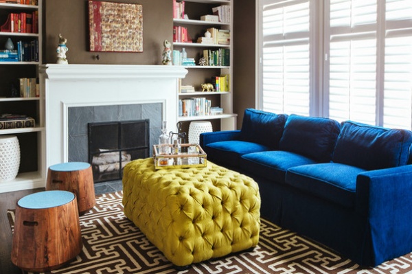
Homeowners’ request: “The homeowners, a couple who make raising three kids under age 5 look like a breeze, love hosting at their home,” interior designer Noz Nozawa says. “But having upsized from their previous home, several spaces, including the formal living room, were being underutilized. In the case of the living room, it was a makeshift storage room for kids’ toys, hand-me-down furniture and boxes. Their request in working with me was to find a way to use the room and make it presentable for guests — they love hosting — so that they wouldn’t be tempted to revert to using the space for storage.”
Plan of attack: “My first step was to determine with the clients what elements of the space would stay and not be reimagined: ultimately the blue sofa, which they’d just reupholstered less than a year before, and the paint color, which the clients actually weren’t sold on, but I loved it and knew we could make it work. The bookcases surrounding the wood-burning fireplace were already installed when they purchased the home, so we had several elements to the design anchored, on top of beautiful dark wood floors.
“Even though in San Francisco you’re rarely permitted to use a wood-burning fireplace, I still wanted to orient the room’s seating around the hearth. It’s classic, and with the family’s extensive nutcracker collection, featuring nutcrackers across the mantel would be perfect during the holidays. The homeowners wanted the seating to be versatile, easy to move around and safe for young kids. With all the major pieces decided, the last step was highlighting the homeowners’ beloved novel collection by color-blocking and using lots of decorative accents and bookends.”
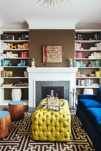
Why the design works: “I think this room’s architectural elements are so classic — fireplace focal point, symmetrical bookcases on either side, coved ceiling — that the design approach was really informed by the architecture. By including versatile seating like round stools with handle cutouts and a large tufted ottoman-coffee table, the homeowners are also able to rearrange the room for different-size parties. The stools and ottoman can serve as seating in addition to the garden stools in the bookcases, and they can all be oriented with the sofa around the fireplace.”
What wasn’t working: “The formal living room had a lot of potential when I arrived, but being that it’s separated from the rest of the home’s otherwise open floor plan — the dining room, sitting room, family room and kitchen are all connected on the other side of the foyer — it was easy to neglect the room and not focus on it for as long as the homeowners did, especially since they were living just fine without a formal living room in their previous home. By understanding the flow of the homeowners’ guests during gatherings, we decided that the space would serve well as a welcoming or receiving space for grown-up guests to enjoy cocktails and conversation, while kid guests could run off into the family room for their own fun.”
Who uses it: “This space will primarily get used when guests are over. It’s meant as a hosting space, but the two older kids in the family love jumping on and crashing into the tufted ottoman, which is so exciting to me, because I ultimately wanted the furnishings in the room to be safe enough for kids to romp around. Boe and Sophie Hayward are the coolest, easiest-going, warmest people. They are parents to three kids under the age of 5 and a golden retriever named Dusty.
“They work with the city of San Francisco and host different kinds of events regularly — from dinner parties to fundraisers — so most rooms in the house are meant to accommodate varied events. For example, in the dining room, we installed a walnut regulation-size Ping-Pong table that would fit a large party for dinner and then convert into a court for table tennis.”

Designer secret: “If you plan on hosting in your space, remember to have some fun creating a space that really feels like you when your guests are there. Or, if you have limited space to host guests, look for pieces that have versatile use value, as seats or occasional tables, that can also be set aside or stored when not in use.”
“Uh-oh” moment: “Color was the big challenge in designing this space. The homeowners and I went back and forth throughout the process on which colors to keep in the space or what colors to add, and ultimately deciding what color the custom ottoman would be was a debate. Our initial decisions to not reupholster the blue chenille sofa — mostly because it had just been reupholstered less than a year prior and I felt confident that we could work with the color — and to not repaint the walls dictated the majority of colors in the space. Then when I recommended the brown rug, it meant that whatever we selected for a coffee table should make a big statement.
“Previous concepts for the room were falling flat when I drew them up with standard coffee tables. We looked at iron with glass, brass with glass, solid wood tables — every shape. But when I proposed the idea of a tufted coffee table-ottoman, the concept came together. Once we decided to create a custom piece for the space, we could dream up any color. We looked at materials in every jewel tone, and ultimately, the ocher-mustard won — and I think the color really complements the blues and browns in the space without dominating the color scheme.”
Splurges and savings: “By not repainting or reupholstering, we saved plenty on budget to be able to splurge on a beautiful light fixture and the custom ottoman. Also, by creating an ottoman that doubled as a coffee table, and finding great affordable wood stools from Blu Dot, we didn’t need to get accent chairs for the room, which gave us the budget to purchase a beautiful sideboard for the bar [not shown], and even some budget to purchase cool bookends and decor for the bookcases.”
The nitty-gritty: Blue sofa: clients’ own; tufted ottoman: custom designed by Noz Nozawa and fabricated by Gil’s Upholstery with Robert Allen fabric; rug: Archive in brown, Surya; wall paint (similar): Whitall Brown, Benjamin Moore; wood stools with felt tops: Blu Dot; garden stools: clients’ own
4. Tough and Timely
Designer: Kim Ledlie
Location: Austin, Texas
Size: About 27 feet by 15 feet (8.2 by 4.5 meters)
Year built: 2014
Homeowners’ request: “The homeowners wanted a formal yet approachable space that would be perfect for entertaining, as the dining space is shared on the opposite side of the room,” interior designer Kim Ledlie says. “Since they wanted to actually use the formal living room as a living room, they wanted to be able to sit comfortably to watch the television as well.”
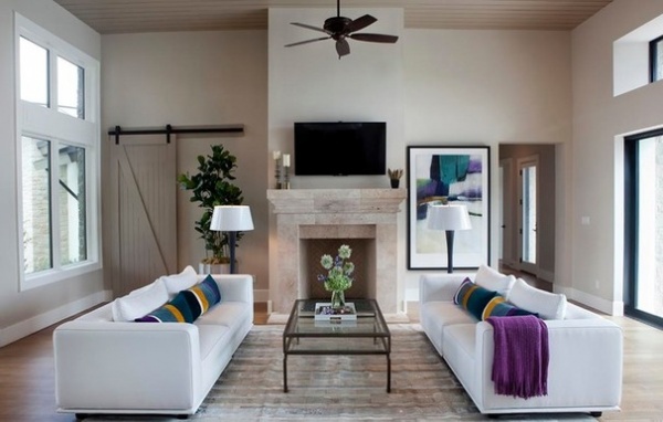
Plan of attack: “Do to the traffic flow of the room, flanking the fireplace with sofas allowed for the most seating. This also provides a great view of the fireplace from the formal dining area. Since I worked hand-in-hand with the builder on the design of this home, I was able to space-plan the furniture well before construction even began. For the furniture, the homeowner fell in love with the sofas, and we worked from there, knowing that we would want to add bright pops of color to add interest to our neutral palette.”
Why the design works: “The entire back wall of the room is a set of sliding glass doors that recede into a wall, creating a massive indoor-outdoor space, which is well-suited for Austin living. The front of the home is almost all glass as well, so we chose sofas with low backs to allow for a great 360-degree view.”
Who uses it: “My clients are John and Jenny, a retired couple who like to entertain friends, travel and attend local sporting events. Most commonly, Jenny uses the space to hang out with her daughter, Emily, who lives in Austin. The arrangement of the sofas is perfect for visiting, as Jenny and Emily are able to face one another to chat, each enjoying gorgeous views.”
Designer secret: “Since the homeowner wanted white sofas with bold, rich accent colors, we went with Sunbrella outdoor fabric on the bodies of the sofas. This fabric can be cleaned much more aggressively without damage, which is important when you plan to entertain and your sofas are white.”
“Uh-oh” moment: “This project involved custom pillows. We had planned on working with a local fabric designer and artisan, who is amazing, but it just wasn’t coming together well. I had a vision, and we just weren’t getting there, so I went to a designer resource in Austin and pulled together several swatches of bold velvets that I could bring to the site to look at with our art. From there I did several color renderings for custom striped pillows, and I had my fabricator sew them from scratch. What we wound up with are bold and rich color blocks that flow from one kidney pillow to the next. It was a sigh of relief to see how much the homeowners love them.”
Splurges and savings: “Most of this room was a splurge. I would say that we saved the most on accessories, but even the rug was custom made, down to the stitching and hide colors, in Brazil.”
The nitty-gritty: Wall paint: Accessible Beige SW 7036, Sherwin-Williams; ceiling and barn door paint: Tony Taupe SW 7038, Sherwin-Williams; sofas: Della Robbia Harper sectional with Sunbrella sailcloth fabric; pillows: custom design by Kim Ledlie Design with custom Robert Allen Contract velvet fabrics; rug: custom cowhide, Feizy Rugs; coffee table: Table of Contents, Cara Cole; art: custom; candlesticks: Arteriors; Fluted floor lamps in navy with 22-inch gloss white parchment shades: Barbara Cosgrove Lamps
Team involved: Nalle Custom Homes (builder); Paula Casentini (photography)
See more of this home
5. Lofty and Lovely
Designer: Richard Blender
Location: Chicago
Size: 450 square feet (41.8 square meters)
Year built: 2008
Homeowners’ request: “The owner wanted the space open to the workspace and west-facing windows beyond, and also for the wall to display books and art objects,” architect Richard Blender says.
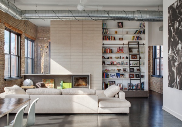
Plan of attack: “We started with the layout of the workspace behind the fireplace wall, which houses a home office and workout room. The fireplace is centered on the sectional sofa, leaving enough room for display.”
Why the design works: “The design of the entire home is based on not touching the existing exposed masonry walls. The walls contain a lot of glass facing south, and this is what was unique about the space. This informed how to design the fireplace wall to ‘float’ away from the masonry.”
What wasn’t working: “The existing space was horrible, and the owners were happy to see it all go away.”
Who uses it: “The space is for a family of four plus one dog. The display wall is both for family photos as well as elements that are used by the adults and kids. The library ladder is for anyone willing to access the higher shelves.”
Designer secret: “Clean lines, elegant proportions and natural materials. Keep it simple.”
“Uh-oh” moment: “The house had to be completed for a house swap between the owners and another family from France. This drop deadline created the biggest challenge.”
The nitty-gritty: Sofa: Roche Bobois; tiles: recycled ceramic tiles, Terra Green Ceramics; countertops: Caesarstone; recessed lighting: Aculux, Juno Lighting Group; fan: Modern Fan Co.; fireplace: Rais
Team involved: Brian Peters of Blender Architecture; JWA and BES Mechanical (engineers); KWI (millwork); WB Construction (general contractor)
See more of this home
More: How High Should Your TV Be?
New This Week features designs from projects most recently uploaded to Houzz. Have a great project? Here’s how to share your photos on Houzz.
Related Articles Recommended


