Room of the Day: Tile Patterns Mix It Up in a Master Bath
http://decor-ideas.org 08/19/2015 23:14 Decor Ideas
Shaun Loh and Karen Ko loved the architectural details on the exterior of their Edwardian home in San Francisco’s scenic Pacific Heights neighborhood. But the couple, who had previously lived in a contemporary high-rise condominium, wanted the interiors to reflect something a bit more modern.
When it came time to update the home’s master bath, their designer, Heather Cleveland, understood the couple’s goals and helped them mix tile patterns and move around some of the components to create a relaxing, transitional space that feels modern while still embracing the history of the home.
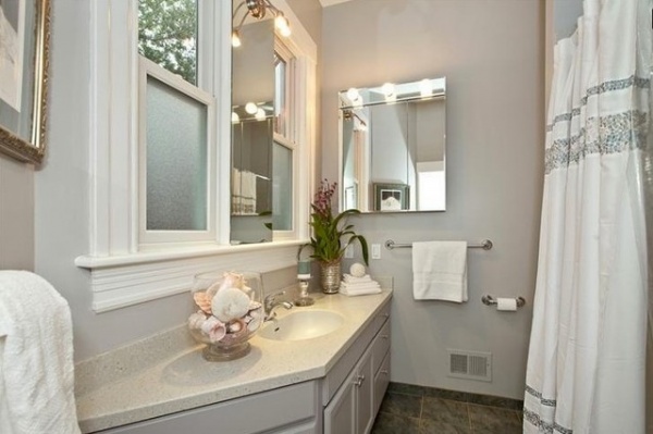
BEFORE: Prior to the renovation, the dated and poorly planned master bath had an angled vanity with counters about 3 inches too short, a tight shower and tub combination behind the door swing, and a dividing wall next to the toilet that took up valuable floor space. “They wanted it to feel more expansive, light and practical,” Cleveland says.
“After” photos by Open Homes Photography
Bathroom at a Glance
Location: San Francisco
Who lives here: Shaun Loh, a physician, and wife Karen Ko, a homemaker
Size: 7 feet, 11 inches by 7 feet, 4 inches (about 60 square feet, or 5½ square meters)
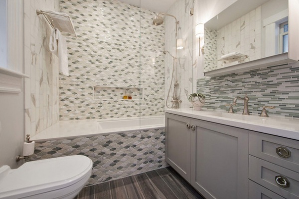
AFTER: To make the room more functional and user-friendly, Cleveland eliminated the dividing wall next to the toilet and moved the location of the vanity to the other side of the room. A pocket door replaced the swing-in door that took up floor space, and a new wall-mounted toilet now sits where the vanity once stood. The shower head in the updated glass-enclosed bath and shower combo took over the space once occupied by the toilet. “I wanted you to walk in and see the most beautiful element first,” Cleveland says. “You’re facing the back wall and see the investment they made in the tile.”
Cleveland mixed tiles in supersoft greens, blues and grays to find the right tension between traditional and contemporary styles. Since Ko loves marble, large marble field tiles were used for the side walls of the tub and the top of the tub surround. The ogee-shaped tiles on the back wall and the outside skirt of the tub have a classic feel, while the matchstick tiles used for the vanity backsplash that remind Ko of sea glass have a more modern edge. An easy-to-clean dark gray tile floor helps ground the space.
The glass enclosure for the shower and tub combo creates a feeling of spaciousness, but also makes sense given the elegant details used in this space. “The tiles are just stunning, and the shower hardware with the classic Edwardian fixtures are beautifully crafted, and you don’t want to hide them,” Cleveland says.
Floor: Tileshop; tub: MTI Baths; wall-mounted toilet: Strada, Villeroy & Boch; shower head: Exposed shower package, Perrin & Rowe; glass shower door: custom; paint by Dunn-Edwards Paints: Veiled Spotlight DE6324 (walls); Lighthouse DEW385 (trim and ceiling)
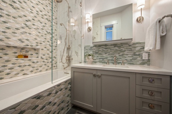
The soft gray finished vanity has simple Shaker cabinet doors. It includes a large cabinet with two pullout drawers for toiletries, four side drawers for makeup and brushes, and a thick quartz countertop.
The 10-foot-high ceiling allowed the couple to add a medicine cabinet with a mirror that slides straight up. It includes a defogger and plugs for hair dryers and other small appliances. “I love how modern it is, and how everything is hidden away but easily accessible,” Ko says.
Uplift mirror cabinet: Robern; Aberdeen sconces in polished nickel: Hudson Valley Lighting; vanity backsplash tiles and field tile for shower wall: Walker Zanger; back shower wall tiles: Pointed Oval in glazed option, Artistic Tile; vanity cabinet: Silver Smoke, Harmoni Kitchens; polished nickel hardware on vanity: Nest Studio; custom vanity counter, ramp sink and tub deck: PentalQuartz, Bay Countertops
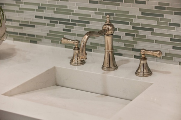
A custom ramp sink adds a bit of edginess to the transitional space and blends seamlessly into the counter. The tall polished nickel Georgian era-style faucet with lever handles balances out the contemporary sink and adds visual height to the shallow sink.
The couple decided to go for one sink instead of two in order to have more counter space and not overwhelm the look of the vanity.
Sink faucet: Rohl
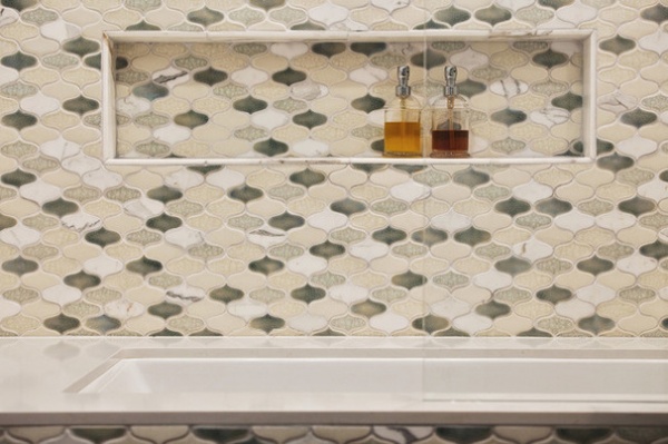
A custom 2½ -foot-long niche stores soaps, shampoo and conditioner on a marble shelf with a rounded edge.
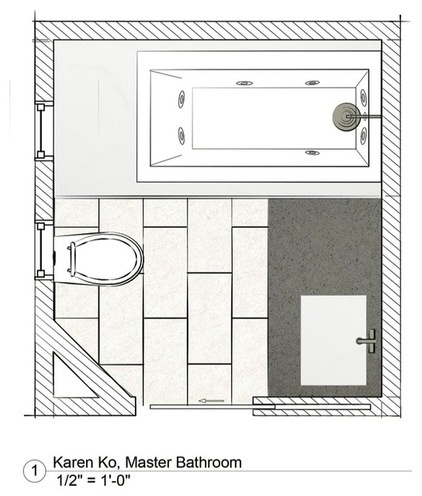
This floor plan shows how smart planning allowed for more roominess and function in a small footprint. “The bathroom now feels open and spacious, even though it’s a pretty small space,” Ko says. “It’s beautiful to look at but also a pleasure to use.”
More: Key Measurements to Make the Most of Your Bathroom
Related Articles Recommended


