Houzz Tour: Smart New Look for a Once-Faded Beauty
http://decor-ideas.org 08/16/2015 22:13 Decor Ideas
These homeowners, both real estate investors, originally saw their 1939 Colonial Revival home as a great opportunity for a quick flip. They knew that even after many years of being uninhabited and neglected, the home had great bones that could still shine through with some focused attention. What they didn’t realize was that once the project began, they’d fall in love with the space and not want to let it go. That’s when interior designer Ty Larkins was brought in to turn this quick flip into a loving restoration.
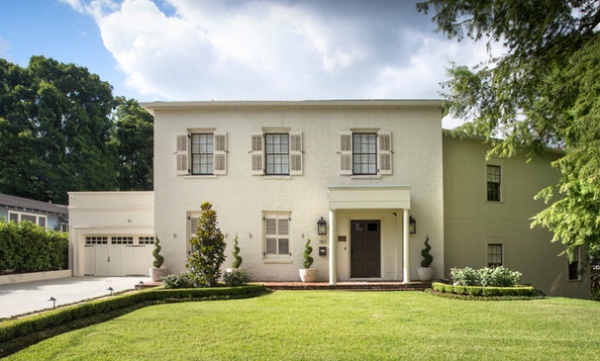
Houzz at a Glance
Who lives here: A couple who are real estate investors
Location: Baton Rouge, Lousiana
Size: 3,600 square feet (334.4 square meters)
Designer: Ty Larkins Interiors
The custom shade of white paint selected for the home’s exterior was inspired by the shade of white often found on buildings in Paris. “It has this antique, earthy quality to it that’s timeless,” Larkin says. The home’s front windows also received functioning shutters that helped bring it back to its Colonial Revival roots.
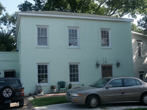
BEFORE: The front yard’s previous circular driveway was removed and replaced with a grass lawn to create a more natural curb appeal.
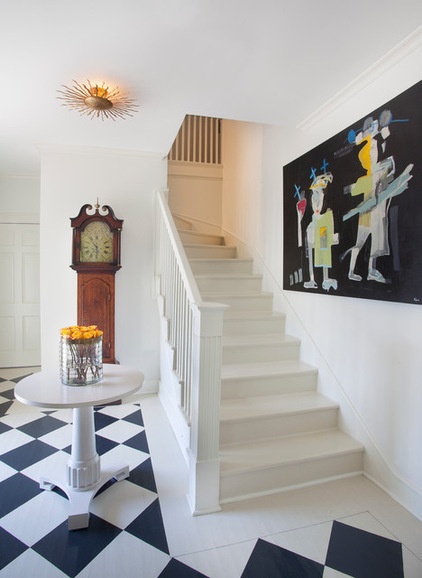
AFTER: Larkin says that the home was in such a state of neglect that all of the floors needed to be replaced. In the foyer, white oak floors were painted in a diagonal black and white checkerboard pattern. “Stone and marble used to be prohibitively expensive a century ago, so it was very common to paint floors to mimic the look of stone,” Larkin says. “Painting the foyer floors was a nod to the past.”
Ceiling light: Visual Comfort; art: Tony Mose; pedestal table: Bernhardt
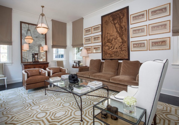
The large tapestry and collection of 12 framed ancient Greek prints hung behind the sofa inspired not only the color selection for the living room, but the entire design scheme. “Everything stemmed from that tapestry and those prints. They infuse the room with a classic character that we built tension around by adding both contemporary and antique pieces,” Larkin says.
Leather armchairs: Vanguard Furniture; white armchair: Alfonso Marina
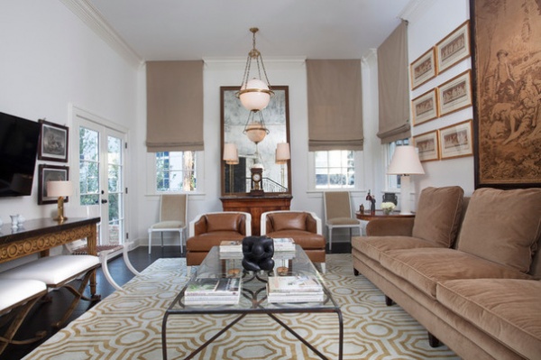
The room has a variety of pieces in brown, cream and gold. The sofa is covered in a light brown velvet, and the brown leather armchairs are trimmed in white painted wood. The large midcentury-inspired area rug is actually two identical rugs sewn together. “Creating a custom rug to cover the entire room would’ve been very expensive. Piecing two together is a great way to achieve a similar effect for a fraction of the cost,” Larkin says.
White stools: Alfonso Marina
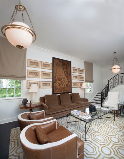
Since the house is built on a sloping hill, the first floor has the feel of a spit-level ranch. A small flight of stairs leads from one level of the first floor to the next. Larkin created a custom pattern for the wrought iron stair railing.
Ceiling lights: Visual Comfort
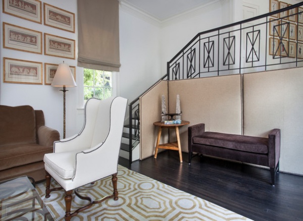
Underneath the stairs a pair of 3-foot doors leads to a storage space that is used to house entertainment equipment and wiring. To conceal the space but still allow access, Larkin designed a custom movable screen made of linen with brass nailheads.
Linen screen: custom, Ty Larkins Interiors; upholstered bench: Mitchell Gold + Bob Williams
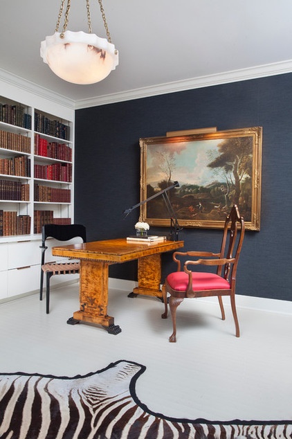
Larkin says he was inspired by the works of one of his favorite designers, Ralph Lauren, and fashionable men’s attire when creating the home office. “It’s a bit like a tailored suit. The flannel fabric wallpaper is the suit, the crisp white floor is the starched shirt, and the red silk on the seat cushion is the tie,” Larkin says.
Burled walnut desk: 18th century; modern desk chair: Scala Luxury; desk lamp: Tizio, Artemide; ceiling light: Visual Comfort
Discover 95 dazzling deskscapes
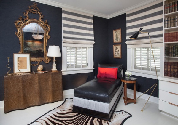
The office’s credenza is meant to look like a tablecloth made of alligator skin but is actually made of resin. Modern built-in bookcases designed by Larkin and a midcentury floor lamp juxtapose the ornate gilded mirror and antique prints.
Chaise: custom, Vanguard Furniture; resin credenza: Phillips Collection; floor lamp: Julian Chichester
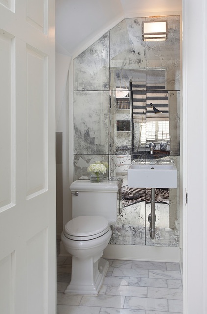
The powder room, off the office, is under a flight of stairs. “It’s a small and oddly shaped room, so we wanted to make it feel bigger and also add some drama,” Larkin says. To achieve this goal, he lined the vanity wall in antiqued custom-cut mirrors.
Mirror tiles: custom, Ty Larkins Interiors
Browse 102 eye-popping powder rooms
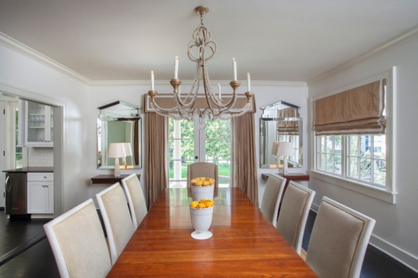
The homeowners already owned the dining table, which is more than 150 years old. Larkin wanted to contrast the antique table with streamlined dining chairs in a color palette pulled from the living room. The window treatments are custom and are made of silk.
Chandelier: Niermann Weeks; dining chairs: Vanguard Furniture; mirrors: Global Views; lamps: Visual Comfort
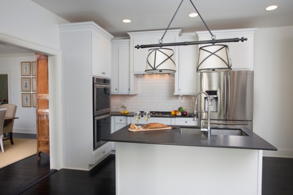
Creating a timeless space was the goal at the heart of the kitchen design. The color palette of black and white includes subway tile, honed black granite countertops and Shaker cabinets, and was designed to stand the test of time.
Light fixture: Visual Comfort
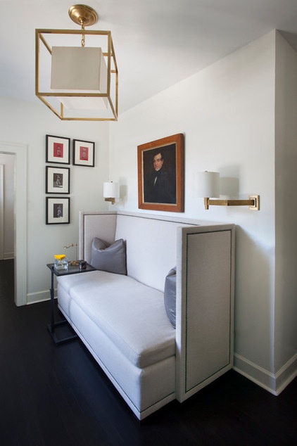
Larkin says the second-floor foyer, which includes a linen banquette sofa trimmed with brass nailheads, is one of his favorite spots in the house, due to its 200-year-old portrait. “The homeowners have a huge collection of oil paintings. This particular portrait was in storage in their last home, but it provides the perfect accent above the sofa and ties the entire vignette together,” the designer says.
Banquette: Vanguard Furniture; ceiling and sconce lights: Visual Comfort
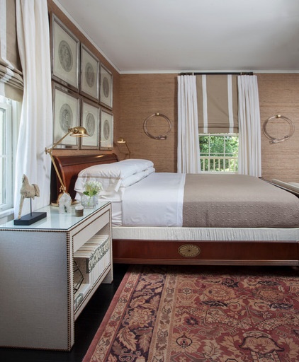
The brown and golden hues of the living room and dining room made their way up to the master bedroom on the second floor, in the form of grass cloth wallpaper.
Custom blown-glass loops frame a window along the bed. “I wanted something different for this wall. Another mirror or another piece of art wasn’t going to cut it. These glass loops provide something unexpected,” Larkin says.
Wallpaper: Phillip Jeffries; nightstands: Bernhardt; bronze task lamps: Visual Comfort
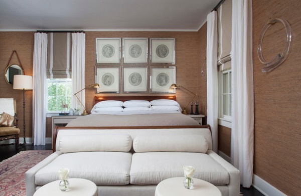
Mirrored frames for a collection of six prints featuring ancient Roman coins above the bed provide a contemporary take on the classics. For the foot of the bed, Larkin created an intimate seating area with a linen sofa and two white stools.
Antique prints over bed: Trowbridge Gallery; sofa: Vanguard Furniture
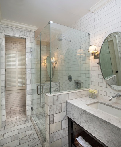
As he did with the kitchen, Larkin took the classic route when designing the master bathroom. He used Carrara marble tile for the walls and shower surround, and statuary marble on the floors.
A feature of the master bathroom that might be hard to discern in the photo is that identical vanities and mirrors are located on both sides of the shower. The vanity and mirror in the rear of the photo are in an alcove behind the shower wall.
Mirrors: Restoration Hardware; sconces: Visual Comfort

BEFORE: The previous backyard had no privacy fencing or walls and was largely unused. This picture was taken after two balconies, previously enclosed, on the back of the house were remodeled and returned to their original state.
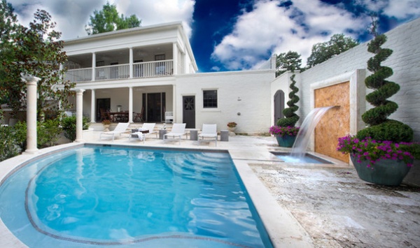
AFTER: A large brick wall was built for privacy and painted the same white as the home’s exterior. A pool and water feature create a great area to cool off in during the hot and humid Louisiana summers.
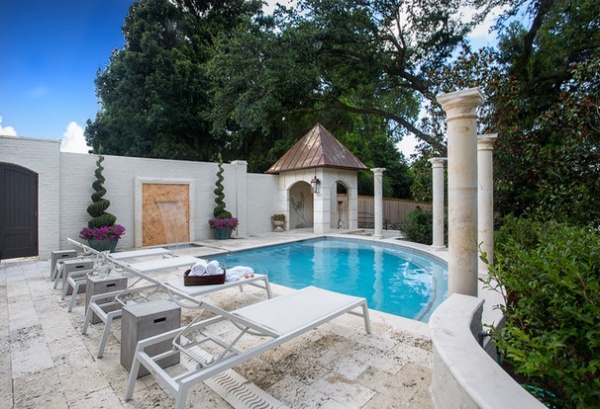
The classical pillars that surround the pool are juxtaposed with modern outdoor chaises and side tables.
Outdoor chaises and stools: Kannoa
Browse more homes by style:
Small Homes | Apartments | Barn Homes | Colorful Homes | Contemporary Homes | Eclectic Homes | Farmhouses | Floating Homes | Guesthouses | Lofts | Midcentury Homes | Modern Homes | Ranch Homes | Townhouses | Traditional Homes | Transitional Homes | Vacation Homes | Homes Around the World
Related Articles Recommended


