New This Week: 6 Modern Dining Zones in Homes Big and Small
We recently reported on how formal dining rooms are alive and well. But this is still the age of the open floor plan, when rooms are being replaced by zones. Establishing the kitchen and living room zones tends to come first in open layouts, dictated more easily by where to hang the TV or where the existing plumbing is to hook up a kitchen sink. But the dining zone is a bit more complicated. You have to think more conceptually, working in an undefined gray area floating between the cooking and living spaces.
The following six spaces — uploaded recently to Houzz by their respective designers — show how to work a dining zone into a modern open floor plan without its feeling forced, cramped or bound to be ignored. Splashy accent walls, right-sized tables and, heck, even an indoor slide help turn these zones into multifunctional areas that get used far more often than their formal counterparts.
Here, the designers dish on their plans of attack, “uh-oh” moments and much more.
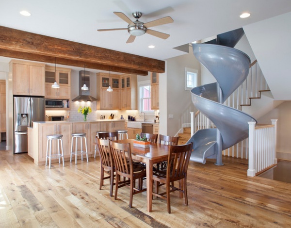
1. Hip and Slide
Designers: Pete Weber and Danielle Lynn of Coburn Development
Location: Boulder, Colorado
Size: 25 by 19 feet (7.6 by 5.7 meters); 475 square feet (44.1 square meters)
Year built: 2014
Homeowners’ request: “It was important that their new family home was light, airy and inviting, with just the right touch of playfulness,” designer Danielle Lynn says. “The overall vision was for a space that was clean and simple, with natural, rustic touches.”
Plan of attack: “This room was really designed around the slide. It was an element that was very important to our clients, and we worked to incorporate it from day one. The stairs and the master bedroom above were configured in a way that would accommodate the slide. The slide was meant to be a central design element for the space, along with the reclaimed wood beams and flooring. Everything else was designed around those elements.”
Why the design works: “Part of what makes this space work is the simplicity of the color palette and materials. The reclaimed floor complements the reclaimed beams, while the neutral walls and clean white trim allow the space to feel bright and open. The metal element of the slide is echoed throughout the space with aluminum bar stools and stainless steel appliances.”
What wasn’t working: “This space was part of a new-construction single-family-home project, so we had the benefit of being able make the space fit our vision. The most challenging aspect was coordinating the slide. Not only did we need to carefully calculate the space and clearances needed, but we also had to carefully sequence the installation of all the finishes around it — drywall, paint, railings and floor.”
What goes on here: “Pictured here is the kitchen and dining room, but to the right is also the living room and entry, and across from the slide is a large folding NanaWall that opens up to the backyard. This space is really the central hub of the house, where daily life happens.”
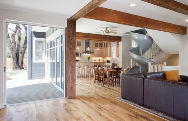
Who uses it: “This home belongs to a couple with two young daughters who are thoroughly enjoying their new home. The slide does get used on a daily basis — and yes, not just by the kids.”
Designer secret: “We try to encourage the use of simple, timeless materials and colors for the interior of spaces. Choose an element or two to set the character of the space, and let the rest of the room be clean and simple. In this case, the space was really about the slide and rustic accents of reclaimed wood.”
“Uh-oh” moment: “We were all really excited when the slide arrived onsite, until we discovered it didn’t quite fit. We had two options. Either we remove the slide from the project and give the extra room to the master closet upstairs, or we sacrifice even more room from the closet to get the slide to fit. To the clients, there was only one logical answer: create a notch in the master closet and keep the slide.”
Splurges and savings: “There were more splurges than savings on this level of the house, but there were opportunities for savings on other levels of the house in order to achieve the overall vision. The slide was definitely a splurge, but well worth it.”
Take-away: “This was the first time we were asked to incorporate a slide into a project, and while it was challenging, we had a lot of fun working with our clients to create their vision. It was rewarding to go beyond our usual realm of expertise to create a unique, fun space for this playful family.”
The nitty-gritty: Flooring: reclaimed antique oak, Reclaimed DesignWorks; beams: reclaimed; cabinets: Durango door in Natural Maple, Tharp Cabinet Co.; counters: soapstone; pendant lights: Eclipse cord-hung in white, Barn Light Electric Co.; slide: custom, DunRite Playgrounds; bar stools: Spin, Crate & Barrel
See more of this home
2. Cool Corner
Designer: Gita Jacobson of In the Details
Location: San Francisco
Size: 7 by 7 feet (2.1 by 2.1 meters), 49 square feet (4.5 square meters)
Homeowners’ request: “Turn a small corner area in the great room into a unique and intimate dining space that will accommodate four guests,” designer Gita Jacobson says.
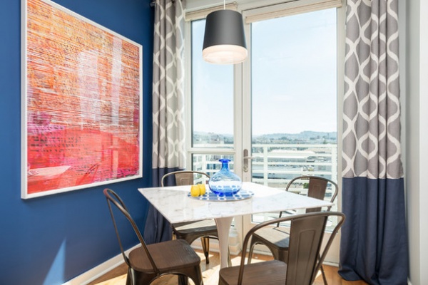
Plan of attack: “My first step was to find a dining table and chairs that were small enough to fit in the space but large enough to be comfortable to eat and entertain at. I wanted to use contemporary furnishings that were comfortable to sit in and that matched the rest of the space.
“I first found the 36-inch square marble dining table, which set off the design direction. I loved how clean and elegant it looked. I wanted to pair it with chairs that had a small footprint, and that made the space feel less formal and more fun. The metal and wood chairs were the perfect combination for the sleek marble table.
“I then wanted to work in a bright pop of color. I chose a navy for the wall color and found an oversized bright print that frames the dining area. I hung a black pendant from the track lighting system and designed custom drapes. The drapes feature a bold gray pattern print and a navy bottom section to tie in the navy wall. Simple navy and yellow table accessories add some color and interest.”
Why the design works: “It was a small space, so I wanted to maximize the form and the function. I wanted to use bright, bold colors to make it feel intimate even though it was a small space in a large room. I was able to create separate functional spaces within the great room by using color, art furnishings and lighting.”
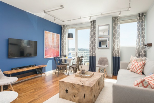
What wasn’t working: “The homeowners felt like they didn’t have a large enough space to entertain guests and host their friends for dinner. They liked the idea of having a dining table and area, but they didn’t want to sacrifice the space for something that wouldn’t get used every day. I was able to design the great room to feel very open but have separate spaces where things could happen. At the same time, I designed a space that wasn’t too formal, so they didn’t feel guilty for sitting and eating there every day.”
Who uses it: “Two young professionals living in San Francisco. Both are in the tech space and love design. Before this project, they ate all of their meals on the couch. Now they have a space that is casual enough to eat at every day and formal enough to dress up and host their friends for dinner.”
Designer secret: “Just because you have a small space doesn’t mean you can’t buy large art and use bold prints and patterns. I find that the more you put into a space, the larger it seems because your eye has a lot to explore. Visually you are looking at a much larger space, because there are so many interesting colors, patterns and textures.”
“Uh-oh” moment: “Because the space was so small, I couldn’t fit a table in without turning it at a 45-degree angle. There wasn’t enough space to pull out the chairs when the table was square. Turning it at a 45-degree angle provided the extra foot to be able to pull out the chairs and sit down.”
Splurges and savings: “I tried to find store-bought curtains to hang, but the ones I liked sold out before we could buy them. We ended up splurging on custom drapes. I was able to save money by shopping online to find great items at a discounted price.”
Take-away: “Small spaces aren’t easy to design right. Many times smaller spaces need much more planning and thought put into them to make them seem larger and more interesting.”
The nitty-gritty: Paint: Dignity Blue, Sherwin-Williams; Tabouret vintage wood-seat bistro chairs: Overstock; Lippa 36-inch marble dining table: Modway; Elrene linen Luna drapes, 52 by 84 inches: Macy’s; navy blue fabric: Jo-Ann; art print: Scarlet Fete III, Providence Art Group; pendant: Henrik Grand, Tech Lighting
See more of this home
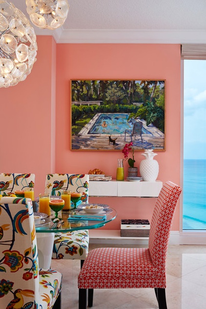
3. Pretty in Pink
Designer: Joseph Pubillones
Location: Singer Island, Florida
Size: 12 by 15 feet (3.6 by 4.5 meters); 180 square feet (16.7 square meters)
Year built: 2014
Homeowners’ request: “The homeowners wanted a place where they could dine informally with their family when on vacation,” designer Joseph Pubillones says.
Plan of attack: “Rather than allot a formal dining room, I suggested to the clients redesignating their breakfast area into the main dining area right off the kitchen.”
Why the design works: “Since this a vacation home, the clients warmed up to the idea of a single space to share meals. Their request was to make it colorful and make it fun.”
What wasn’t working: “A small table for two, where the space could accommodate a table for eight.”
Who uses it: “This New York family is composed of two professionals and two college students. They always travel to Florida with family or friends as guests for periods of one week to one month.”
Designer secret: “A natural tendency when designing against the blue of the ocean is to pick up on the blues and aquas of the ocean. In this room, much to my client’s doubt, I had the room painted a bright coral pink. When the room was finished, she confessed to me that it is the perfect shade of pink.”
“Uh-oh” moment: “When I realized that the cascading chandeliers would not center over the dining table. I then designed a medallion in the same shape as the table to allow for all the electrical wiring to adjust to its proper location.”
Splurges and savings: ”I needed a glass-top table — client’s request — that would be able to expand for special occasions. I found one from Calligaris that was a splurge but made the room work perfectly.”
Take-away: “Be confident in designing. Being bold is a good thing.”
The nitty-gritty: Paint: Youthful Coral SW 6604, Sherwin-Williams; table: Cosmic, Calligaris; chair fabric: Norbar Fabrics; orb chandelier: Palm Beach Antique & Design Center; art: Exotic Setting, by Guerin, Mary Woerner Fine Arts
Team involved: Jeff Smith Contracting (general contractor); Rob Robinson (project foreman)
See more of this home
4. Rich and Refined
Designer: Andrew Gath
Location: San Francisco
Size: About 175 square feet (16.2 square meters)
Year built: 2001
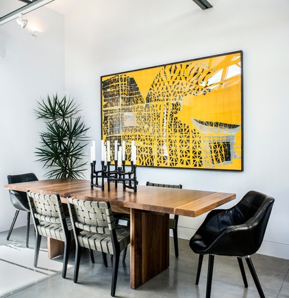
Plan of attack: “The dining room was a blank canvas when we started,” interior designer Andrew Gath says. “First we selected the dining table. We wanted something very warm for the finish to continue the accent of warm tones throughout the house, but we also wanted something very modern. The Room & Board Corbett dining table in walnut was perfect.
“We then we selected the head chairs. We wanted something that had a feeling of California 1970s modern. We found the pair of leather patchwork chairs at HD Buttercup in San Francisco. We then wanted to find a complementary guest chair that was small-scale and open. The Risom side chair was perfect. I love the khaki green straps in contrast with the ebonized frame. It adds a hint of color while still remaining fairly neutral.
“The collage by Matt Phillips was a piece we saw while shopping for art in Seattle. This is one of the first pieces you see when you walk into the open living space. We wanted a bold pop to contrast against the fairly neutral furniture. My client and I both fell in love with this piece and knew it was perfect for the dining room.
“The final additions were the Pipe candelabra from BoConcept and the tree in the corner — the two perfect pieces to finish the space off by adding visual texture and sculptural elements.”
Why the design works: “The space is like a gallery with its stark white walls and concrete floor. It really helps set off any direction you want to go. This solution works well because every piece in the space is doing its part to bring the design together: the table to bring in warmth and anchor the space; the head chairs to add a masculine, warm vintage element; the guest chairs adding a soft hint of color. The art is the showstopper, and the plant and candelabra add organic and industrial elements to round off the space.”
What wasn’t working: “Track lighting is hideous, but we had no choice but to work with it. It was my goal to have the furniture, art and accessories stop your eye. Before the installation, all I could focus on was the track lighting, and now it is inconspicuous, despite being out in the open.”
What goes on here: “This dining room is meant to function less as a formal eating space for the client and more as a design element to the open living space, as well as to serve as a surface for my client’s fun summer gatherings and provide a place for him to have his morning coffee and read the paper.”
Who uses it: “My client is a young, busy professional. He has a very full social and travel schedule. He is a child of the 1980s and ’90s and loves to play video games, read, watch films and travel.”
Designer secret: “I love a space with a mix of design elements, but it’s key to balance it out and to edit. Each piece should be thoughtfully curated.”
“Uh-oh” moment: “The space between the legs on the dining table is very tight. We needed to find a smaller-scale chair to fit the space to accommodate two people on either side. My client is very tall, practically built like a football player, so we were challenged with finding a chair small enough for the space that wouldn’t make him feel like a giant in a tiny chair.”
Splurges and savings: “The furniture is midpriced, which allowed him to splurge on the collage above the table.”
Take-away: “A space with only six different pieces, including accessories, can really make an impact, and although heavily edited, the space can feel full, warm and cozy.”
The nitty-gritty: Dining table: Corbett in walnut, Room & Board; head chairs: Lewis in black leather, HD Buttercup; guest chairs: Risom side chairs in khaki with ebonized frame, Knoll; art: Wave, by Matt Phillips, Kate Alkarni Gallery; Industrial 6-armed candelabra: BoConcept; plant: Dracaena marginata, Tom Evanoff Gardening
Team: Philip Storey of Redhill Painting
See more of this home
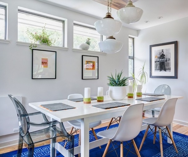
5. Light and Laid-Back
Designer: Keith Wardlaw of Plus Modern Design
Location: Weatherby Lake, Missouri
Size: 60 square feet (5.5 square meters)
Year built: 2010
Homeowners’ request: “Basically, we purchased a modern house that was the perfect style for us, yet when it came time to decorate it, we couldn’t execute,” says Amy Dirks, who lives in the home with her husband, Jared, and their two daughters. “We had cool pieces — vintage and new — yet had such a hard time defining certain spaces in the house. This is where Keith [Wardlaw] came in and rescued us. His plan of attack was to take what art, accessories and furniture we had and try to make it work while defining certain spaces for us.”
Plan of attack: “We painted all the walls white, which were previously gray. We had all of this beautiful art of my mother-in-law’s and just felt the gray didn’t do it justice. We love the clean look and blank canvas white gives you anyway.
“We liked clean modern, rustic modern, eclectic-industrial modern and midcentury modern, and we had pieces from all of those decorating styles too, so nothing really quite meshed. [Keith] was confident that midcentury was definitely our design style and was excited because it was one of his favorites as well. From that point on, he just took it and ran with it. We basically handed it over to him and let him do what he’s best at, and just helped to make decisions along the way.”
What goes on here: “The dining room itself is a small space, but is combined with the kitchen and living room, so it all flows nicely and doesn’t seem so small. As a mom and dietitian, I am always trying to make dinner and get the family to actually sit down and eat at the table. We love to entertain, so many times the space becomes a gathering place for dancing, singing, snacking, playing games etc. We purposely did not put a TV in the whole living room-kitchen-dining room so that the true purpose of the room prevailed.”
Who uses it: “Jared is a family-practice doctor. He uses the space for music, entertaining, business occasionally on the computer and eating, of course. Cooking and experimenting in the kitchen-dining room is what I typically do. The girls — Harper and Finley, who are 6 and 4 — use the space most often for art. They love to paint and color and create, and with the dining room table and island, it is perfect for them to do so while I’m prepping in the kitchen. Again, this is also nice because they are in a no-TV zone and can use their imaginations. Our dog, Bennie, likes to lay under the table and see if he can catch any scraps.”
Splurges and savings: “The lights in the dining room were like $10 each from an old hardware store — True Value, I believe — in Warrensburg. Bootlace Design and Build came in and built a walnut platform for them to be mounted to and kind of tie all of the rooms together. Our dining table was an Ikea purchase from back in the day when there were only a few stores in the U.S. Jared had purchased the chairs online, and we sold the benches that came with the table.
Take-away: “Quality design takes time and money. Jared and I have always had do-it-yourself aspirations for many projects, but seeing these professionals do what they are best at was totally worth our money and the time we didn’t have to take away from our kids and life to make it happen. Life’s too short. It was also nice for Jared and I to have a neutral party come in to help us with our design differences. It wasn’t worth arguing over, and Keith found a way to please us both.”
The nitty-gritty: Rug and candle accessories: Jonathan Adler; art: Teresa Dirks; portrait: signed Ben Harper poster; table: Ikea; rock planters: Marshalls
Team involved: Bootlace Design and Build (light box)
6. Minimalist Might
Designer: Denise Ashmore of Project 22 Design Inc.
Location: Vancouver
Year built: 2012
Homeowners’ request: “A family-friendly room that the kids would be happy creating or eating in and that the homeowners would be happy to entertain in,” interior designer Denise Ashmore says.
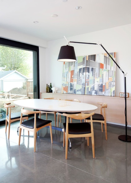
Plan of attack: “Planning for the amount of seating required is key to any great dining space. We also had to choose a table that is big enough for day-to-day but is also generous enough for more guests. Feature art and storage were also important to consider.”
Why the design works: “The oval dining table is elegant in form, with a super-hard-wearing laminate tabletop that welcomes the kids’ creativity.”
Who uses it: “An active family of five. The kids are ages 6, 4 and 2.”
Designer secret: “The floor lamp as a light source adds whimsy.”
Take-away: “Concrete floors work for families and feel surprisingly soft underfoot when they are heated.”
The nitty-gritty: Stools: Ikea; countertops: Diresco, Pacific Granite; replica Hans Wegner Elbow chairs; black Tolomeo Mega floor lamp: Artemide; art: Nicole Milkovich
Team involved: Scott Posno Design (architect)
See more of this home
More: Proof the Formal Dining Room Isn’t Dead


