Kitchen of the Week: Storage and Style Galore
http://decor-ideas.org 08/14/2015 19:13 Decor Ideas
Tired of their dated kitchen with oak cabinets crammed between appliances, which they lived with for almost 14 years, Chris and Dawn Pirie decided it was time to upgrade. They tapped kitchen designer Chanelle M Woodis to help them add more storage and style. Florrata white granite countertops and textured laminate cabinets handle the style, while things like hidden drawers for pan lids deliver on the storage.
Kitchen of the Week
Who lives here: Chris Pirie, who works at a commercial design firm; his wife, Dawn, a registered nurse; and their 9-year-old son
Location: Mukilteo, Washington
Size: About 140 square feet (13 square meters), plus an additional 100 square feet (9.2 square meters) for an attached kitchen table and eating area
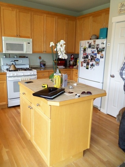
BEFORE: Prior to the renovation, the dated kitchen inside the 2,200-square-foot Craftsman home in Mukilteo, Washington, had limited lighting and oak cabinets squeezed between white appliances. “There were a lot of cabinets, but they just weren’t efficient,” says Woodis, of Chanelle M Woodis/Creative Kitchen & Bath.
A center island was too small for seating, and a walk-in pantry was so narrow and deep, items were often forgotten or lost in the back shelves.
“After” photos by Dan Farmer of seattlehometours.com
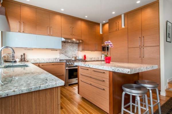
AFTER: Smarter cabinet and drawer placement upped the storage capacity. The homeowners chose flat fronts and to take the custom cabinets all the way to the 9-foot ceiling to make the kitchen appear larger.
Florrata white granite with rust veining and a polished finish for the countertops and backsplash complements the cabinets. While the perimeter countertops are 1¼ inch thick, the island countertop is 2¾ inches thick, chosen to create more of a focal point.
Cabinets from Bellmont Cabinet Co.: perimeter cabinets are 1900 series in Terra Field, and island is a combination of Terra Field and Bourbon on cherrywood; cabinetry hardware: Topex Design; flooring: oak plank with Swedish finish
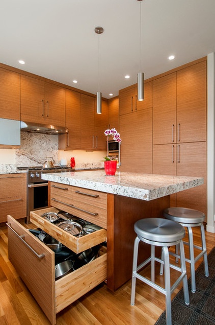
The new two-tone island has seating for two and a deep drawer for pots and pans, with a shallower hidden drawer above it for lids. The two drawers on top store utensils, kitchen knives and silverware, with a single wide drawer beneath for less frequently used utensils and grilling tools.
The old pantry and existing wall were replaced with more efficient 24-inch-deep paneled cabinets — to the right of the new paneled refrigerator — with pullouts and adjustable shelves.
Island stools: Crate & Barrel, pendants over island: Tech Lighting; recessed lights: Juno Lighting Group; paneled refrigerator: Liebherr
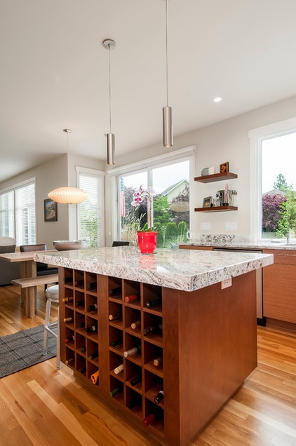
Another side of the island has a built-in wine rack that holds up to 30 bottles, which comes in handy when the homeowners entertain.
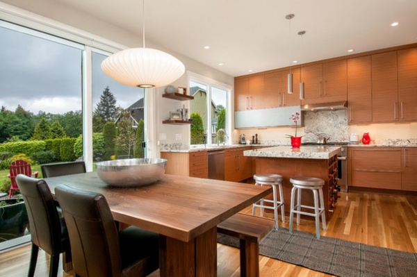
The kitchen opens to this dining area, which then flows into a living area.
Dining bench, chairs and table: Crate & Barrel; Nelson Saucer pendant lamp: Design Within Reach
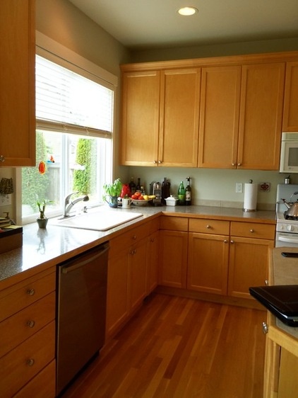
BEFORE: The previous sink window limited views outside and often made the kitchen feel dark, even with the light finish on the cabinets.
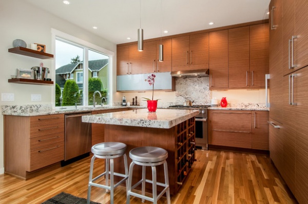
AFTER: Woodis raised the header over the window to expand it vertically, then widened the window by a foot to expand the views of the lush golf course and pond that the home backs up to.
Meanwhile, removing the upper cabinets to the left of the new oversized undermount sink and replacing them with two floating cherry shelves for displaying family photos and collectibles further opened the space up.
Sink window: Style Line in white vinyl, Milgard Windows & Doors; undermount sink and touchless sink faucet: Kohler; beverage faucet: InSinkErator
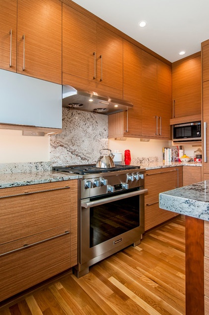
The new range with a six-burner cooktop and an oven has a six-speed vent hood with LED lights, something possible thanks to the decision to move the microwave to the back corner of the kitchen. “They’re not big microwave users, maybe just warming up a cup of water, so having it in that center location didn’t make sense,” Woodis says.
Undercabinet lighting now illuminates task areas, while hidden angled power strips under the cabinets keep outlets from visually cluttering up the wall.
Range: Miele; hood: Kobe Range Hoods; microwave: Samsung; undercabinet lighting and power strip: Task Lighting
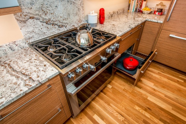
A paneled 30-inch warming drawer now sits to the right of the range. “It was something [Dawn] always wanted,” Woodis says.
Paneled warming drawer: Miele
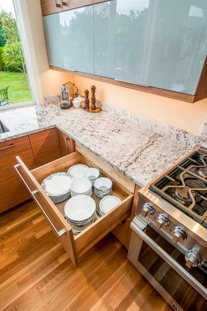
A wide, deep drawer to the left of the range provides storage for everyday dishes. It also contains a hidden pullout for potholders.
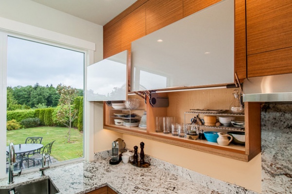
A section of lift-up upper cabinets with back-painted glass with a gloss finish offers easy access to everyday cups and bowls, and helps break up the look of the paneled cabinetry. “We were looking for something reflective but didn’t want to see inside,” Chris says.
Lift-up wall cabinets: glass in Mist Gloss, Bellmont Cabinet Co.
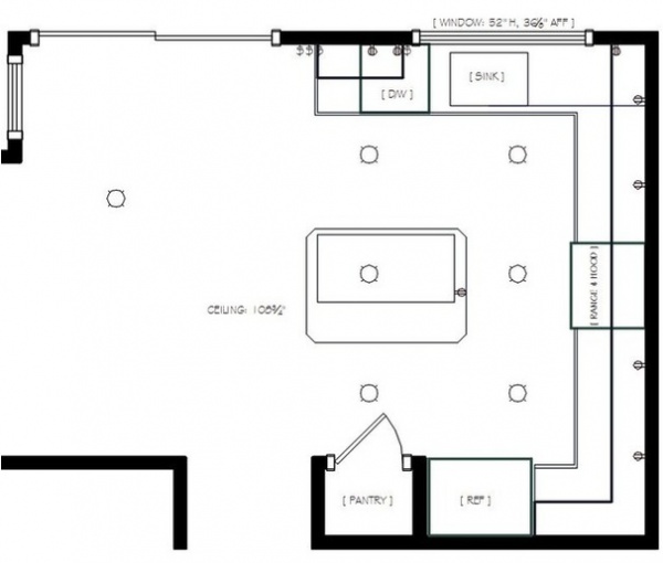
BEFORE: This previous floor plan shows an inefficient layout and a limited lighting scheme. “It only had lighting in the center of the room and not in the task areas,” Woodis says. “We really worked to expand on the potential of this kitchen.”
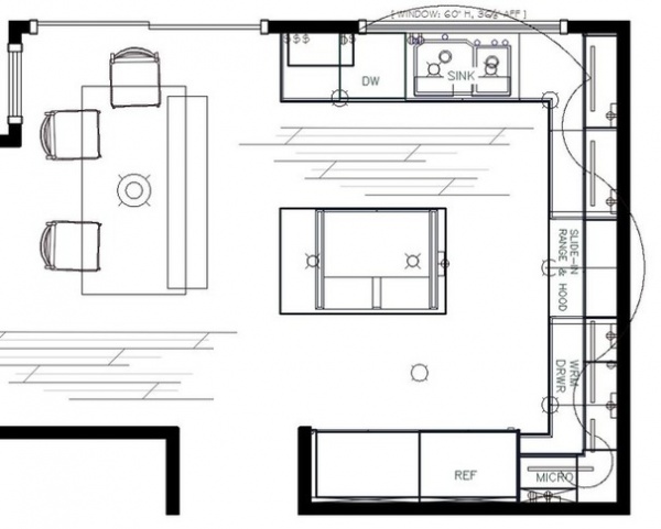
AFTER: The new floor plan illustrates the improved lighting, the removal of the pantry framing wall, the relocation of the microwave and the expanded center island. “It has really modernized the house,” Chris says.
See more Kitchens of the Week
Related Articles Recommended


