Houzz Tour: Life in a 19th-Century Creamery
http://decor-ideas.org 08/14/2015 00:13 Decor Ideas
Amanda Ficek has always been comfortable around old things. She owns and manages three antiques shops in the Twin Cities region of Minnesota, and is always hunting for furniture and decor from forgotten times. But when the opportunity came up to remodel and live in a 121-year-old former creamery near the town of Independence, her response was swift: “I said there’s no way in hell I’m living in that building.”
Houzz at a Glance
Who lives here: Amanda Ficek, an antiques shop owner and manager; her husband, Scott, a real estate investor; and their kids, Claire, 12, Charlie, 11, and Kate, 8
Location: Independence, Minnesota
Size: 2,500 square feet (232.2 square meters), plus a 2,000-square-foot (185.8-square-meter) store below; 4 bedrooms, 2½ bathrooms
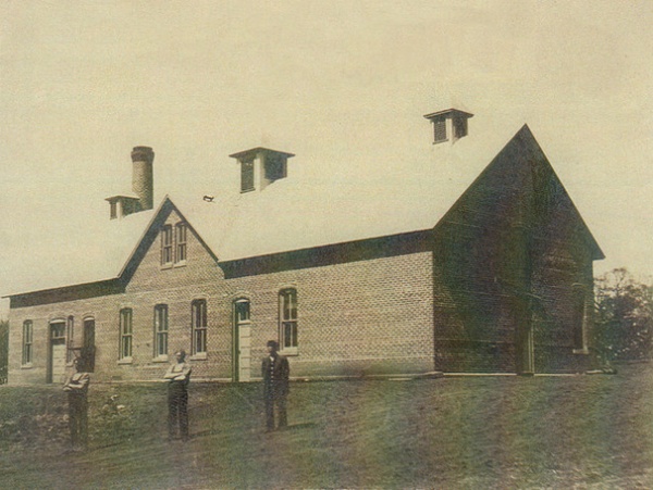
BEFORE: The building had character, for sure. It was originally the Lyndale creamery, seen above, cofounded in 1894 by Frank Coffin, who was part of the family who first settled the area that’s now known as Independence. It was here that three large steam separators made butter that was then taken by horse-drawn carriages into Minneapolis for sale.
But decades of various tenants and uses had all but destroyed the interiors by the time Amanda, her husband, Scott, and their three kids looked into buying the building. Everything from car parts to old sinks was piled as high as snowdrifts. Not to mention there wasn’t any plumbing, electrical, mechanical or heating and air conditioning. There weren’t even framed-out spaces for bedrooms, just an empty barn-like storage space with two small windows. Amanda couldn’t imagine how in that condition it could possibly work for a family of five.
But with some persuading from Scott, who loves challenges, and their architect, Lee Buescher of Architectural Overflow, Amanda gave in to the idea of remodeling the building, eventually throwing a year’s worth of her time and attention into the project to ensure that it provided the features of a modern home but still looked like an old, comforting antique. Just like she’s used to.
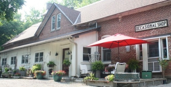
AFTER: On the ground floor, Amanda opened a co-op occasional store right away while the family spent a year building out the upstairs. The store is open once a month for a four-day stretch, during which 12 local artists sell handcrafted, recycled or upcycled furniture, decor and antiques in a 100-square-foot space. Amanda also hosts workshops on things like chalk-paint techniques and how to reface kitchen cabinets.
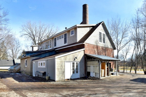
On the other side of the house, Buescher came up with the idea to add a long dormer to bring natural light upstairs. While it didn’t add square footage, it created more usable space by pushing up the roofline.
Buescher added plumbing, electrical, mechanical and an HVAC system and framed out areas above the store for bedrooms, bathrooms, closets and a kitchen.
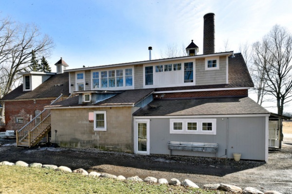
Buescher also established a new entryway staircase around the back of the home so the Ficeks wouldn’t have to cut through the shop below to go in and out.
The cinder block portion was added by a previous owner. It now houses two artists when the shop is open. To the right of that is a single-car garage that Amanda uses as a paint studio, where she teaches her classes.
The bank of windows on the top dormer to the left is for the kitchen. The smaller bank of windows on the top right is for the master bedroom.
The brick smokestack is original to the creamery.
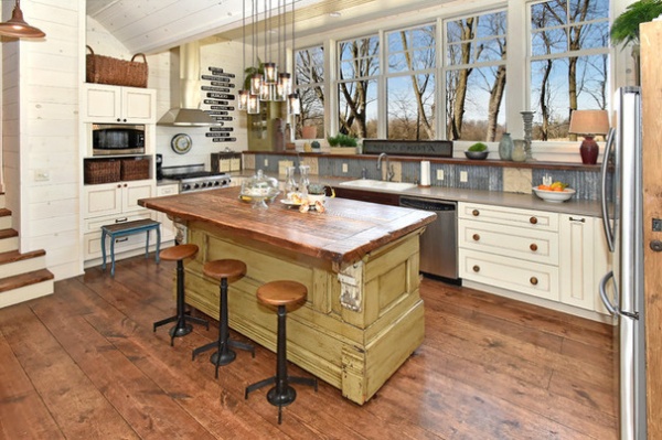
Amanda believes the kitchen island was built to be a checkout stand at a store. The top is on a big cart with wheels on one end and V-legs on the other. “To move it, you lift it up like a wheelbarrow,” she says.
When she bought the island, it was topped with 12-by-12-inch black and white harlequin tiles. A friend of hers built a reclaimed-wood top for her instead. The perimeter countertops are Silestone. The stools are from a general department store that Amanda’s grandparents’ used to own in Mississippi.
To save money on the cabinets, Amanda regularly checked in at a local kitchen outlet store. She found a complete set that had been built for a homeowner who canceled the order. Amanda snatched up the set and made it work for her layout. The section on the end was originally intended for a double oven, which the Ficeks didn’t have. So Amanda pulled the cabinet doors off and framed a shelf for the microwave.
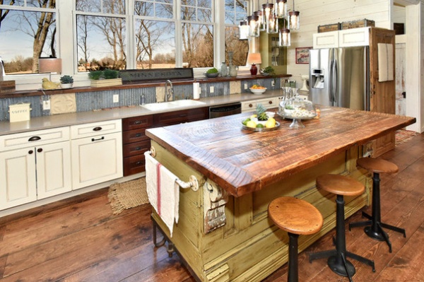
Amanda says she was virtually paralyzed over the backsplash decision. She had her carpenter there ready to install a backsplash, but she hadn’t picked out a material yet and couldn’t decide what to do. The carpenter said he’d come back later when she figured it out, but Amanda wasn’t having that. “I know how that goes,” she says. “I let him go and I won’t see him for six months.”
So she went downstairs and rummaged through what she had in storage and found some leftover ripple tin roofing and ceiling tile, which she handed over to her carpenter. “He starts cutting and measuring and screwing it in, and after it’s done, I’m like, ‘I’m never changing that. I love it,’” she says.
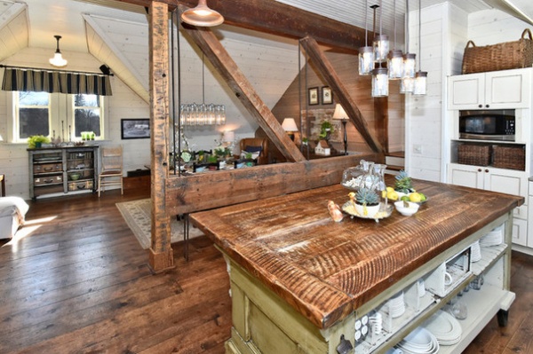
The kitchen opens to a dining and living room area. Amanda had planned on staining the original beams because they were in such rough shape, but after taking a shop vac to them and removing years of dust, she didn’t need to do anything else. “They looked great after that,” she says.
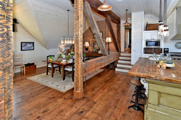
As for the furnishings and paint colors, she wanted to keep things super neutral. “I wanted to be able to change furnishings out,” she says. “Being in the furniture business, I’m always flipping pieces in and out.”
But she still wanted the place to have the look and feel as if it were finished out 100 years ago. “I didn’t want Sheetrock,” she says. Instead, pine boards painted with watered-down Old White chalk paint from Annie Sloan cover almost every wall.
To create the worn look for the floors, Amanda had 1-by-10 pine planking installed unstained at the start of construction. She then let work go on as planned, allowing the workers to rough up the boards while they hauled tools and materials about. After construction was finished, she then stained the scratched and dented floor herself with a dark brown matte polyurethane. Face-nailing the planks with “fat nails,” as she calls them, instead of installing the floors using the tongue-in-groove method, also helped give them that old-fashioned look. “People come up and think it’s reclaimed pine,” she says. “But this was way cheaper.”
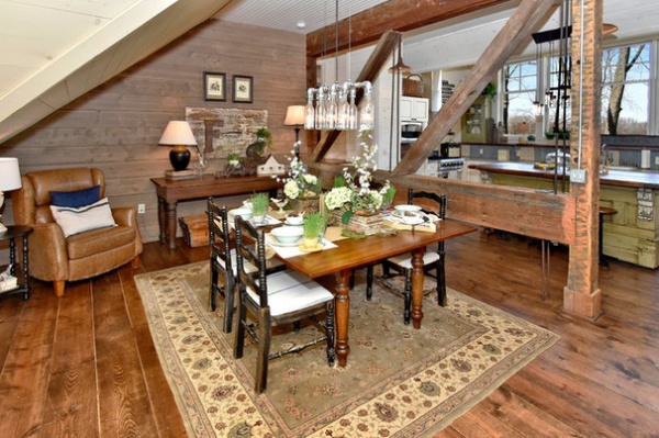
A bottle light fixture that Scott built hangs over a dining table that the couple already had. Amanda found the chairs at one of her antiques stores. The table along the back wall was from her grandparents’ department store. It’s a fabric cutting table that the island stools go with.
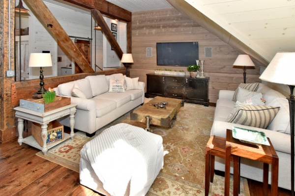
Opposite the dining area is the living room. The pitched roofline meant there wasn’t a lot of opportunity for overhead lighting. “We rely heavily on lamps,” Amanda says.
The old railroad-cart coffee table can be wheeled around to make room for daughter Kate to practice gymnastics.
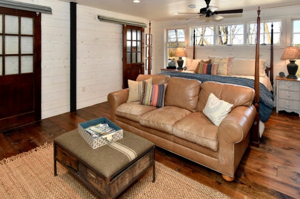
Amanda broke up the master bedroom to include a living area with a TV. Because there’s only one living room in the house, this way if her kids have friends over, she and Scott still have somewhere to hang out.
She got the coffee table ottoman at the annual Junk Bonanza vintage market. The sofa came from a friend’s furniture store. “It was well-loved and worn,” Amanda says.
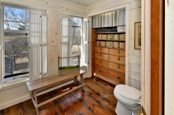
This is the master bathroom. Because of the home’s tricky layout, Amanda had to settle for somewhat unconventional bathroom layouts. But she was just happy she got the number of bathrooms she did.
She kept all the walls and pine plank floors the same throughout the home. “The building is so chopped up, I wanted the flooring to be the same everywhere,” she says.
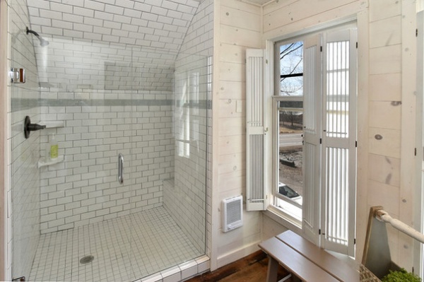
Even though the engineers said a bathtub would be fine, Amanda worried about too much weight and decided to add only showers to the bathrooms, including in the master bathroom, shown here. “Our kids passed the age of baths anyway,” she says.
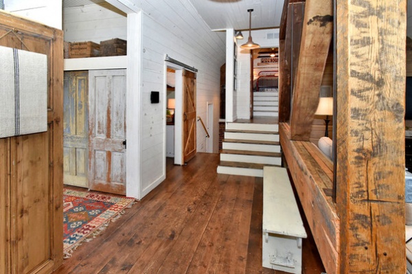
This image shows the entrance hall on the left, a half bathroom where the sliding barn door is and a staircase leading up to Charlie’s room. The stairs to the left lead down half a flight to the girls’ rooms and a home office.
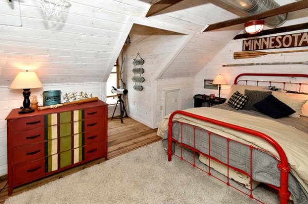
Charlie, who loves to fish, wanted a cabin theme for his room. “I wanted it to be looser on the ‘cabin’ definition, though,” Amanda says. Old camp directional signs and oars fit the bill. The bed and dresser came from Amanda’s antiques shops.
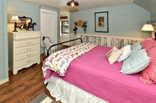
Because Claire loves horses and barrel racing, Amanda accumulated vintage paint-by-number horse prints and horse statues for her room.
Wall paint: Duck Egg Blue, Annie Sloan
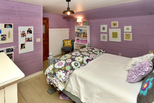
Kate just wanted color for her room. Amanda responded with Old Ochre paint on the floor, which she lightly brushed on and then sealed with a matte lacquer, and Henrietta paint on the walls, both from Annie Sloan.
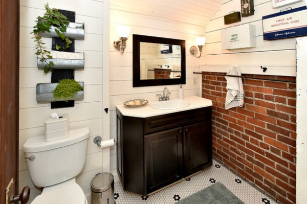
The kids’ bathroom is small, but Amanda was able to get a shower, toilet and sink in there. “The finishes are probably what you’d see 100 years ago,” she says. Her collection of antique first-aid kits hangs on the wall.
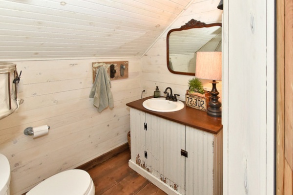
Amanda found the vanity base for the half bath for $50 at an antiques store and added a piece of stained old wood to the top.
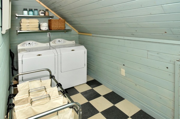
When the family dog, Claire, comes into the house covered in dirt and mud, Amanda can take her into the laundry room for a quick cleaning on the durable black and white vinyl composition tile floor.
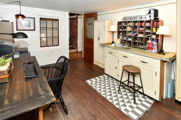
An office is tucked into the end of the house with the bedrooms. Amanda and Scott have his-and-her desks — his is the wood desk on the left (Amanda lightly brushed it with paint to give it an old barn-wood look); hers is the craft station with all the supplies.
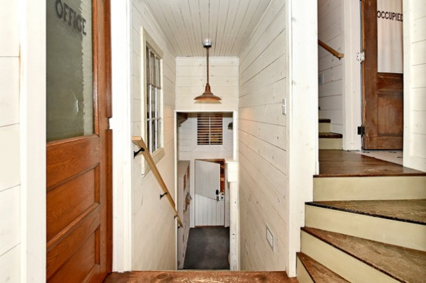
This staircase leads to a Dutch door that opens to the store.
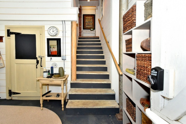
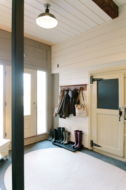
A yellowish door to the left of the same staircase is original to the creamery and leads to what was once the ice box but is now part of the store. “That door is at least 8 inches thick,” Amanda says.
To the left of the former icebox door is the rear mudroom entry to the home.
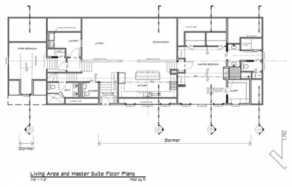
The layout of the home is somewhat difficult to explain. The kitchen and living area had been dropped by a previous owner about 3 to 4 feet below what would be a top floor. So, one end of the home is basically a three-story tower containing a portion of the shop on bottom, then two bedrooms on what would be the second floor and one bedroom on the third floor. The living spaces and kitchen are then in the middle, with the floor resting between what would be the first and second floors. On the other end is another tower that contains a two-story portion of the shop below and the master bedroom on what would be the third floor above.
In other words, if you were to walk into the store below at one end, you’d walk into a space with a normal ceiling, followed by a space with a slightly higher ceiling and finally a space with a double-height ceiling.
What began as a no-way-in-hell scenario ended with Amanda feeling like her home is now the cream of the crop.
General contractor: David Klein of Klein Group Remodeling
Floor and wall material: Fullerton
Island top and half bathroom sliding barn door: Patrick Stinnett of Robinwood Reclaim
Browse more homes by style:
Small Homes | Apartments | Barn Homes | Colorful Homes | Contemporary Homes | Eclectic Homes | Farmhouses | Floating Homes | Guesthouses | Lofts | Midcentury Homes | Modern Homes | Ranch Homes | Townhouses | Traditional Homes | Transitional Homes | Vacation Homes | Homes Around the World
Related Articles Recommended


