My Houzz: Japanese Minimalism Blends With Classic New Orleans Style
Brett Davis didn’t need to look far to find the perfect building for his first project after getting a master’s degree in landscape architecture from Louisiana State University. His parents, owners of the Davis Gallery of African Art in New Orleans, had purchased a shotgun home on Magazine Street in New Orleans in 1977, operating their gallery business out of the front and living in the back portion of it. As their family grew, they moved to a larger home nearby, but they continued to use the building as the gallery space until 2000 and then rented it as a commercial space until 2013.
That’s when Davis came back into the picture. “As I was jogging by the building one day shortly after my return to the city, and in the middle of looking for work and a place to live, it occurred to me that I had a solution for everything I was looking for in the building. It was definitely in need of a renovation, and I had just spent three years learning design theory, digital drawing and drafting, so it seemed like an obvious project for me to embark on,” Davis says. The renovation included designing new office space on the first floor and adding a second story at the back to create a classic New Orleans “camelback” shotgun-style home.

Houzz at a Glance
Who lives here: Brett Davis and Justine Holzman
Location: Magazine Street, New Orleans
Size: 2,200 square feet (204.4 square meters); 2 bedrooms, 2 bathrooms
Year built: Around 1880
Today, the second-floor apartment with its large balcony overlooks Magazine Street. The first floor is home to both a Warby Parker Frame Studio and office space.
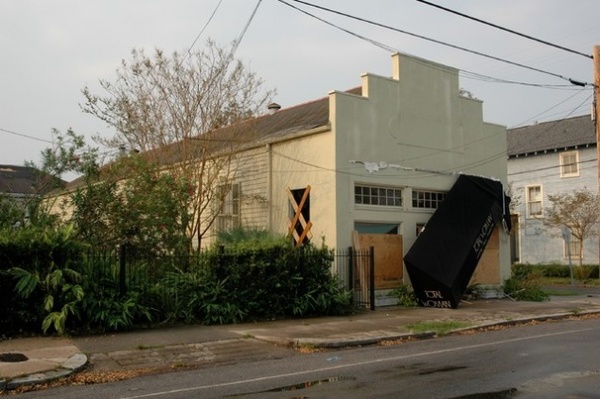
BEFORE: “I really didn’t know that much about buildings, so I contacted a family friend and retired architect, Nancy Amoss, who put me in touch with one of the city’s most prolific contemporary architects, Wayne Troyer,” Davis says. “After a few brief meetings with him, he encouraged me to dive right in and take on the whole process on my own. It proved to be a steep learning curve, as I was trying to make the building a mixed use-mixed occupancy type: commercial and residential.”
The building had suffered damage during Hurricane Katrina, as this photo taken in 2005 shows, but the major repairs had been made before Davis started the renovation.
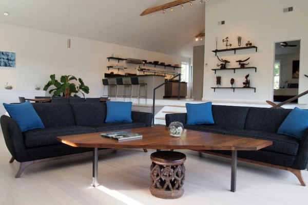
AFTER: The main living space includes an open-plan living room, dining room, eating area with bar stools, and kitchen.
“When I added the ‘camelback’ onto the existing building, I demolished about 40 feet of the original roof. I saved all the heart pine rafters and roof sheathing that came out and made several pieces of furniture with it. A friend from the local dog park, David Lapin, has a woodworking studio about four blocks away that he allowed me to use to build the dining table and coffee table. He showed me how use all his equipment and helped me craft it,” Davis says.
Sofas: SmartFurniture; coffee table: reclaimed heart pine with legs from Etsy; flooring: strand bamboo
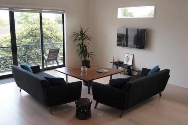
The apartment’s living room is flooded with natural light, thanks to the high ceiling and sliding glass doors that bring the outdoor view inside.
Wall paint: Extra White, Sherwin-Williams
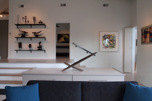
Davis notes that growing up in an art gallery setting gave him an appreciation for using contrast, lighting and singularity to highlight colorful art objects. As a result, he kept the walls white so art pieces would stand out. This large wooden piece, which is thought to be an African birthing chair, is the focal point of the living space, complementing the architectural angles.
“Shortly before starting on the project, my partner, Justine, and I went to Japan for a few weeks after graduation. In both the architecture and gardens we visited, there was an amazing appreciation for minimalism in design that I am sure helped influence some of the interior spaces,” he adds.
Framed art on back wall: Wayne Amedee; geometric painting on right wall: Margaret Davis (Brett Davis’ grandmother)
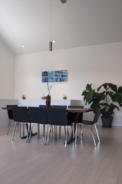
The dining room is open to both the kitchen and living room. The large print on the far wall is an abstract photograph of a waterfall taken by Davis and Holzman on a recent trip to Iceland. They love how nature and personal experiences can inject meaning and importance into the pieces that they bring into their home.
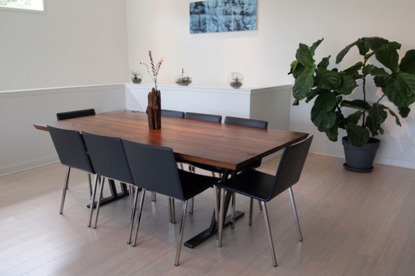
Though the couple’s style is minimalist, plants and flowers can still be found throughout the home. “Through my experience with landscape architecture, I have gained an appreciation for the forms and color created by indoor plants, and with so much natural light in the space, they are very easy to tend to,” Davis says. “There are the larger, more common ones — like the fiddle leaf figs, marginata, rubber plant and yucca — but I also have some small air plants and succulents. Mom and Dad like to bring little flower arrangements to me from their country property when they visit.” His parents’ country home was recently featured on Houzz as well.
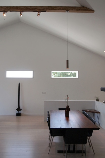
The African piece centered under the left window is a Topoke “bride price” currency in spear form from the Democratic Republic of Congo. Its tall, thin shape draws attention to the peak of the home’s vaulted ceiling.
“The apartment uses a vaulted ceiling, which is not only beautiful but functional in that it helps give warmer air a place to hang out. The heat in New Orleans is one reason why ceiling heights here are typically 10 or 12 feet high,” Davis says.
Ceiling beams: glulam
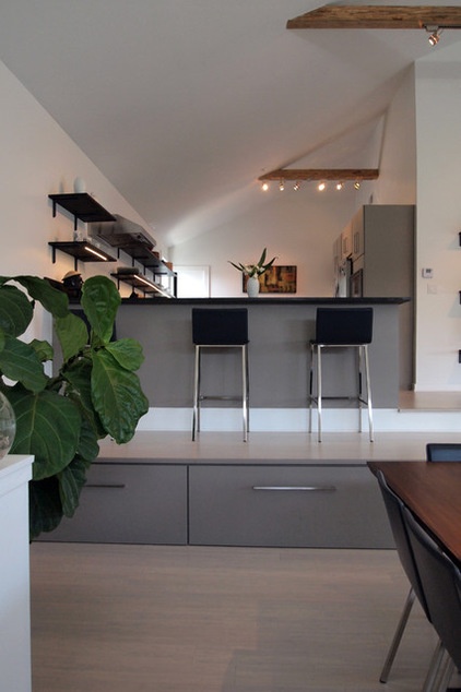
The high ceilings help with airflow at the expense of traditional attic storage. “Because there was no attic space with the vaulted ceiling, I designed in the storage bins on the sides of the steps under the bar seating and art platform,” Davis says. “People always comment on these as a really clever idea. I store things like camping equipment, linens, books and old Mardi Gras beads in them.” The top of the cabinets also provides a space for the bar stools overlooking the kitchen’s work area.
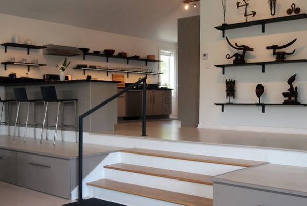
A change in levels helps delineate areas within the space while still promoting an open plan. “There is a split level in the apartment which mimics the split level in the retail portion of the building that we used to live in. One of the previous uses of the building in the early 20th century was as a steam laundry. When that business went in, one side of the raised shotgun was dropped so that a brick room could be built to house the steam laundry equipment. Above that brick room is the mezzanine level, where my sister and I used to sleep when we lived there in early ’80s,” Davis says. Raising the ceiling height in the area over the mezzanine created needed headroom.
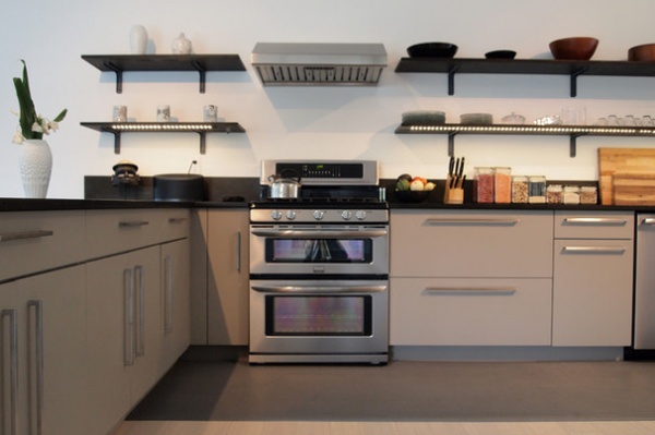
The kitchen includes lower cabinets with open shelving above to continue the open feeling. There’s plenty of room for two people to work together and also to interact with guests in the living and dining rooms.
During the renovation, Davis had to consider both budget and quality. “That is tough for me to parse out exactly, as I had a whole budget for the improvement of the entire building, including the renovation of the retail space and construction of the office below. I definitely went on the higher end for my windows and LED lighting. Everything else I feel was above average to high quality, but not too far above average in cost.”
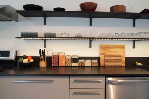
The open shelving shows off the couple’s minimalistic glass tableware. Davis makes it a point to be as environmentally conscious as possible in his personal life, which greatly influenced his design and choices for materials, including Energy Star-certified appliances and recycled paper countertops in the kitchen.
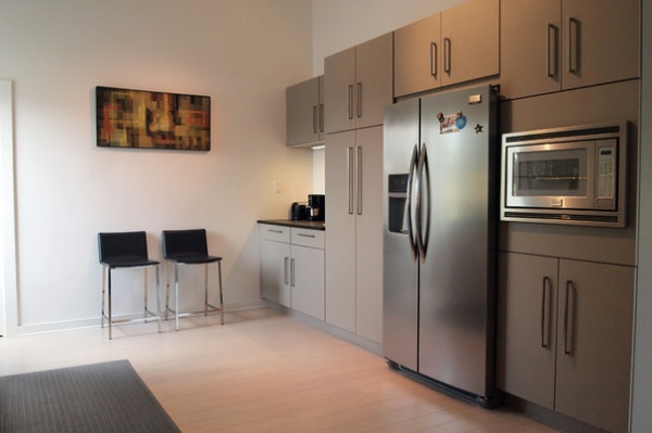
More art can be found in the kitchen as well.
Geometric painting: Margaret Davis
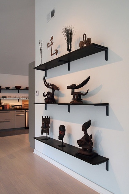
Davis used leftover PaperStone from the kitchen countertops to create these display shelves. “A lot of the African art my family has given me on special occasions over the years is displayed throughout the house. Not only is the art beautiful and unique, it tells the story of how the building came to be,” he says. “My older sister, Inglish, who co-owns the building with me, was able to decorate her midcentury modern home in Jackson, Mississippi, with pieces she has received over the years, and I really liked the way it turned out. That inspired me to do the same.”
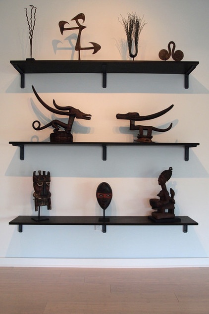
On the top shelf is African currency from Nigeria and Cameroon made of iron and copper alloy. It was traded for goods and services before the colonial period.
On the middle shelf sit Bamana headdresses from Mali, used in a ceremonial dance to invoke the spirit of Chi Wara during the planting and harvesting of crops to ensure their success.
The bottom shelf holds an Ijo hippo water spirit mask from Nigeria and a Dan crier mask from Liberia, both used to announce important events, and a Yoruba mother and child divination figure from Nigeria.
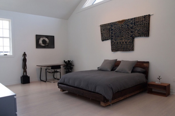
The African piece to the left of the desk in the master bedroom is a Mumuye female figure from Nigeria. It was used as a communal protector and also to provoke rain.
Above the bed is a Cameroon king’s gown, woven from cotton. The pattern in the textile was drawn using beeswax to prevent the dye from penetrating the patterned part of the garment.
The beds in both the master bedroom and the guest bedroom were fashioned from the salvaged heart pine rafters from the roof of the original building.
Ceramic vase on nightstand: Justine Holzman
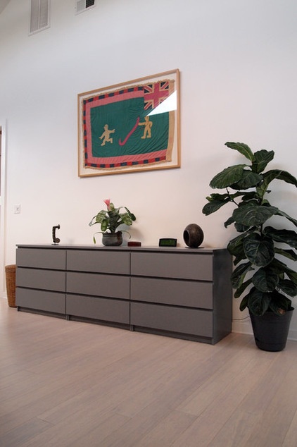
Above the dresser is a framed Kuba textile: a tribal war flag, given to Davis by his parents.
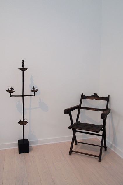
Two unusual pieces sit in another corner of the bedroom. The Malinke chair is from Guinea. The Senufo oil lamp to its left is from Ivory Coast. Both were given to Davis by his parents.
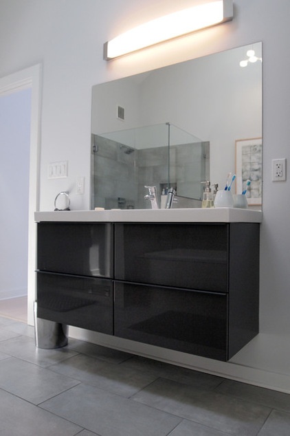
These contemporary floating vanities are in keeping with the contemporary and minimalistic feel of the apartment. “I saved quite a bit of money by using Ikea vanities that I assembled myself and by ordering my fixtures and appliances in large groups online for a discounted price,” Davis says.
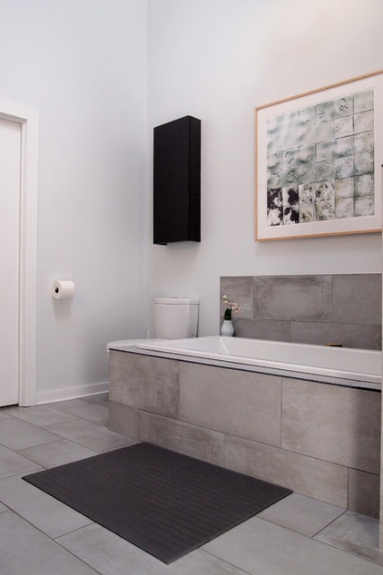
Holzman’s artwork above the bathtub goes beautifully with the neutral tones of the room and the nature-inspired motifs of the home.
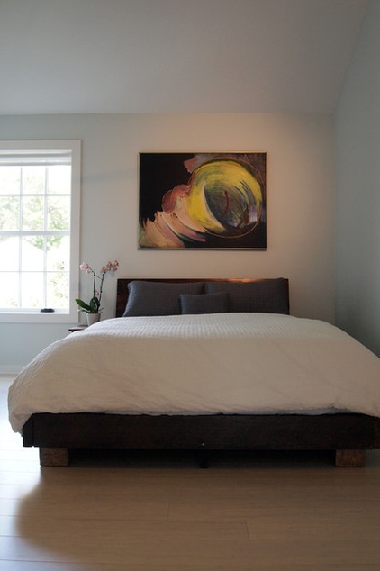
The guest bedroom features a lovely abstract painting by John Finley. The neutral color of the bedding and walls allows the artwork to take center stage.
Wall paint: Topsail in eggshell finish, Sherwin-Williams
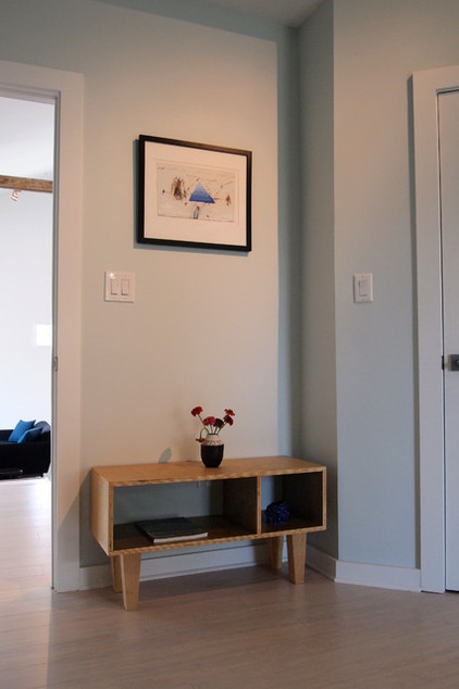
Another piece of art, this one by John Casado, hangs just past the guest bedroom door.
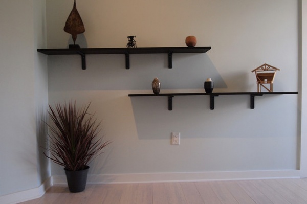
A Dracaena marginata fills the negative space created by the staggered wall-mounted shelves in the guest room.
The small balsa wood architectural model on the bottom shelf was created by Davis during a high school architecture class. After he finished the renovation, he brought this piece in and noticed that he had used the same shape for the window in the master bedroom.
Ceramic vases: Justine Holzman
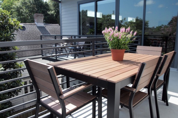
The balcony provides an ideal spot for dining and relaxing. The seats have a view of Magazine Street but are hidden from passers-by by the Japanese plum tree (Prunus mume) in the yard. “It’s amazing what a little elevation will give you in such a flat city,” Davis says. “By having the balcony only 14 or 15 feet off the ground and facing away from surrounding buildings, I get amazing views of the sky. It’s really great during cloudy summer evenings when the sun turns everything red or when lightning storms are coming in.”
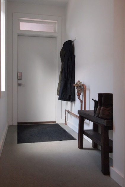
Downstairs, a convenient mudroom between the covered parking area and the apartment upstairs does double duty as a storage space for outdoor gear, such as jackets and boots.
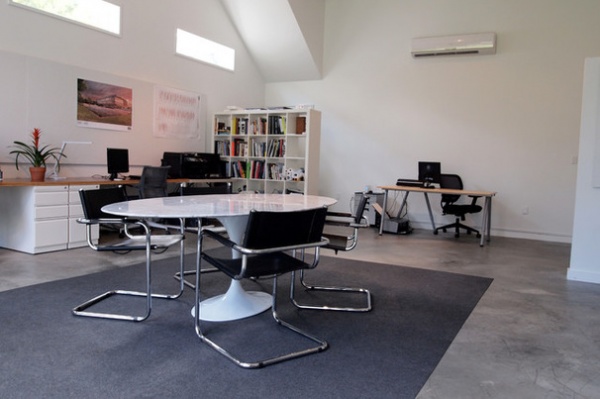
Below the apartment is a contemporary architecture office where Davis has his company, Land Cover; he shares the space with the architects of One to One along with a few other architects. “I love the fact that I can take a flight of stairs to work in the morning. Having the office below me, with its view over the yard, and all the activity on Magazine Street, is an ideal work environment. Whenever I am ready for lunch, coffee, tea or a break, I can be home in a matter of seconds.”
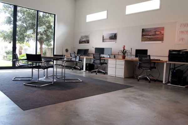
This open working space is about 750 square feet (69.6 square meters). With the large windows and sliding glass doors, it feels like much more.
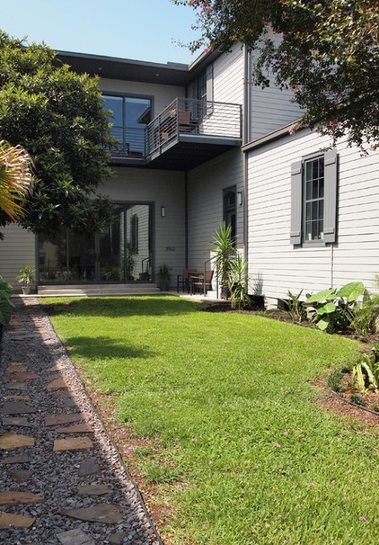
The nearly 1,400-square-foot (130-square-meter) side yard extends almost the full length of the property. Because Magazine Street is primarily commercial, this much yard space is unusual for the area. “In expanding the footprint of the building, it was important to me to preserve a good portion of the side yard and the facade of the building by positioning the ‘camelback’ addition further away from the street. Getting the right proportions was key,” Davis says.
Davis’ mom, Kent, planted the pink-flowering crape myrtle when she and her husband purchased the building in the late ’70s, and Davis adds that his dad, Charlie, helped re-landscape the side yard during the renovation.
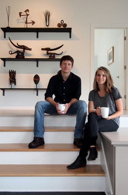
Davis and Holzman, seen here, appreciate their location and the renaissance spirit of their New Orleans home. “I also recognize how important it is for cities to densify inward and upward instead of out in order to efficiently use land and natural resources,” Davis says. “I am happy to be right in the middle of the action and feel incredibly lucky to have the space.” He adds that New Orleans is being reborn and is recognized as one of the most culturally significant cities in the U.S. and internationally.
See more photos of this home
My Houzz is a series in which we visit and photograph creative, personality-filled homes and the people who inhabit them. Share your home with us and see more projects.
Browse more homes by style:
Small Homes | Apartments | Barn Homes | Colorful Homes | Contemporary Homes | Eclectic Homes | Farmhouses | Floating Homes | Guesthouses | Lofts | Midcentury Homes | Modern Homes | Ranch Homes | Townhouses | Traditional Homes | Transitional Homes | Vacation Homes | Homes Around the World


