New and Old Mix It Up in a Historic Farmhouse Kitchen
http://decor-ideas.org 08/11/2015 22:13 Decor Ideas
Sometimes you reach a breaking point with a kitchen. Just ask Jacqui Jarrett and her partner, Joe Yannuzzi, whose critical moment came last year as they were hosting a big Thanksgiving dinner for family and friends. “I had 30 people standing in our kitchen, and the oven wasn’t working,” Jacqui says. All that raw turkey inspired her and Joe to make a change.
Kitchen at a Glance
Who lives here: Joe Yannuzzi, an attorney; Jacqui Jarrett, a registered dietician; his son, Anthony, 15; and her son, Dylan, 24
Location: Bethlehem, Pennsylvania
Size: 290 square feet (26.9 square meters)
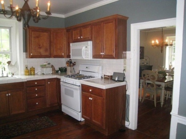
BEFORE: The existing closed-off kitchen in their historic Bethlehem, Pennsylvania, farmhouse, which was built in the 1790s and was once owned by a descendant of William Penn, was updated by a previous owner. It had dark maple cabinets, tile counters, white appliances, limited prep space and a narrow doorway that limited flow between the kitchen and dining room.
“There wasn’t enough counter space or storage space, the refrigerator jutted out into traffic flow, and there was that oven that didn’t work,” Jacqui says.
“After” photos by Matt Villano Photography
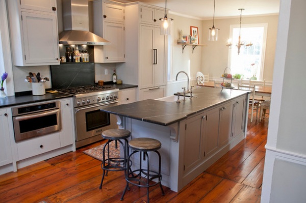
AFTER: The couple, who share the home with Joe’s son, Anthony, 15, and Jacqui’s son, Dylan, 24, opened things up and created better flow by eliminating the wall between the kitchen and adjacent dining room.
Working with their kitchen designer, Jacqui’s sister Jill Jarrett of Jarrett Design, the couple went for a transitional look with soft gray tones that help bridge the gap between old and new. A multipurpose center island, distressed soapstone counters, stacked inset cabinets and a refinished original hardwood floor give the space character and style.
Removing the wall between the kitchen and dining room opened things up. But, as with many historic homes, eliminating the non-load-bearing wall filled with years of dirt, horse hair and newspapers required special attention. “The floor was sloped where the wall came down, about 5 inches, and the installers had to perform some magic so the floor now looks straight,” Jill says.
Cabinetry: custom in Vista Gray and Stone, Plain & Fancy Custom Cabinetry; counters: distressed soapstone, Bucks County Soapstone; pendants over island: Roost, Lightology; wall paint: Silver Coffee Pot, Sherwin-Williams
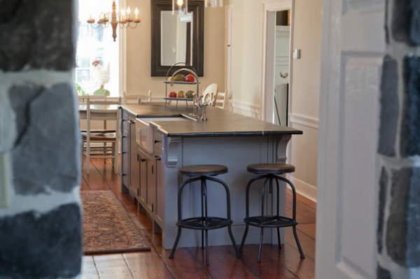
This view into the kitchen from the doorway to the family room gives a glimpse at the interior stone walls that contribute to the character of this classic farmhouse, as does the antique pine floor. “We had to refinish it, locate some antique pine and bring in someone familiar with antique floors,” Jill says. “Because we tore the wall down, we also had to repair a few spots. It required work, but it adds so much character, and it would be a shame to use anything else.”
Island stools: Ballard Designs
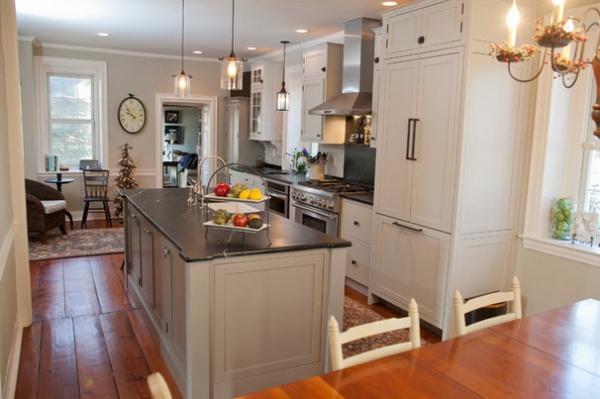
This is the view of the kitchen from the dining room, with a small seating area beyond the kitchen. The family room is through the doorway.
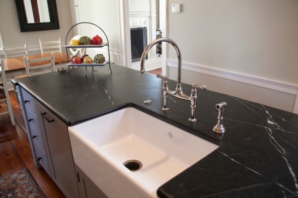
The multifunctional island doubles as a buffet for entertaining, with a medium gray finish that contrasts the surrounding light gray maple cabinets. The island has the kitchen’s main single-basin sink with a polished nickel bridge faucet, along with double trash pullouts, a paneled dishwasher and distressed soapstone counters.
“The soapstone was the perfect choice for a farmhouse and gives us a timeless look,” Jacqui says.
The electrical part of the project was another challenge. Since the walls are stone and stucco, adding switches and outlets for lighting on the walls was nearly impossible. The solution was to add them to the posts of the island. You can barely make out a couple of switches on the post at the far end of the island in this photo.
Shaws Original apron-front fireclay kitchen sink and Perrin & Rowe bridge faucet: Rohl; paneled dishwasher: Thermador
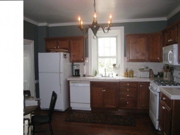
BEFORE: The old white refrigerator protruded into the main traffic-flow area of the kitchen.
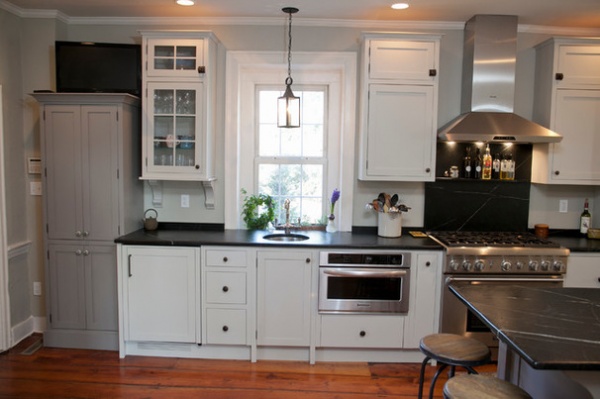
AFTER: With the kitchen’s main sink now located in the center island, a new prep sink highlights the kitchen’s beverage center and prep area. A paneled beverage refrigerator sits to the lower left of the sink, with a microwave and convection oven combo to the right. A pullout spice rack is located between the microwave and the range.
The seeded-glass-front cabinet stores cups and glasses. Corbels lend it a furniture look that reflects the classic nature of the home. To the left, a stacked light gray pantry cabinet is shallower to ease traffic flow while creating a collected look. “I wanted the kitchen to look like it has been there forever and had layers,” Jacqui says.
Lantern over prep sink: Katie’s Colonial Lighting; prep sink: Blanco; prep-sink faucet: Rohl; microwave-convection oven: KitchenAid
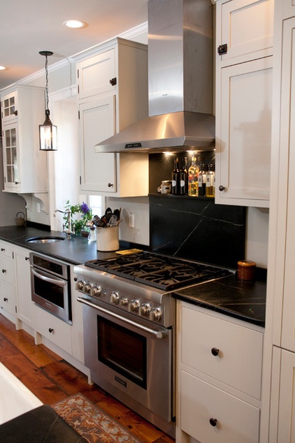
The 36-inch-wide, six-burner range with vent hood is an update from the previous four-burner range.
Soapstone extends from the counters to create the range backsplash, with a simple shelf added for bottles of oils and a few spices. “It’s nice to limit the different materials,” Jill says. “You can sometimes get too fancy. This honors the simplicity of the home.”
Range and hood: Thermador
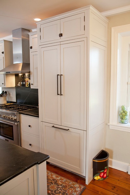
The large paneled French-door refrigerator with pullout freezer gives the couple the furniture look and warmth they wanted. The two deep drawers between the refrigerator and range offer storage for pots and pans.
Paneled refrigerator: Thermador
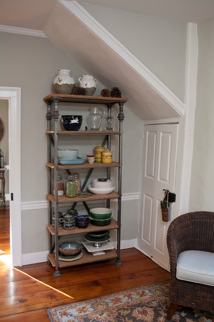
A custom antique-style open shelf unit made from local iron and reclaimed wood from a local 200-year-old granary holds frequently used serving bowls and other dishes. “It was an opportunity for extra storage, and a chance to use that area with the angled ceiling,” Jill says.
The small door leads to the basement.

BEFORE: This floor plan of the existing kitchen shows the limitations of the old L-shaped layout and how the kitchen was cut off from the dining room. It also highlights how the refrigerator stuck out like a sore thumb.
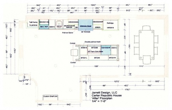
AFTER: Now the kitchen extends and blends into the dining room, and gives the homeowners what they need for quick weekday meals, weekend dinner parties and, yes, those large Thanksgiving meals, too.
More: 8 Elements of a Farmhouse Kitchen
Related Articles Recommended


