Houzz Tour: Seize-the-Moment Design
http://decor-ideas.org 08/11/2015 20:13 Decor Ideas
It’s impossible to overlook the amazing views that surround this California home. In fact, the modern home on the site is designed to capture the rolling hills that ring it. But, although you can enjoy it, the old saying “You can’t eat the scenery” is true. Even if your home is in a beautiful environment, you still need places where you can dine, rest and just generally live life. The family that resides in this house chose it; they did not build it. When they moved in, they asked interior designer Holly Bender to help them create interiors that modulated the sleek modernist lines and expressed their fun-loving personalities.
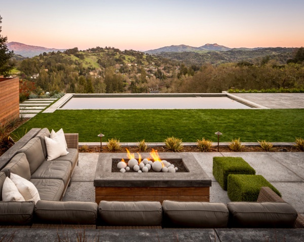
Photos by Scott Hargis
Houzz at a Glance
Who lives here: A couple and their 2 boys (ages 13 and 14)
Location: Lafayette, California
Size: 3,900 square feet (362 square meters); 5 bedrooms, 4½ bathrooms
The house sits on an incredible lot that includes views, a pool and a small vineyard.
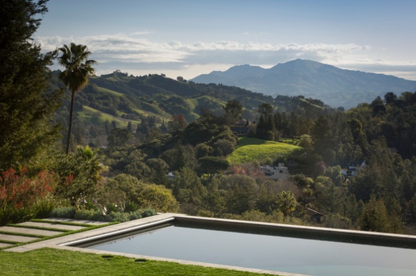
The owners had moved around a bit, and Bender, principal of Holly Bender Interiors, says they dove right into making the place their own. “The view was everything. Absolutely everything was about the view,” she adds.
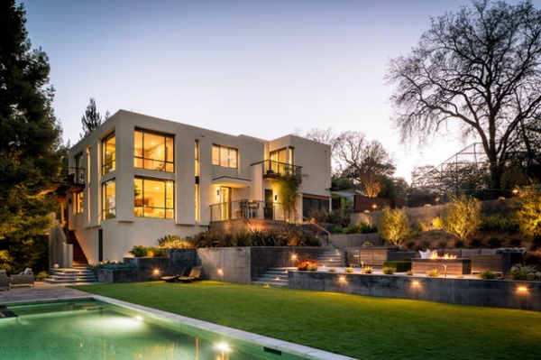
“Their primary concern was making sure the modernist home didn’t feel cold and that it didn’t go completely angular,” Bender says. “However, they did want the furnishings to be appropriate to the home.”
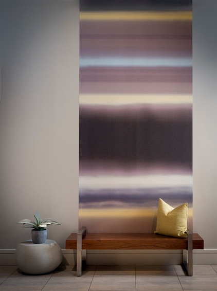
Together, the clients and designer invented a style they call organic modern. “We made it feel harmonious with the outdoors by using neutral colors you’d find in nature and organic shapes,” Bender says.
The designer set the tone in the entry with a wooden bench in front of a nearly floor-to-ceiling wallpaper accent that mimics a dramatic sunset. “This is a very high-ceilinged space. We needed a big statement piece,” she says. When a commanding artwork didn’t readily appear, the designer installed two strips of wallpaper instead. “I’d never recommend people buy art just to fill a space,” Bender says. “This will do until a really special piece is found.” And with a look this dramatic, who knows? It could be the long-term solution.
Wallpaper mural: Selänne, Marimekko
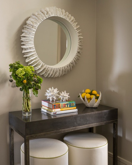
The adjacent wall has a design trio made up of a console, a mirror and ottomans.
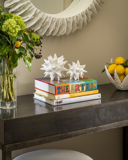
The mirror in the entry was a no-brainer. “It’s a good place to check your hair as you come in and as you depart,” Bender says. The console is where keys are stowed. The ottomans are about fun and function. “I like the way they pick up the white in the mirror,” Bender says. “They are also a place to sit and remove shoes, or they can be pulled into another room for extra seating.”
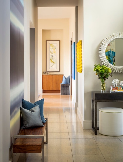
Looking down the hall, you can get a glimpse of what lies ahead. This is a home where art makes an impact in big and small ways.
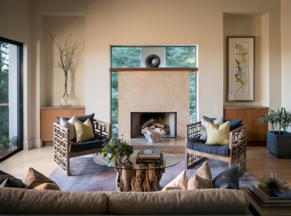
An example of a small but dramatic way: the sculpture centered atop the fireplace. The fireplace is surrounded by glass, allowing treetop views to outline it. What could possibly make it more striking? A simple, round sculpture that acts like an enthusiastic punctuation mark.
The armchairs reflect one of the owners’ passions: Art Deco.
Chairs: Kathy Kuo Home
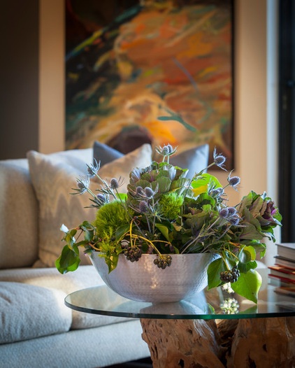
An arrangement in the living room captures the nature-based color palette of the space.
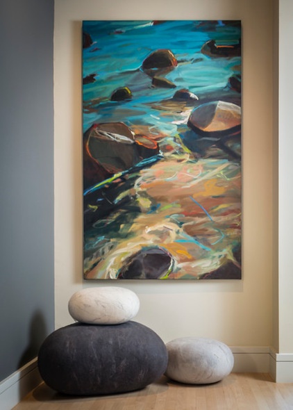
Those organic hues were also included in a painting by Sharon Paster the owner commissioned. “The artist’s work fits completely with the organic modern look,” Bender says. “And putting the stone-like ottomans and the painting in this niche made sense of it.”
Artwork: Sharon Paster
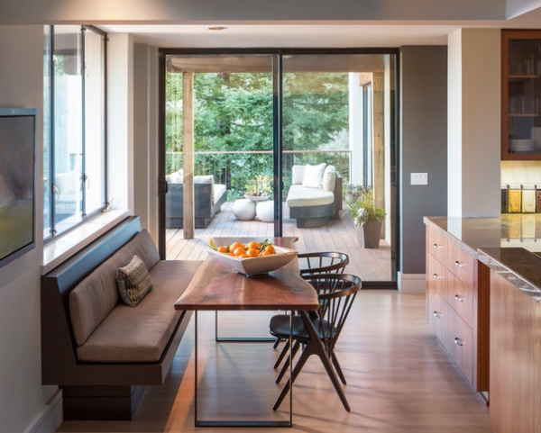
The banquette bench was already in the house, but the designer made it comfortable with cushions and a live-edge table that is narrow enough for people to pass by it to the deck outside.
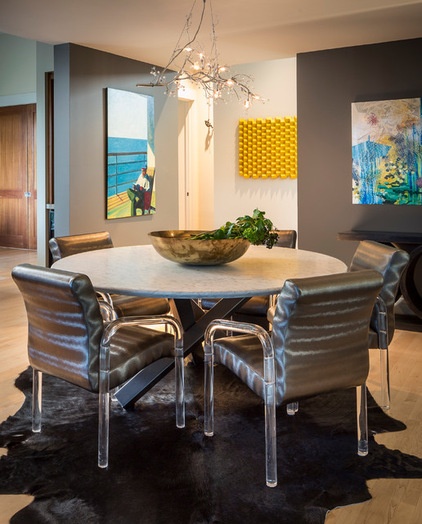
The dining room, located just off the kitchen, houses a remarkable set of vintage chairs. Bender uses identical pieces with Lucite arms and legs as her own office chairs. When the client visited her studio and sat in one, she knew she’d found the seats for her dining room table.
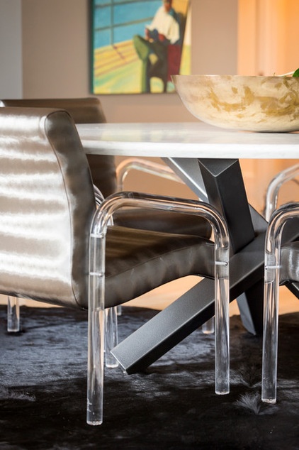
For this residential setting, Bender selected a fabric with a weave that makes it appear metallic. “It’s actually a faux leather,” she says. “It’s perfect for a dining chair, because you can wipe it off.” The hide rug was also selected for its easy-clean nature. The designer calls hide rugs bulletproof.
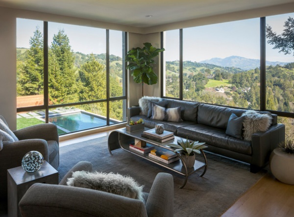
Bender also used that “hard to ruin” concept when she furnished the media room.
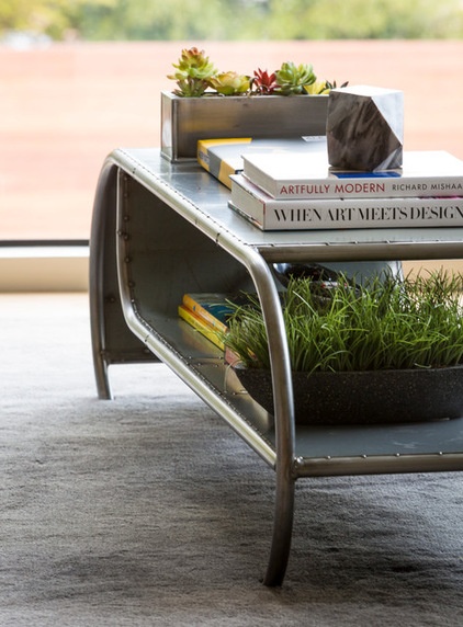
For example, the coffee table was created with salvaged car parts.
Coffee table: custom, Rustbelt Rebirth
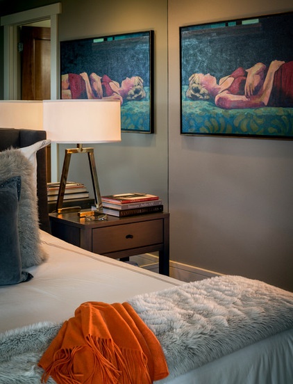
In the bedroom, Bender chose a blue-gray palette for a soothing atmosphere. The mirrored accent wall behind the headboard was existing, and the designer recommended leaving it there. “The bed looks into a wall; the windows are on the side of it,” she says. “The mirrors bounce light into the room.”
The art is by T.S. Harris. “The clients fell in love with it,” Bender says. “This piece is special, one of those things you put in your will.”
Wall paint: Chelsea Gray, Benjamin Moore; artwork: Sleeping Beauty, T.S. Harris
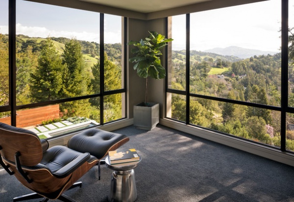
The room the couple calls the lounge is right off the master bedroom. The directive to Bender was to furnish this room minimally. “It’s supposed to be a meditative space,” she says. “It’s a place where you sit down with a glass of wine and a book.” The plant in the corner is meant to bridge the gap in green between the windows.
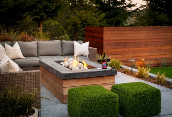
The majority of Bender’s work was on the interior, but outside she made a notable contribution. The green ottomans here are upholstered in artificial turf and sit on casters that make them easy to roll from place to place. “It’s just something I dreamed up,” the designer says. And why not? You only live once.
Architect: Robert Swatt, Swatt Miers Architects
Landscape design: Ross Knaz, L&L Landscaping, Design-Build
Browse more homes by style:
Small Homes | Apartments | Barn Homes | Colorful Homes | Contemporary Homes | Eclectic Homes | Farmhouses | Floating Homes | Guesthouses | Lofts | Midcentury Homes | Modern Homes | Ranch Homes | Townhouses | Traditional Homes | Transitional Homes | Vacation Homes | Homes Around the World
Related Articles Recommended


